NetBase Enterprise — making the power legible and shareable

Catherine Hicks


NetBase Enterprise was the company's flagship — for a long stretch, its only product: a high-precision NLP engine that processed billions of social posts and delivered the results through deeply customizable dashboards. It was powerful, and it was built for trained analysts. As Sr. Product Designer I did three feature builds on it, and the recurring theme across all of them wasn't adding capability — the platform had plenty. It was making that power legible and shareable: closing the gap between the analyst who understood the data and everyone else who needed it.
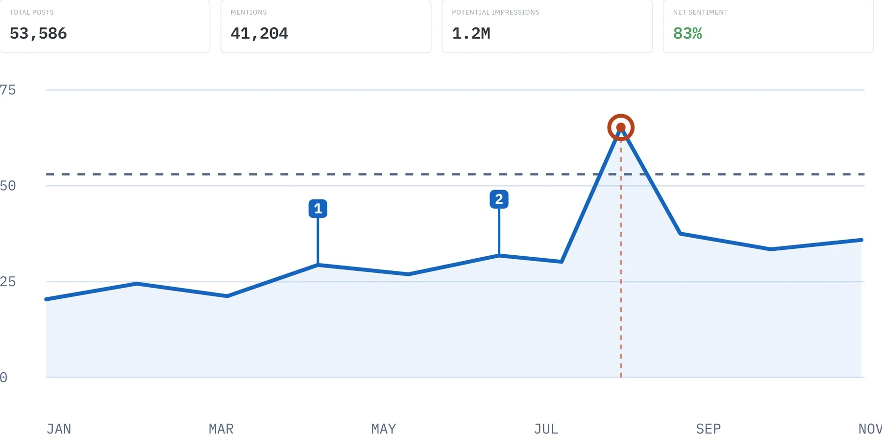
The Enterprise dashboard — sentiment over time across billions of posts, with the three features that made it shareable visible at once: in-chart annotation pins, a fluctuation spike, and a dashed threshold line.
Three builds, one through-line. Annotations gave raw data context. The Executive Dashboard carried that data to people outside the platform. Fluctuation Analysis put a spotlight on the moments that mattered. Read them as three answers to the same non-analyst-shaped gap.
Annotations — a spike means nothing without the story
Analysts sat on huge, valuable data sets they wanted to share — but stripped of context, that data was useless to anyone unfamiliar with it. A spike on a chart means nothing unless you know a product launched that day, a campaign went live, or something broke. Annotations let a user mark that context directly on the chart, so anyone with access could read the data with the story.
The design decision that defined it: my first concept put the notes in a side panel next to the chart. In wireframing and testing it didn't hold up — it didn't give enough context, and it cluttered the UI. The stronger, riskier idea was to place annotations directly on top of the data, in-chart. Our visualization layer was Highcharts, and no one was sure it could even support in-chart annotation. Rather than design around the uncertainty, I led with the best idea and let it push engineering — kept fallbacks in my back pocket, and the dev team stretched to build it. It shipped in-chart.
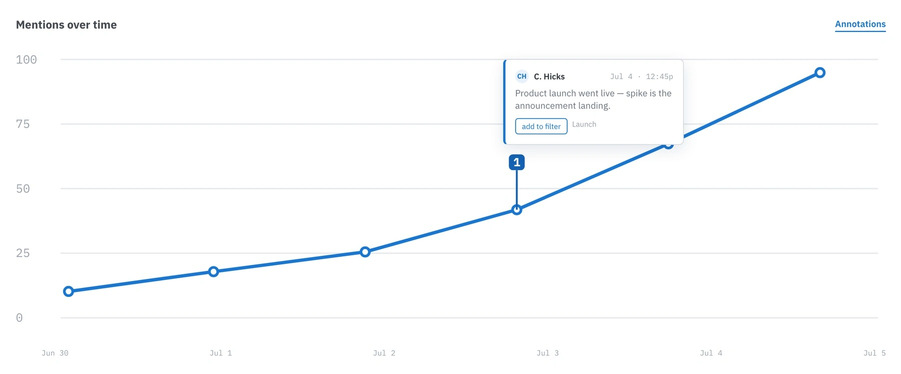
An annotation pinned in-chart — the note sits on the data point itself ("product launch went live"), so a spike reads correctly to anyone with access, not just the analyst who knew the story.
Executive Dashboard — get the data to the execs, without the platform
A major global retailer needed social data in front of their managers and C-level execs — without handing those execs the raw Enterprise platform, which they had neither the training nor the need to navigate. The analysts were stuck manually building reports for the people above them. The goal was one simple place where non-analysts could see the data an analyst chose to surface, no analyst intervention per request.
It started smaller than it ended: the original idea was to email a snapshot of a saved search. Working with the client, a better shape emerged — a live dashboard page of analyst-curated data. That surfaced a real team tension: a live dashboard, or a static refreshable report? I made the call for live, because it fit the client's actual use case. The constraint underneath was that we were building for one specific retail client, but it had to ship as a general feature — so I de-risked it by showing the in-progress design to other clients, who liked it and fed their own requirements back in.
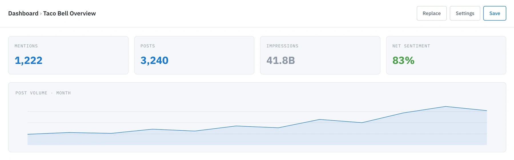
The Executive Dashboard — a live, analyst-curated view for managers and execs who never open the raw platform: the metrics that matter, no training required.
Fluctuation Analysis — catch the spike, then find out why
Crisis management is one of the biggest selling points of an enterprise social platform. Analysts needed to catch large fluctuations fast — spikes that could be very good or very bad — and immediately dig into what was driving them. The goal: make large fluctuations impossible to miss in a sea of data, and let users drill straight into the root cause.
The hard question was the feature: what even counts as a fluctuation? The honest answer is it depends on who's looking — a threshold that's a crisis for one brand is a quiet Tuesday for another. We landed on a pragmatic definition — a spike in positive or negative posts past a threshold — and I scoped it with our CTO's framework: simple, sufficient, complete. Simple is the MVP; sufficient is enough to launch with; complete is fully realized. Letting users set their own thresholds was clearly sufficient-slash-complete territory, so for the MVP we set thresholds programmatically, with a clear roadmap to hand users control later.
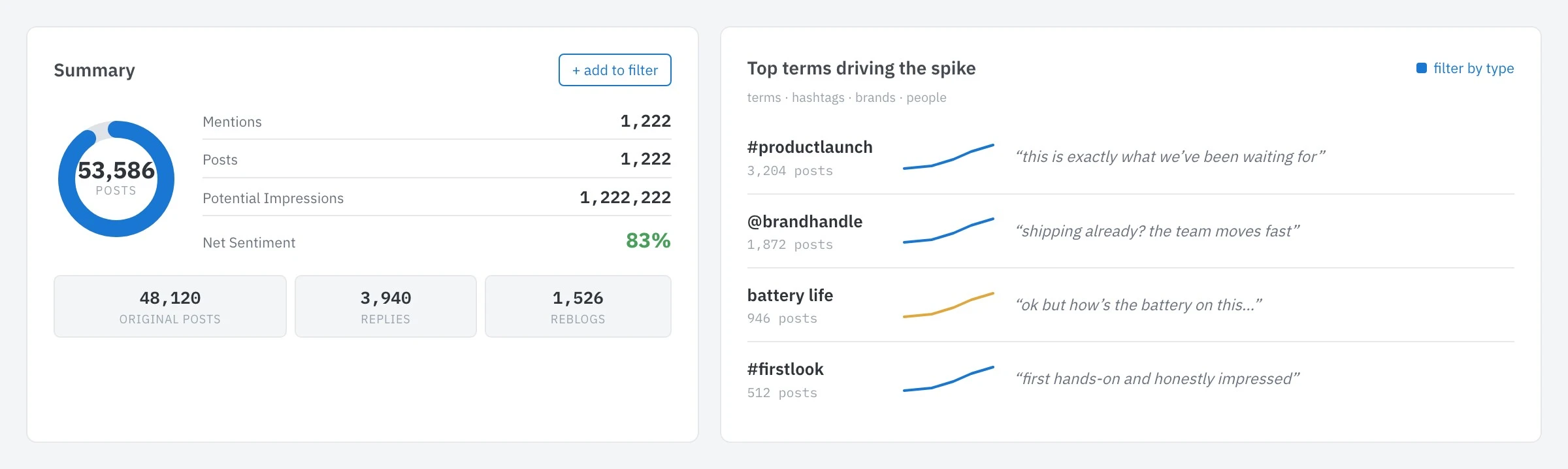
Fluctuation drill-in — the spike summary alongside the top terms driving it, so an analyst can catch the moment and go straight to the cause.
What shipped, and what it taught me
All three shipped into production. Annotations went in-chart over an initial technical unknown; the Executive Dashboard shipped as a live dashboard, built with one retail client but validated with others; Fluctuation Analysis shipped as a threshold-based MVP with a defined path to user-configurable thresholds. The through-line across all three was pushing engineering past building only to the platform's defaults — and deepening the whole team's command of Highcharts. One honest note: these features shipped with KPIs framed as goals — more data shared between analysts and non-analysts, faster understanding of fluctuations — rather than measured figures I can stand behind, so I don't quote numbers here.
The connective lesson: on a powerful platform, the design job is rarely "add more power" — it's making the power legible and shareable. Two methods stuck with me — simple, sufficient, complete to scope honestly and keep momentum, and design for the best idea to pull engineering forward rather than pre-compromise. And all three features were about the same non-analyst-shaped gap that eventually justified building NetBase Pro.
See the full case study → https://design-case-studies.vercel.app/netbase/enterprise
Like this project
Posted Aug 3, 2026
NetBase Enterprise was a high-precision analytics platform only trained analysts could run. As Sr. Product Designer I built three features — Annotations, the Executive Dashboard, and Fluctuation Analysis — each about making that power legible and shareable beyond the analysts.
Likes
0
Views
49
Clients
Netbase Quid