The Palette Creator was a rescue, not a redesign

Catherine Hicks


This one wasn't a blank page — it was a rescue. Kelly Moore already had a Palette Creator on their site, built in Flash, and it had quietly strangled a good idea. My job as UX consultant at Traction was the front end of that rescue: responsive wireframes and the specs to rebuild the tool in HTML5. The arc runs from a broken Flash tool to a shipped product called myCOLORSTUDIO, and most of the work lived in the judgment between the two.
A tool for picking colors that made picking a color frustrating
The core idea was sound: let people pull paint chips off a wall online, the way you would in a store. But the original took the metaphor too literally. To faithfully mimic the in-store chip wall, it rendered swatches at roughly their real-life size — which on a screen made them far too small to reliably click. The one job the tool existed to do was the broken one. And under that sat a technology problem that would end it regardless: Flash was being locked out of the mobile web.
Make the chips bigger — then rebuild around it
Before I drew a single screen I needed one deceptively small answer: what details actually have to live inside a chip? The answer came from the store. A physical paint chip carries exactly three things — the color, its name, and its number — the things a customer references, writes down, and asks for at the counter. So the digital chip carried the same payload, then did the two things paper can't: save the palette and email it.
The pivotal move was almost embarrassingly simple to state and structurally significant to execute: make the chips bigger, sized for a screen and a cursor rather than a wall and a hand. That one change forced, and freed, a rework of the entire layout — a palette capped at four colors to compose and compare, a predictable home for the disclaimer and controls, and full responsiveness (still genuinely new in 2013).
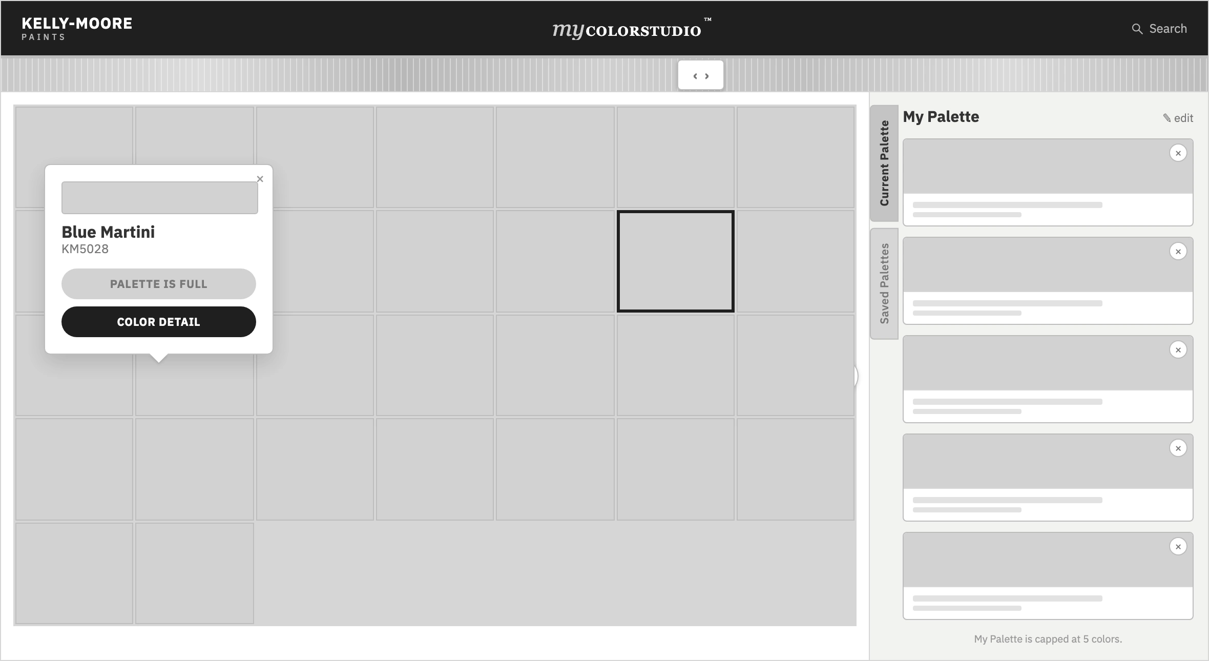
The responsive spec wireframe — the chip wall, the color-detail overlay, and the save-and-email steps, with page-by-page callouts. The tool was specced at two breakpoints (~900px and ~640px), a novel demand in 2013.
What shipped
The turnaround was fast and resource-light, which forced real compromises — full online saving was scoped as a later phase, and the first release saved locally. But the wireframes and specs became the blueprint for what Traction built and shipped as myCOLORSTUDIO: the store-wall chip grid, a color-detail card carrying each color's name and number, a "My Palette" rail capped at four, and Create, Save, and Email actions — live on desktop and mobile.
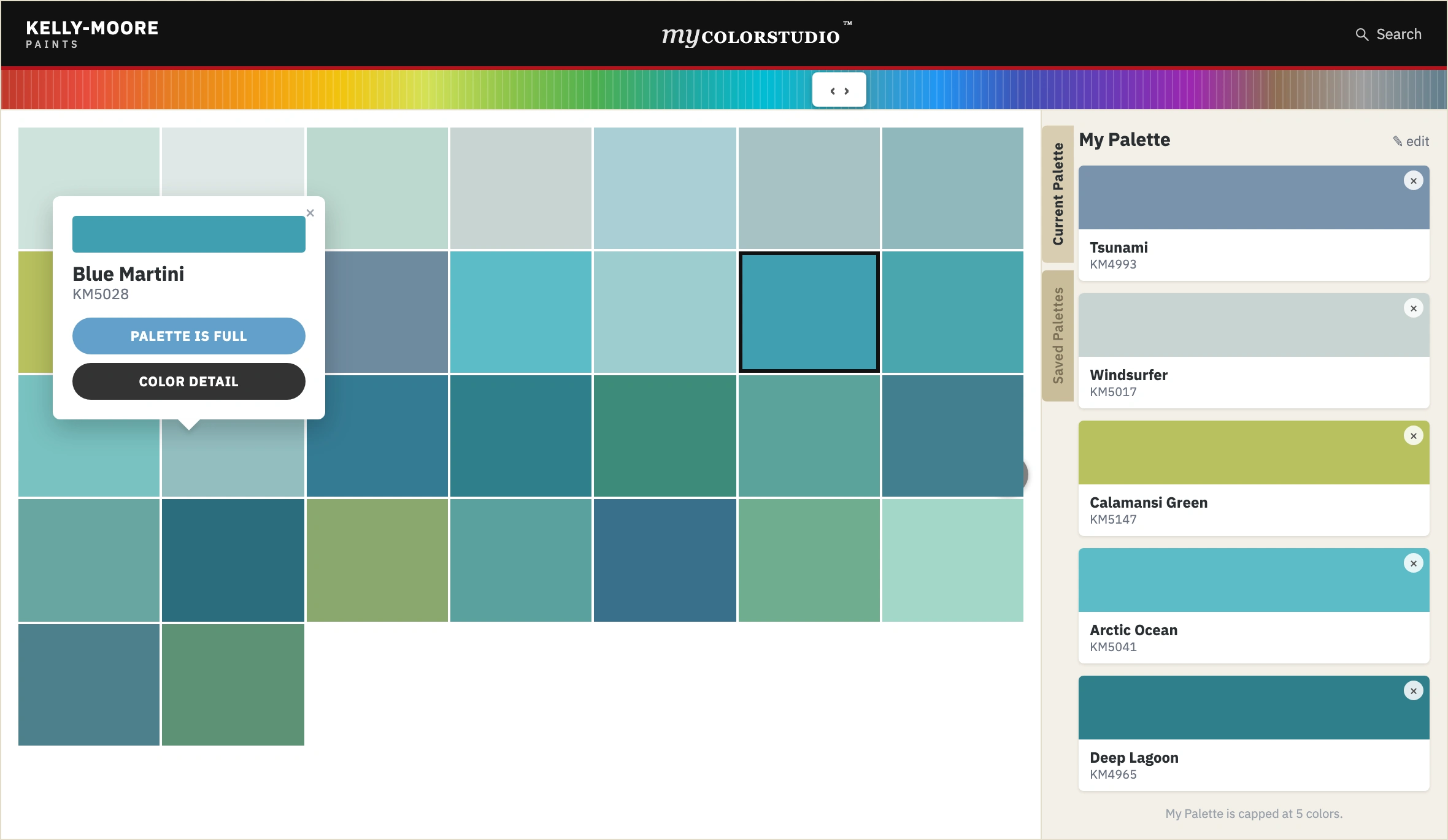
myCOLORSTUDIO as shipped — the store-wall chip grid, a color-detail card carrying each color's name and number, and a four-color "My Palette" rail.
At the tool level the engagement held up: sessions close to five minutes, roughly half of users returning, about 10% saving and sharing their palette — the exact behavior the rebuild existed to enable. To keep the framing honest, the tool was one piece of a larger Kelly Moore program at Traction, and the broader numbers the agency credited that program with belong to the whole program, not the tool alone.
The lesson I carried out: rebuilding an existing app into a new platform can be harder than building from scratch. A rescue hands you a set of decisions someone else already made — some load-bearing, some quietly broken — and asks you to tell them apart. Most of the value was the judgment about what to keep, what to enlarge, and what to throw away — then writing it down clearly enough that a new stack could carry the good part forward.
See the full case study → https://design-case-studies.vercel.app/palette-creator
Like this project
Posted Aug 3, 2026
Kelly Moore had a color-palette tool built in Flash that had quietly strangled a good idea — swatches rendered so small nobody could click them. I wireframed and spec'd the HTML5 rescue that shipped as myCOLORSTUDIO.