Snippet Sentry: making a modern product finally look like one

Catherine Hicks


Some products are hard to sell because the problem is boring — right up until you're the bank. SnippetSentry solves one of those. Employees talk to clients on iMessage, WhatsApp, and SMS — the tools people actually use — and in regulated industries every one of those messages has to be captured, monitored, and archived. Get it wrong and the fines are enormous. SnippetSentry captures and archives all of it with almost no IT lift and no change to how people text.
The trouble was that none of that came through on the old site. It was dated and flat, and it did the one thing a compliance vendor can't afford: it looked less trustworthy and less current than the problem it was solving. And the timing sharpened everything — the company was heading into a Series B, the moment a marketing site stops being a brochure and becomes a signal. My job was to make SnippetSentry look like the category leader they were raising money to become.
The bet
The whole project rested on a single strategic bet: in this market, visual differentiation wasn't decoration — it was a competitive wedge. Nearly every competitor's site looked the same kind of dated. So if SnippetSentry showed up looking measurably more modern and more considered than everyone else, the design itself would communicate market leadership before a single feature bullet was read. I studied the competitive set to find the gap and set the real bar — not "be beautiful in the abstract," but "look distinctly more current and more confident than the specific companies a buyer is comparing us to."
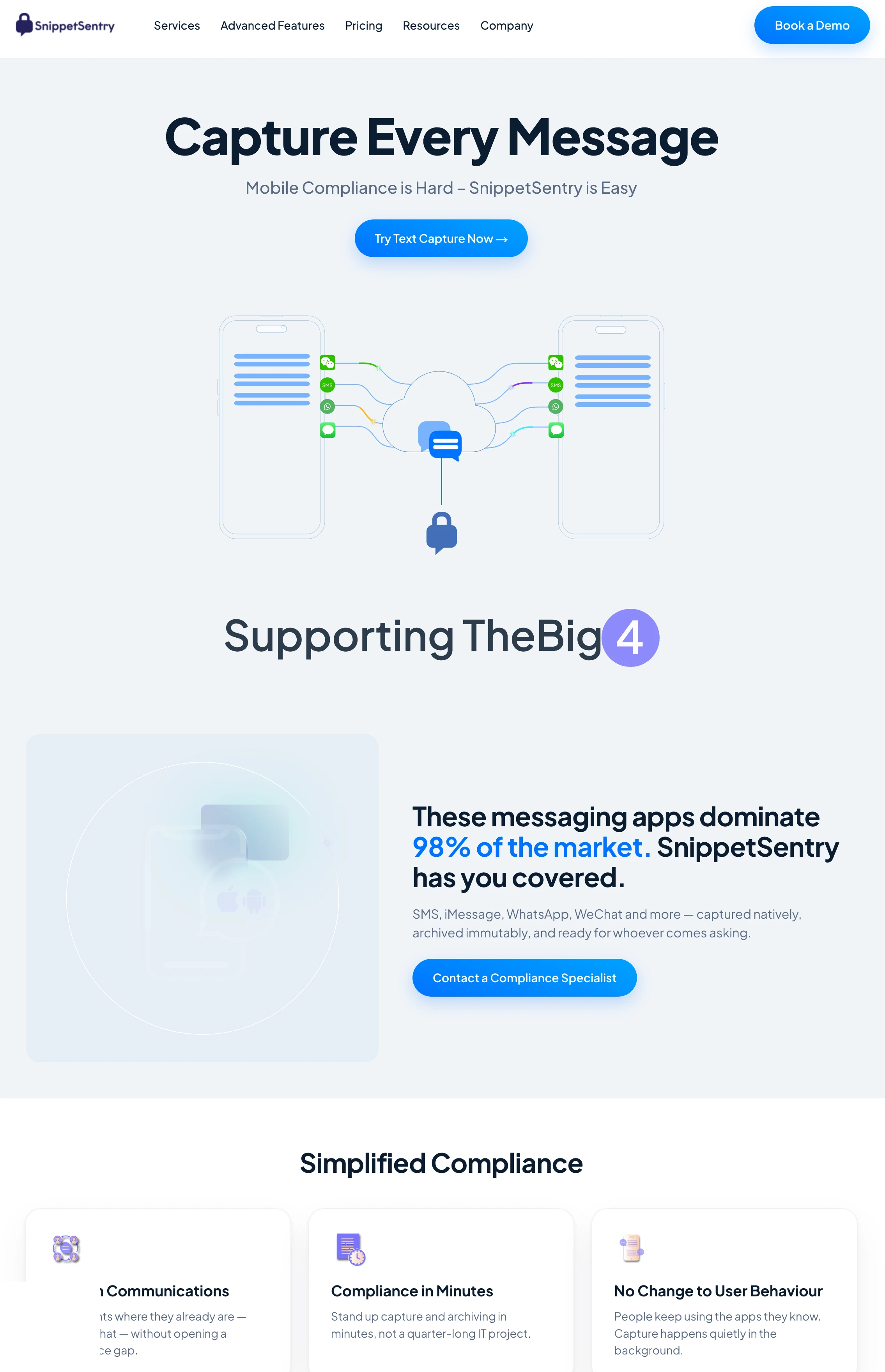
The redesigned homepage: modern minimalism, a disciplined color system, and bold, readable type — clarity as credibility on a compliance purchase.
The design
The direction was modern minimalism — a harmonious color system and bold typography, with the information architecture rebuilt so a visitor travels cleanly from what is this to why it matters to me to talk to us. That clean structure was doing strategic work: in a compliance purchase, clarity is credibility.
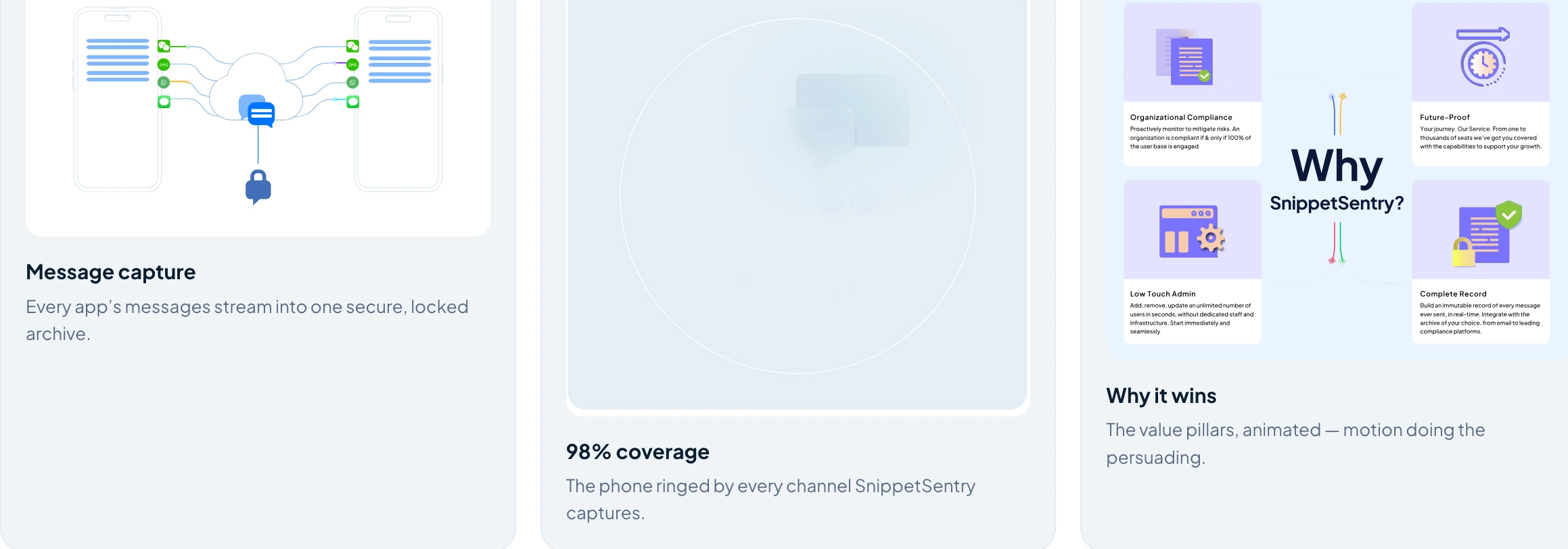
One of the three custom animations, built as optimized Lottie/SVG — motion used to explain the product, not decorate it: message capture, channel coverage, and why it wins.
The part I'm proudest of is the motion — and the rule that governed all of it: animation earns its place only when it explains something. Three custom animations, each with a job. The capture: every app's messages streaming through secure channels into one locked archive — the constant secure flow made visible. Coverage: a phone ringed by every channel it captures, so coverage has no gap depending on what phone your people carry. And why it wins: the platform's key benefits broken into digestible segments.
Craft vs speed
The recurring fight was craft versus performance. Animation-heavy sites are easy to make and easy to ruin — the same motion that makes a page feel premium can make it stutter, which on a compliance site reads as exactly the opposite of trustworthy. So the discipline was in the engineering of the motion, not just its design: lightweight, optimized Lottie, CSS, and SVG, built in close partnership with the developers. I designed the motion in After Effects and exported it as Lottie, worked with the dev team on the interactive pieces in GSAP and SVG so they ran natively rather than as heavy video, and took the visual system from Figma into a pixel-precise, fully responsive Webflow build.
What happened
The redesigned site launched successfully ahead of the Series B and was well received by both internal stakeholders and clients — a clear lift in how modern and credible the brand felt, arriving exactly when the company needed to project leadership. My own résumé record notes roughly a 23% lift in engagement; I'll flag the honest caveat rather than hide it — I'd want to nail down which metric that measures before treating it as a headline.
Two things stuck with me. Design can be the differentiator when a whole category has stopped trying — in a field of look-alike, dated sites, showing up genuinely modern was positioning, not vanity. And motion earns its place only when it explains something. Running high-craft animation inside a no-code platform without wrecking performance taught me that on the modern web, the design and the engineering of an effect are the same job.
See the full case study → https://design-case-studies.vercel.app/snippet-sentry
Like this project
Posted Aug 3, 2026
A compliance product that captures every regulated text message — heading into a Series B behind a dated site that made it look less current than the problem it solved. I redesigned the marketing site to look like the category leader they were raising to become.
Likes
0
Views
33
Clients
SnippetSentry