NerdWallet: two studies, two halves of one decision

Catherine Hicks

At NerdWallet, trust is the product. It helps people make informed money decisions across credit cards, loans, insurance, and budgeting — and if a form asks for too much too soon, the reader closes the tab and the advice never lands. That's the lens the whole engagement ran through. Over two months I owned the research behind the Personal Loan Prequalification revamp end to end: writing the plan, moderating, synthesizing, and reporting up.
The engagement in one line: the research behind NerdWallet's Personal Loan Prequalification revamp, owned end to end.
A harder problem hiding inside the flow
Prequalification asks for progressively more sensitive information in exchange for loan offers, so it sits right on the fault line between usefulness and trust. It hadn't been researched since 2020. And there was a harder problem hiding inside it: roughly 65% of people who go through prequalification receive no offers at all — and the existing study had only covered the people who got offers. What the declined majority saw was an open question.
So I set two parallel goals and paired two studies to answer them. Find the usability and trust barriers in the current flow — a why question. And figure out which of several candidate designs best helped a rejected user understand their alternatives — a how-many question that needed a quantitative read. A metric tells you a page underperforms without ever telling you people found the SSN ask premature; a quote tells you that without telling you which redesign fixes it. So I plugged both into the same decision the team was about to make.
The qualitative half
Two rounds of moderated, think-aloud sessions over UserTesting Live, walking 9 participants through a Figma prototype. I recruited across two credit-defined segments to see whether they experienced the flow differently. They didn't — both hit the same friction points, so the problems were about the flow itself, not any one audience. Five themes carried across both groups: Compare wasn't findable and its icon misled; the SSN was asked too early; the soft-pull reassurance didn't land; APR — the thing they cared about most — was visually buried; and mid-flow account creation killed momentum. Set against that, the step-by-step layout was a genuine strength — the finding that told the team what not to break.
The quantitative half
To answer the declined-majority question, I ran a preference test on 100 respondents, showing five candidate designs for the post-decline page and asking which best helped them learn about alternatives and decide how to proceed.
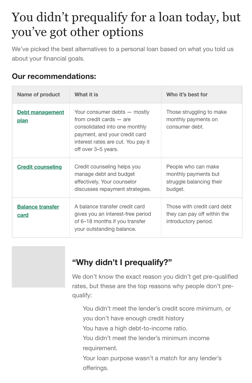
The five candidate designs for the declined-results page — each a different answer to "you didn't get offers; here's what to do next."
The result was decisive: Design 2 won with 43% of the vote, well ahead of the next option at 24% — a defensible direction backed by a real sample rather than a hunch.
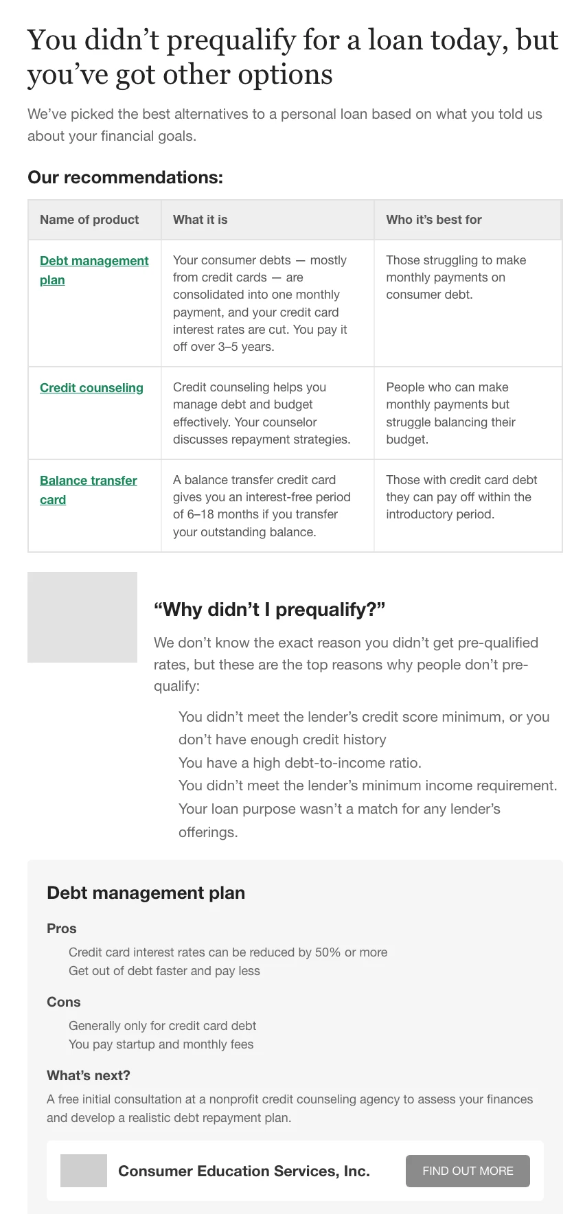
The winning declined-results design — the clearest path from "no offers" to a next step a rejected user could actually take.
Where it landed
I didn't stop at problems. Each theme came with a How-Might-We and a concrete direction: reposition and re-icon Compare where users expect it; defer the SSN and account creation until the user has shown intent; revise the hierarchy so APR lands first; make data-use language crystal-clear; and protect the step-by-step layout by reducing clutter rather than adding to it.
I'll keep the outcomes honest: the findings fed the team's 2022 product iterations, and the declined direction was decided on a real 100-person sample rather than a guess. I'm not going to attach completion or trust metrics I don't have.
The lasting takeaway is about method pairing and owning the whole loop. When the same person writes the guide, moderates, and reports, less gets lost in translation. And in a trust-driven domain, the qualitative why and the quantitative how-many aren't competing approaches — they answer different questions, and a team making a real product decision usually needs both on the table at once.
See the full case study → https://design-case-studies.vercel.app/nerdwallet
Like this project
Posted Aug 3, 2026
At NerdWallet, trust is the product. I owned the research behind the Personal Loan Prequalification revamp end to end — pairing a moderated usability study with a 100-person preference test to answer a problem the last study never looked at: the 65% who get no offers at all.