PayPal Holiday: from a warm idea to a pitch you can point at

Catherine Hicks
Edelman Digital had an opening with PayPal and a concept everyone was excited about: a high-end holiday gift-giving destination where PayPal users could discover unusual gifts and pay for all of it with PayPal. It was a warm idea and a real conversation — but there was no approach yet. My job was to turn it into a UX design polished enough to hand the visual team and carry into the final pitch. It was also my first time designing inside an agency.
Real interest, no approach
There was genuine interest on PayPal's side, but nothing concrete enough to put in front of the client and say "this is the thing." Because this was a pitch, not a funded build, there were no KPIs and no budget — with the riskiest assumption baked right into the premise: that after all the work, PayPal would say yes.
I was handed a lot of creative freedom, which sounds like a gift and is actually a trap. The idea was abstract and the brief was genuinely vague — a true "I'll know it when I see it," no requirements, no acceptance criteria. My instinct was to go visually interactive: big, motion-heavy, exploratory. But the audience was a client, not a user, and to a client that reads as expensive — it risked scaring PayPal off before the idea landed. So I made a deliberate trade: scale from interactive to stunning. A beautiful, art-directed look would carry the pitch instead of heavy interaction. The way through the ambiguity was iteration and interrogation — get every clarifying question answered, and when the answers run out, let the wireframes do the asking. Show, don't ask; a wireframe is a question you can point at.
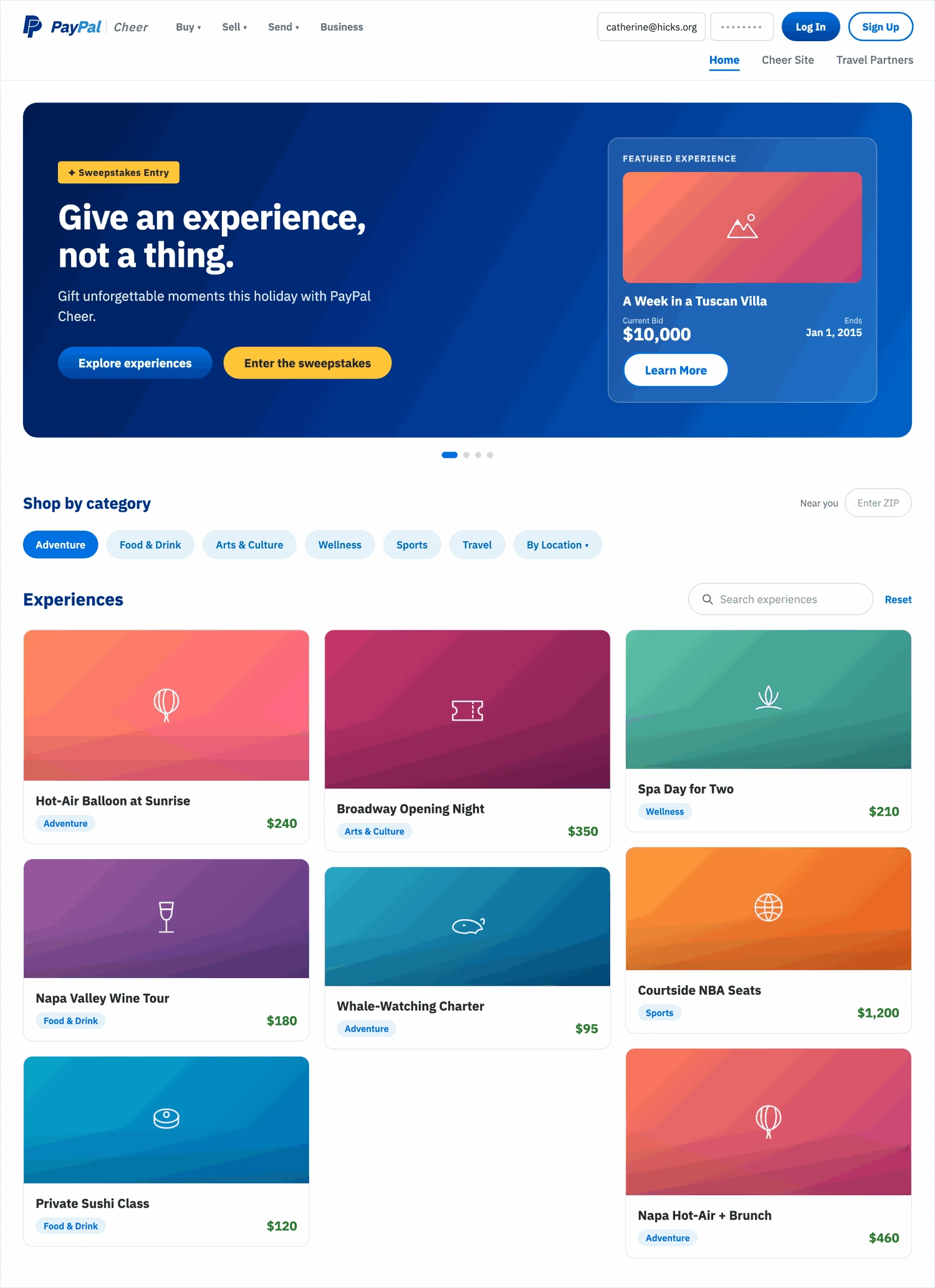
The holiday destination built to sit inside PayPal's own chrome, so it read as a native place rather than a microsite bolted on — the real top nav over a sub-navigation of Home, a Cheer Site, and Travel Partners.
The unlock: experiences, not products
The one thing I most needed made concrete was the hardest to get — what kinds of gifts were we pitching? The content team's list resolved it, and the answer unlocked the whole information architecture. The "gifts" weren't products off a shelf; they were experiences — a ski holiday in Aspen or Tahoe, travel, one-of-a-kind outings. Framed as browsable "experiences" organized by category, the design suddenly had a spine, and the guiding principles narrowed to two: genuinely unique categories, and a visually striking look. My job was the structure that held both.
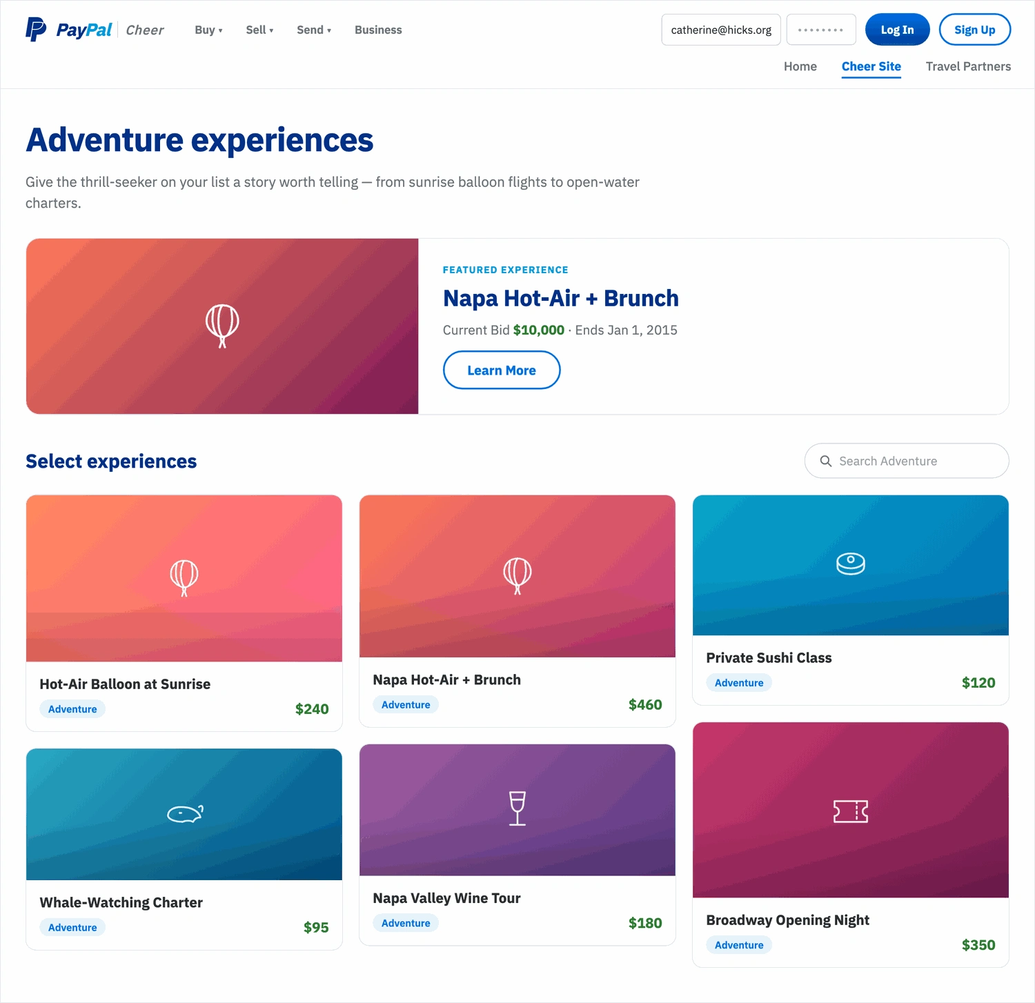
Experiences organized by category — the reframe that gave the whole concept a spine. Each frame composed to be dressed up into something beautiful rather than to demo interaction.
Each experience opened to a detail page: description and highlights, a scrollable Locations list (one experience could live in many places), related "Other Experiences," and a Buy Now to check out with PayPal. Higher-ticket items got an auction and bidding mechanic borrowed straight from eBay — natural given PayPal's eBay lineage at the time — so a marquee item like a week in a Tuscan villa could carry the pitch with a hero moment. A Travel Partners landing handed users off to airline and travel-partner offers, reusing the same browsable grid so the one step past PayPal felt continuous rather than like leaving.
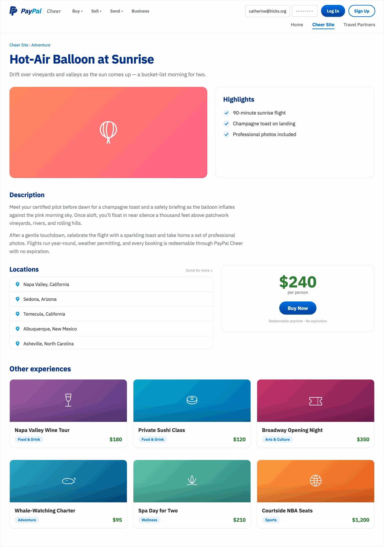
An experience detail page — description, a scrollable Locations list, related experiences, and Buy Now — with a bidding mechanic borrowed from eBay for marquee, higher-ticket items.
Where it landed
The work was a full UX design — a vague verbal concept taken to iterated wireframes, handed off ready for PayPal's final pitch. It taught me what to ask, how far to push for clarity, and when to stop asking and start drawing — and, honestly, that I do my best work inside real constraints, even the ones I have to manufacture myself.
I'll be candid: this was pitch work, so there's no launch metric, and because I moved straight onto another contract right after, the pitch's final outcome is simply one I never learned. The value was the design and the judgment behind it — not a number I don't have.
See the full case study → https://design-case-studies.vercel.app/edelman/paypal-holiday
Like this project
Posted Aug 4, 2026
PayPal wanted a high-end holiday gift destination but had no approach yet. My first agency project — a vague brief, total creative freedom. I turned an abstract concept into art-directed wireframes for the final pitch, and learned when to stop asking and start drawing.