Texas Capital Bank: How Far Behind Is the Experience, Exactly?

Catherine Hicks

Most of my case studies end at a screen. This one starts in a room — the kickoff where a bank decides whether it believes the team it just hired. In 2021, through Deloitte Digital, I worked a month-long engagement for Texas Capital Bank as it launched a digital transformation. Before anyone talked redesign, I made a more useful question the whole engagement: how far behind is the experience, exactly? So the work wasn't a redesign — it was a heuristic evaluation and competitive teardown of TCB's consumer online banking, graded against Chase, Wells Fargo, and Marcus. Analysis and comparison, not a shipped product. The value was the evaluation, and the alignment it created.
The kickoff was the moment of truth
A transformation this size is won or lost in the first room. The kickoff had to do two jobs at once: show the bank we genuinely understood its market, and give everyone a shared, evidence-based picture of where the experience stood. Get it right and the room agrees on the problem before anyone argues about the solution. The honest way to prove you understand a market isn't to walk in with a pitch — it's to audit it.
The constraint chose the method
The complication was time — roughly a month. You can't run defensible primary research across a whole banking experience in that window. So I chose a method that trades breadth for defensibility: a heuristic evaluation — expert usability review against established best practices — paired with a targeted competitive benchmark. It won't tell you what real customers do; it tells you, rigorously and fast, where the experience sits against principles the field agrees are good and against the competitors setting expectations.
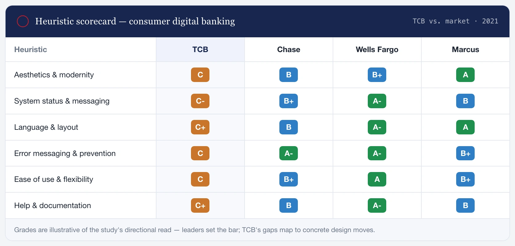
The centerpiece was a scorecard — six heuristics down the side, four banks across the top. Directional grades, honestly labeled as such, mapped to concrete design moves.
Four high-frequency features, graded against the leaders
I took the features consumers touch most and found the seams where a better pattern was obvious and winnable.
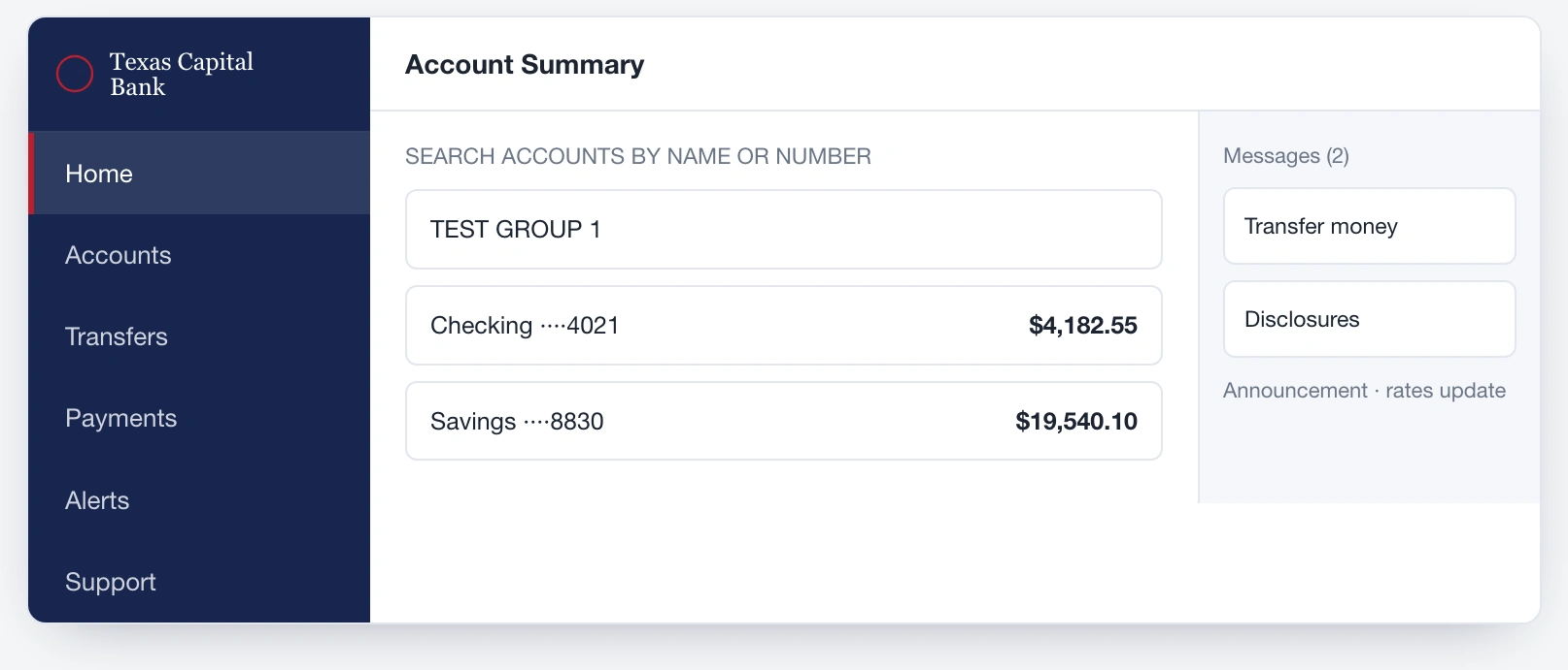
The TCB account dashboard, where a space-eating side nav and a low-value right rail wasted the most valuable real estate on the page.
On Accounts & Dashboard, TCB's side nav ate horizontal space a top bar wouldn't, and its right rail carried little contextual value; Marcus showed the opposite instinct — a single unmistakable balance and one or two actions.
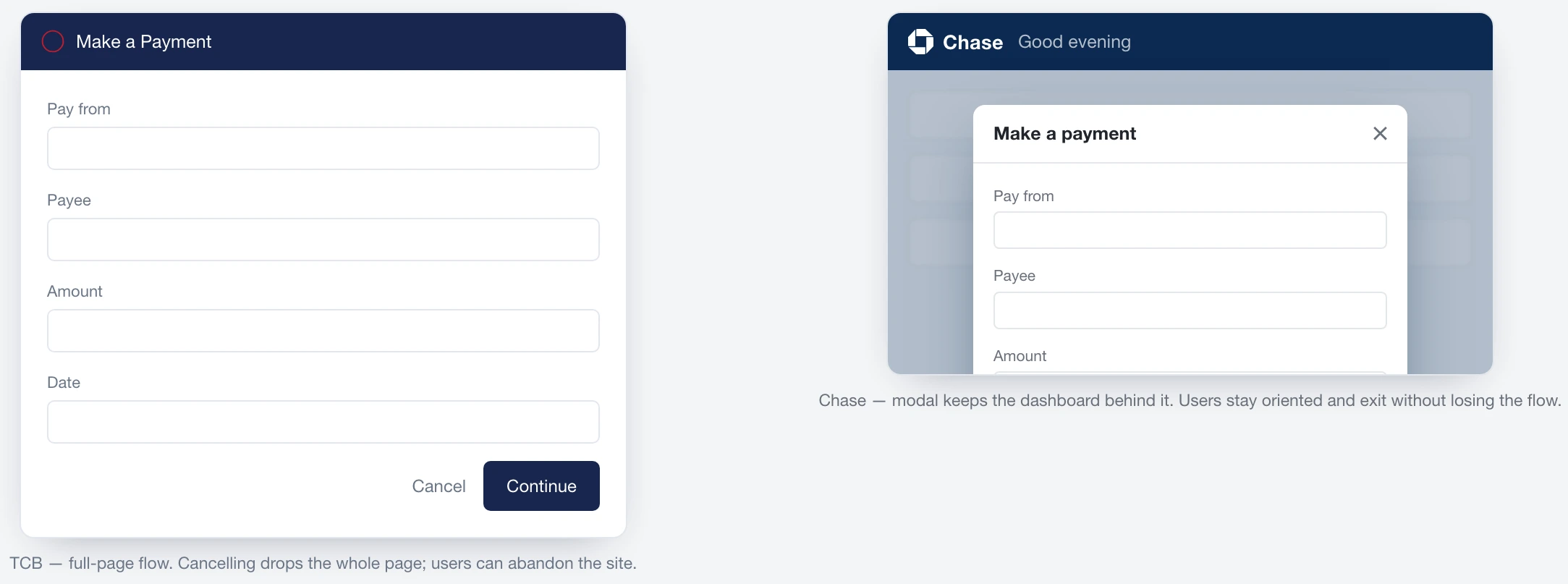
Bill-pay compared across TCB and its competitors, showing how a full-page flow makes a misstep costly versus Chase's oriented modal.
On Payments, TCB's full-page flow made a misstep costly — fail and you lose the whole page; Chase's modal keeps the dashboard visible so users stay oriented. Transfers was the one TCB was already close on, and I said so.
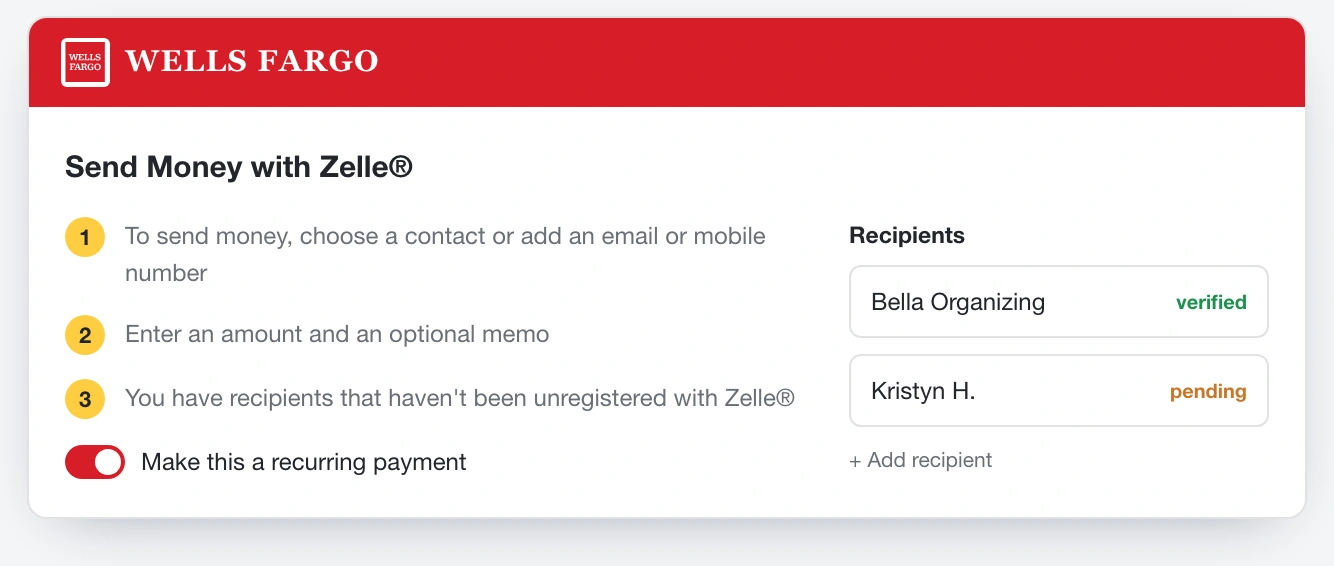
The Zelle peer-to-peer payment screen, where TCB offered no way to save a recipient — no reuse, no recurring payments.
On peer-to-peer, TCB had no way to save a recipient; Wells Fargo folds reusable recipients, recurring payments, and clear alerts into one screen — though its own screen shows the risk of too many competing CTAs.
The same experience, against six heuristics
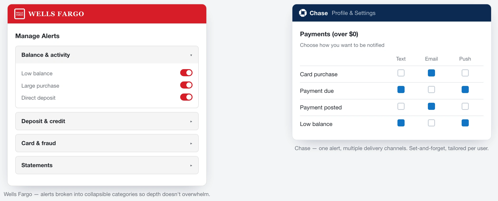
Alerts compared across banks, showing how the leaders use hierarchy and collapsible groups while TCB buried status behind competing CTAs.
On system status, TCB's homepage offered a lot of information but competing CTAs buried the guidance and any status but "Messages" vanished; the leaders use hierarchy. Distinguishing pending from posted is a small distinction with an outsized effect on trust. On errors, all three competitors state a bad username or password — but Chase and Wells Fargo bring the fix into the message; TCB names the problem and stops.
Every heuristic closed on concrete moves, not vibes: consolidate navigation, cut clutter, make status and speed front-of-mind, write errors that carry the fix, empower customization, make help searchable. And I framed the whole thing honestly — a month isn't enough to prove all of it with primary research, so I called it an evaluation grounded in real competitive evidence, clear about what I knew versus inferred.
Where it landed
The evaluation fed directly into the kickoff and gave the room a shared, evidence-based picture of where the experience stood and where it could go. Two things stuck. In early-stage strategy work, the deliverable is alignment, and a rigorous, well-designed audit is one of the most powerful tools I know for creating it. And the highest-leverage moment in a big transformation is often the smallest one: the room where everyone finally agrees on the problem.
See the full case study → https://design-case-studies.vercel.app/texas-capital-bank
Like this project
Posted Aug 3, 2026
Before anyone talked redesign, I ran a competitive teardown of a bank's online banking graded against the experiences its customers actually compare it to.