Reachable: making a tangle of relationships legible

Catherine Hicks

Reachable answers a genuinely useful question: who on my team already knows the person I'm trying to sell to. It pools everyone's contacts into a shared database, enriches it, and traces referral paths — the bet being that social proximity beats physical proximity. The catch was place. It was built first as a Salesforce plugin, and the standalone web app was bolted on as an afterthought that inherited none of that care — cumbersome and genuinely hard to use. The product's best idea was locked behind a door non-Salesforce customers couldn't open. I was brought in to give it a home of its own.
The audit came back uncomfortable
Before designing anything, I wanted one answer: how much of the existing v1.0 standalone could we reuse? Salvaging is cheap, rebuilding is expensive, so I did an honest audit — and the answer was very little, for a damning reason. The core of Reachable's value, the mapping of who-knows-whom, was the exact part of the old UI that didn't hold up. I couldn't reliably tell, looking at the alpha, how a relationship between two people was even being defined on screen. When the one thing a product exists to show is the one thing users can't parse, patching the edges won't save you.
The hard part was legibility
The case I kept in front of me: Sam knows Susan; Susan knows Mark and Mike; both know Bill. One target, several intermediaries, several paths — and several channels per relationship (Gmail, LinkedIn, Facebook, an email thread). A single pair might be connected five ways; one person might bridge to five targets. All of it true on one screen without becoming a hairball. Three principles kept me honest: social proximity is the product; pooled team data is the unlock; and a connection you have to think hard about is worthless.
The pivot is the spine of the redesign
I started where a lot of people start with relationship data — a scrollable, down-the-page view, almost like reading a log of how two people were linked. Thorough, and miserable. You couldn't hold more than one connection in your head, and comparing paths meant scrolling back and forth, which fought the one thing the product needed to do. So I pivoted to a left-to-right structure — you on one side, your target on the other, the connecting people laid out between. That single change, from vertical log to horizontal comparison-first canvas, is what the entire redesign hangs on.
Then I made sure it could hold reality
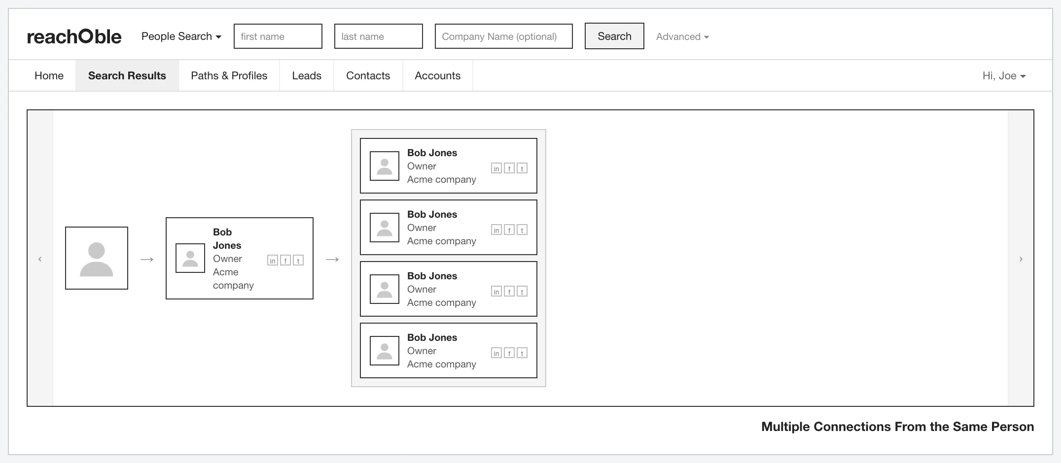
The connections-from path view — one contact acting as a hub who knows several of your targets, given its own clear treatment.
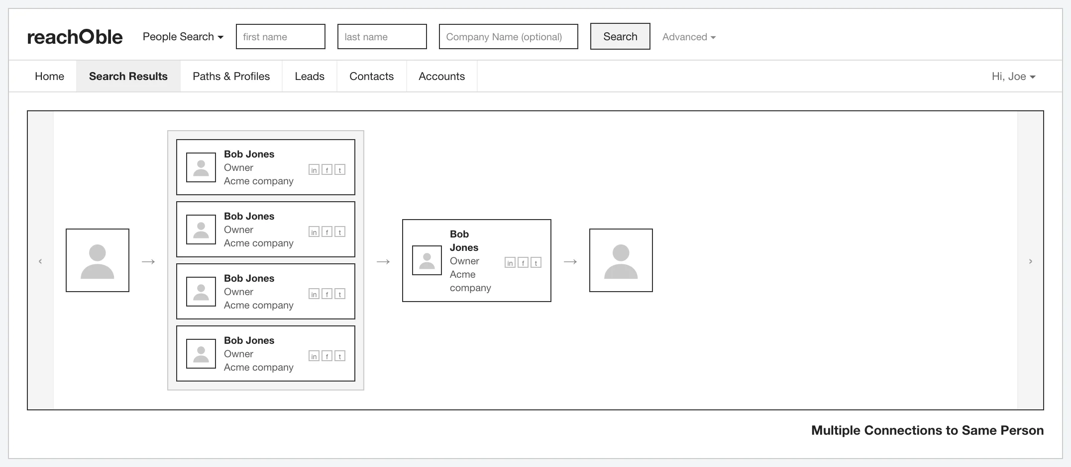
I worked through every way one user could reach another and assembled the full set of use cases. The two that shaped the interface most were mirror images: multiple connections to the same person, and multiple connections from the same person. Each needed its own clear treatment so users never confused many roads to one door with one person, many doors.
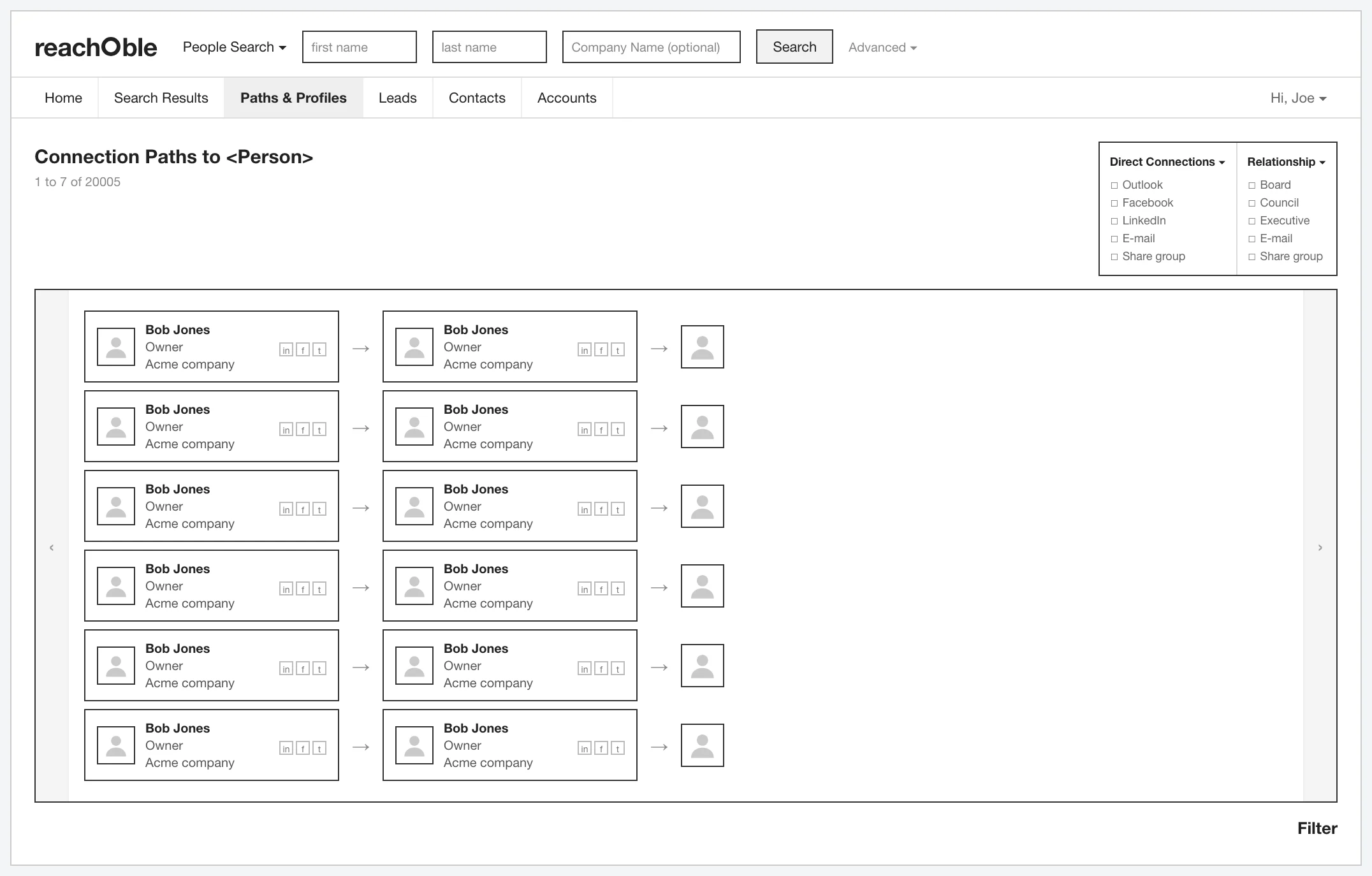
The filter panel, narrowing 20,000 possible connections by channel and relationship type so the map stayed usable at real scale.
From there the design filled out: a filtering layer to narrow 20,000 possible connections by channel and relationship type.
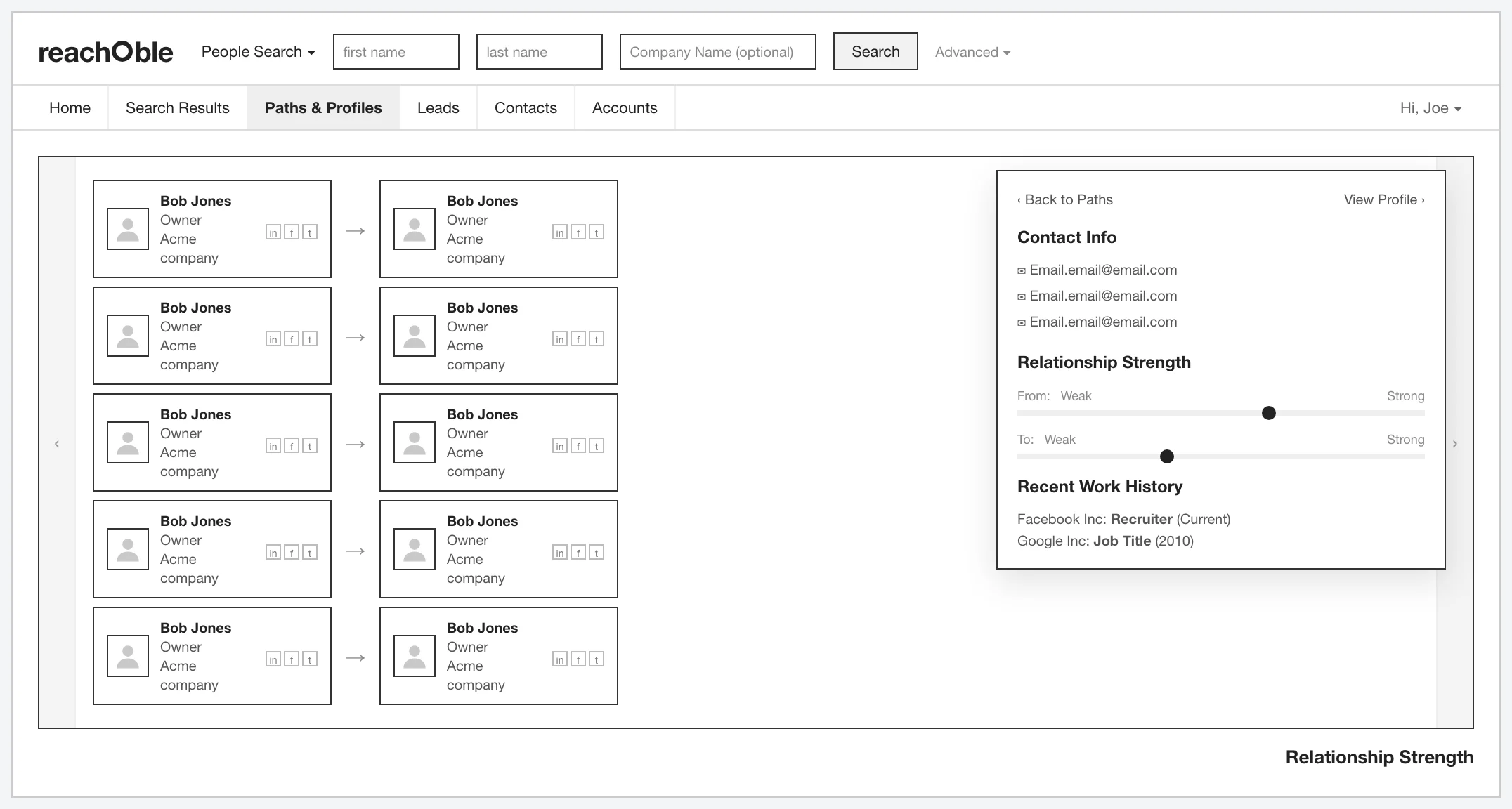
The relationship-strength panel, giving a weak-to-strong read in both directions plus recent work history — the context a salesperson needs before deciding whether a warm intro is actually warm.
A profile / relationship-strength panel with a weak-to-strong read in both directions and recent work history, plus a deliberate pass on the contact card, the atom the whole map is built from, and real error and warning states.
The wireframes shipped as hi-fi on the Salesforce Lightning Design System

The connection canvas re-expressed in Salesforce Lightning — avatars, brand-blue connectors, a strongest-path call-out, and a native intro-request action.
That was pragmatic, not aesthetic: the internal Reachable tool already ran on Salesforce UI, so building the standalone on Lightning let us reuse patterns, components, and engineering effort instead of inventing a second design language. The connection canvas is the same comparison-first spine, re-expressed in real SLDS.
The honest asterisk, and where it landed
The entire premise — that a market existed for a standalone Reachable — was an assumption, not validated fact. Confirming it sat with marketing, outside my scope; I asked to join those conversations and it never materialized. What made the work possible was a product owner with a clear, opinionated vision. I designed against his requirements knowing they weren't backed by research, named the risk, and made a deliberate call: on a short engagement, demanding upstream research wasn't the battle worth having. The redesign reframed the standalone around its actual value — comparing referral paths at a glance — and gave it the first genuinely considered UX it had ever had. The two target KPIs were more standalone adoption and new standalone customers, but no measured results exist in the source yet. Two lessons stuck: when a project is fighting for organizational oxygen, the fastest way to win the argument is to make the value visible rather than keep describing it — and not every gap is yours to close inside one engagement.
See the full case study → https://design-case-studies.vercel.app/reachable
Like this project
Posted Aug 3, 2026
Reachable answers who on your team already knows the person you're trying to sell to. Its best idea was locked behind a cumbersome standalone app — I was brought in to give it a home of its own.
Likes
0
Views
8