Lenovo: A Recovery Job About Judgment, Not Pixels

Catherine Hicks
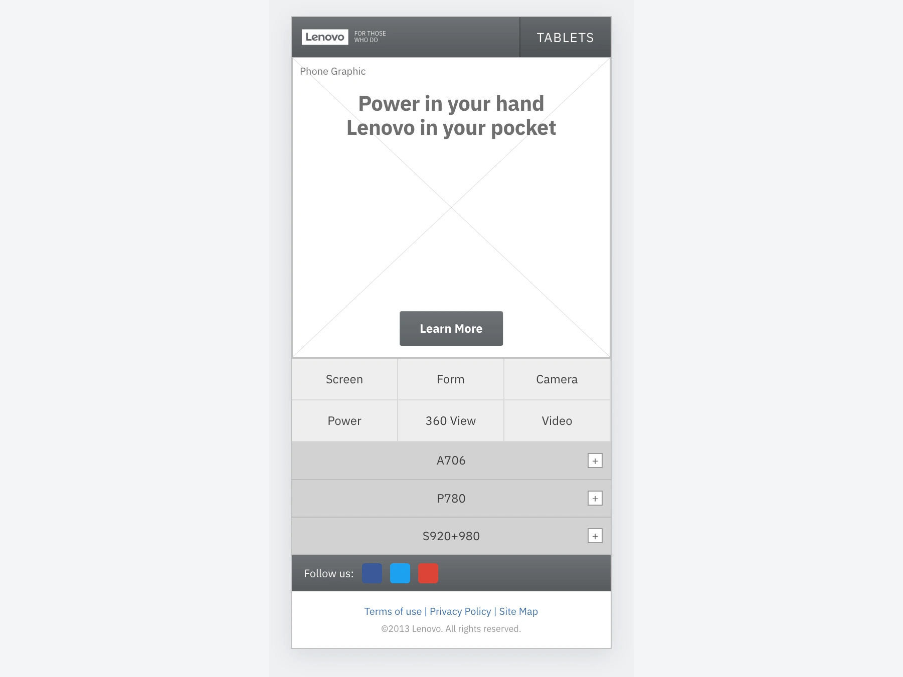
Two Lenovo device launches already lived on desktop, and the job was to bring them to mobile. The catch: a first round of mobile concepts had already gone to the client and come back rejected. I came in through CIBO Consulting as a recovery consultant — not onto a blank page — and the team that produced the rejected work was the team I was there to help. Early-career, short engagement, but a good story about judgment.
Name what actually went wrong
The rejected concepts weren't bad ideas in a vacuum — they strayed too far from the desktop sites. In a coordinated device launch, that broke the one thing the client cared about most: consistency. Messaging, branding, and tone didn't carry cleanly to mobile, so Lenovo looked at the work and didn't recognize their own launch. The goal was easy to underestimate: mobile pages that felt like a natural extension of the desktop launch, that the client would actually approve — on a compressed timeline. Under that I held a real user benefit so "just match desktop" didn't become thoughtless copying: a customer researching a Lenovo phone should be able to make a purchase decision whether they land on desktop or mobile.
The pivot decision was about degree
Before touching a wireframe, the thing I most needed to know was how much of the desktop sites to bring across. The first round had failed by being too different, so the answer turned out to be — the more the better. Treat the desktop sites as the source of truth and translate them down. Honestly, left to my own instincts I'd have designed for mobile, not translated to it. But with a short turnaround and a client who'd just rejected "different," fidelity to desktop was the right call. Knowing when a situation calls for restraint instead of reinvention is its own design skill.
The turning point was paper, not pixels
The first real obstacle wasn't the design — it was getting a nervous team to see what I saw. I started at the whiteboard, my usual, and it wasn't landing; people couldn't picture how a full desktop marketing page would behave collapsed to phone width. So we printed the existing desktop pages, shrank them to roughly 50%, and physically broke them down into how they'd stack as mobile. Holding a half-scale page made the translation concrete, aligned everyone before wireframing, and calmed the team, because now we were reasoning about something real instead of arguing about something imagined.
From aligned prototypes came disciplined wireframes
Four patterns held the work together.
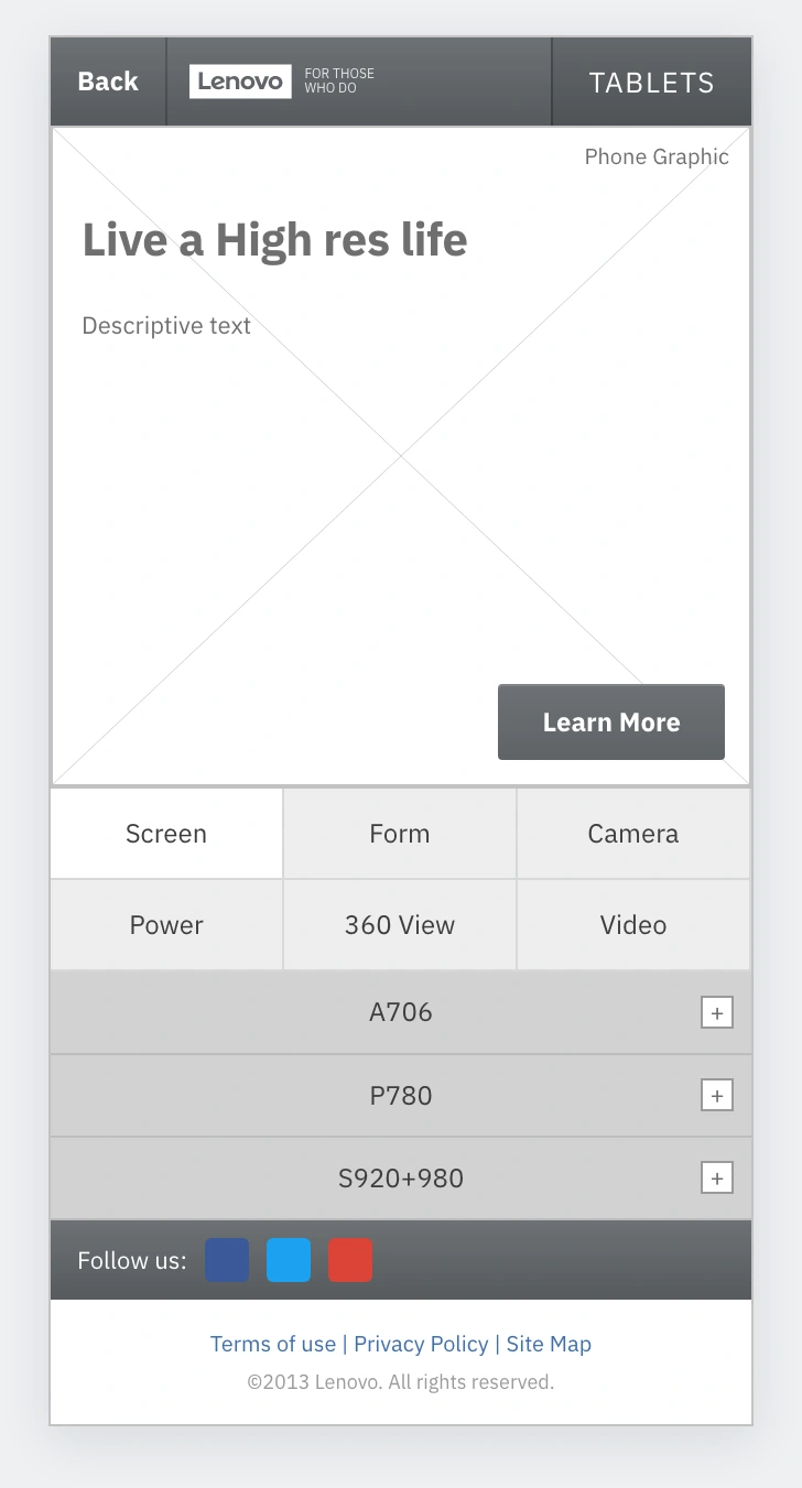
The product-detail template — header, copy header, descriptive copy, phone graphic, and Learn More CTA — reused across screens so the launch felt like one site.
A consistent product-detail template, reused across screens so the launch felt like one site. And a persistent bottom nav — Screen, Form, Camera, Power, 360 View, Video — anchored to every page with the current one highlighted, so a shopper could jump straight to the spec that mattered. This is one of the few places mobile got to be better than desktop.
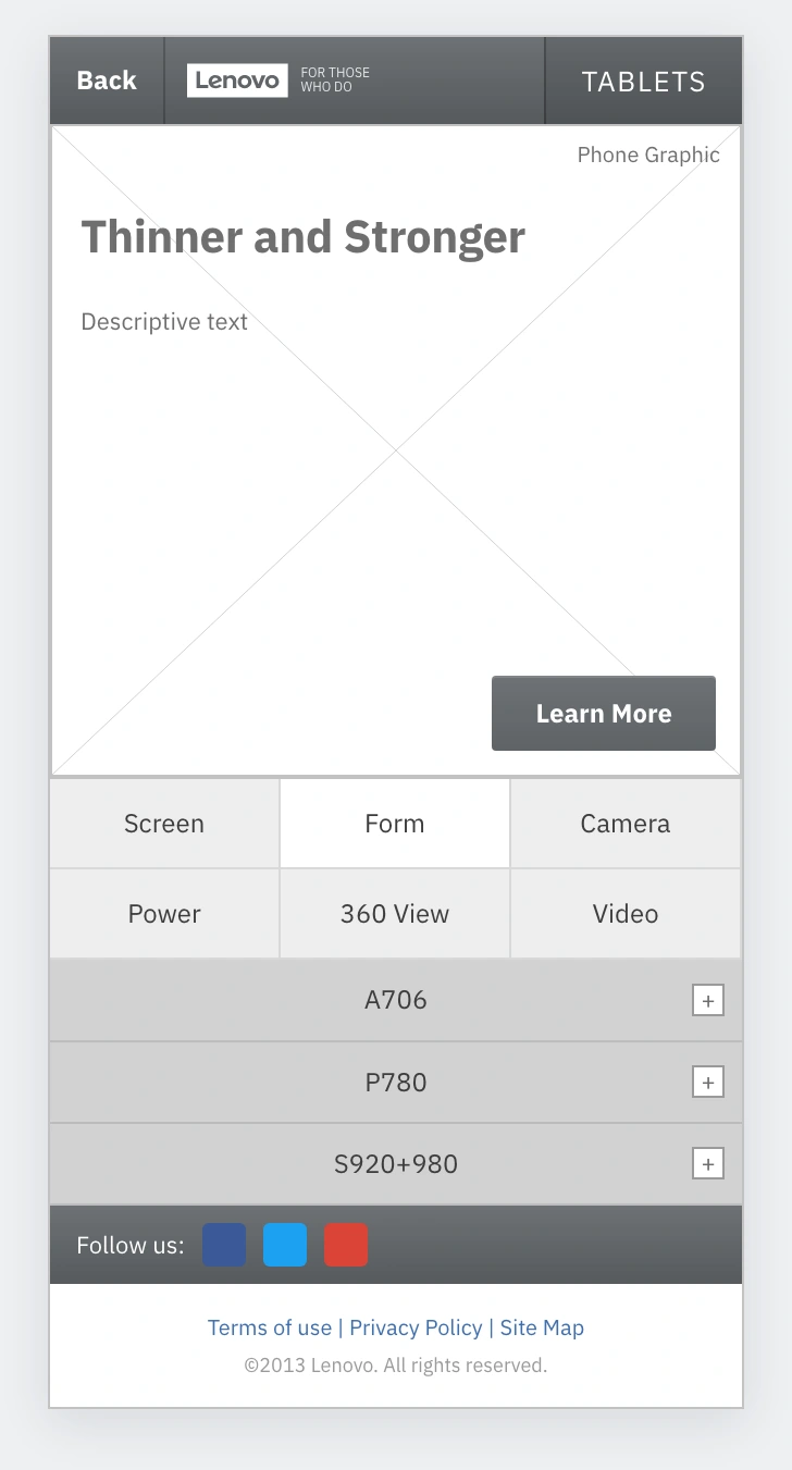
The detail page with the Form spec surfaced, reached directly through the persistent bottom nav that let shoppers jump to the spec that mattered.
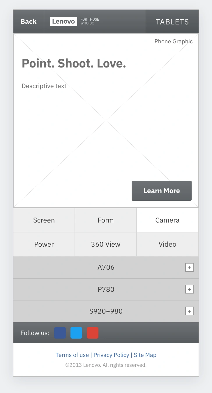
The detail page with the Camera spec, showing how brand-faithful chrome and the shared template carried across every device screen.
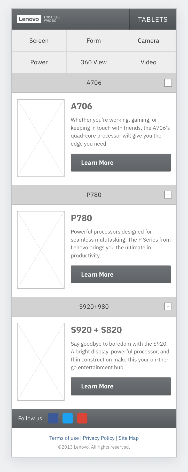
An expanded accordion on the landing page, revealing a device without endless scroll so the page could hold the full product range.
Expandable phone drawers on the landing page accordion open to reveal each device, so the page held the full range without endless scroll. Every decision laddered back to the same principle — preserve the desktop's messaging and structure, adapt only the interaction.
The hardest part was interpersonal, not visual
The team was raw from having their work rejected, which made them sensitive to any new direction that read as "you did it wrong." So I walked a deliberate line: I didn't blow up their work; I framed the shift as bringing the launch into alignment with what the client had already approved elsewhere. That made it about the desktop standard, not their judgment. I'll be straight about outcomes — this was a short, assist-style engagement, no KPIs were defined, and I won't paper over that. What I can say is the work delivered on its stated goal: aligned, on-brand mobile wireframes the team could take back to the client with confidence. Two lessons stuck: paper prototyping is a communication tool as much as a design tool, and reading the room is part of the design brief.
See the full case study → https://design-case-studies.vercel.app/lenovo
Like this project
Posted Aug 3, 2026
Two Lenovo device launches lived on desktop, and a first round of mobile concepts had already been rejected. I came in as a recovery consultant to help the team that produced it get to a yes.
Likes
0
Views
5