iTradeNetwork: The Most Useful Thing I Left Was a Direction

Catherine Hicks

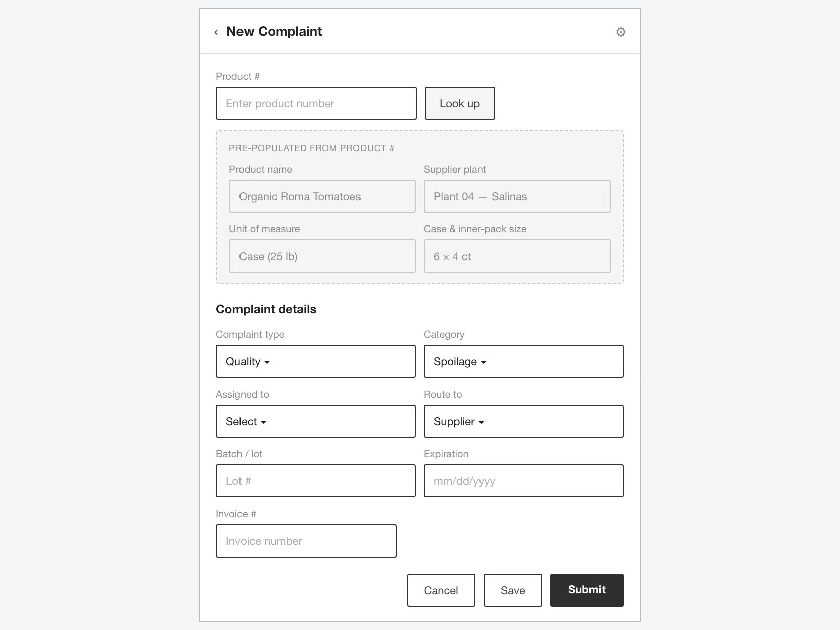
iTradeNetwork's flagship quality tool worked. The functionality was new and it did what it was supposed to — that was never the problem. The problem was that people couldn't get through it. Users failed the tasks they came to do, every stumble became a support ticket, and the app leaned on high-touch training just to keep customers moving — expensive for iTN, frustrating for the chefs and shop managers using it. The complexity wasn't in what the product did; it was in how it made you do it.
I was the company's first UX hire — and I was a bridge
iTN had never had a UX person before me. The previous designer had just left, a new two-person team was about to start, and I was the person in between: three months to diagnose the problem and hand the incoming team a direction they could build on. Part of the job was cultural — educating the team on UX process and organizing cross-platform teams across product, dev, and business. The hard part was scope: weeks, not quarters.
So I anchored on one flow instead of trying to fix everything. I picked the complaint process — the most-used part of the platform and, not coincidentally, the most problematic. When a shipment arrives spoiled, short, or wrong, this is the flow a customer walks to log the complaint, attach evidence, and chase a credit — so it became the spine of the redesign. My working hypothesis was simple and testable: users would move through the platform far more efficiently once the UI was reworked for genuine usability.
My diagnosis came from support data, not user research — and I'll name that honestly
With my timeline, a proper research program wasn't realistic, and I'll be candid that this is a real limitation of the work. So I triangulated: primarily the platform's own customer-service data, the teammates who talked to clients daily, and what I could reconstruct from the departing designer. The signal was consistent: the features were fine; the complexity of how it all worked tripped people up. Then I made a deliberate fidelity call — sketches and paper prototypes, not polished mockups. A finished-looking set of comps would have eaten the whole runway; sketches let me move fast, test buildability with onsite developers in a hallway, and let the new designers look over my shoulder at the reasoning, not just the result.
The streamlining happened in those sketches
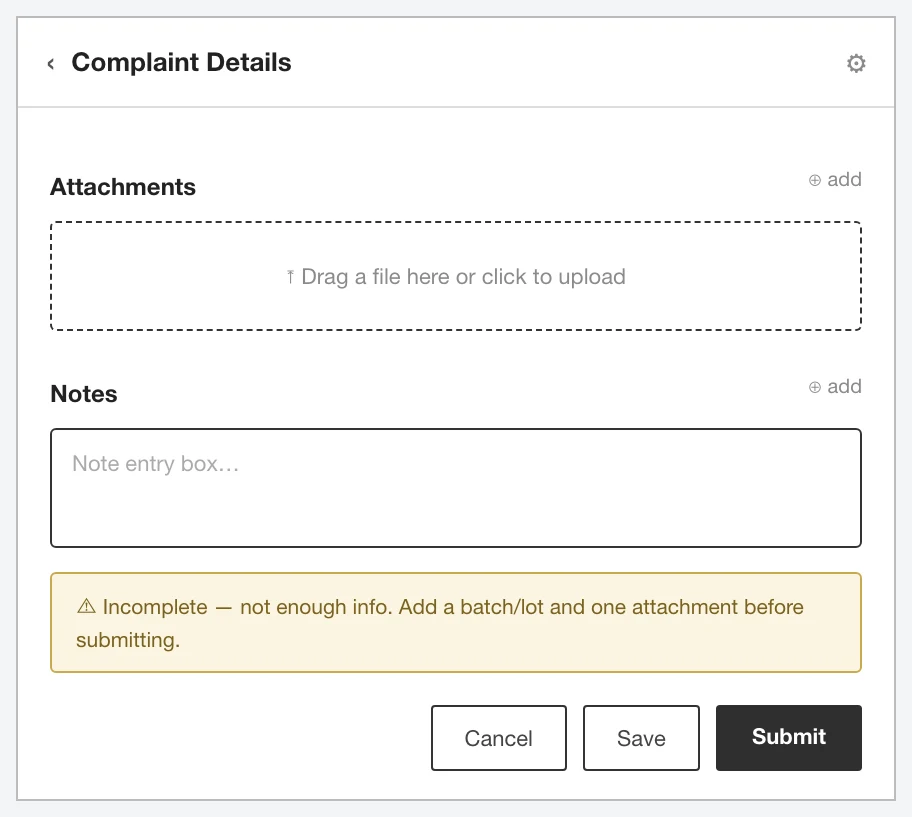
The complaint-details screen with attachments and notes, given a clean save/submit/cancel model and an explicit "incomplete" state so a half-finished complaint said what it needed.
Complaint entry was the worst offender for wasted steps, so I reworked it: entering a product number pre-populates everything the platform already knows — product name, supplier plant, unit of measure, case and pack size — instead of forcing the user to key each field. Complaint details got a clean save/submit/cancel model with an explicit "incomplete" state, so a half-finished complaint told you what it needed instead of failing silently.
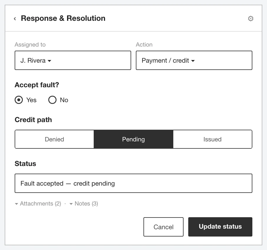
The response & resolution screen, structured around the real decisions — assigned-to, who was contacted, accept-fault yes/no, and the credit path — rolling up to one clear status.
The resolution form — the side the quality and credit teams work — I structured around the real decisions: assigned-to, who was contacted, accept-fault yes/no, and the credit path, rolling up to one clear status.
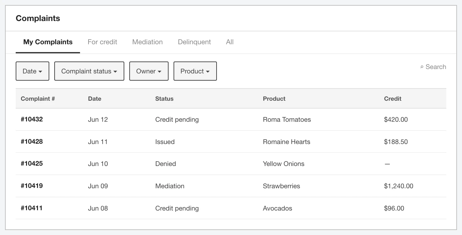
The filterable complaint list with saved views and task-oriented tabs — My Complaints, credit, Mediation, Delinquent — organized around how people actually triage work.
And I explored the complaint list as a filterable table with saved views and task-oriented tabs. Around the sketches I did the connective-tissue work a first UX hire has to do: leading requirements gathering from key clients, writing the initial use cases, building interactive Axure prototypes where higher fidelity was warranted, and standing up a usability test plan the next team could run.
The honest part about results
Because I left as the new team arrived, none of these decisions were validated by user testing before my departure — that was, by design, the next team's job. So I can't point to a movement in support-call volume and claim it as mine. What I can point to is the handoff: a diagnosis of the real problem, worked-through concepts, use cases and requirements from actual clients, cross-platform teams organized, and a test plan ready to validate it all. For a company that had never had UX, that was the difference between starting cold and starting with momentum. The takeaway is about scope and voice: when you don't have the time, tools, or research to do the job fully, the responsible move is to say so, out loud, early.
See the full case study → https://design-case-studies.vercel.app/itradenetwork
Like this project
Posted Aug 3, 2026
As the company's first UX hire, I had three months to diagnose why users couldn't get through a food supply-chain quality tool that worked — and hand the incoming team a direction they could build on.
Likes
0
Views
5