In a security dashboard, editing is the design

Catherine Hicks

Security teams don't lack data — they drown in it. That's the whole problem this project set out to solve, and it's the line I came back to every time I was tempted to add one more thing to the screen.
This was a threat-visibility experience I designed for a modern application-security platform — a product that continuously discovers, tests, and protects the APIs, mobile apps, web, and cloud services in a company's stack. My work sat inside the API-protection product: how to show the attacks hitting a customer's APIs. It's anonymized, and every figure in the mockups is placeholder sample data — so what I can talk about is the design thinking, which is the part that travels anyway.
The problem was a flood, not a drought
A platform like this watches a customer's whole ecosystem, and every surface streams security signal all day — attempted exploits, suspicious traffic, schema mismatches. The raw material is all there. What's missing is a way to stand back and read it. Without a vantage point, a team triages line by line through logs — slow, expensive, and the easiest way to miss the pattern for the noise. The question I designed toward is the one a security lead actually asks first thing in the morning: what's hitting us right now, where's it coming from, and what do I deal with before lunch?
Five questions became the gate
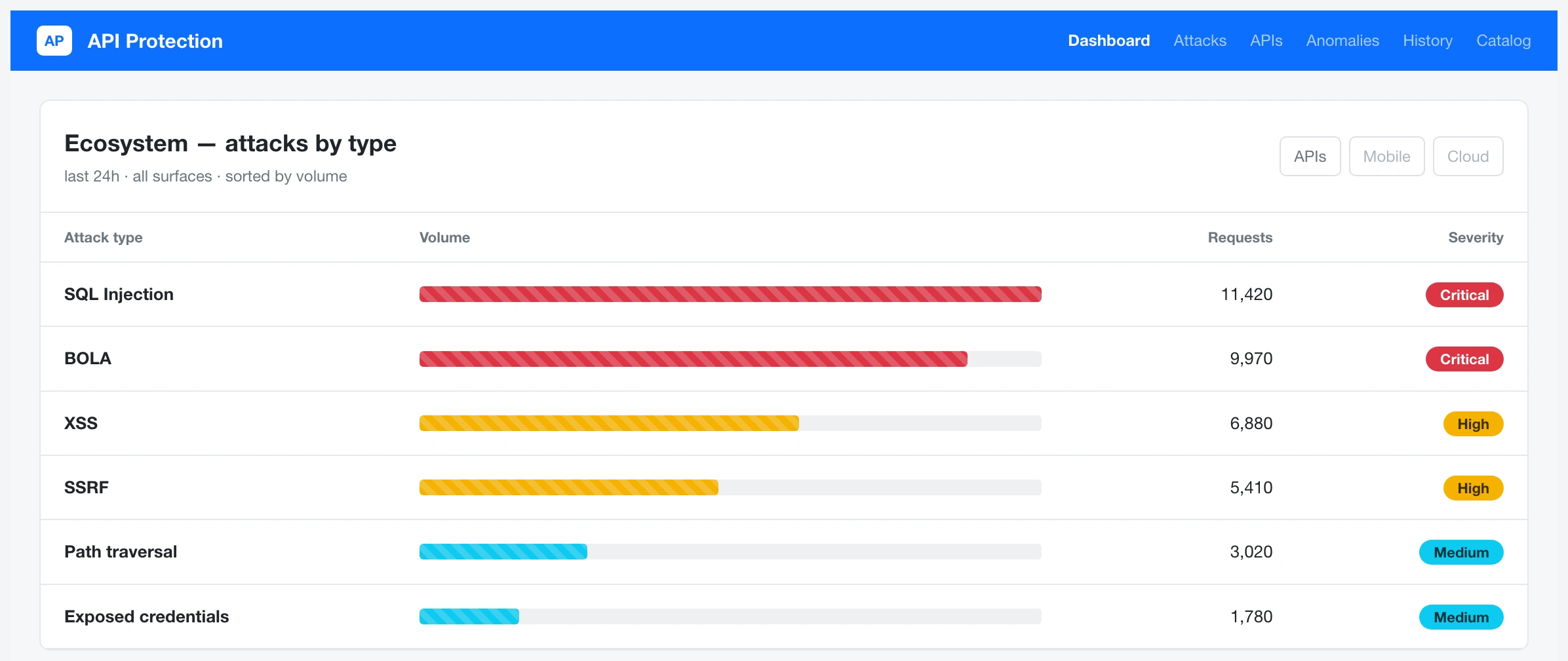
Vague goals make vague dashboards, so I framed the whole design around five questions a security lead asks on sight — what's most common, where's it from, how severe, what's my attack surface, what are the trends. Those five became the gate: every visualization had to answer one, and nothing earned a place unless it did. That single rule did more editorial work than anything else in the project. One persona anchored it — the security lead responsible for threats across a whole portfolio, technical, time-poor, opening this between a dozen other tabs.
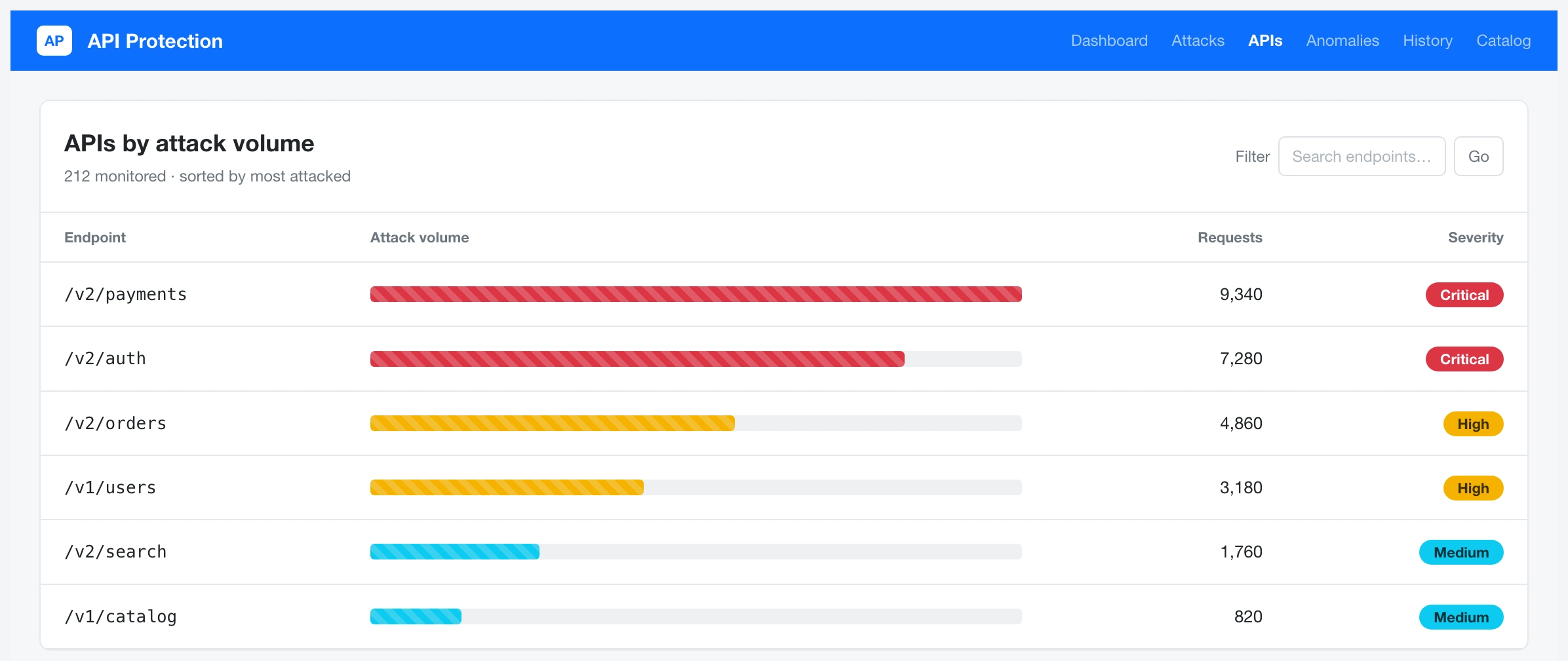
The ecosystem dashboard ranks a customer's APIs by attack volume and encodes severity in color, so a lead reads the shape of the whole attack landscape in seconds.
One grammar, five views
Lead with type and origin, rank by volume, encode severity by color. Learn that grammar once on the ecosystem dashboard — attacks grouped by OWASP type, ranked, severity in color — and every other screen reads the same way. The attack-surface view turns the same grammar on endpoints: which of my APIs is taking the most heat. The historical view stretches it over time — spot a spike, jump into the window that caused it.
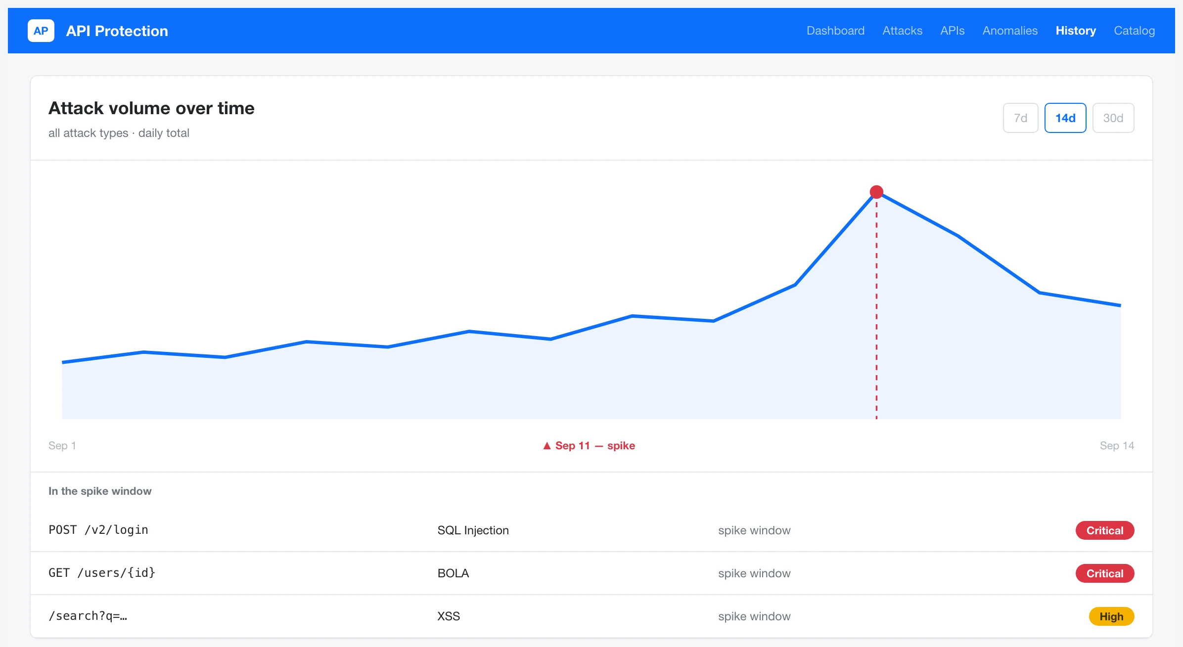
The historical view plots attack volume over time with a visible spike, so a lead can jump straight into the window that caused it rather than scrubbing logs.
And the part I cared about most: click an attack and a detail drawer opens with the payload, the path, and the one clear next action, reusing the platform's existing policy-violation pattern so it feels native.
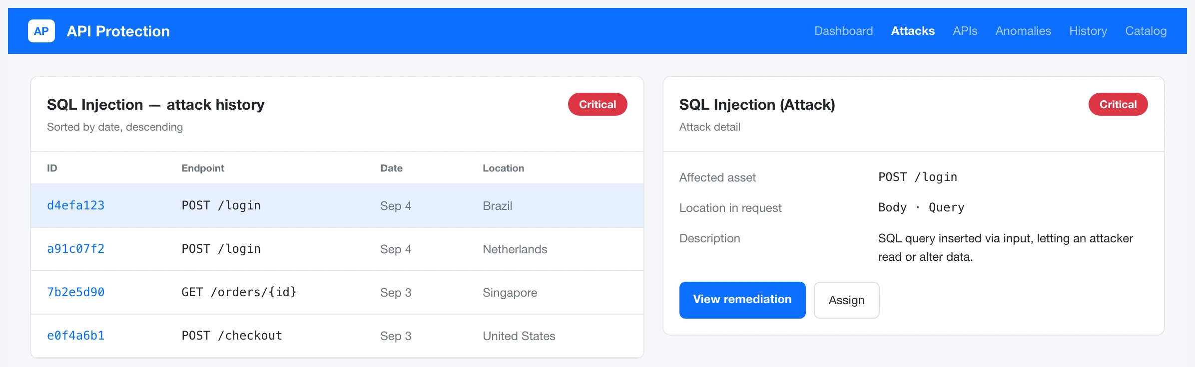
Clicking an attack in the history list opens a detail drawer with payload, path, and one clear next action — keeping the path from "I see a problem" to "I'm acting on it" short.
Anomalies that aren't attacks — a rate-limit breach, a schema mismatch — open the same drawer, so there's nothing new to learn.
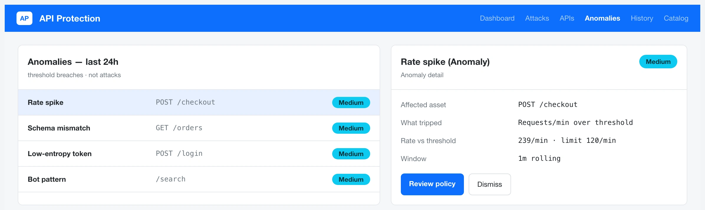
The anomaly-detection list surfaces non-attack events like schema mismatches and opens them in the same detail drawer, so there's no second interface to learn.
The real work was editorial
Underneath sits a full taxonomy — the attack types the view had to represent, and a separate class of anomalies that aren't attacks but still matter. The design lived in deciding what earned the glanceable layer and what got demoted to on-demand detail. Promote volume, severity, attack surface. Demote payloads and request internals to the drawer. Encode severity so a critical attack can never read as safe. A chart that's interesting but ambiguous is worse than none — in a security context it points attention at the wrong thing.
The plan was to test the dashboard with real users, refine the encoding and the drawer before build, then partner with engineering on rollout. What survives documents that plan, not a measured outcome — the numbers in the mockups are placeholder sample data, and I won't dress that into results I can't stand behind.
The lasting lesson: in a data-dense, high-stakes domain, editing is the design. Anyone can add another widget. The value is in what you leave off, and why.
See the full case study → https://design-case-studies.vercel.app/data-theorem
Like this project
Posted Aug 3, 2026
Security teams don't lack data — they drown in it. I designed a threat-visibility experience for an application-security platform so a security lead could read the whole attack landscape at a glance, not triage it line by line.
Likes
0
Views
6