Cadence: the deliverable wasn't a portal — it was momentum

Catherine Hicks
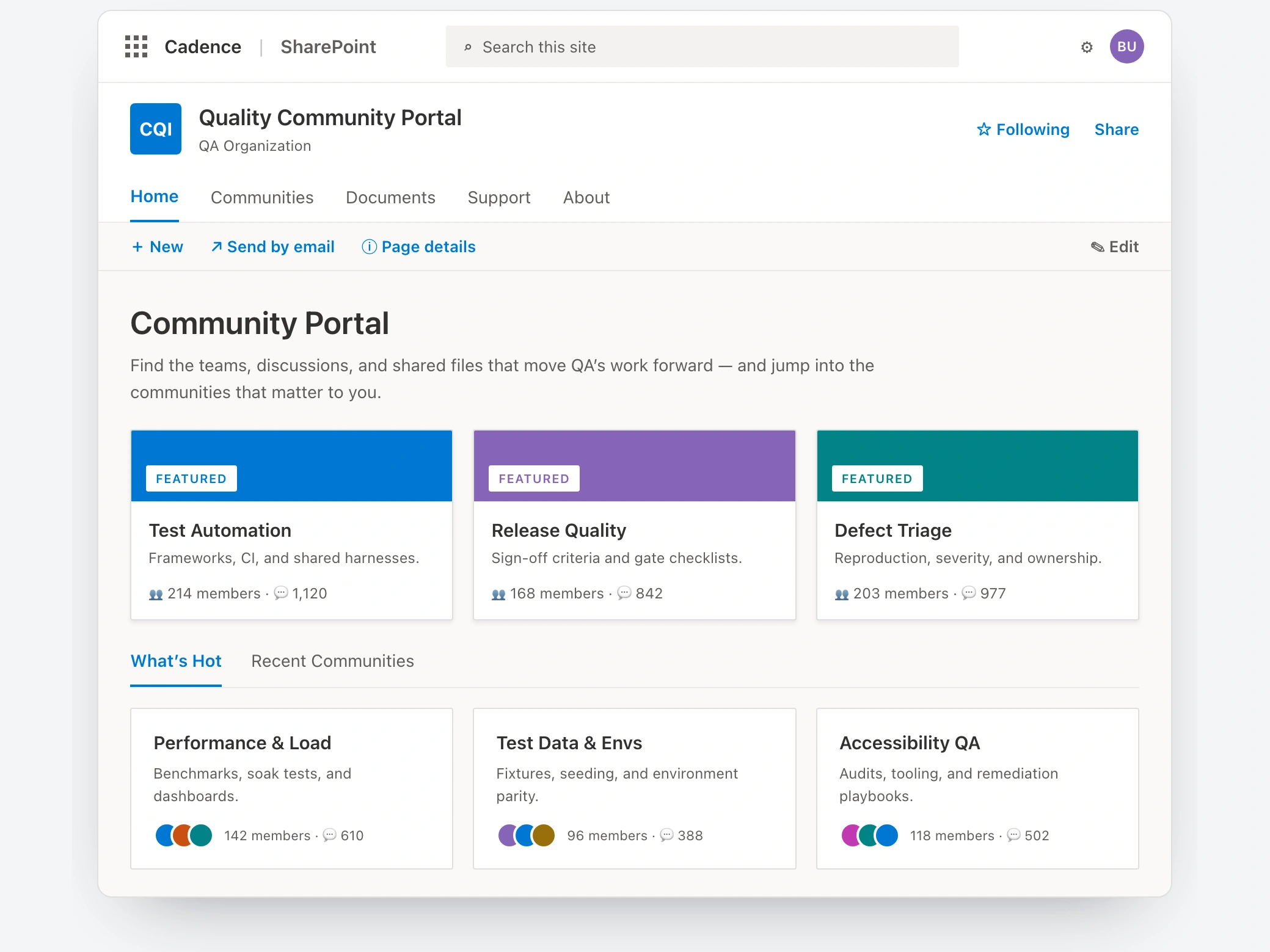
Cadence's QA team already had an internal portal when I came on as the UX consultant. The problem was that almost nobody used it. It was cumbersome and mostly outdated, so the broader team had never really adopted it — too complex to be worth the effort. A place meant for collaboration had quietly become a place people avoided.
The tempting fix was the wrong one
IT wanted to move the whole company onto a better setup, and the obvious play was to treat it as a version upgrade — lift the content, drop it somewhere new. But moving a cumbersome site somewhere new just gives you a cumbersome site somewhere new. The actual problem was adoption, and adoption is about how people work, not where the files live. And the company was far too big to prove any of that everywhere at once.
So the team ran a pilot
Pick one content-heavy, well-defined group — QA — rework their portal end to end, and come out with two things: a site the team actually lives in, and a design-plus-migration blueprint repeatable across every team. Two principles held it together: every choice had to be scalable, and the new site had to be genuinely easier than the old one. The assumption I was least sure of, I named out loud — that we understood this new way of working well enough to build it. Rather than paper over it, the team found budget to bring on two Microsoft consultants, partly to deepen our grasp of the platform and just as much to make sure everything scaled across the whole company.
My hands-on work was the UX spine, and it started with an audit
I spidered the entire QA portion of the existing site, sat down with team members to find out what the intranet was missing, and walked leadership through what was outdated versus what actually needed to move. That surfaced the real finding: the old site's complexity was the reason for its low adoption. From there I ran both an open and a closed card sort to figure out how QA's content should be grouped and named — rather than replicating the tangle that had failed to catch on. That card-sort structure became the backbone of the site I built.
Two screens carried the argument for the whole migration
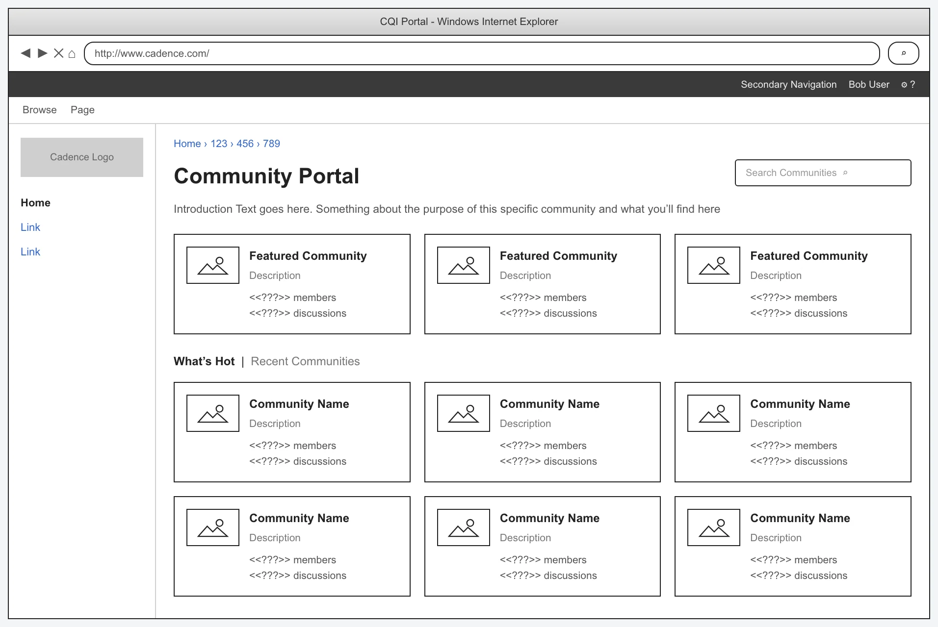
The community-portal wireframe, structured so people could find where the work was happening — featured communities, a What's Hot / Recent toggle, and a grid of community tiles.
The design converged on a community portal homepage so people could find where the work was happening, and the portal signalled activity: featured communities, a What's Hot / Recent toggle, and a grid of tiles showing member and discussion counts, so the place read as alive.
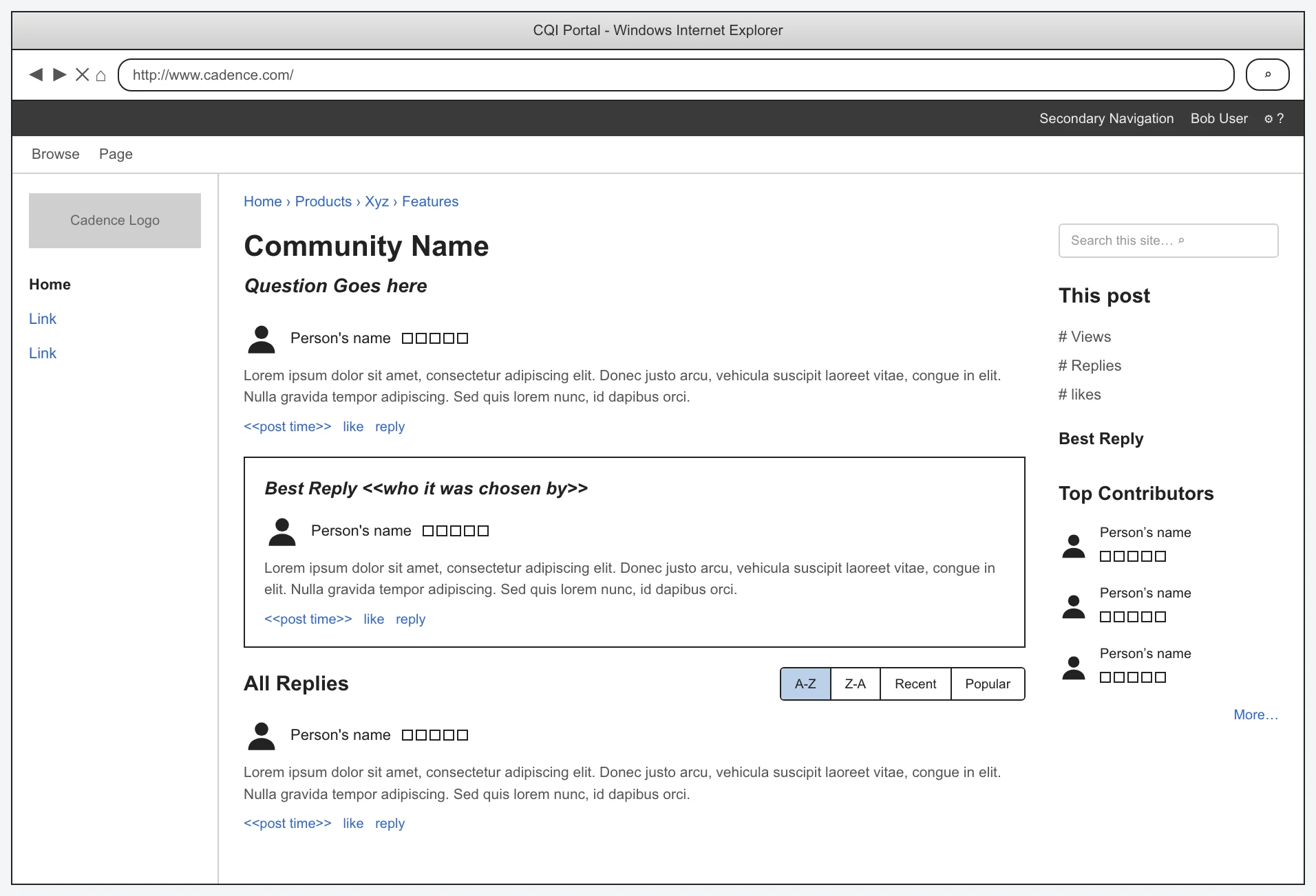
The discussion-board wireframe, borrowing the Stack Overflow pattern — a question, a highlighted best reply, voting, sort controls, and a stats rail.
The discussion page borrowed the Stack Overflow pattern — a question, a highlighted best reply, up and down voting, sort controls, and a right rail of stats and top contributors.
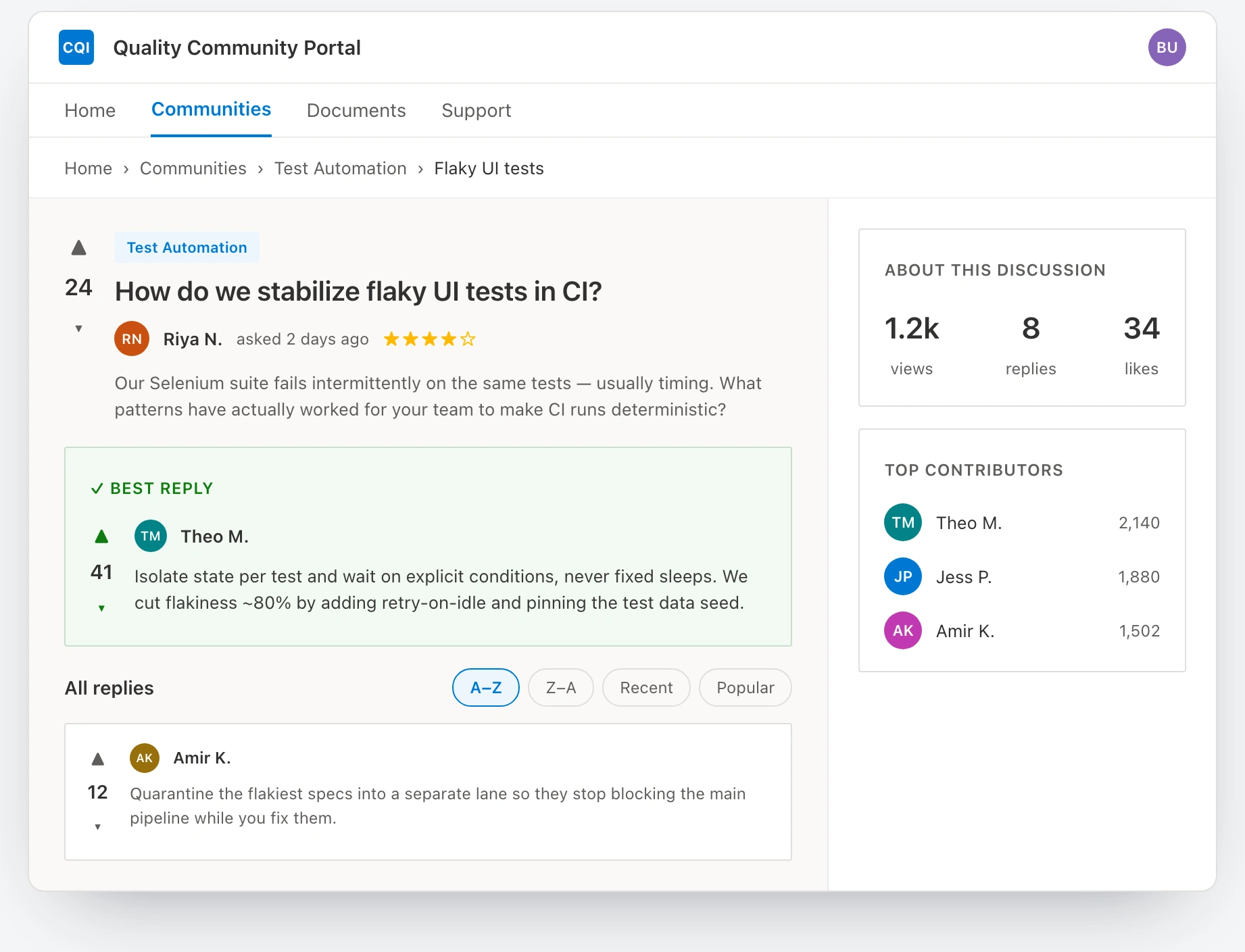
The discussion board built into the production SharePoint Web UI Kit, taking the wireframe from concept to a real, skinned surface.
I took both from wireframe to a production skin in the SharePoint Web UI Kit. The hardest constraint wasn't any single screen — it was that every decision had to be scalable. A design that worked beautifully for QA but couldn't carry across all teams would have failed the actual goal.
The honest ending
The pilot launched — QA's quality portal went live on the new setup — right before I rolled off. So I saw the site go live and the migration approach take shape, but I left before the longer-term adoption numbers came in, and I'm not going to invent any. The lesson: when you're introducing a new way of working, name the assumption you're least sure of and spend to close it — and remember the durable deliverable often isn't one good screen, but a process solid enough that other teams can repeat it without you in the room.
See the full case study → https://design-case-studies.vercel.app/cadence
Like this project
Posted Aug 3, 2026
Cadence's QA team had an internal portal almost nobody used. I ran a pilot to rebuild it end to end — and produce a design-plus-migration blueprint repeatable across every team.
Likes
0
Views
2