Apple: one platform, from a global view to a single room

Catherine Hicks

Apple's campuses are enormous — many buildings across many sites, every one full of meeting rooms that have to be kept working and kept busy. In 2015 the facilities team had no single place to do that job. I came in through IS&T as a UX design consultant to design one platform that could serve three very different roles from one dataset.
Two jobs, three roles
The work split into two jobs living in the same rooms: keep them functional (health), and understand how heavily they're used (utilization) so the team can plan. And it was never one kind of user. The team spanned facilities managers who plan across campuses, building managers who run a single building, and check-in support staff who keep individual rooms online — three roles looking at the same reality from a different altitude. The brief: give managers all the relevant data across every building they manage, ideally from one platform every role could use for its own job.
The question I answered first
Before design could start, there was a real open question: can a single platform actually serve all three roles at once? It would have been easy to assume no — three roles means three tools. I didn't assume. I went to the source, spoke with people across the facilities team about what each role did day to day, and built the requirements from those conversations rather than my own guesses. The answer came back yes — because what differed between roles was the view, not the underlying data. That finding is the hinge the whole project turns on.
Partway through, a third principle arrived alongside "easy" and "scannable": it had to work on mobile. Not a nice-to-have — the meeting-room signage across campus ran on iPads, and facilities work happens on your feet, walking a building. From then on, every wireframe carried a paired mobile view.
The breakthrough was hierarchy
This was the hardest data problem I'd taken on to that point. The difficulty wasn't any single screen — it was organizing a very large dataset so it could be sliced into many pieces, structured so every role could pull exactly what it needed without wading through what it didn't. The roles actively fight each other here: a structure built for the manager's global planning starved the building lead of room detail; one built for room troubleshooting buried the manager in noise.
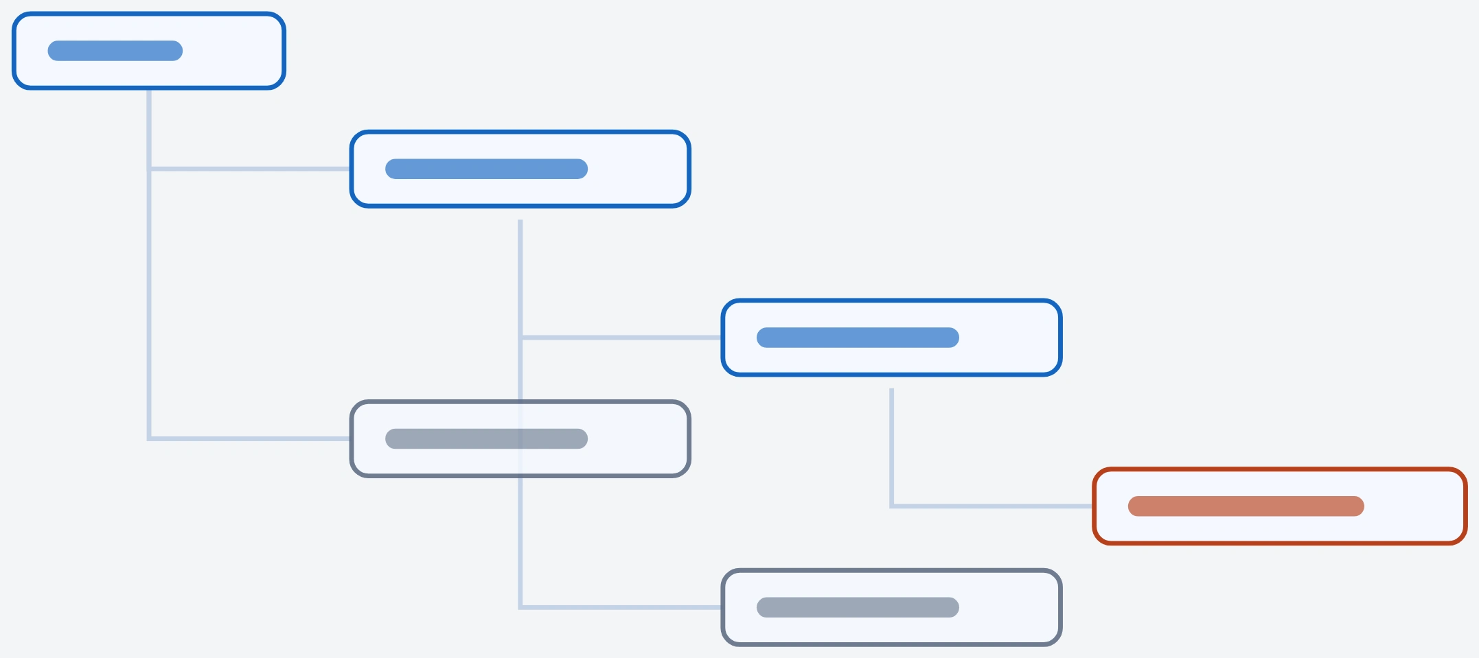
The data was fundamentally hierarchical, so I designed a drill-down that mirrored the real shape of the campus: region → location → building → room → device. Because the structure matched reality, every person could descend to exactly the level meaningful to them and stop there. The facilities manager lives near the top; the check-in staffer drops straight to a room to debug a ticket. Same tree, different depth. I worked it out on a whiteboard before any of it became a wireframe.
Scannable at every level
Every view shared one navigation — a selector across the hierarchy, search-by-name, and a Favorites feature to pin the rooms or buildings you watch most. The detailed views carried a real metrics dashboard — utilization, cancellation, takeover, and recovery rates up front, with an expandable set of secondary tiles. At the room level, the same read reappears: utilization and sparklines up top, an online/offline toggle to bring a room back, and a device table beneath. The discipline was keeping depth from becoming clutter — secondary metrics expanded only on request, so the default read stayed fast. (Figures in the mockups are illustrative sample data.) The role model turned out richer than three flat labels — four permission shapes, all feeding off one dataset.
Where it landed
I'll be straight about it. I carried the project from research and requirements through to a completed set of design journeys — the architecture, navigation, region and room views, favorites, and role model — and that work was finished before my engagement ended. The tool shipped afterward, but I never saw it reach implementation myself and never measured adoption, so I won't claim a usage outcome I didn't witness. What the project unambiguously produced was a validated structure: a drill-down architecture, grounded in real conversations, that could serve three roles from one dataset.
Two things stuck: how to work productively within a rigid existing design system, treating the constraint as part of the problem rather than an obstacle to it, and how to build frameworks for genuinely detailed datasets in a far more structured way than before. One dataset, three roles, five levels of drill-down — a complex data experience made simple, inside constraints I didn't get to move.
See the full case study → https://design-case-studies.vercel.app/apple
Like this project
Posted Aug 3, 2026
Apple's facilities team had no single place to keep thousands of meeting rooms working and busy. I designed one platform that served three roles — from campus-wide planning down to debugging a single device — off one dataset.
Likes
0
Views
4