Kaiser: designing telemedicine before it was a category

Catherine Hicks

Everyone has telemedicine now, and that's exactly why this case study interests me. I was making the case for virtual care inside Kaiser Permanente's My Doctor Online before the company was building it, and honestly before it was even a category. But I'm not here to sell the idea — the idea is table stakes today. I'm here to show what the idea was made of: a structural call that still separates a demo from a system.
The brief was a blank sheet and a question
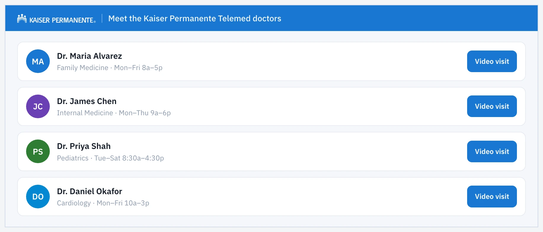
Most projects hand you constraints. This one handed me neither. My Doctor Online already existed as a SaaS platform where patients found their doctors and managed their care — but telemedicine wasn't in it, and wasn't really on anyone's roadmap. The job was to see into the future a little more easily. The business question sounded simple — how would a telemed platform work inside MDO? — but the interesting problem underneath wasn't about what a video visit should look like. MDO was organized around individual doctors: every doctor had their own page. So the real question was where does it attach? Everything downstream flows from how you answer that.
The intuitive answer is where I started
Put a video-visit flow on every doctor's page, so a patient books right where they're reading about their physician. No context switch, book in place. It's a reasonable instinct — and it didn't survive contact with scale. If every doctor's page carries its own embedded flow, every one of those has to be built, maintained, and kept in sync across a very large roster of physicians. One change to the visit experience replicates across the whole directory — a maintenance burden that grows linearly with the size of the org. And Kaiser is not small. I could see the concept collapsing under its own weight before it ever launched.
So I inverted it
Instead of the flow living inside each doctor's page, I designed a single, shared telemed flow — one canonical experience — with a launch button placed on the doctor pages. Two entry paths feed into that one flow. From a doctor's page, their info passes straight through, no re-selecting. Coming to the flow directly, choosing a doctor becomes its first step. One flow to maintain, two ways in, context preserved either way. That's the spine of the whole concept, and the difference between a demo and something operable at Kaiser's scale.
The wireframes made the decision concrete
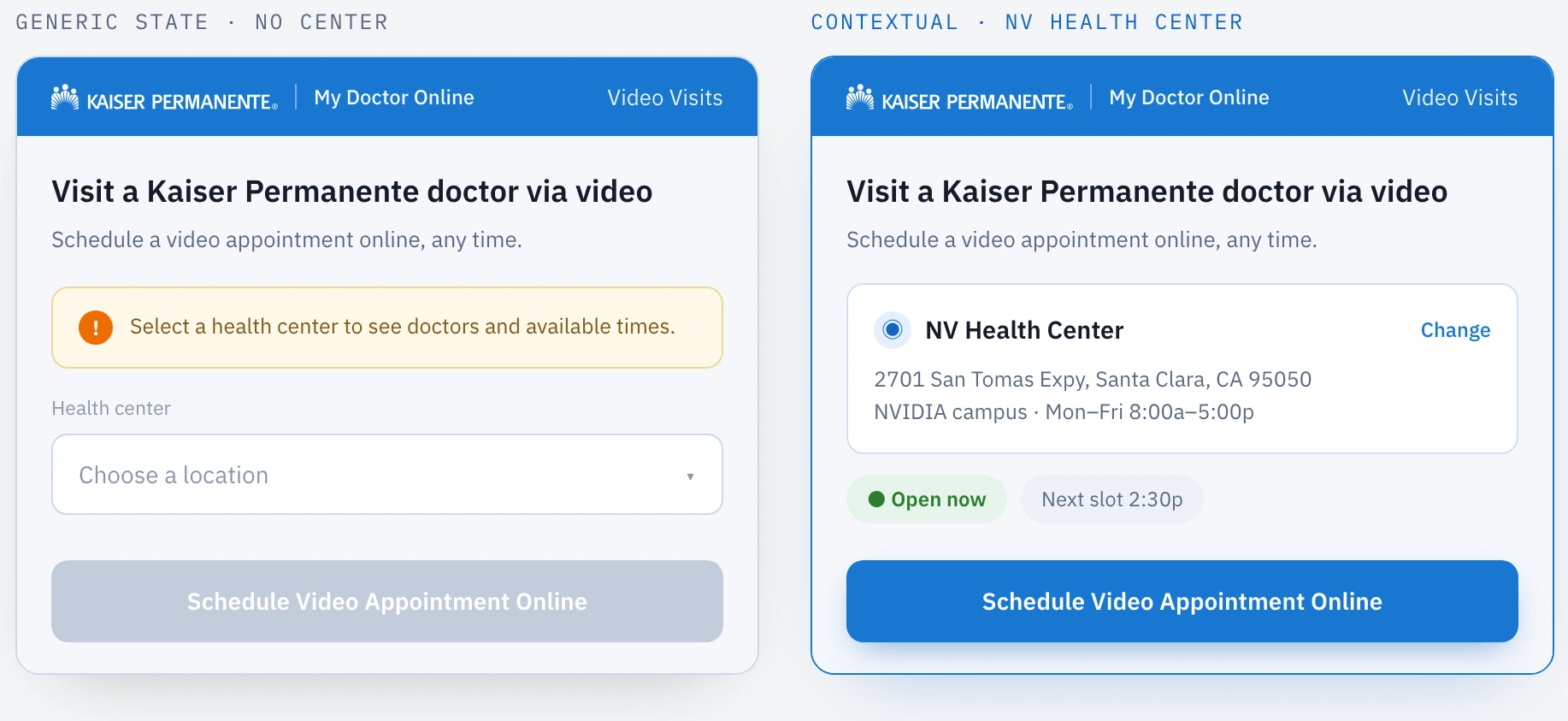
The context-aware telemed home in two states — one prompting the patient to pick a health center, one pre-filled with location, address, and hours once a center is attached.
The shared telemed home renders context-aware: land without a health center and it prompts you to pick one; arrive with one attached — the pilot framing used the NVIDIA campus and the NV Health Center in Santa Clara — and it pre-fills location, address, and hours.
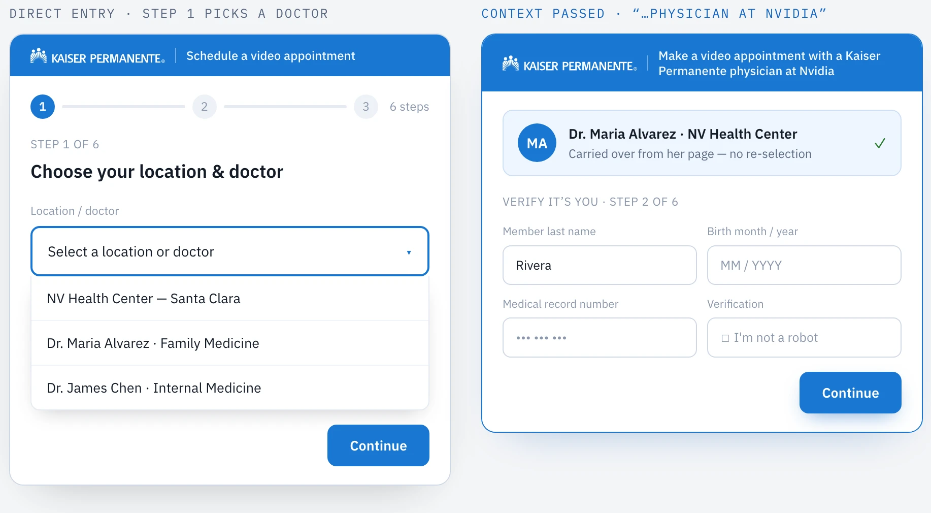
The six-step verified booking wizard, forking on the same context logic so both entry paths funnel into one shared flow.
The booking is a six-step verified wizard forking on that same context logic.
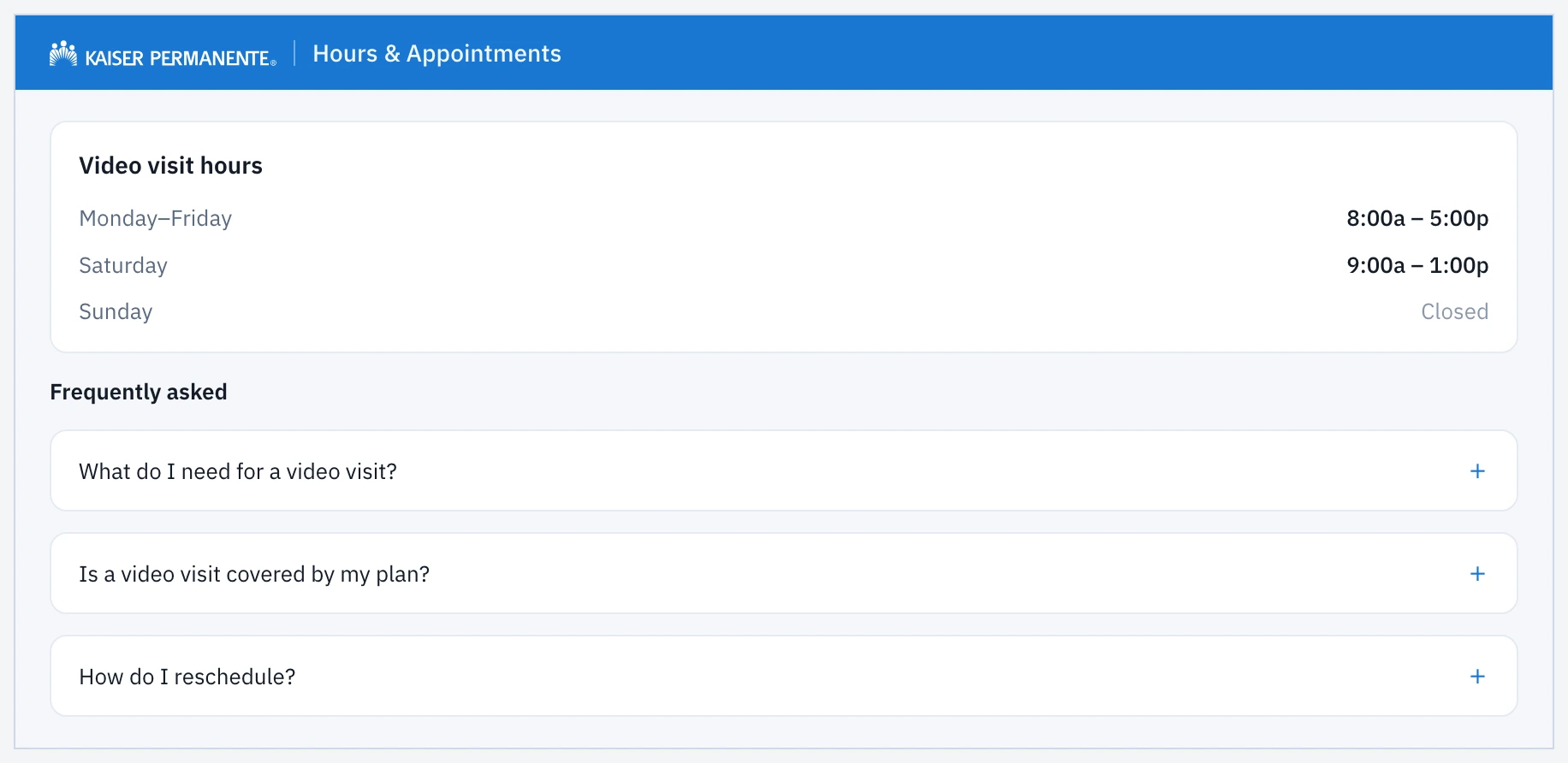
The Hours & FAQ page, rounding out the set so the concept reads end to end rather than as a single isolated screen.
A doctors directory plus an Hours & FAQ page round the set out so the concept reads end to end.
What it delivered
The honest hard part wasn't the interaction design — it was the absence of constraints. Because telemed didn't exist at the company, I had no confirmed tech stack, no platform team telling me what was possible. To keep moving, I inferred a plausible stack from products I'd already designed. That assumption wasn't meant to be correct; it was scaffolding — just enough certainty to explore the experience instead of stalling. This was an exploration, and it delivered what explorations are supposed to: a concrete concept and a defensible point of view where there had been only a question. There were no KPIs to hit here by design; the value was clarity. The biggest thing I took away is about myself: I don't do my best work in a total vacuum — constraints aren't the enemy of creativity; they're the thing that makes it possible.
See the full case study → https://design-case-studies.vercel.app/kaiser
Like this project
Posted Aug 3, 2026
I made the case for virtual care inside Kaiser's My Doctor Online before the company was building it — and the real win wasn't the idea, it was one structural decision that separates a demo from a system.
Likes
0
Views
5