Advance Auto Parts: designing a store customers trust

Catherine Hicks

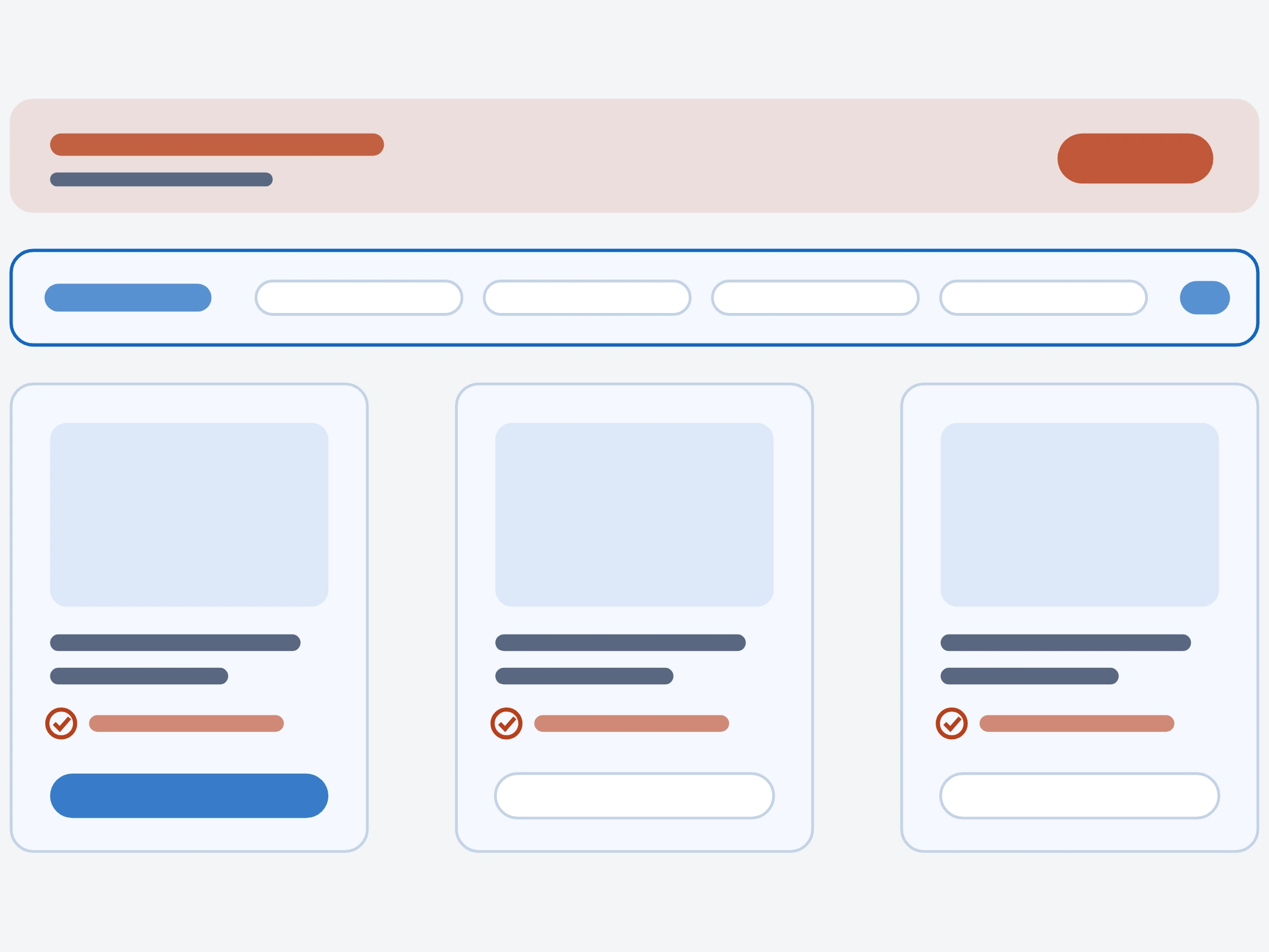
The whole thing comes down to one belief in a customer's head: this is the correct part for my vehicle. I joined Advance Auto Parts as a Visual Designer, September 2009 to March 2010, on the launch and redesign of their e-commerce store, and that single question of confidence sat under every decision.
A redesign, not a blank page
The existing store had an outdated interface and a navigation customers struggled with, and too many left before they bought. The redesign had to fix three things at once — the look, the findability, and the drop-off — and serve two very different people: professional installers who need the right part fast, and DIY customers standing in a driveway with a broken car and a lot of uncertainty. Over six months the role grew from producing assets toward coordinating design across the platform.
I designed against evidence, not taste
User-centered design in a specific order: understand real behavior first, design against it, validate before committing. Research meant analyzing site analytics to see where customers actually dropped off. I created the visual system — page layouts, wireframes, UI graphics, icons, color schemes — the coherent system that keeps new and recurring web projects on-brand. But it wasn't a styling exercise. The fitment selector, the per-product fitment check on every card, is the difference between a customer who buys and one who second-guesses and leaves.
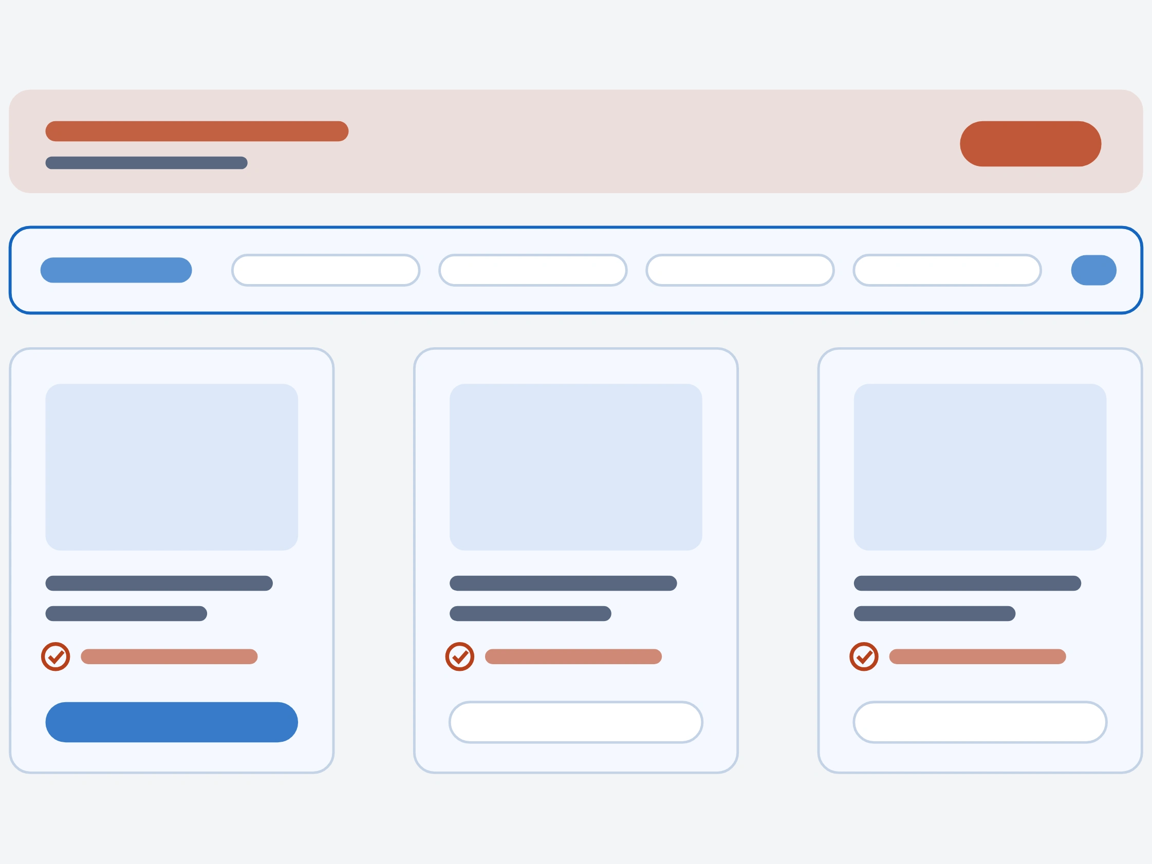
The storefront: a highlighted fitment selector up top and a per-product fitment check on every card — the confidence cues that decide whether a customer buys.
A retailer this size runs on a relentless calendar
I owned production and design of all online-only promotions across three channels — banner advertising, promotional email, and other online media. The creative worked as a system: one seasonal push produced once as an anchor unit, then run across every placement.

A 15%-off promo banner, produced once as an anchor unit and then run across every placement in the seasonal push.

The Holiday Gift Guide promo banner, part of the same repeatable system that aligned creative output to the enterprise's quarterly rhythm.
Using Flash and JavaScript I also built interactive experiences and did basic development, so I wasn't handing off flat files and walking away.
Where it landed
On the storefront, the reported results were a 15% reduction in bounce rate, longer sessions, and more completed transactions — and I'll flag those honestly: they come from the project's own writeup, so treat them as reported rather than independently verified. The lesson that stuck: on a parts store, the design's real job is confidence — everything from the fitment check to the layout exists to let a customer trust that the part in their cart is the right one.
See the full case study → https://design-case-studies.vercel.app/advance-auto-parts
Like this project
Posted Aug 3, 2026
Launching and redesigning the storefront for one of North America's largest auto-parts retailers — the visual and interactive layer built to make the right part findable, and to earn a customer's confidence before they buy.