eBay: one support portal three countries could launch at once

Catherine Hicks


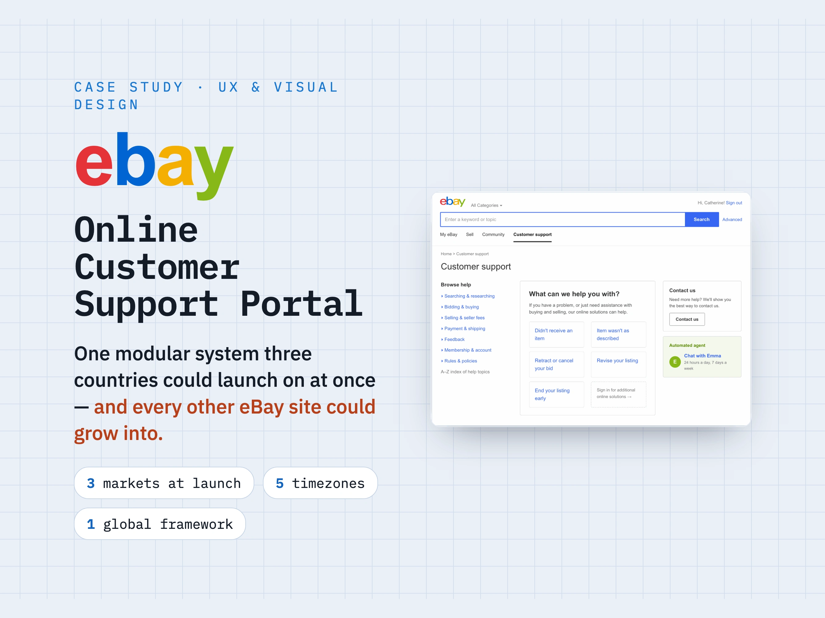
eBay's Online Customer Support portal is where customers went when something went sideways — and it looked years older than the marketplace around it. I led the UX for its redesign: wireframes, visual design, and developer specs, as the primary onsite contact coordinating an offshore team. The one-line version of what I did: I didn't design three portals. I designed one modular system that three countries could launch on at once, and every other eBay site could grow into.
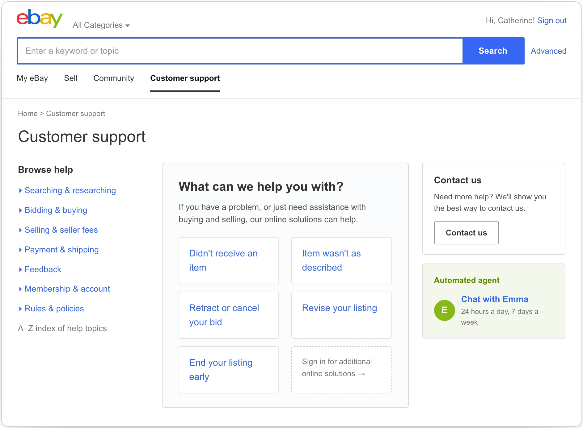
The redesigned eBay Customer Support portal: common problems dead center in a "What can we help you with?" panel, a quiet contact rail with an always-on Emma agent, and browse-help on the left — the shortest path off the phone.
The problem wasn't one portal — it was every country's portal
eBay ran localized sites across the globe, each with its own functionality, regulations, and support needs. That produced two mandates on two horizons: the immediate one, a coordinated launch across US, UK, and Germany at once; and the longer one, easy to underestimate — whatever we built had to scale to eBay's entire global footprint, to markets not yet in scope. The business measured us on two linked KPIs: fewer calls into customer service, and higher use of self-service.
The beliefs mapped straight onto those KPIs — obvious access to self-service drives self-service use up; a cleaner design reduces the mis-clicks that send frustrated customers straight to a call. The buried assumption underneath was the real risk: that we already knew how this would scale globally. We didn't, yet — and closing that gap became the spine of the project. So before drawing a screen, I got informed: a global site feature inventory built with each market's Product Manager — the OCS Global Site Matrix, every international site scored on the same rubric. That comparison reframed the whole problem into one question: how might we design one support experience three countries can launch on simultaneously, and every other eBay site can adopt later, without designing it three — or thirty — times?
The decision I'm proudest of: a framework, not fixed flows
The obvious move is to design end-to-end flows. But flows are brittle across markets — Germany needs a step the US doesn't; a regulation in one country blows up a fixed flow in the next. So I went the other way: a kit of modular pieces, a framework where components could be assembled and, just as importantly, removed without breaking the UI. Self-service first was itself a choice among alternatives — I explored a version with a Buyer Protection promo band (split focus) and a search-led version (buried the common problems) before choosing the one that put common problems dead center.
Every topic resolved into the same Topic / Contact-options pattern, with modular contact blocks — Call us, We'll call you, Chat, Email — a market includes or omits. Overlays layered on top rather than living inside a hardwired flow: an item-retraction picker, a "Call us" panel with live wait time and a PIN, and an IP-Relay path for customers who are deaf or hard of hearing.
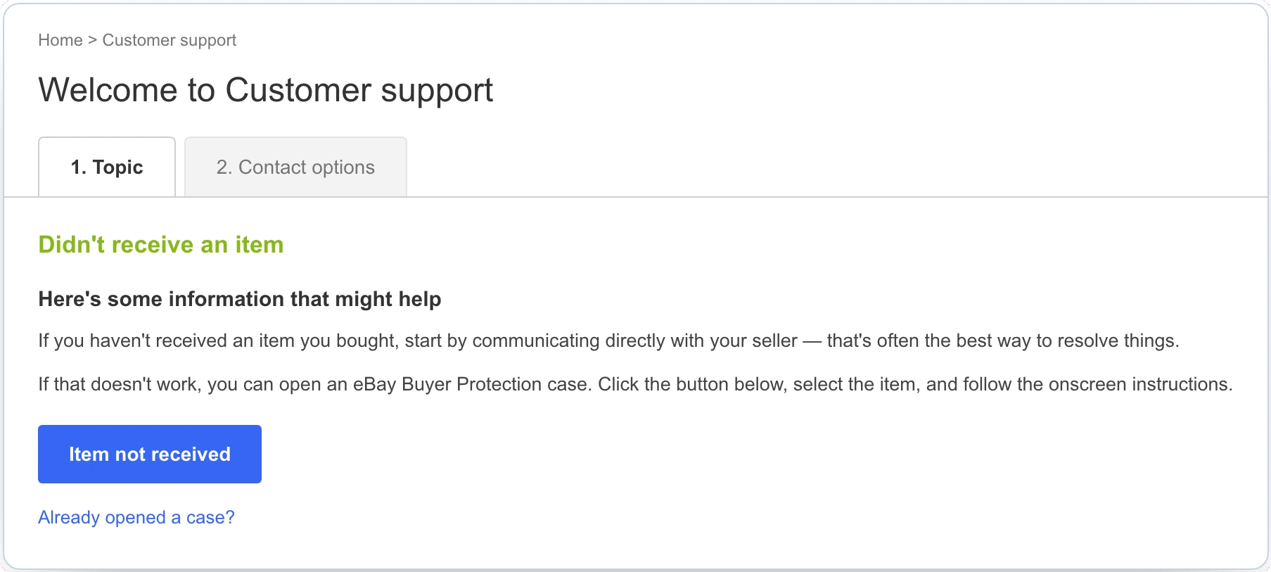
Every topic resolves into the same two-step Topic / Contact-options pattern. Modular contact blocks compose in or drop out per market — nothing hardwired.
The payoff in one screen
Here is the whole thesis in a single comparison: the exact same base page, rendered for France in French — nothing rebuilt. A different property entirely, "Buying on Half.com," dropped into the identical structure. And a dedicated "graying out channels" workstream let a channel recede in place when a market didn't offer it, instead of breaking the layout.
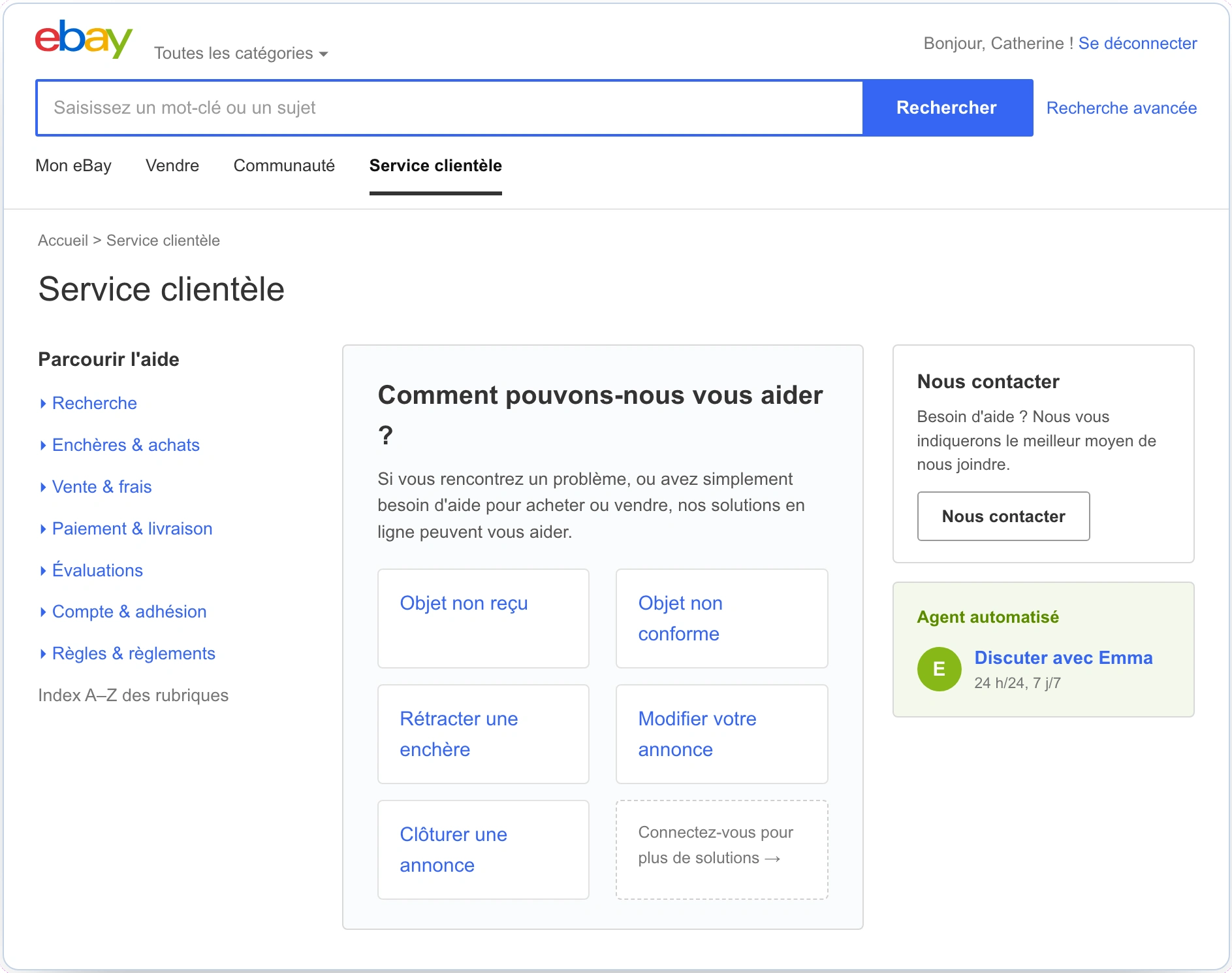
The same base support page rendered for France in French — assembled from the same modular kit, not rebuilt. This is what "one system, many markets" looks like in practice.
That modularity paid a second dividend: it made the design future-proof. The same framework was later carried into further market waves and adjacent features — Answer Center, Call Me, notifications, Report This Item — each another piece composing in, not a bespoke rebuild. And the work was handoff-ready: full redline specs pinning down type, color, pixel spacing, iconography, and states, because in a system meant to be reused, ambiguity would multiply across every market that inherited it.
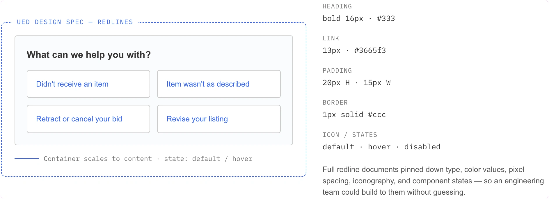
A redline spec from the handoff set — type, color, spacing, iconography, and component states pinned down, so an offshore engineering team could build to the system without guessing.
The hard part was coordination, not design
Stakeholders in five timezones across three countries, plus an offshore team in India. Early on I was the bottleneck; what fixed it wasn't a tool but discipline — deliberate daily check-ins, being the reliable clearinghouse for four PMs, and processes so "who has the latest, and what's next" was never a mystery. The other surprise came from inside the building: eBay's own design team pushed back that the work wasn't "on brand" — but the brand was actively changing, and the support portal was exactly the lower-stakes property to prototype its future. I made that case and got design and product to a shared position.
The portal launched across its target markets on a framework built to scale to eBay's wider global infrastructure. It shipped after I'd moved on, and remnants of the work are still visible on eBay's support site today. One honest note: the KPIs were decreased calls and increased self-service, but no post-launch numbers were captured in the material I have, so I won't claim a figure I can't stand behind.
The lasting lesson: design components that compose and decompose cleanly — not fixed, finished flows. Serving wildly varied needs without fragmenting the experience is a pattern, and choosing a kit of components over brittle flows is the single call that made this one launch, scale, and outlast me.
See the full case study → https://design-case-studies.vercel.app/ebay
Like this project
Posted Aug 3, 2026
eBay's Online Customer Support portal looked years older than the marketplace around it. I led its UX redesign — and instead of three portals, designed one modular system three countries could launch on at once, and every other eBay site could grow into.