BTS Arts Learning: IA as invisible generosity

Catherine Hicks
The Beverley Taylor Sorenson Arts Learning Program (BTSALP) places arts specialists and arts-integrated curriculum directly into elementary schools. Its website already held everything the teachers it serves could need — all of it buried under sprawling, over-nested navigation. My job was to restructure the information architecture and design a homepage that led with the story instead of the sitemap. For a mission-driven org, that reframe isn't cosmetic: making the content findable is the mission.
Everything there, nothing findable
Years of organic growth had left the site deep and tangled. Lesson plans, training, events, and advocacy were all present, but scattered across redundant branches that had accreted rather than been designed. A teacher looking for a lesson plan basically had to already know where it lived. The content wasn't the problem — the structure around it was. A nonprofit's site is its front door, and if people can't find the help, the help may as well not exist.
Map it before touching it
Instead of rearranging pages, I audited the existing site into a full information-architecture tree. Drawn out on one canvas, the over-nesting was impossible to miss: redundant Resources and About branches doing overlapping jobs, and deep chains where a teacher had to click and click to reach a single lesson plan. You can argue about a messy site in the abstract forever; you can't argue with the tree once it's drawn.
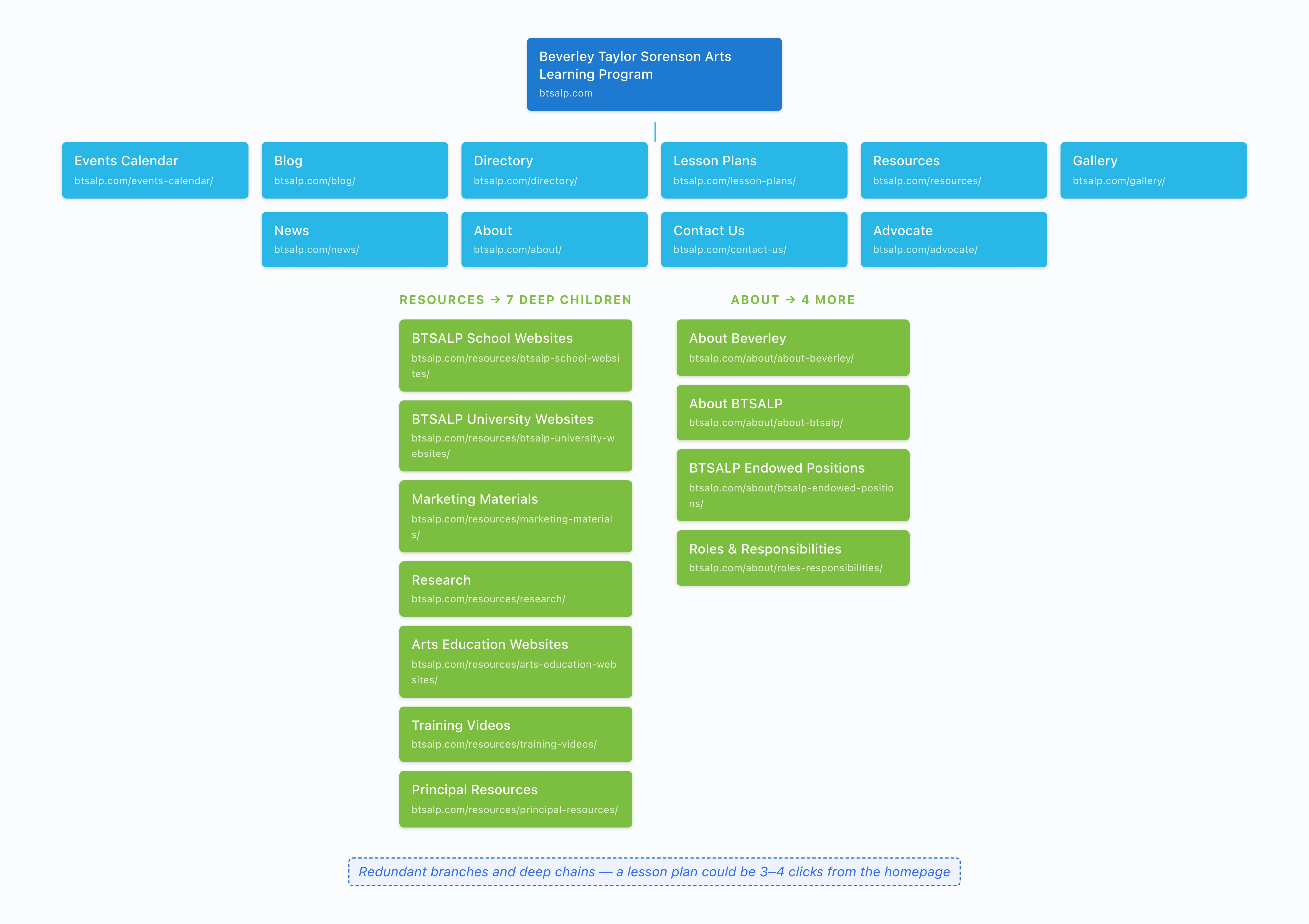
The existing site audited into one information-architecture tree — redundant Resources and About branches doing overlapping jobs, deep chains to reach a single lesson plan. Once it's drawn, the over-nesting is impossible to argue with.
Four doors, not forty
The sprawl collapsed into a lean top-level scheme — four clear entry points chosen to match how people actually arrive, with the deep content organized underneath rather than competing at the top. Resources for lesson plans and training. Get Involved for advocacy and support. News & Updates for the ongoing story. About for who and why. The goal wasn't fewer pages; it was fewer decisions at the top, so the first choice is easy and obviously right.
Lead with the story, then the shortcuts
With the structure sound, the homepage could do its real job. The wireframe opens on a promo video — the mission in motion, impact shown not told, above the fold — then stacks the story and the shortcuts in the order people need them. Quick-access tiles lift the four most-wanted destinations (Lesson Plans, Training Videos, Event Calendar, News) up out of the nav. Featured posts keep the story fresh. A newsletter signup turns a single visit into an ongoing relationship — the quiet win that compounds for an org running on attention and goodwill.
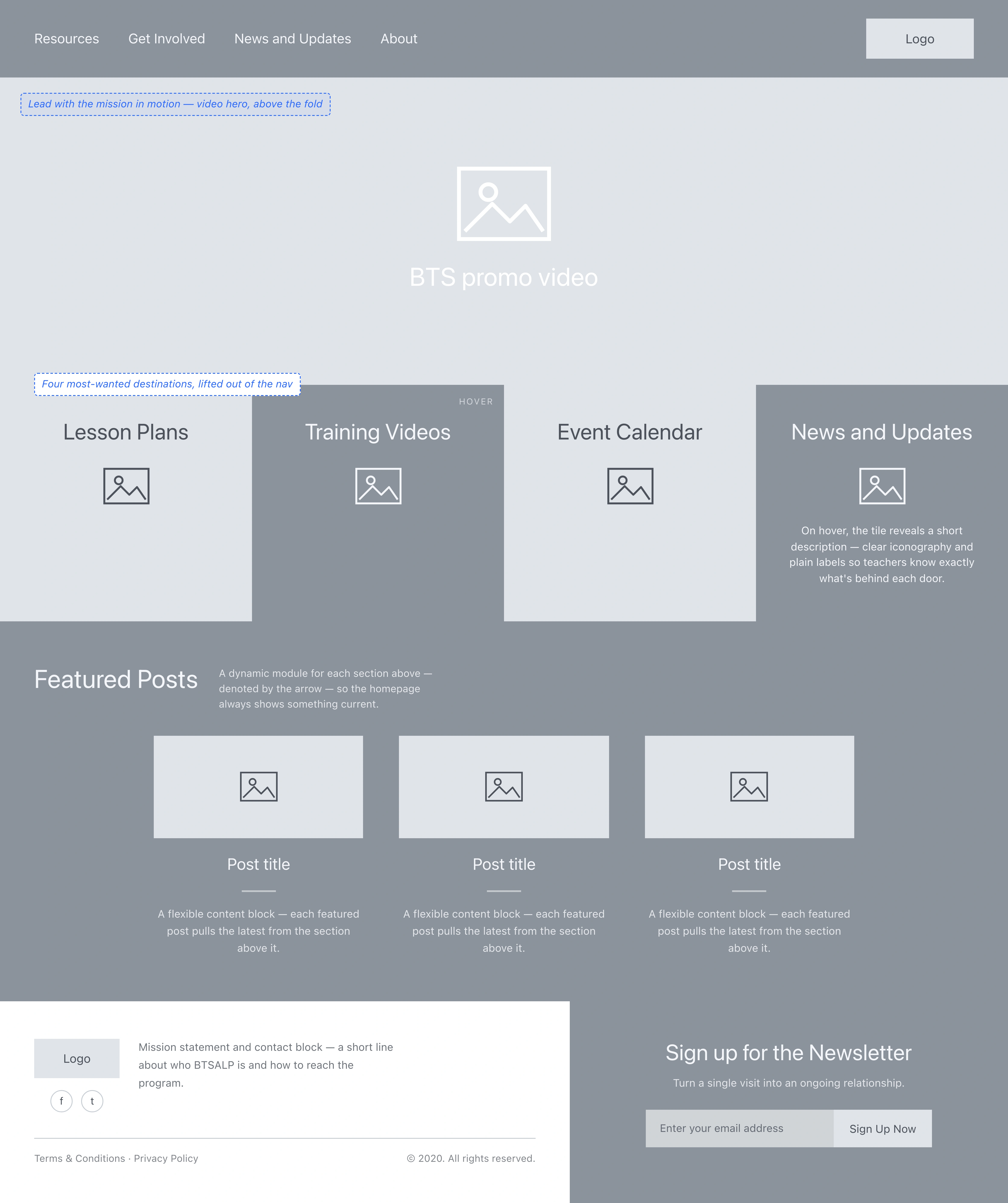
The homepage wireframe leads with a promo video — mission in motion, above the fold — then quick-access tiles that lift the four most-wanted destinations up out of the nav, featured posts, and a newsletter signup.
What I delivered
The engagement handed off annotated wireframes ready for development — a restructured site and a homepage that put the mission first. Good information architecture is invisible generosity: nobody notices it when it's right; they just find what they came for. For a nonprofit living on attention and goodwill, that quiet findability is the whole game.
And I'll keep it honest: the deliverable was wireframes and IA for handoff — the downstream outcomes aren't mine to measure, so I don't attach numbers to them.
See the full case study → https://design-case-studies.vercel.app/bts
Like this project
Posted Aug 4, 2026
A nonprofit arts-education program's website already held everything its teachers needed — all buried under sprawling, over-nested navigation. I restructured the information architecture into four clear doors and designed a homepage that leads with the mission, not the sitemap.