Charles Schwab: which hills to die on with no time to rebuild

Catherine Hicks
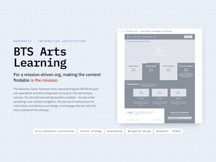
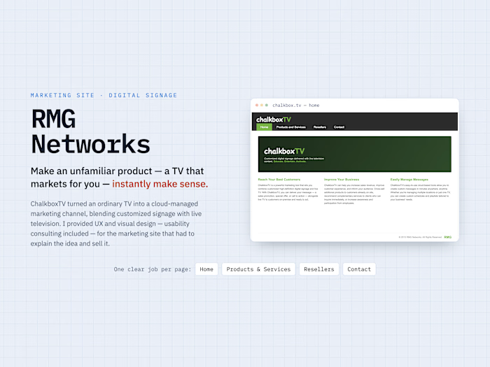
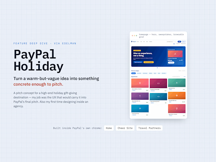
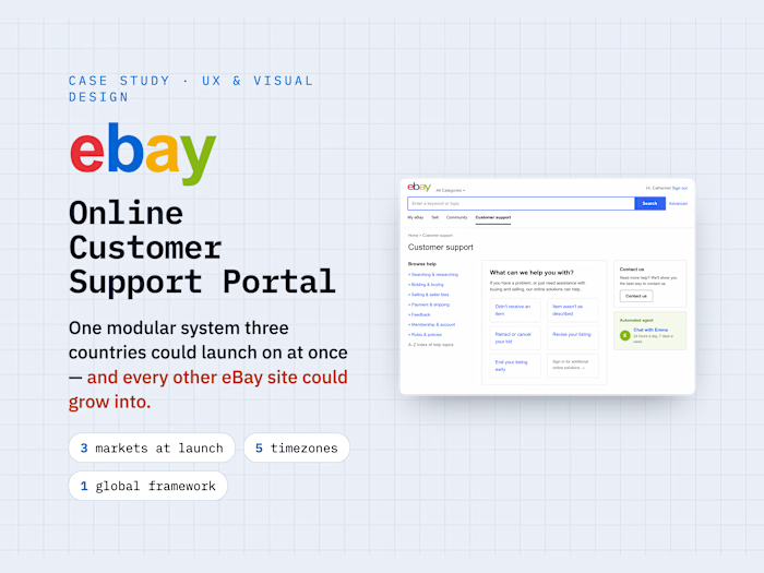
Some projects you shape from the blank page. This wasn't one — and that was the whole story. Rosetta was preparing a pitch to Charles Schwab and had a bold visual concept, the Smart Square, already locked. What the pitch didn't have was a usability voice. I joined near the end, for the final three days, to take that locked concept and make it defensible from the user's perspective — to pressure-test its behavior and consistency across the pages the pitch had to cover, so the team could walk in confident. My job wasn't to reinvent the idea. It was to make sure it actually worked for the people who'd use it.
The creative was locked; the usability voice was missing
Rosetta had an idea they believed in and needed to build into something that would win the work. What they didn't have was anyone whose entire job was to look at it through a usability lens and ask, on Schwab's behalf, does this actually work for a real person trying to get something done? I kept my north star deliberately narrow — enhance the idea, not reinvent it. Narrowing the mandate on purpose was the first decision I made.
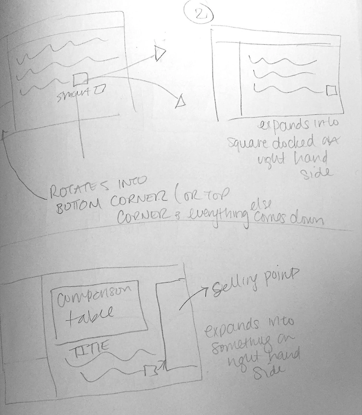
Working the behavior on paper, fast, in variations — the way I work when time is short. Sketching through how the Smart Square moves before committing to a single pattern.
The Smart Square
The concept was a single, strong visual metaphor: a square that represented a distinct area of your financial life and expanded to reveal how Schwab could help you there. Tap it and it grew into a panel of contextual content, the layout reorganizing around it. Locked before I arrived — not mine to overturn, mine to make work.
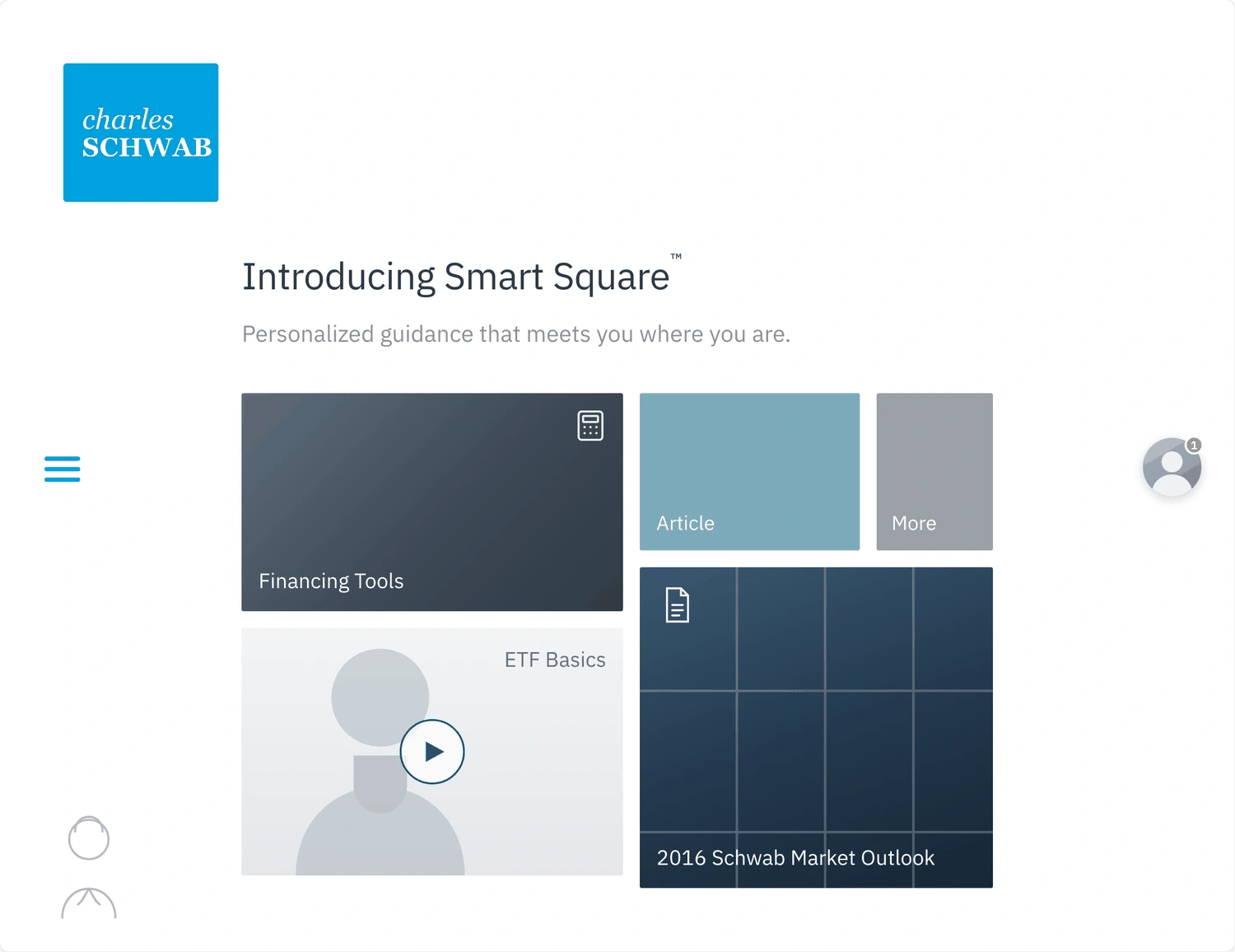
The Smart Square: a square representing an area of your financial life that expands into a panel of contextual content, the layout reorganizing around it.
Making the square earn its place
Because the metaphor was fixed, my real problem was integration: how to use one expressive interaction consistently across everything the pitch had to cover, without it feeling like a flourish bolted on every screen. I worked it the way I work when time is short — on paper, fast, in variations, then quick animations to show how the square moved. I explored its behavior two ways: expand and dock, where the square grows and docks to the right as a persistent panel, and rotate into a corner, where it rotates away and content flows down beneath it. Then I mapped the winning pattern as a system across the pages Schwab cared about — Find a Consultant, Advice, Choice, Partner, Transparency.
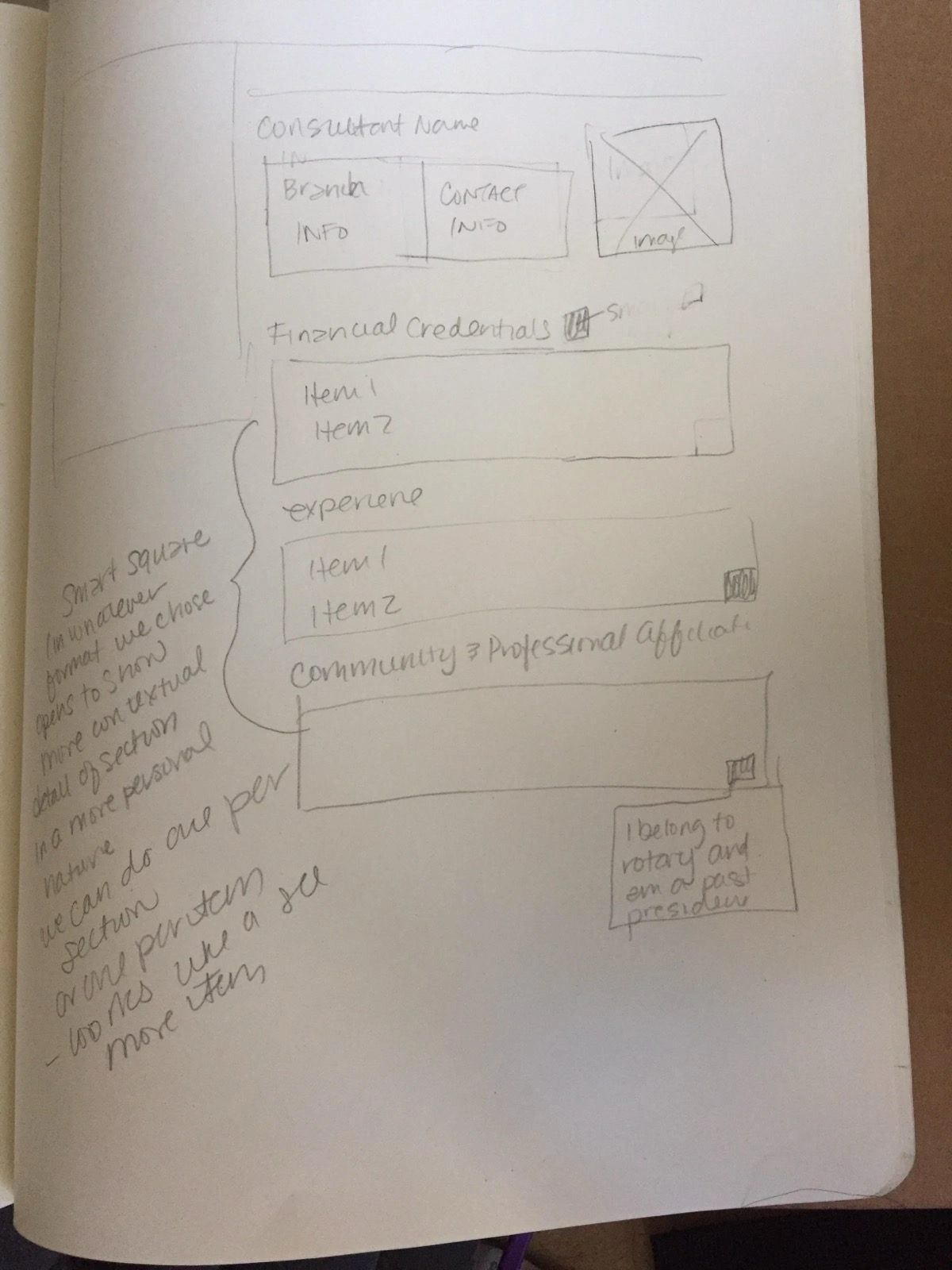
Mapping the pattern to real context — a consultant profile where the square reveals detail section by section, so credentials, experience, and community affiliations feel personal rather than like a bulleted stat block.
On a consultant profile I sketched the square revealing detail section by section — credentials, experience, community affiliations — so the reveal felt personal. "I belong to Rotary and am a past president" reads very differently from a bulleted stat block. The through-line I fought for: the square isn't decoration, it's a promise that Schwab shows you exactly what's relevant, section by section.
The tension
I joined a project so far along that when I saw something I didn't like, I often couldn't ask the team to go back — the clock wouldn't allow it. So I made a rule: I only fought for changes that were genuinely problematic from a usability standpoint. Real usability risk, and I pushed. Something that merely bugged me — a preference, a nicety — I let go, even when it bugged me a lot. That triage, knowing which hills are worth dying on when there's no time to rebuild, was the actual job.
Where it landed
The team walked into the pitch with a concept examined from the user's side, not just the creative's — the square more defensible, its behavior more considered, its application more consistent because someone had sketched through the awkward cases in advance.
Candidly, though: coming onto a nearly-finished project doesn't leave room for true usability work; by the time it's a deck, the best you can do is defend it — a much smaller job than designing. Three days at the very end, no formal KPIs for my slice, and I never learned whether Rosetta won the work, so I don't claim it.
See the full case study → https://design-case-studies.vercel.app/schwab
Like this project
Posted Aug 4, 2026
Rosetta was pitching Charles Schwab with a bold visual concept — the Smart Square — already locked. What the pitch lacked was a usability voice. I joined for the final three days to pressure-test that idea from the user's side and make it defensible, without reinventing it.