TIBCO: fitting a lending library into a checkout line

Catherine Hicks


Most of my case studies are about what I got to build. This one is about what I was handed to build it on — because at TIBCO, the platform was the whole story.
TIBCO needed one place where anyone evaluating their software could download free trials for whatever platform they were on, and manage those trials over time. They called it the Access Point Portal. The brief sounds simple until you hit the catch, and the catch is the entire case study: it had to be built on TIBCO's existing e-commerce technology — designed to sell shopping carts, not lend out demos.
Two mental models that don't line up
An e-commerce platform has a specific idea of what people are doing on it: browse, add to cart, check out, own the thing. Every part of it assumes a transaction at the end. Trials don't work like that. Nobody's buying anything — there's no price, no transaction, just a download, a license, an expiry date, and a EULA to accept. And this wasn't a missing-feature problem I could solve by adding. Every recognizable building block was already there and behaving normally — each one pre-loaded with commerce assumptions I had to modify rather than remove.
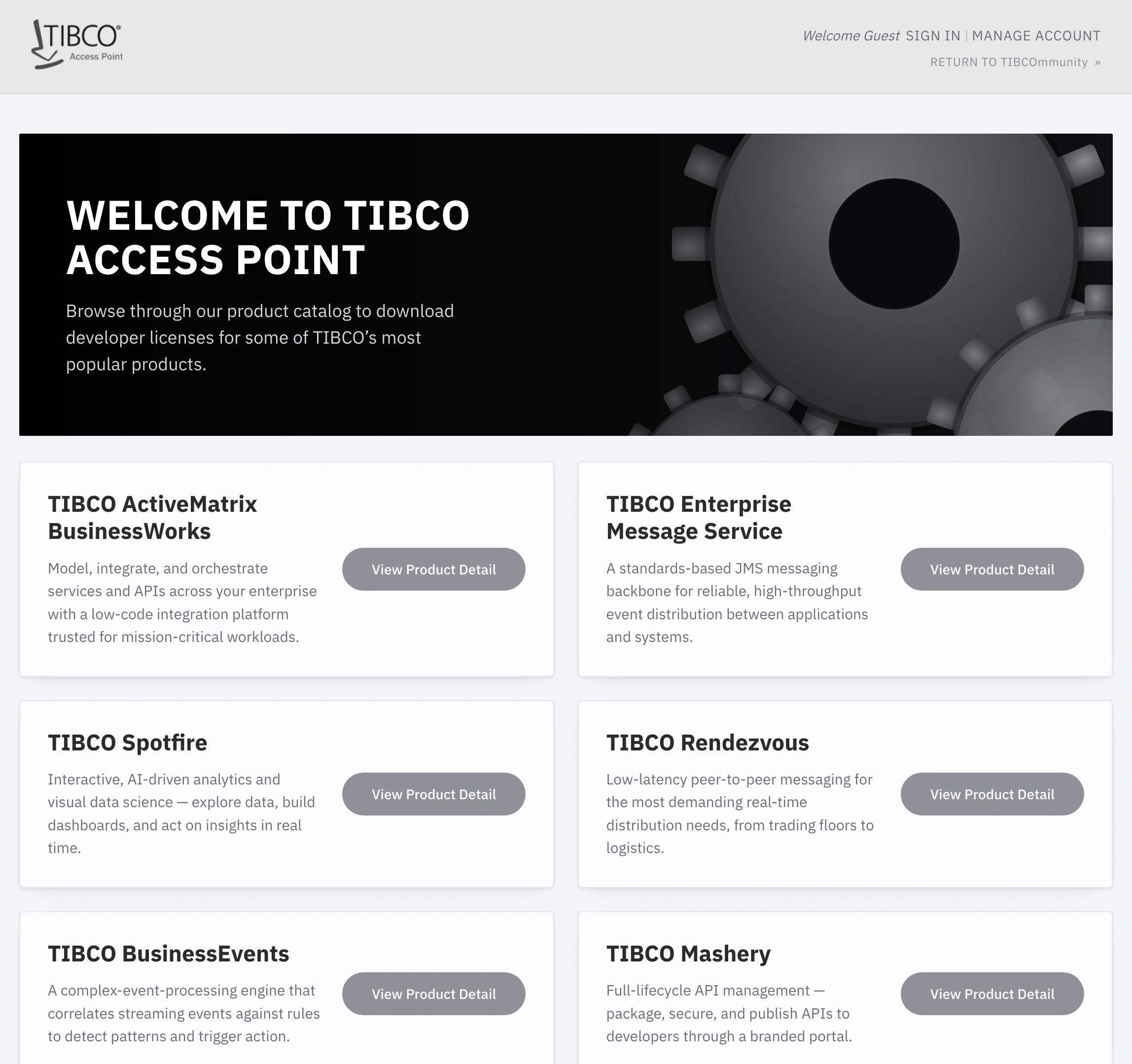
The catalog homepage reworks the platform's product-card grid for a different job — collecting trials to evaluate, not products to buy.
Learn the seams before touching a wireframe
Because the platform was a given, not a choice, the most important thing I could do before drawing a single screen was understand it cold: what can this system actually do, and where does it fight me? Then came the reframe that changed how I held the whole project — I confirmed a full platform revamp was already scheduled for the following Q1. This wasn't the forever home; it was a bridge. That single fact turned "why can't we just do it right?" into "what's the smartest thing we can do with what we have, right now?"
So I carved with the grain: leaned into the cart instead of fighting it, let the product detail pages carry both "get it" and "manage it," and gated the download behind the EULA up front rather than bolting it on afterward.
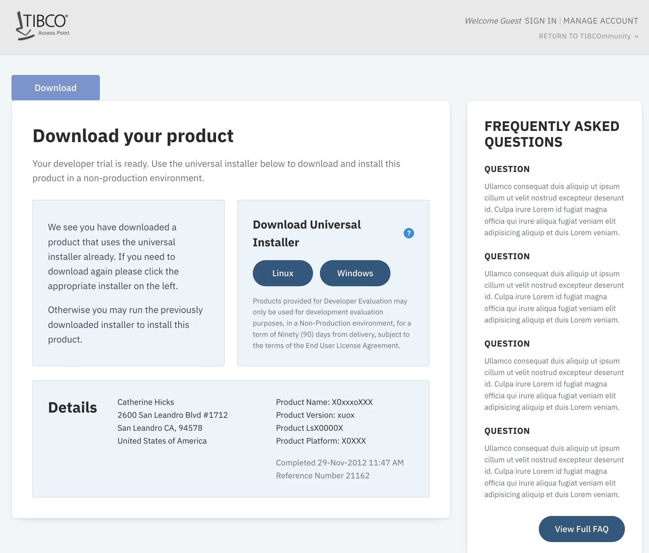
The download page centered on a universal installer with per-platform builds — pick your OS, pull the right trial, accept the license.
The management layer was the actual product
The download was the easy part. The account page's "My Downloads" table listed every evaluation by product, expiry date, days remaining, and downloads remaining — with per-row Linux and Windows controls — paired with editable user details, a change-password block, and a history log. Anyone can hand out a download link; what keeps a prospect engaged long enough to buy is keeping a sprawling set of evaluations legible over time.
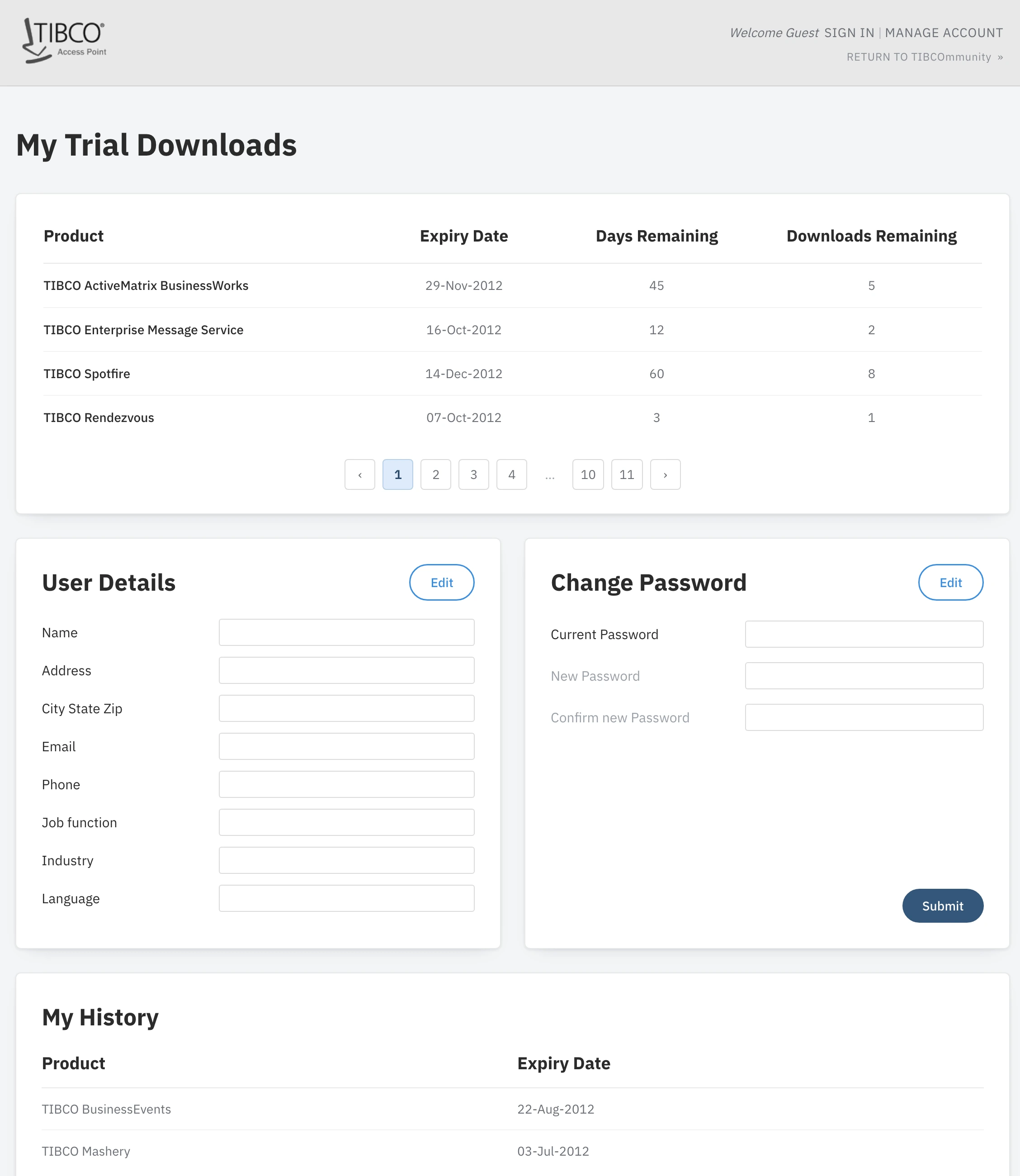
The "My Downloads" management layer — every evaluation tracked by expiry, days remaining, and downloads remaining. Keeping trials legible over time was the real product; the download was the easy part.
The honest turn — shoehorning, out loud
I'll be straight about the central tension, because it's the most useful part. Demoing and managing trials is not the same job as purchasing, even though at a glance it looks close enough that you'd assume it wouldn't be a problem. But the moment you get into the details — no transaction, licenses instead of orders, expiry instead of ownership, EULAs instead of receipts — the platform pushes back, and it genuinely limited how far I could build the feature out. So I made concessions. The experience isn't ideal, but it's as ideal as the required technology allowed — and I could point at each compromise and name the exact limitation that forced it.
That distinction — between "this is bad design" and "this is a known, articulated concession with a fix already on the roadmap" — is what let the team move forward with clear eyes instead of frustration.
Honest about the outcome, too: a short engagement, a couple of weeks, with no KPIs handed down — so there are no download or conversion numbers to report, and I won't invent any. What the work produced was a viable design path: wireframes and interaction patterns that let TIBCO stand up a trial portal on the foundation they had, with the constraints mapped and the compromises documented. It was explicitly a bridge, meant to hold until the full revamp landed.
The lesson I've carried into every constrained project since: the failure mode isn't the compromise; it's the undocumented one. Constraints don't excuse you from good design. They change what good design is.
See the full case study → https://design-case-studies.vercel.app/tibco
Like this project
Posted Aug 3, 2026
TIBCO needed one place to download and manage free software trials — but it had to be built on their existing e-commerce platform, designed to sell shopping carts, not lend out demos. A case study in designing with the grain of a constraint, and documenting every compromise.