Data Visualization Brand Standards
Ruth Hamberg
STARTING POINT
Implement data visualization standards in a fast-moving organization serving startup founders.
CONSTRAINTS
Design
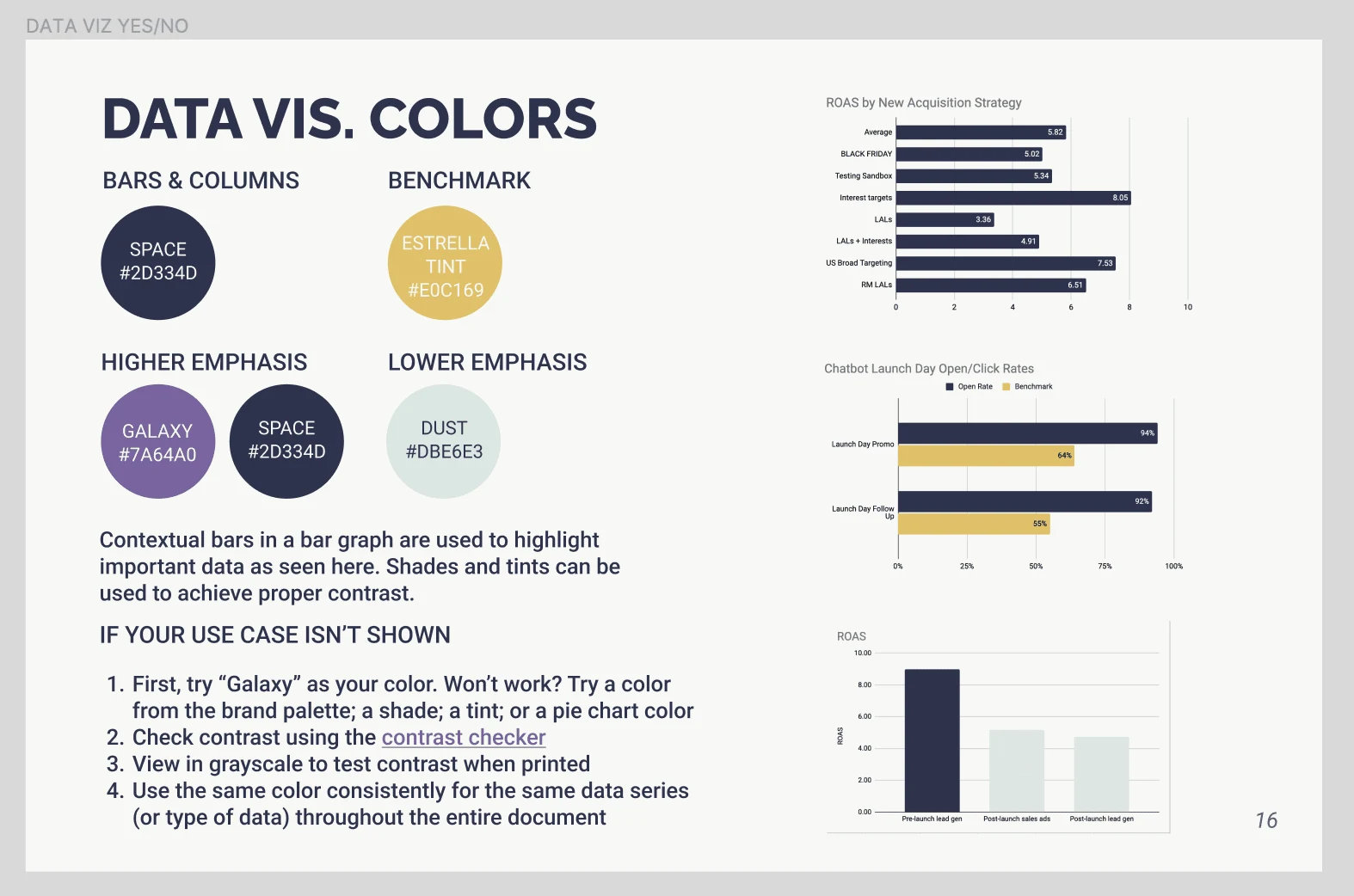
Data presentation should be consistent, clear and impressive
Colors should align with brand standards
Chart formats must include line, bar, pie, and benchmark
Data will be presented quickly, with one main takeaway per visual or slide
The visual impact should align with brand story elements including approachability, clarity, innovation and surprise
Accuracy and aesthetic appeal must be balanced and equal priorities; this is not a research report
Internal user needs
Internal users range from novice to advanced in both chart design and data literacy; they include executive leadership, project managers and analysts
Chart creation should be fast and seamless, ideally possible to delegate to a VA
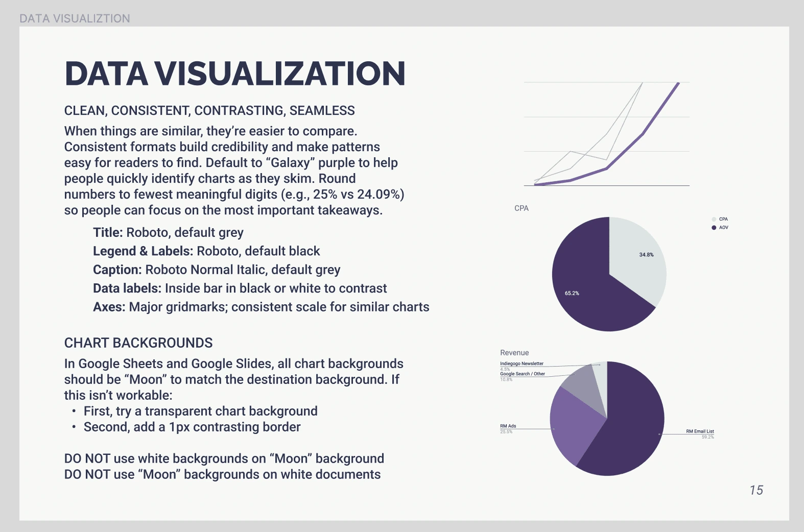
Implementation should take place easily in Google Sheets and Slides
Design should lead
As far as possible, slide deck and chart templates should be self-contained so the team doesn't have to search for branded assets or language
External user needs
External audiences include startup founders and investors
Must be able to quickly skim the slide deck, pull out the key information, and communicate it to third parties on their own
Data takeaways should be skimable with little room for mis-interpretation
Slide decks may be printed in black and white; colors must have sufficient contrast for accessibility in that case
RESULTS
The deployment of data visualization standards directly into templates was essential for adoption of the standards. By making the brand choice the easy choice, we created the conditions for long-term consistency.
The unified standard revolutionized data presentation for the company and its audiences. Prior to this project, colors and uses had been inconsistent and often unclear, resulting in a range of formats presented to clients. The new standards enabled the team to create brand-aligned visuals with clear takeaways, while audiences could quickly understand and act on the most important themes for each report. The internal team shortened the timeline to create client-ready client charts. Whatever the level of data literacy, each person was equipped to produce readable charts. Meanwhile, clients saw a more consistent, clear and modern presentation of data integrated with other reporting materials.
IN DEPTH
Activities
Content shared in dedicated section of brand guidelines
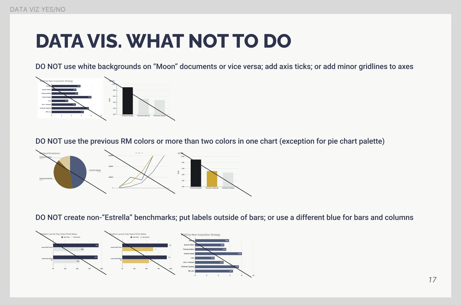
Yes/No examples for the most common chart formats
Guidance introducing data storytelling and best practices to the broader team
Chart formats incorporated directly into workflow via Sheets and Slides templates
Chart colors focused on pulling out a key finding (versus presenting all data series with equal emphasis)
Collaborated with brand designer to finalize color palettes
This was an early iteration of the project. The next steps would have included consolidation and cleaning up of the pages to make them more streamlined. However, the organization entered another rebrand before the next iteration and the project was put on hold. The standards below remained in use, deployed primarily through templates so the team could keep producing reports during the rebrand.
Like this project
Posted May 3, 2023
Developed and implemented data visualization standards for client-facing presentations. Guidance included palette-aligned color schemes and data literacy tips.