🪴 Phil McQuillan - Counselling (UI/UX & Branding)
Sebastian Bistran
📝 Introduction
Phil McQuillan is a registered integrative psychotherapist with previous experience working in an NHS (UK) and a university setting. This case study features the process of designing a website that combines his unique approach of working collaboratively with his clients, but also one that instils trust from the first point of contact. The results are excellent!
💯 The Stats
Timeline: June - July 2022
My Role: UI/UX Designer, Web Designer & Branding Strategist
Deliverables: Logo, Branding Style Guide, Illustration Assets, Page Designs (XD).
🍃 The Problem
When we first met, Phil had recently launched his counselling practice after receiving his qualification degree. But without an online presence to capture leads, his firm was finding it difficult to expand.
In order to completely portray himself as the successful small business owner he already was behind the scenes, Phil recognised that creating a website was the next logical step in giving his practice that "official" status.
🎯 Objectives
Phil works with ambitious people who are committed to attaining their long-term objectives.
That's why he needed a website that:
Captured his knowledge, professionalism, and the importance of his work;
Positioned him as a highly experienced psychotherapist with more than 3 of counselling expertise who has worked at the highest levels;
And, even before the first discovery call, he established a connection with his target clientele and generated a positive customer experience.
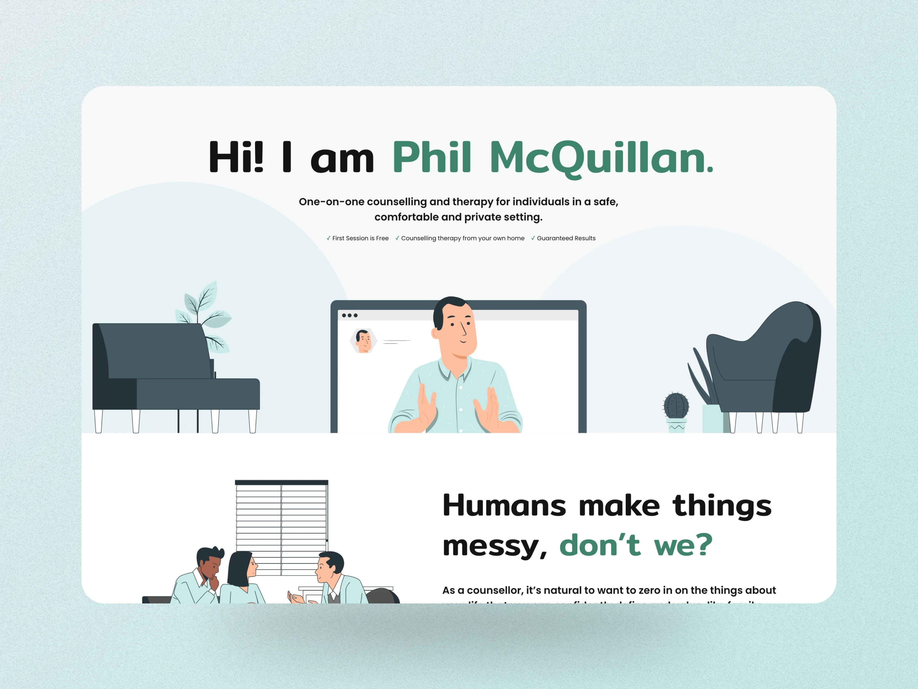
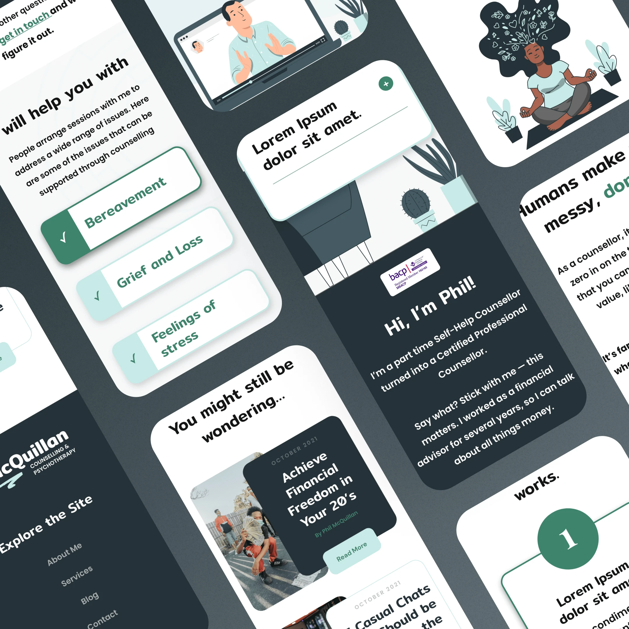
Although Phil treats a wide spectrum of demographics, the fact that most of his patients shared anxiety influenced the design of his new website. To give any potential client reading the information a sense of tranquillity, I made sure the website had a soothing feel with plenty of open space, nice colours, and complimentary illustrations.
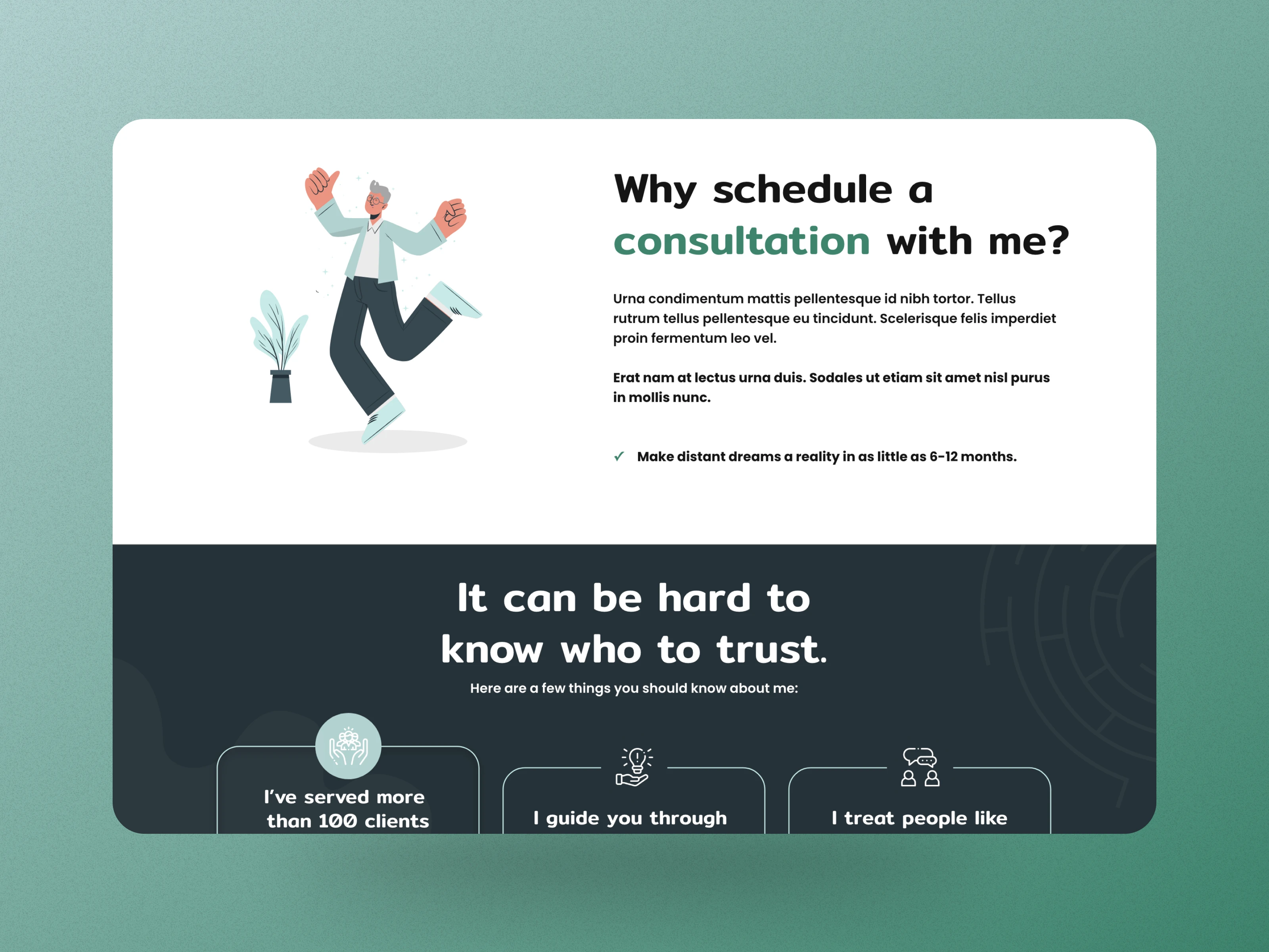
This required me to choose a design that seemed contemporary and professional, utilizing some amazing illustrations to help Phil stand out as the anxiety specialist that he is.
🪄 The Website
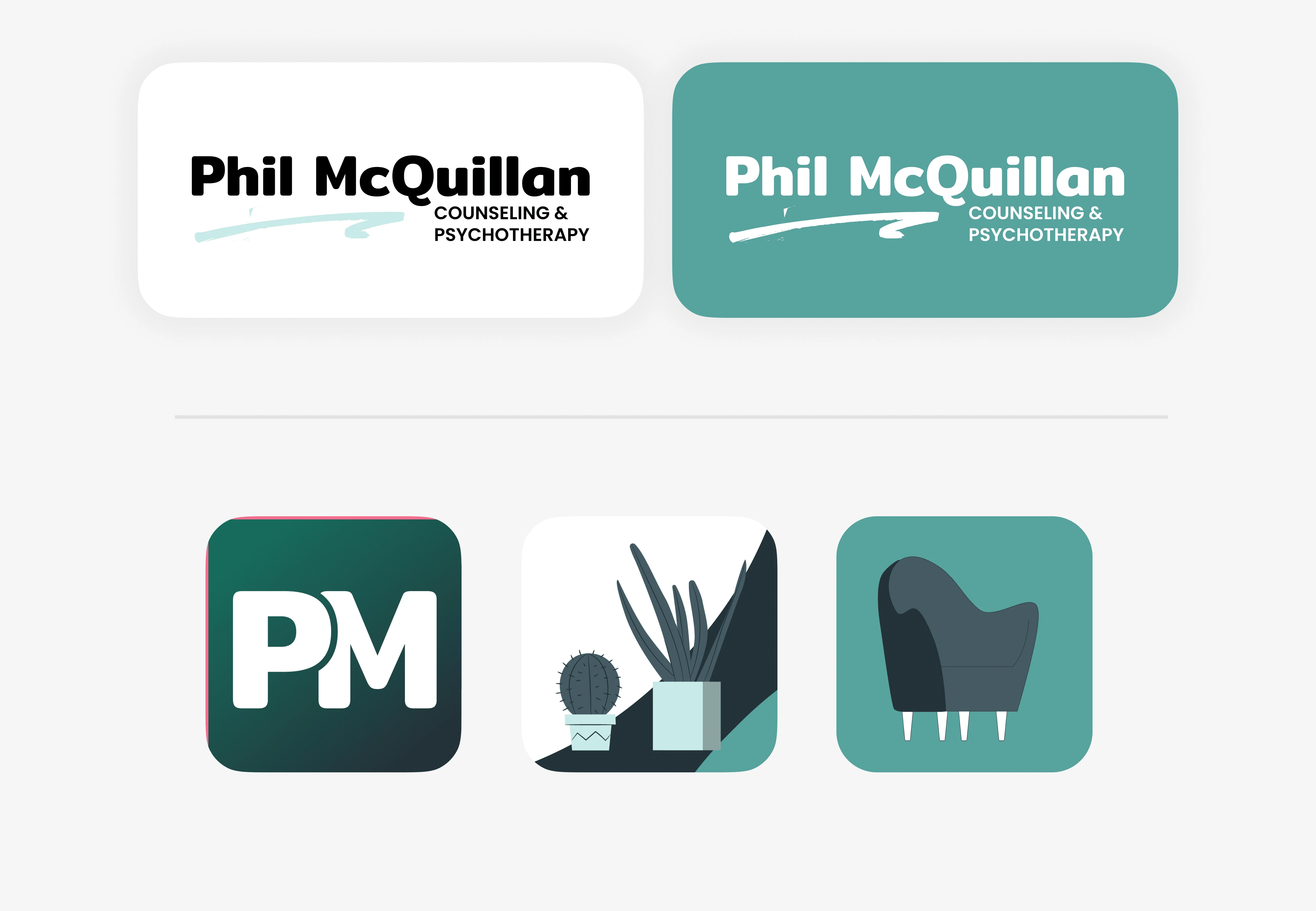
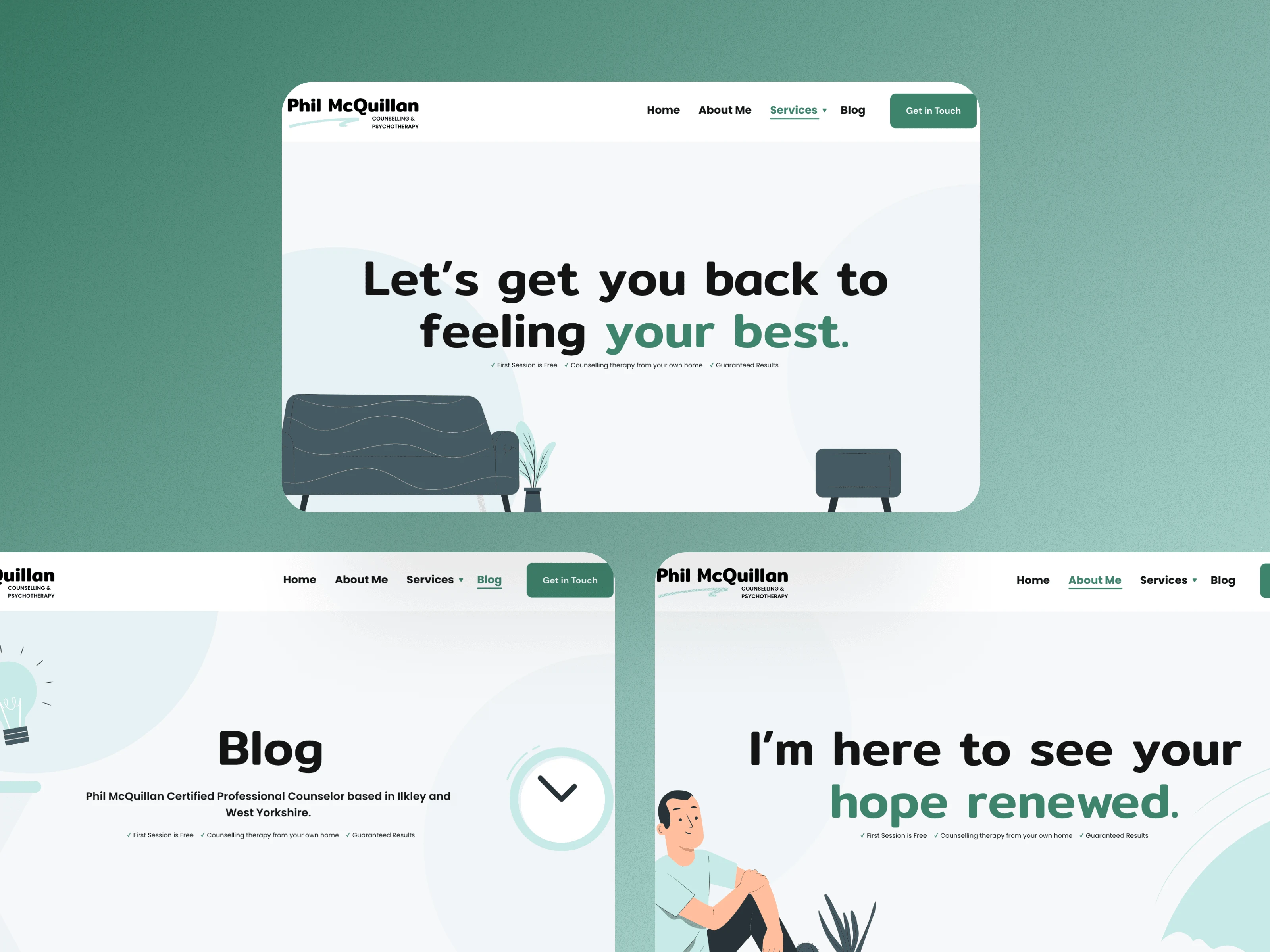
👀 Logos & Brandmark
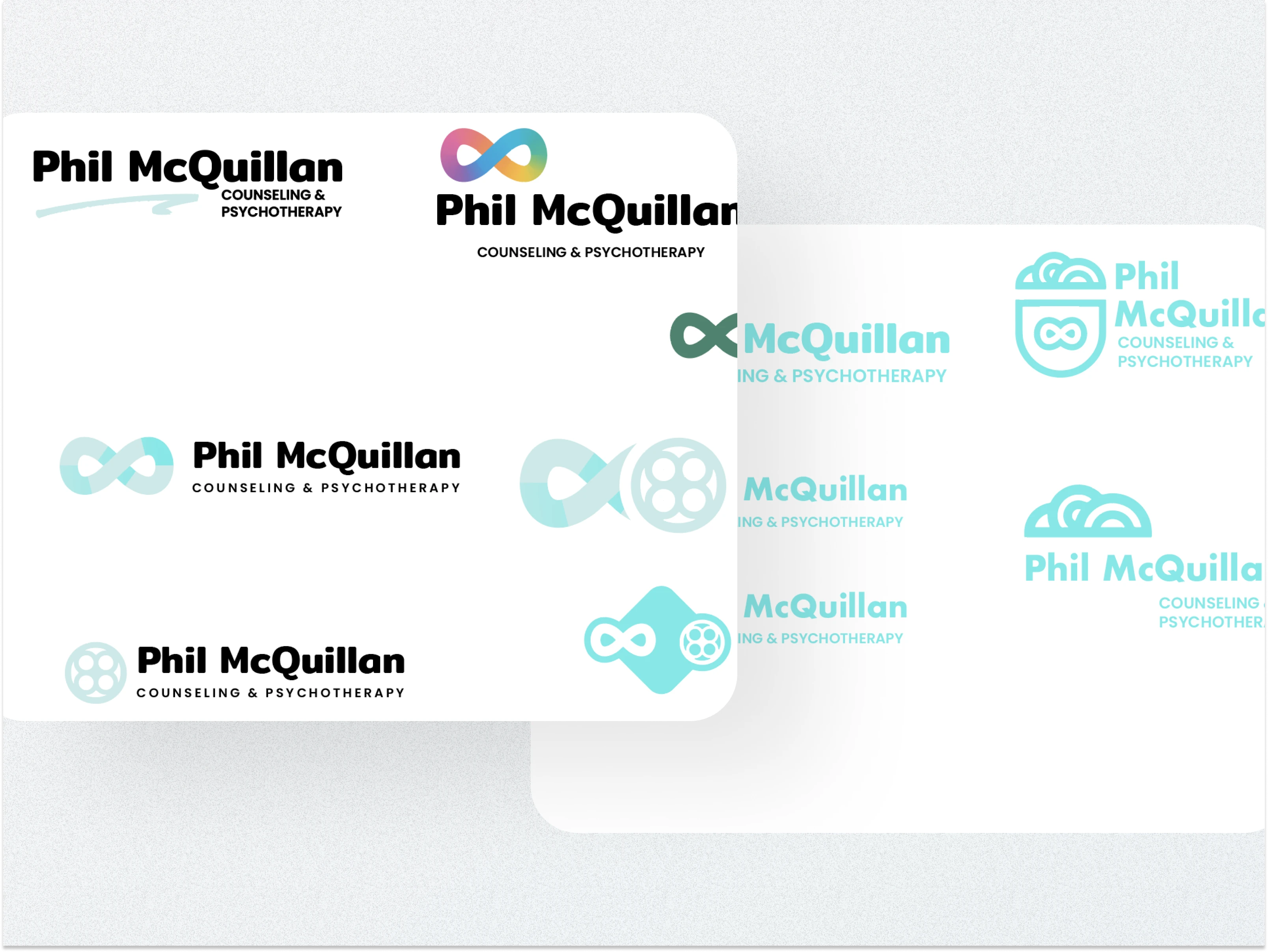
The logo is understated and stylish. To achieve a balanced and approachable aesthetic, I combined bold and delicate elements of typography and doodles. Since this is a personal brand based on Phil's depth of experience, expert psychotherapeutic abilities, and sympathetic nature, the logo highlights his name.
🎨 Colours & Typography
To achieve a calming, polished appearance that is consistent with Phil's brand, I developed a colour scheme based on the traditional green hue.
The qualities of trust and assurance that are essential to Phil's work are connected to the colour green. In order to succeed, clients in this situation must be able to trust and believe in both Phil and themselves.
I choose this soft green so that I could utilise it to highlight key content and call to action.

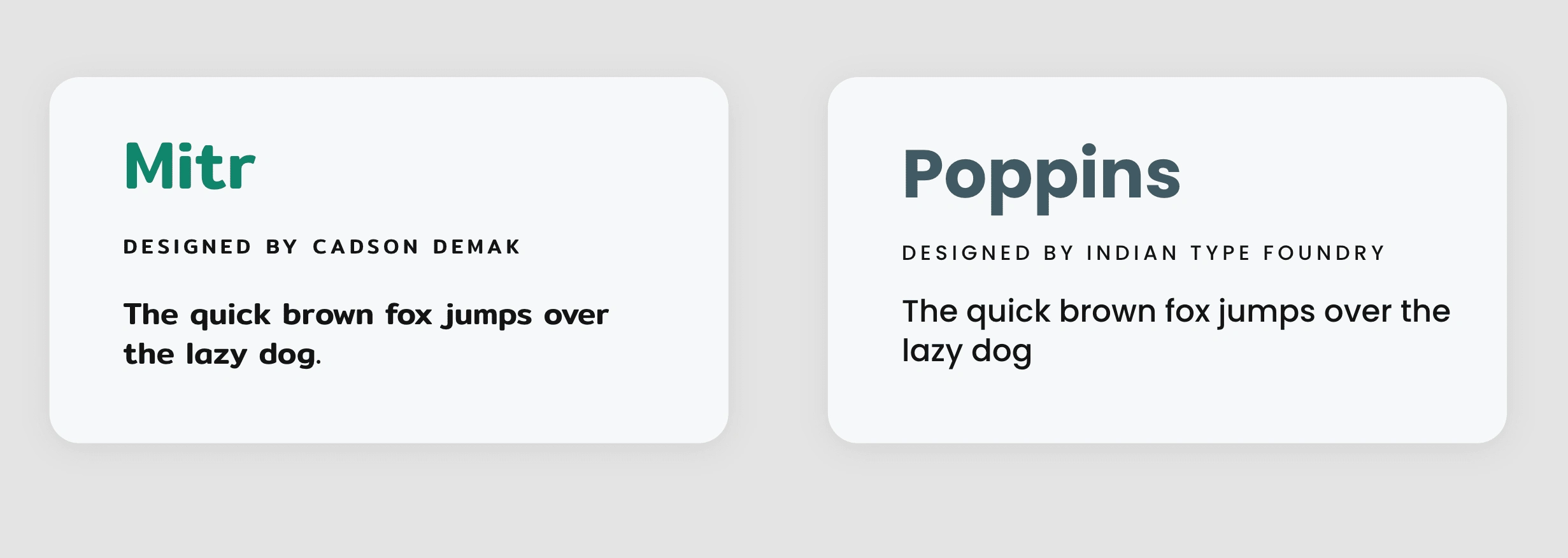
I used Poppins for the body text and Mitr for the headers. Together, these two enduring, traditional typefaces create a sombre atmosphere that is appropriate for the speciality of Phil's work.
👨💻 Final Screens
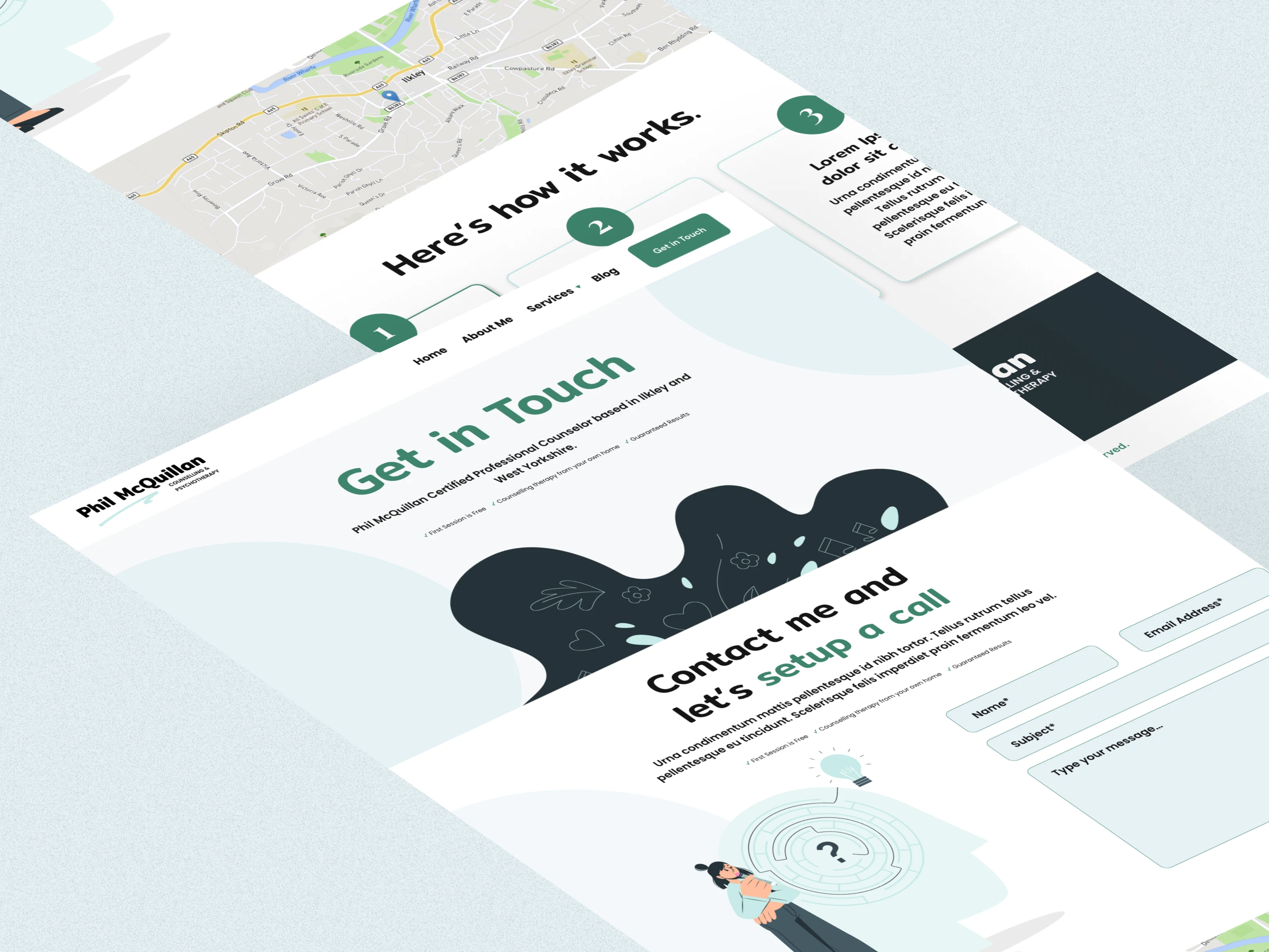
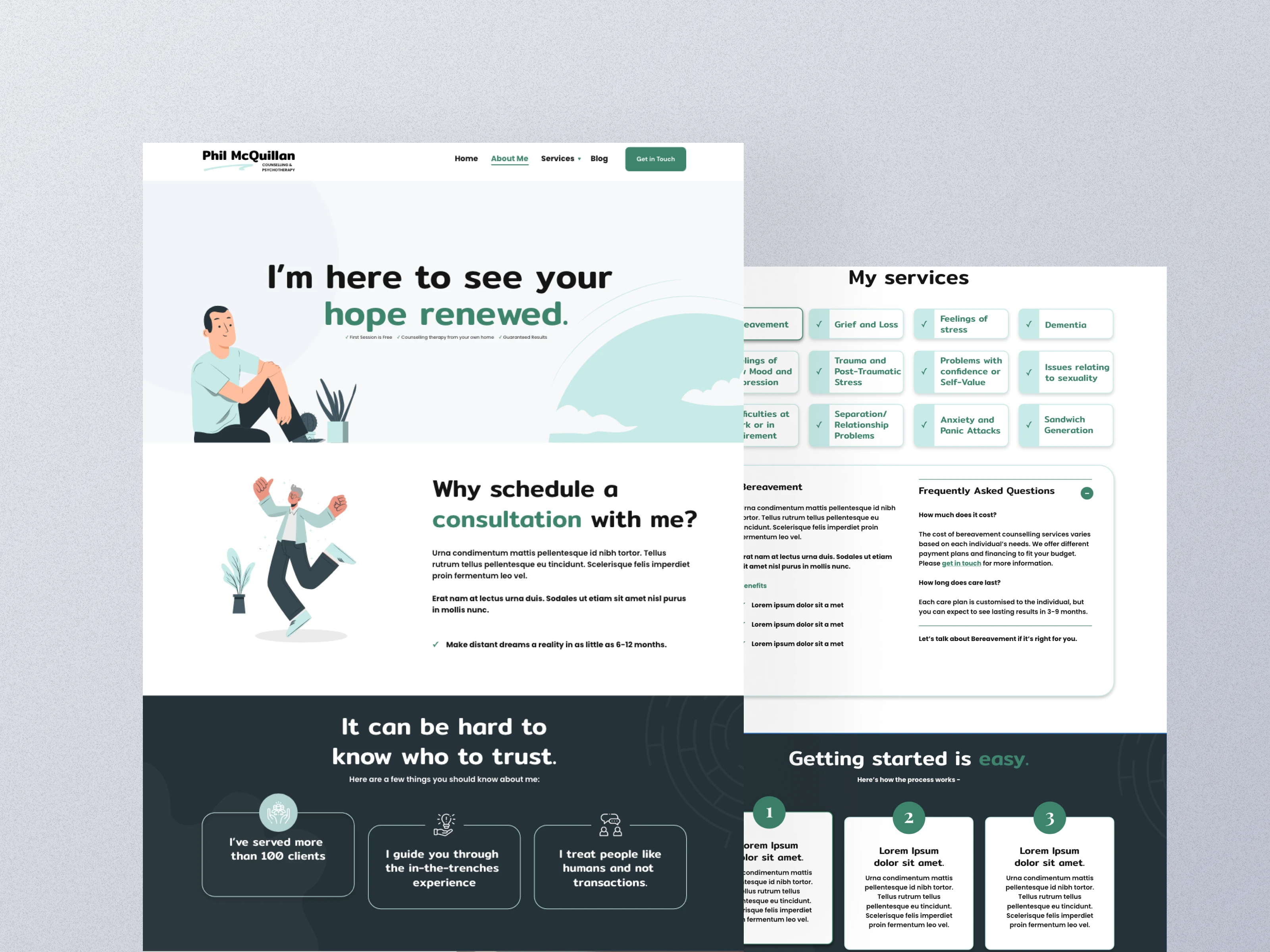
I developed an easy user experience for potential customers of Phil utilising a structured website:
A summary of Phil's company, how he assists his clients, and how people may contact him can be found on the homepage.
To establish Phil as a highly knowledgeable expert and to begin establishing a relationship with the reader, use the about page.
The services page directs potential customers to schedule their first appointment.
A get-in-touch page that lets potential leads turn into customers through an easy-to-fill-out form.
A blog page with free articles that establish Phil as an authority and foster a lifelong relationship with your readers.
In order to make Phil's website accessible whenever his clients were seeking for him, I also used SEO best practices.
🚀 Full Designs
✅ The Results
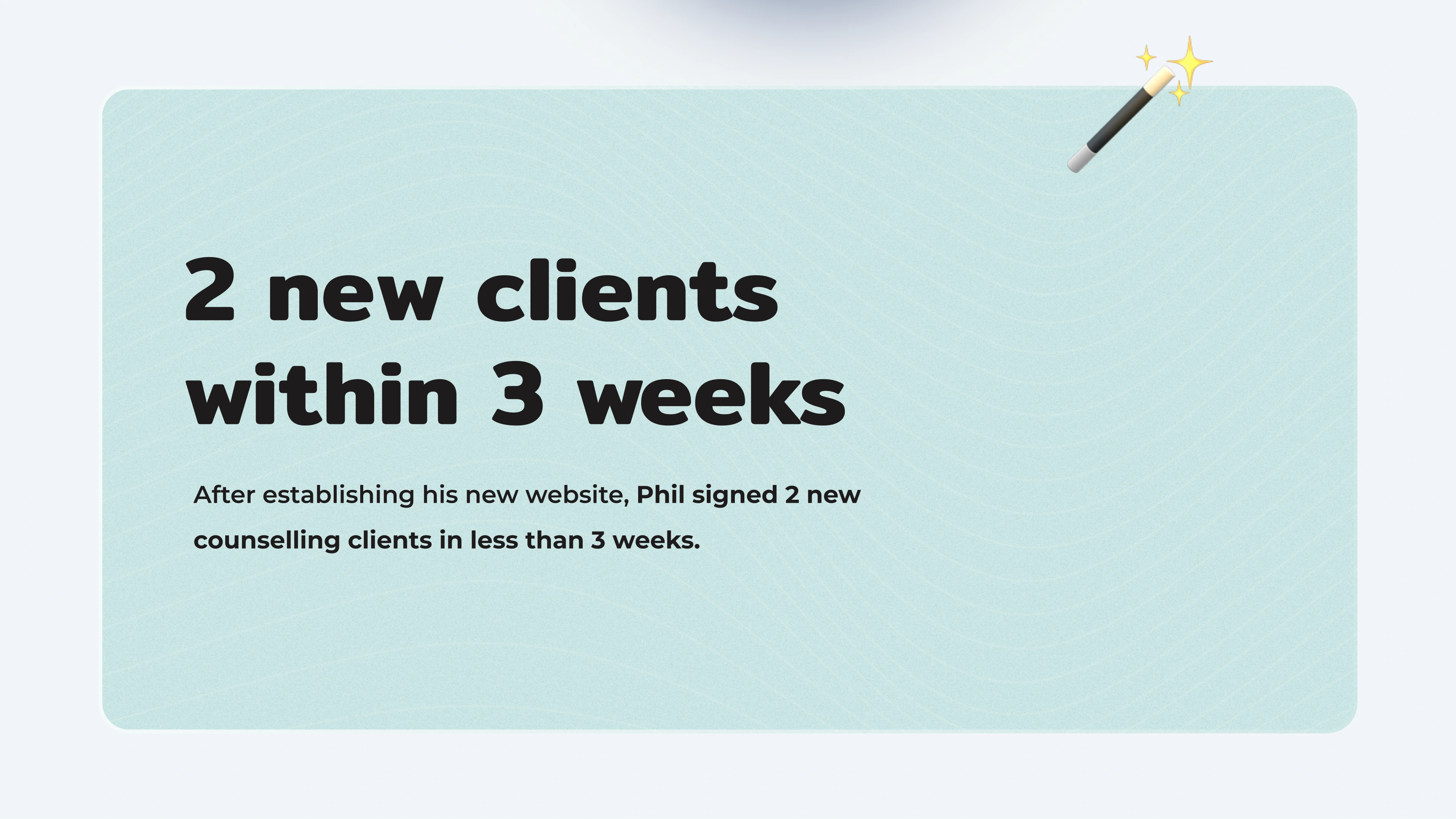
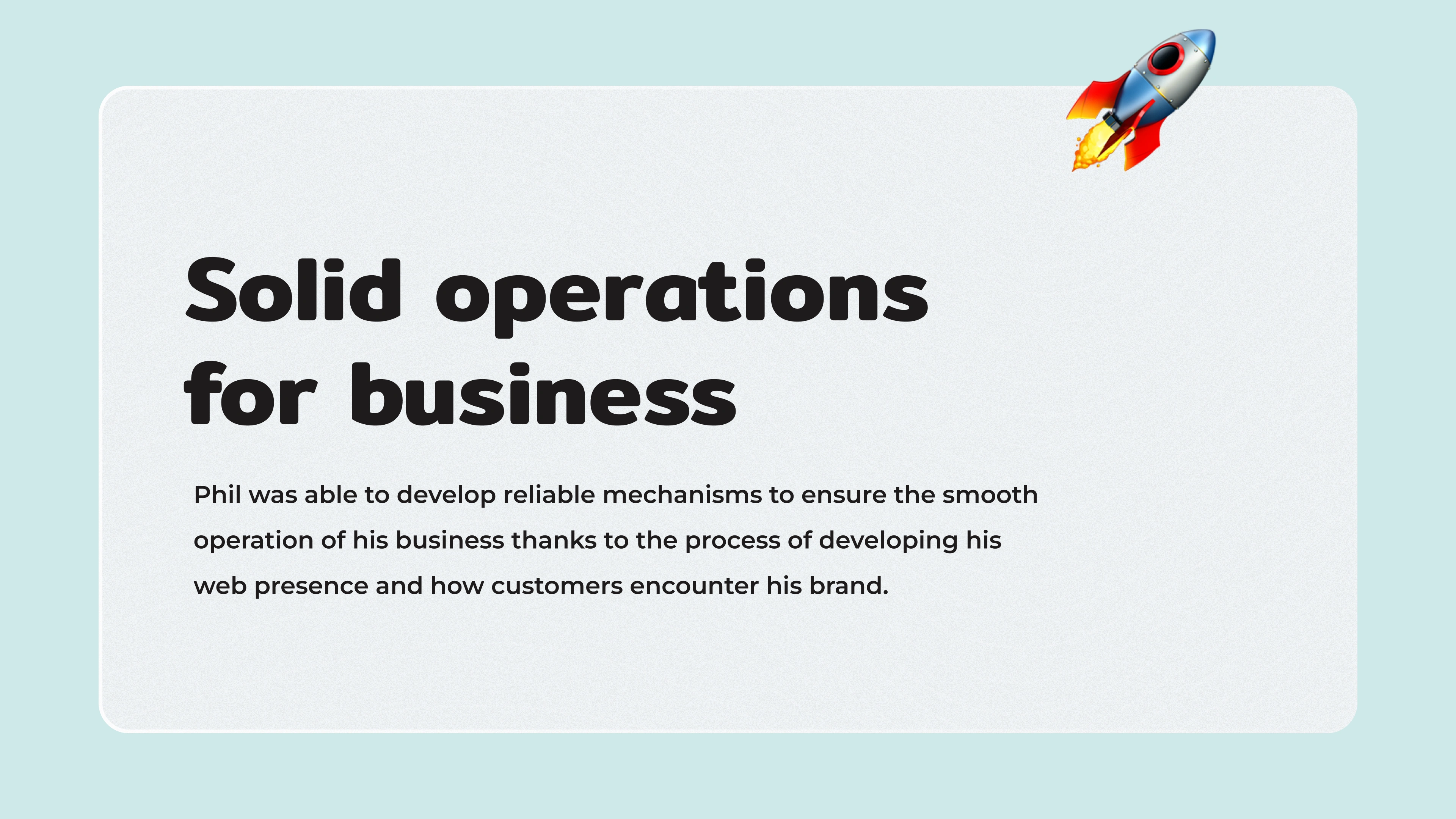
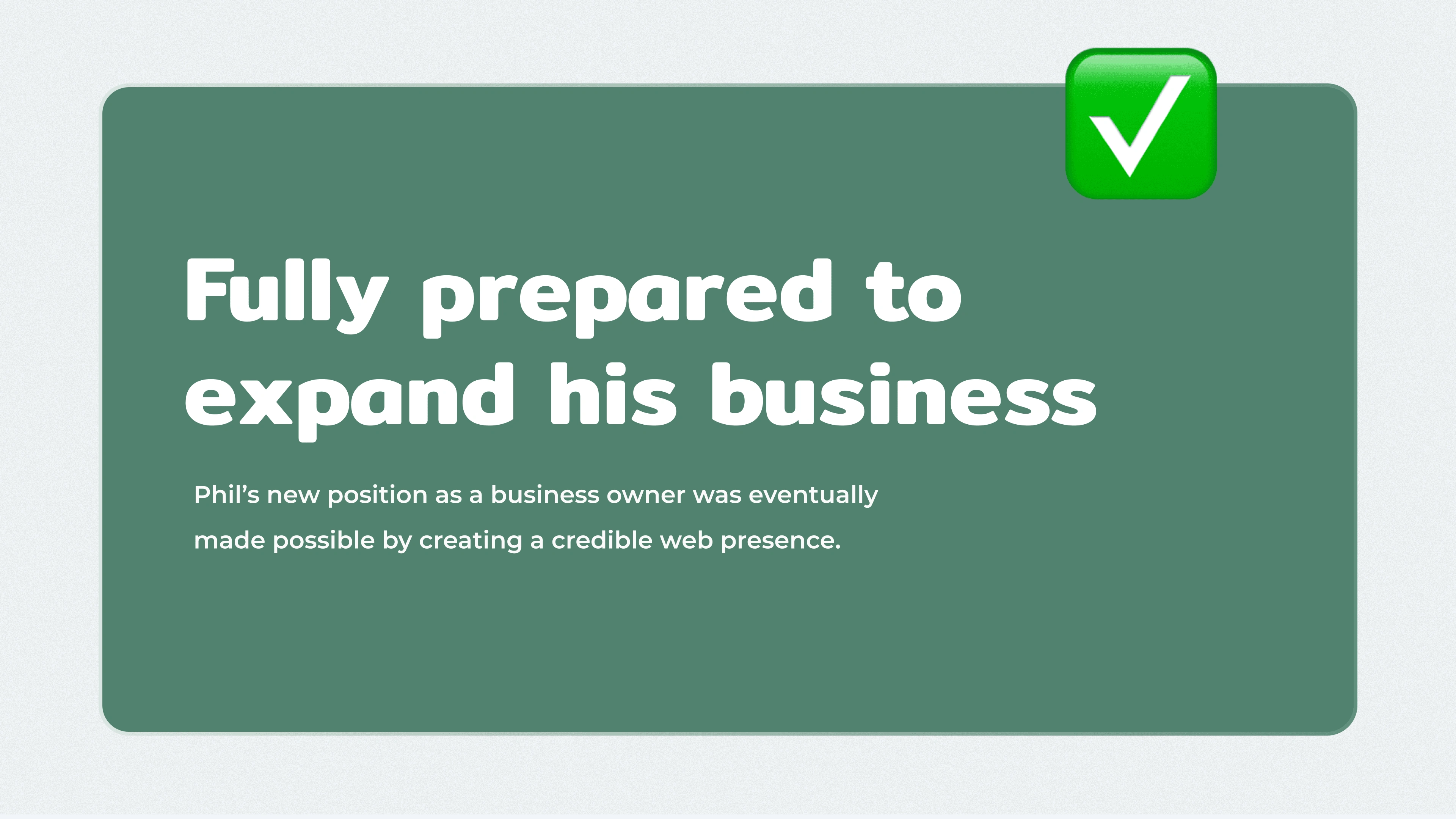
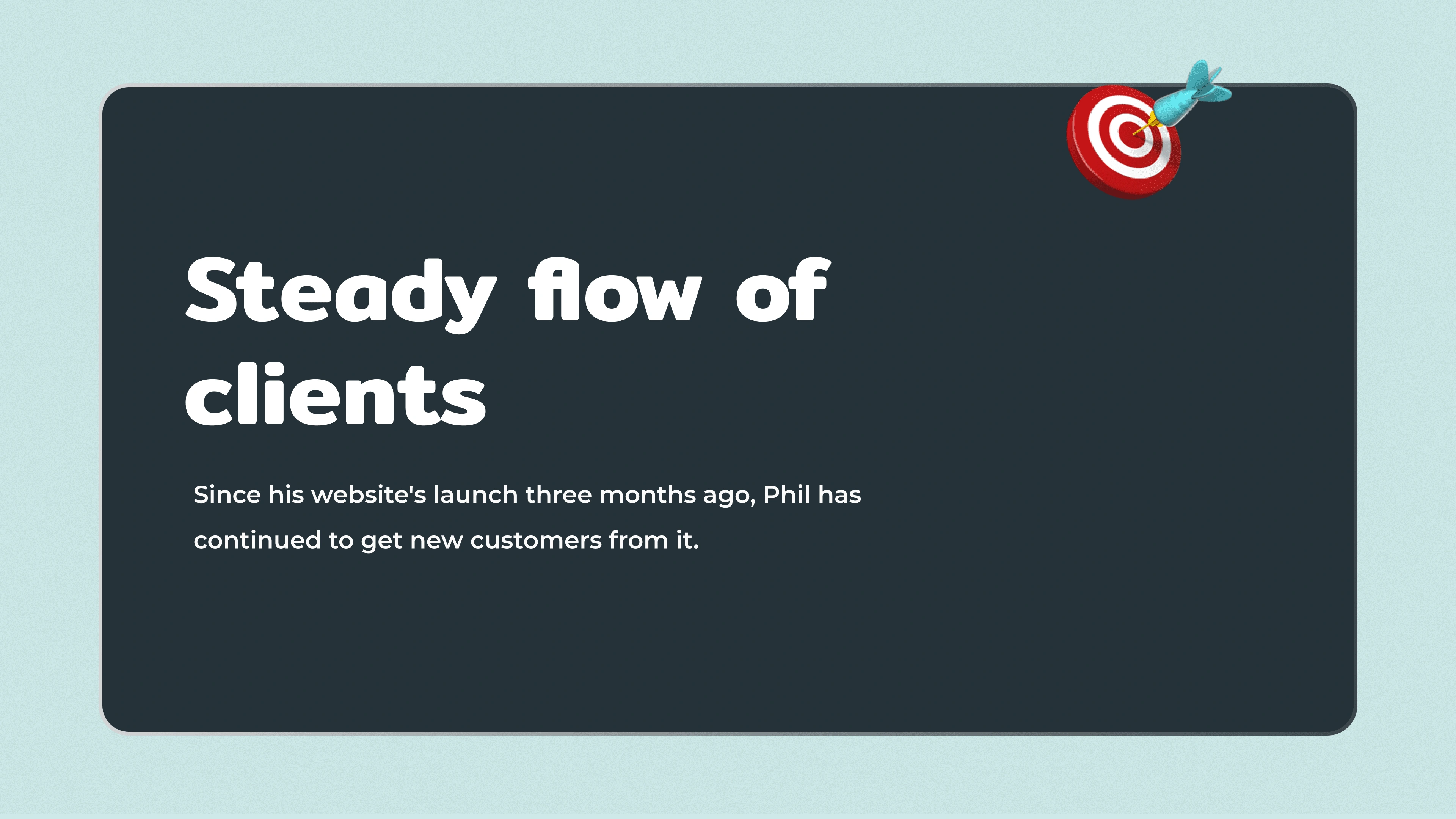
Phil was overjoyed with his new website and immediately began utilising it to expand his company.
Here are a few highlights of the project.
🔥 The Flame
Hope you enjoyed scrolling through this piece of work. I really appreciate you spending a few minutes of the day to see my thought process behind creating this brand and showcasing its different applications.
If you want to see more of my work you can visit my Instagram page or scroll on down to see my portfolio.
✅ Are you ready to kickstart your online website? Let's build a welcoming online space for your business by getting in touch.
Like this project
Posted Oct 23, 2022
Phil McQuillan is a qualified integrative psychotherapist. People come to see him about anxiety, panic attacks, stress, trauma, low confidence and depression.
Likes
0
Views
451