⛳ Golf Escapes - Travel Booking Website (UI/UX)
📝 Introduction
🏌️ FORE! Golf enthusiasts, listen up! Are you tired of spending hours searching for the perfect golf vacation? Do you dream of teeing off on the world's most breathtaking courses, but get bogged down in the overwhelming details of planning the trip? Look no further! Introducing Golf Escapes, a platform that takes the hassle out of planning your golf getaway.
💡 In this UX case study, I'll walk you through the user research, problem statements, and design solutions that went into creating this platform. From personalized packages to accurate information and booking process guidance, we'll explore how Golf Escapes became the go-to platform for golf enthusiasts around the world. So grab your clubs and let's dive in!
💯 The Stats
Timeline: January - March 2022
My Role: UI/UX Designer, Product Designer, Web Designer
Deliverables: Responsive Website Design, Page Design, User Flow & Journey
Company: SEO Travel x Golf Escapes
As a UI/UX designer, my role in this project is to ensure that the platform's design is user-centered and easy to use. I will be responsible for conducting user research, analyzing user feedback, and creating design solutions that are intuitive, efficient, and enjoyable to use.
This UX case study was carried out while I was a UI/UX designer at SEO Travel. My goal was to create a seamless booking experience for golf enthusiasts around the world. Through this project, I learned the importance of understanding user needs and preferences and designing solutions that exceed their expectations.
🧨 The Problem

Golf enthusiasts often face challenges when booking their golf vacations. These challenges include limited information on available golf courses and travel options, lack of flexibility in customizing their vacation packages, and inadequate guidance throughout the booking process. These issues often lead to a suboptimal travel experience and discourage golf travelers from returning to the platform.
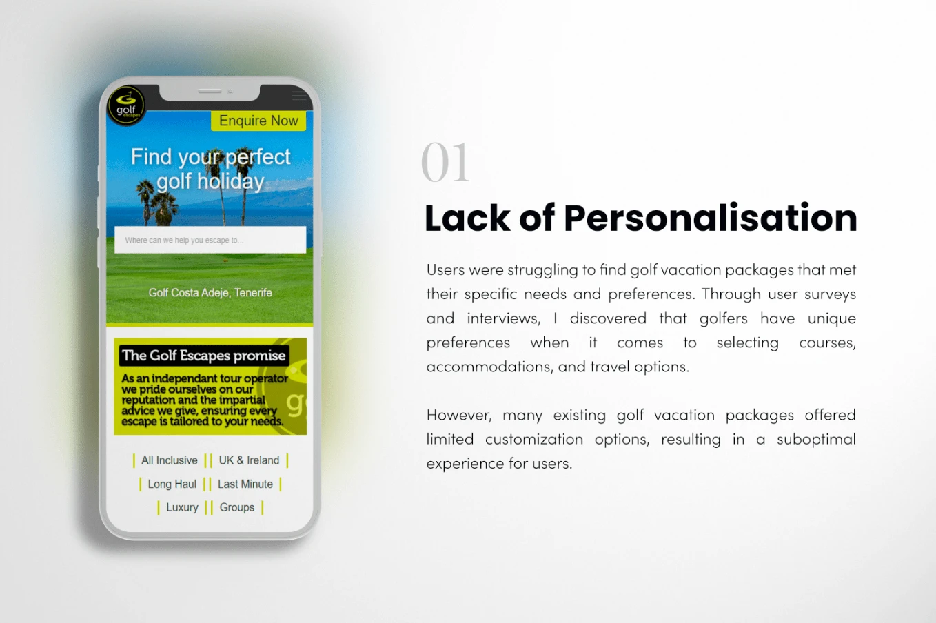
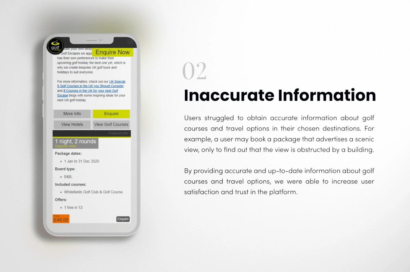
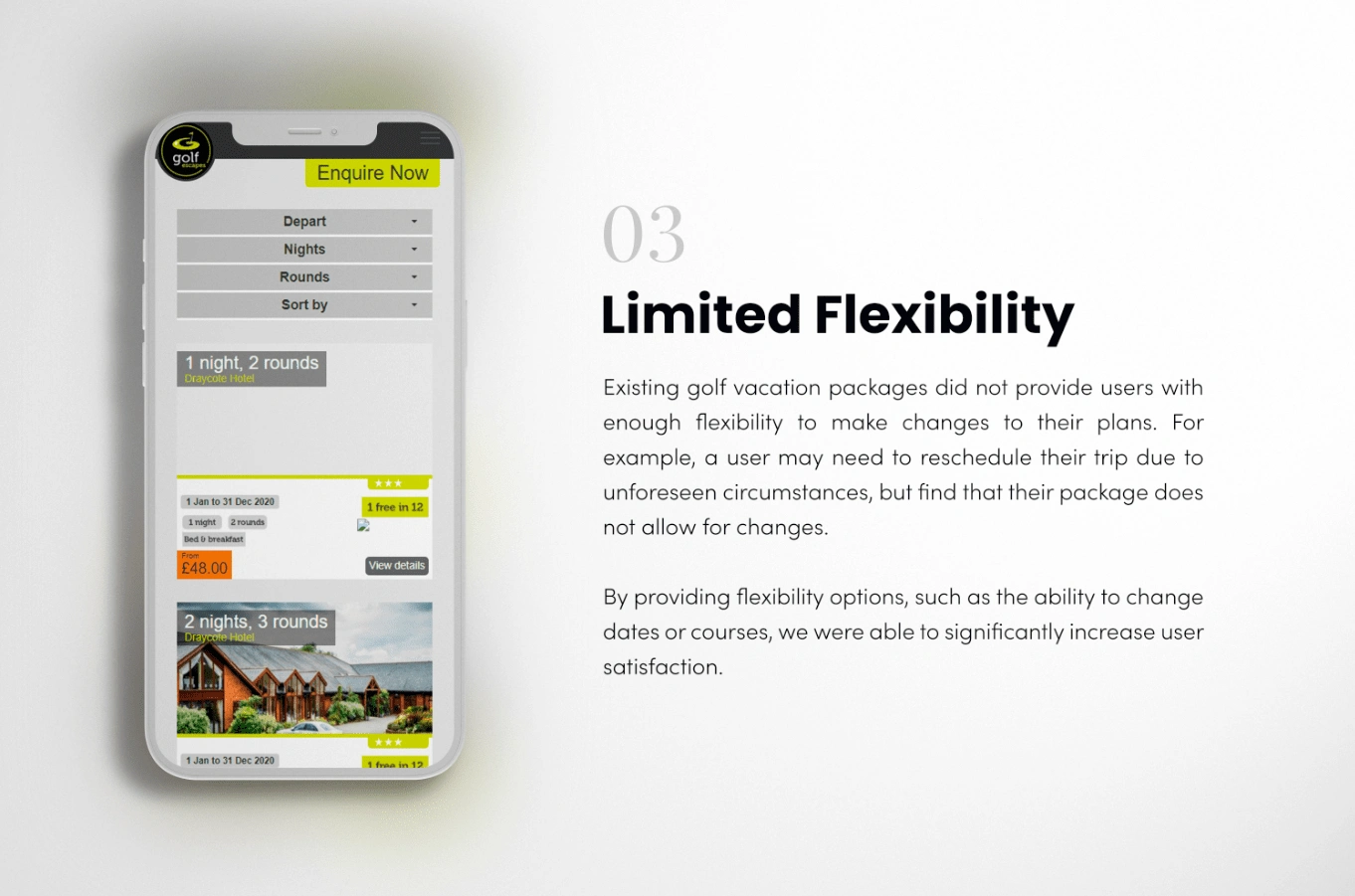
My role was to identify and address the core problems that users were facing on the existing website. Through user research and analysis, I uncovered the following pain points:
⭐️ Objectives
Increase User Satisfaction
The primary goal was to create a platform that meets the unique needs and preferences of golf enthusiasts, providing them with a seamless and enjoyable user experience. By addressing the pain points identified in our user research, we aimed to significantly improve user satisfaction and loyalty.
Build Brand Trust
I understand the importance of building trust in a brand to attract and retain customers. By providing accurate and up-to-date information, ensuring responsive customer support, and designing a user-friendly platform that meets the unique needs of golf enthusiasts, we aimed to establish Golf Escapes as a reliable and trustworthy platform for booking golf vacations. This, in turn, would drive brand loyalty and word-of-mouth marketing, ultimately leading to the success of the platform in the long run.
Create an Engaging and Social Experience
Design features that encourage users to interact with the platform beyond booking a golf vacation. By incorporating personalized recommendations, social sharing options, and other interactive elements, we aimed to make the platform more fun and engaging for users, leading to increased brand loyalty and user retention.
Optimize for Conversions
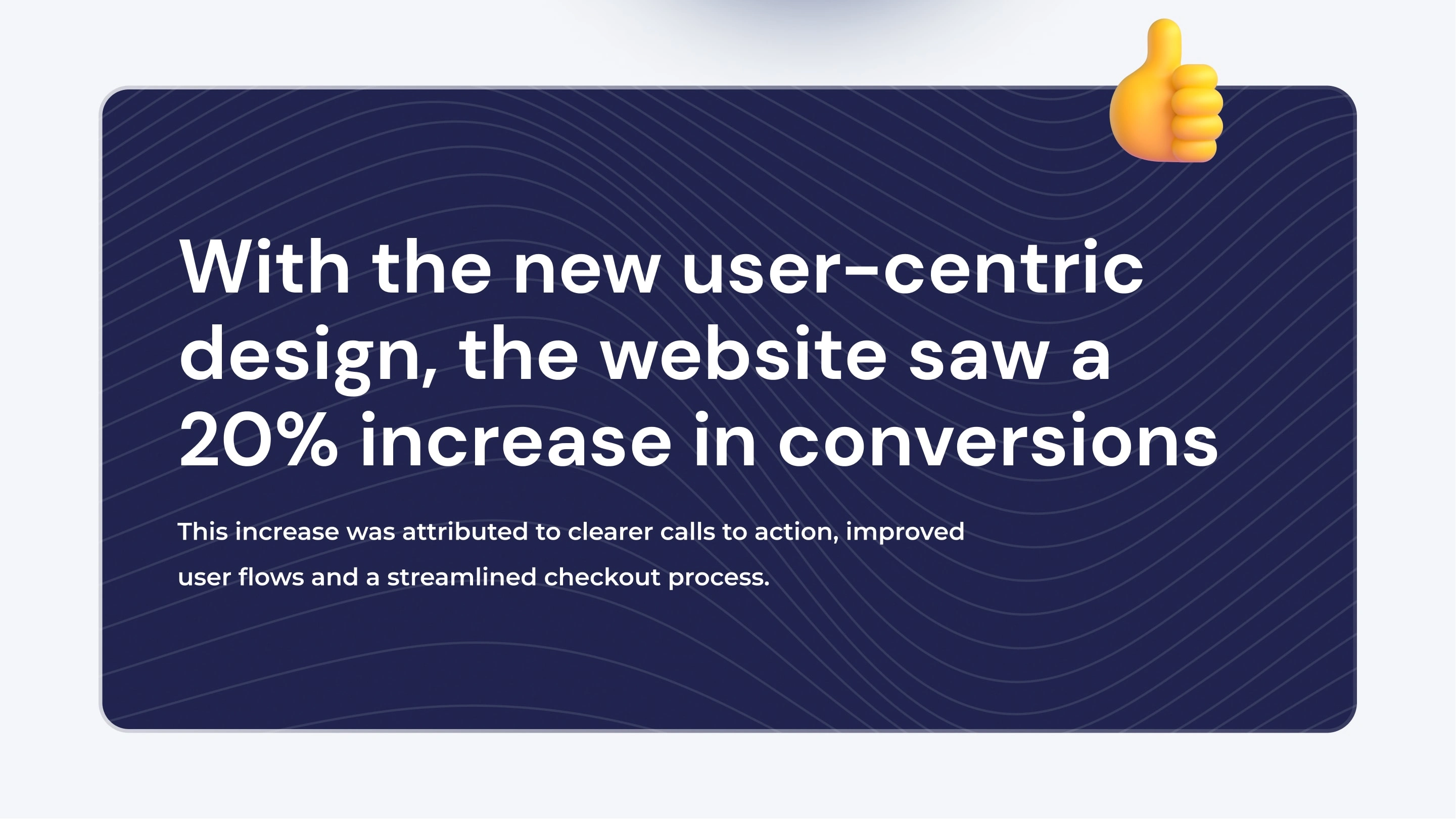
The focus was on optimizing the user experience for conversions, ultimately driving revenue for the platform. By designing clear and intuitive booking flows, providing transparent pricing information, and offering flexible booking options, we aimed to increase successful bookings and maximize revenue for Golf Escapes.
⛳ Understanding the User
User Research
In order to design a seamless booking experience for golf enthusiasts, we needed to understand their needs and preferences. To research the users, I will use a combination of quantitative and qualitative research methods. I will conduct surveys, interviews, and usability tests to gather insights into the needs, preferences, and behaviors of golf enthusiasts. I will also analyze data from user feedback, website analytics, and social media to gain a deeper understanding of user needs and preferences.
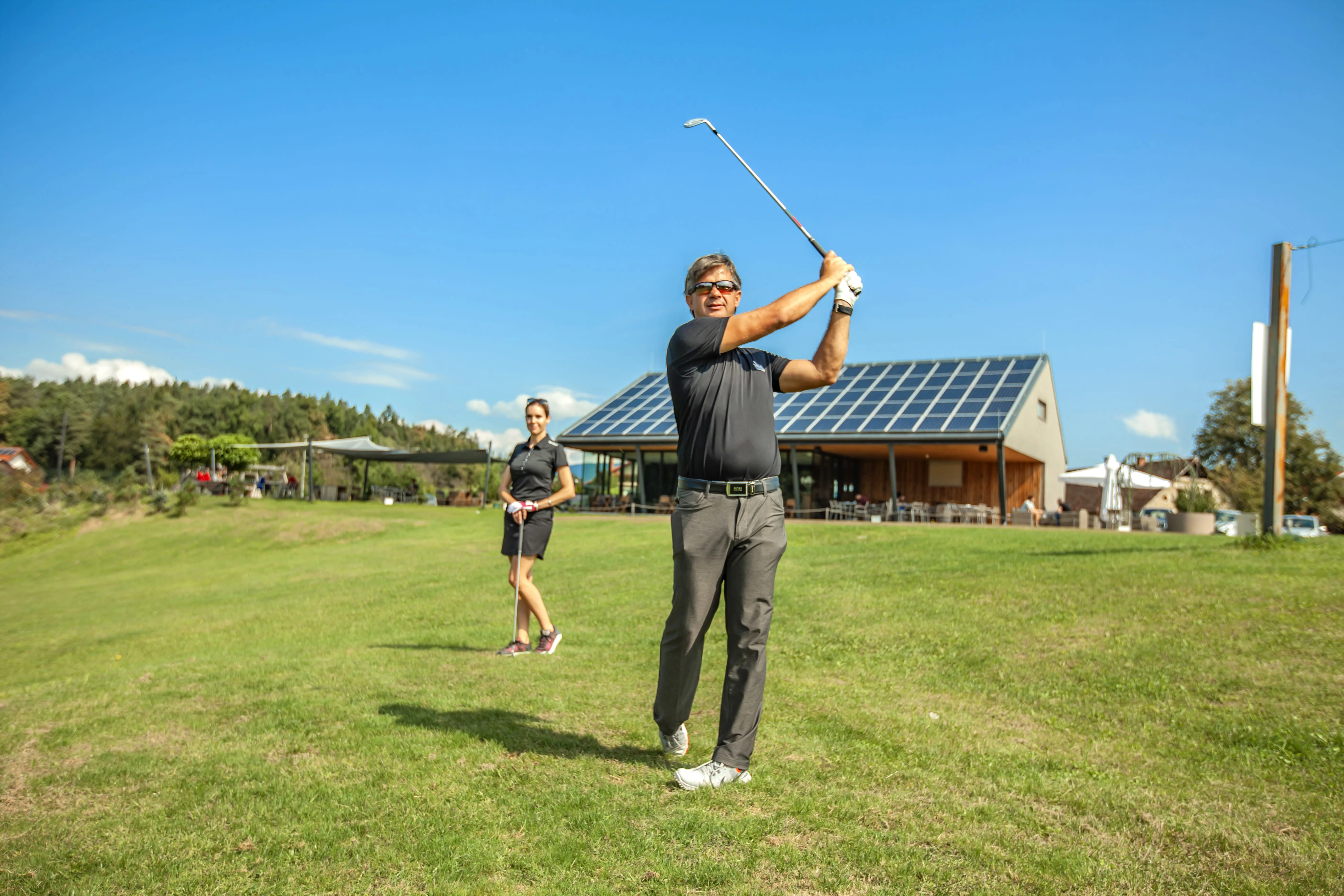
Qualitative research
In-depth interviews: We conducted 4 in-depth interviews with golf enthusiasts to understand their attitudes toward golf travel, their booking behaviors, and their pain points.
Usability testing: We conducted 2 rounds of usability testing to evaluate the effectiveness of the design solutions, identifying areas where users struggled and making improvements to the design to address these issues
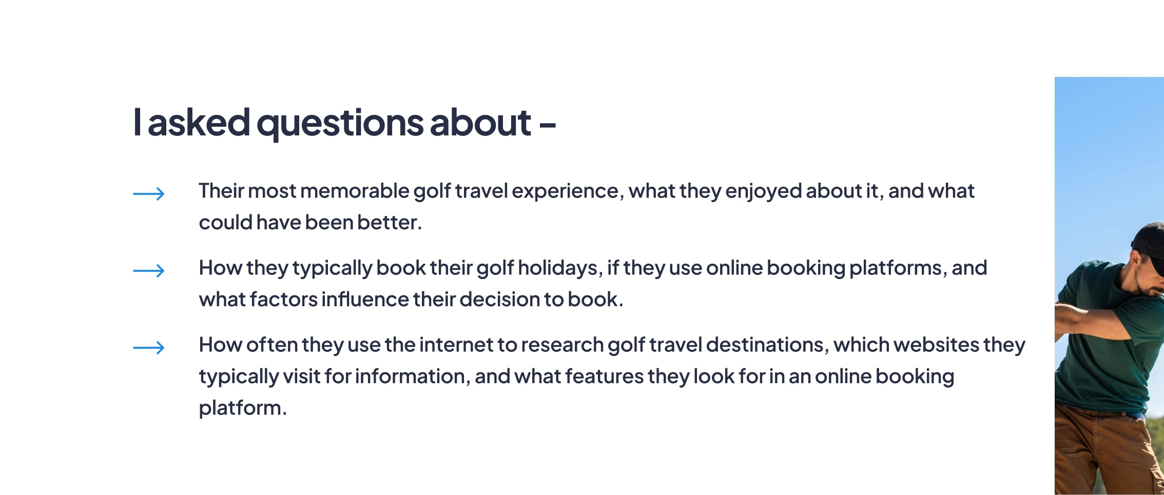
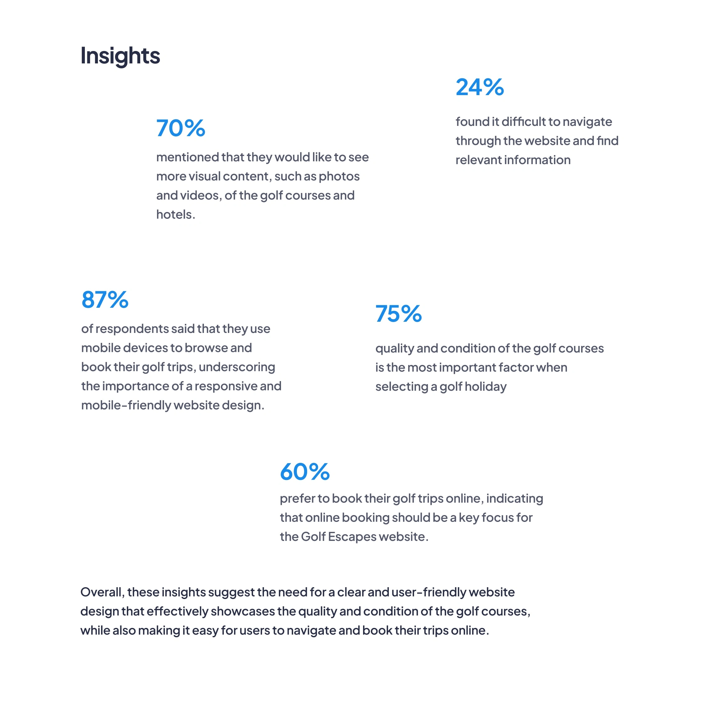
Quantitative research
Transaction data analysis: We analysed transaction data of over 100 conversions to identify patterns and trends in user behaviour, including CTA performance and copy elements for the booking widgets.
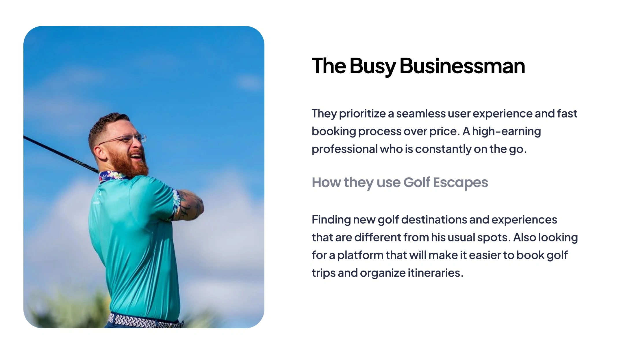
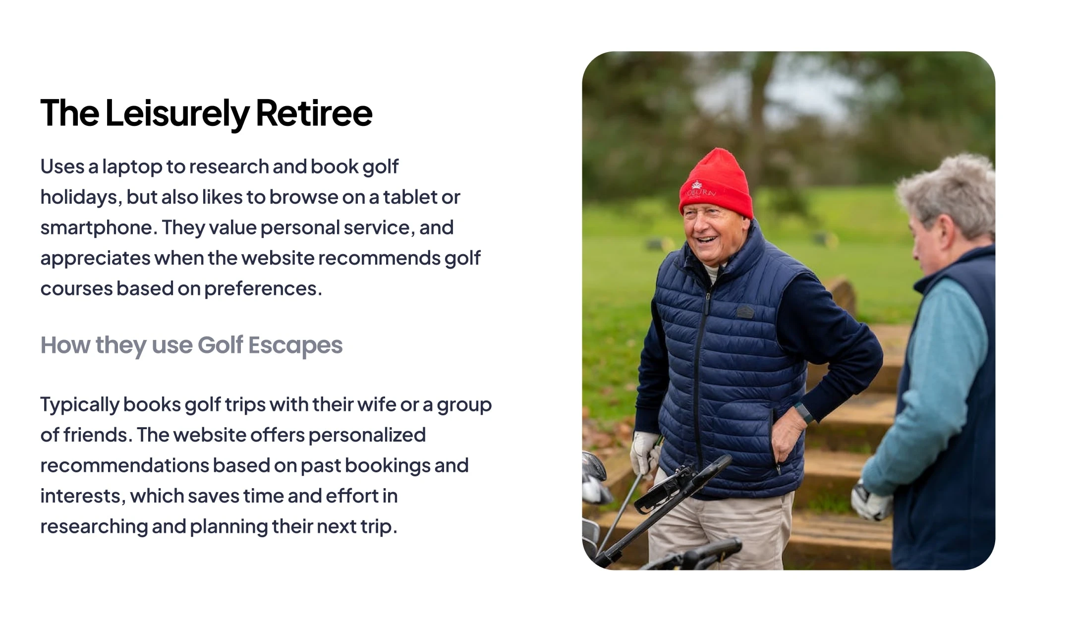
The Users
💻 Design Process
Design Sprints
We followed a five-day design sprint process to quickly ideate, prototype, and test new solutions. This helped us to efficiently iterate on different concepts and arrive at a viable design direction.
User Flows
We created detailed user flows to map out the user journey and identify pain points and opportunities for improvement. This allowed us to optimize the user experience by removing friction and creating a seamless booking process.

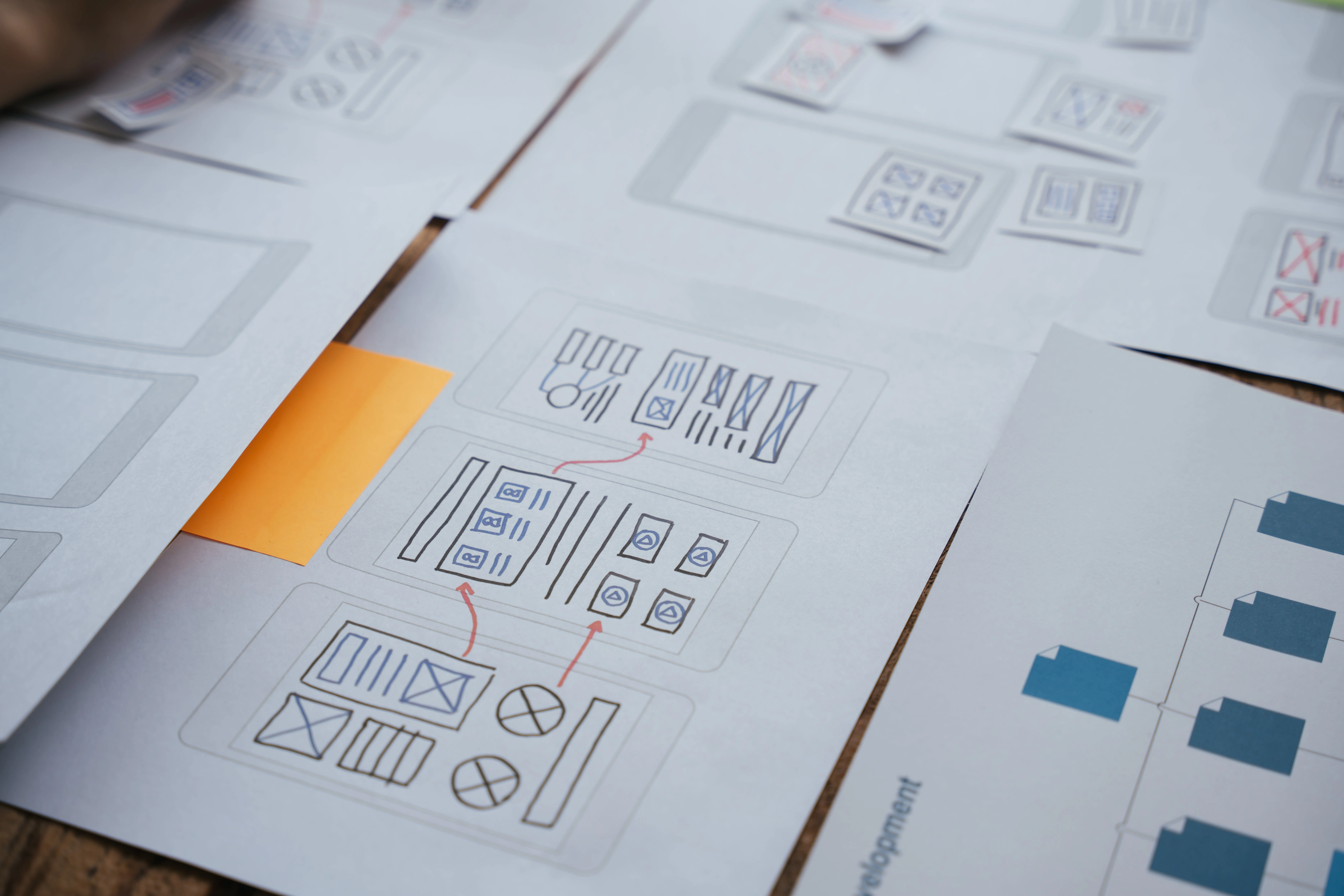
Sketches
We started with rough sketches of our design concepts to quickly explore different ideas and iterate on our designs. This helped us to refine our ideas before investing significant time in creating detailed prototypes.
Early Design Iterations
We created early design iterations using low-fidelity wireframes to quickly test and validate our concepts. This allowed us to gather feedback and refine our designs before moving on to more detailed prototypes.
Overall, our design process was iterative, user-centered, and focused on creating a seamless and enjoyable booking experience for our users. By following a structured design process, we were able to create a highly effective design solution that met the needs and expectations of our users.
Usability Testing & Customer Interviews
Once we had a high-fidelity prototype of the website, we conducted usability testing with 8 participants who fit our user personas. The usability testing helped us to identify areas of the website that were confusing or unclear to users.
We also conducted customer interviews with 4 golfers who had booked a golf holiday in the past year. These interviews allowed us to gain deeper insights into the booking process and the pain points that users experienced during their booking journey.
The feedback we received from both the usability testing and customer interviews was invaluable in refining the website design and ensuring that it met the needs and expectations of our users.
✅ Final Designs & Impact
Streamlined Navigation
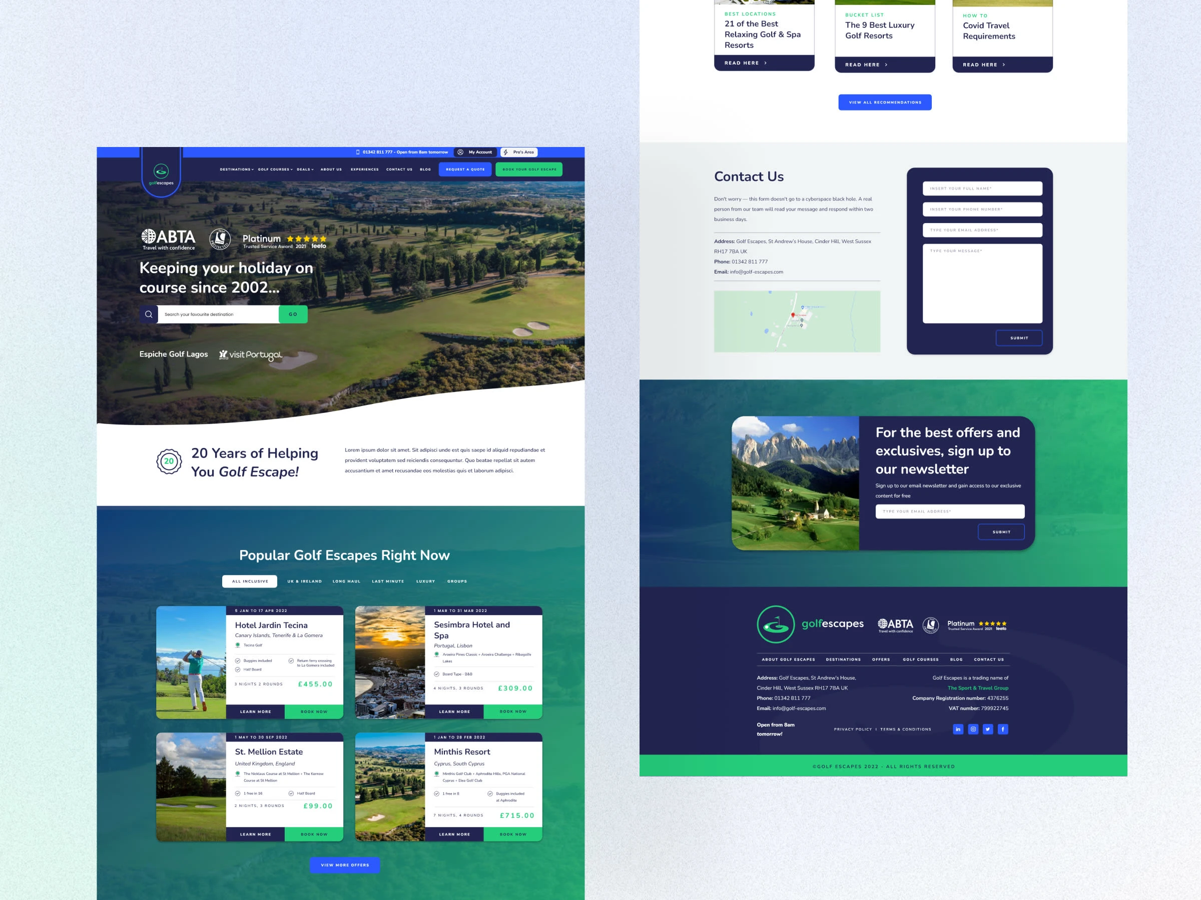
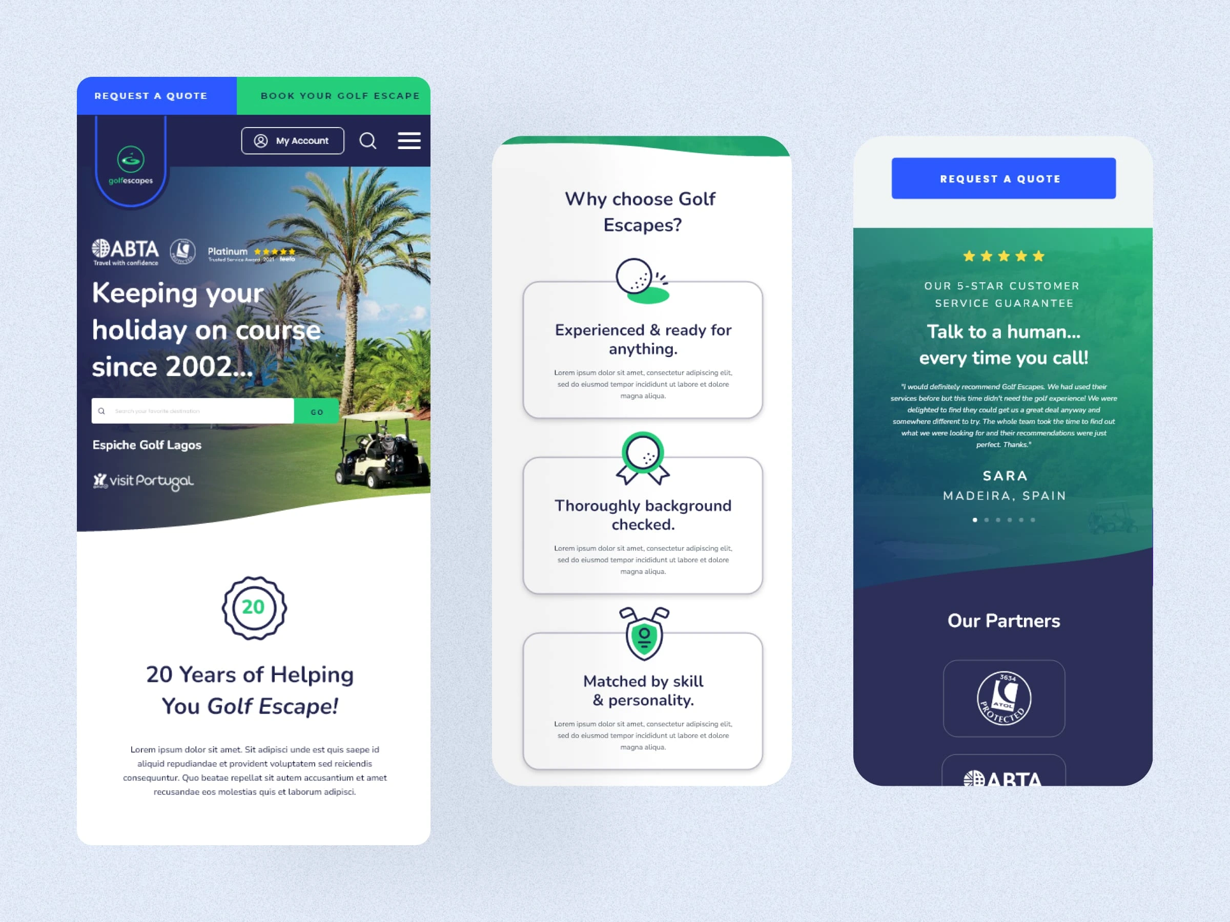
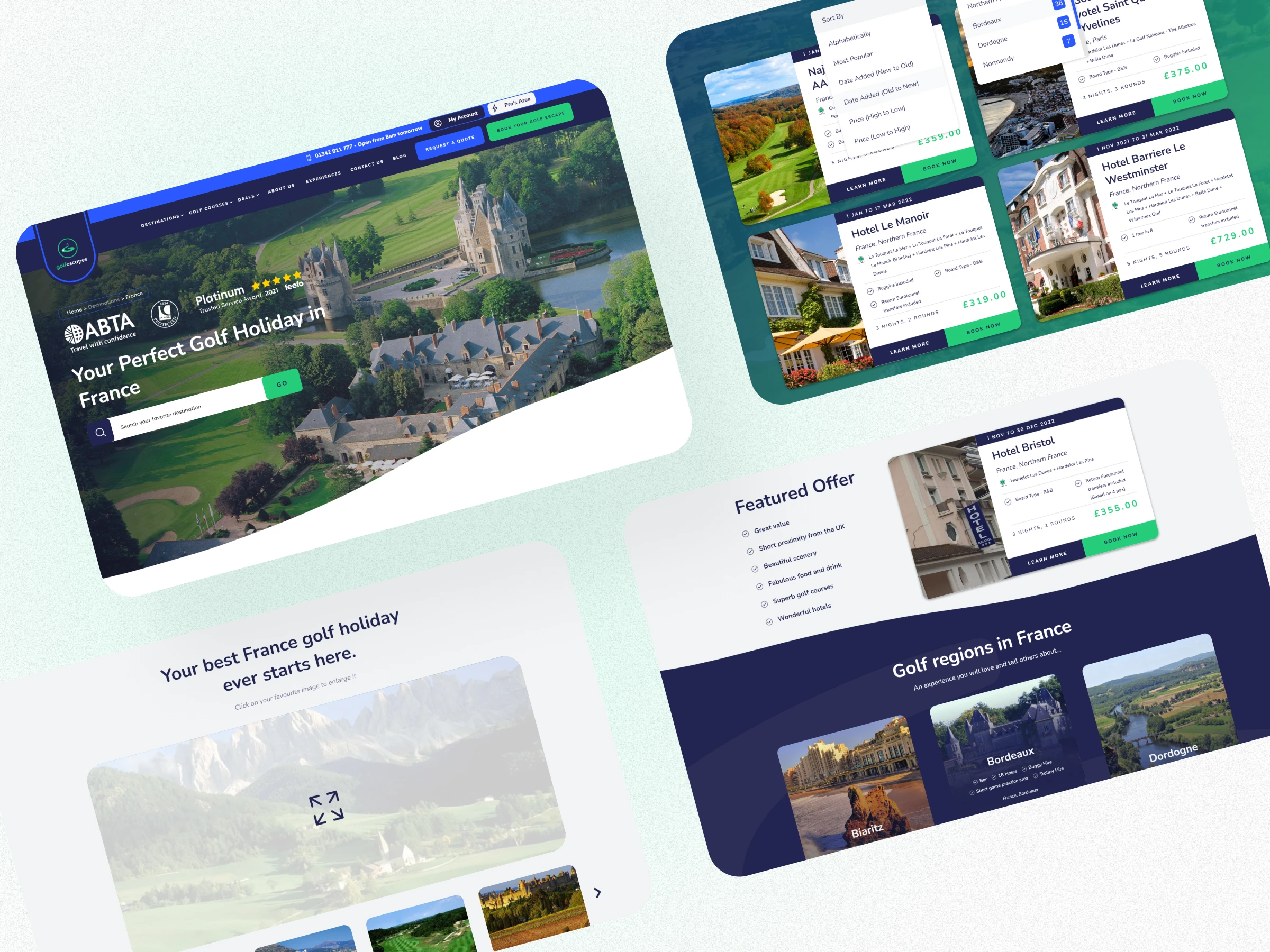
We created a clear and concise sitemap that organizes the content into meaningful categories and subcategories. The final navigation design features a sticky header with drop-down menus, breadcrumbs, and search functionality.
Engaging with Users: Incorporating Feedback for Continuous Improvement
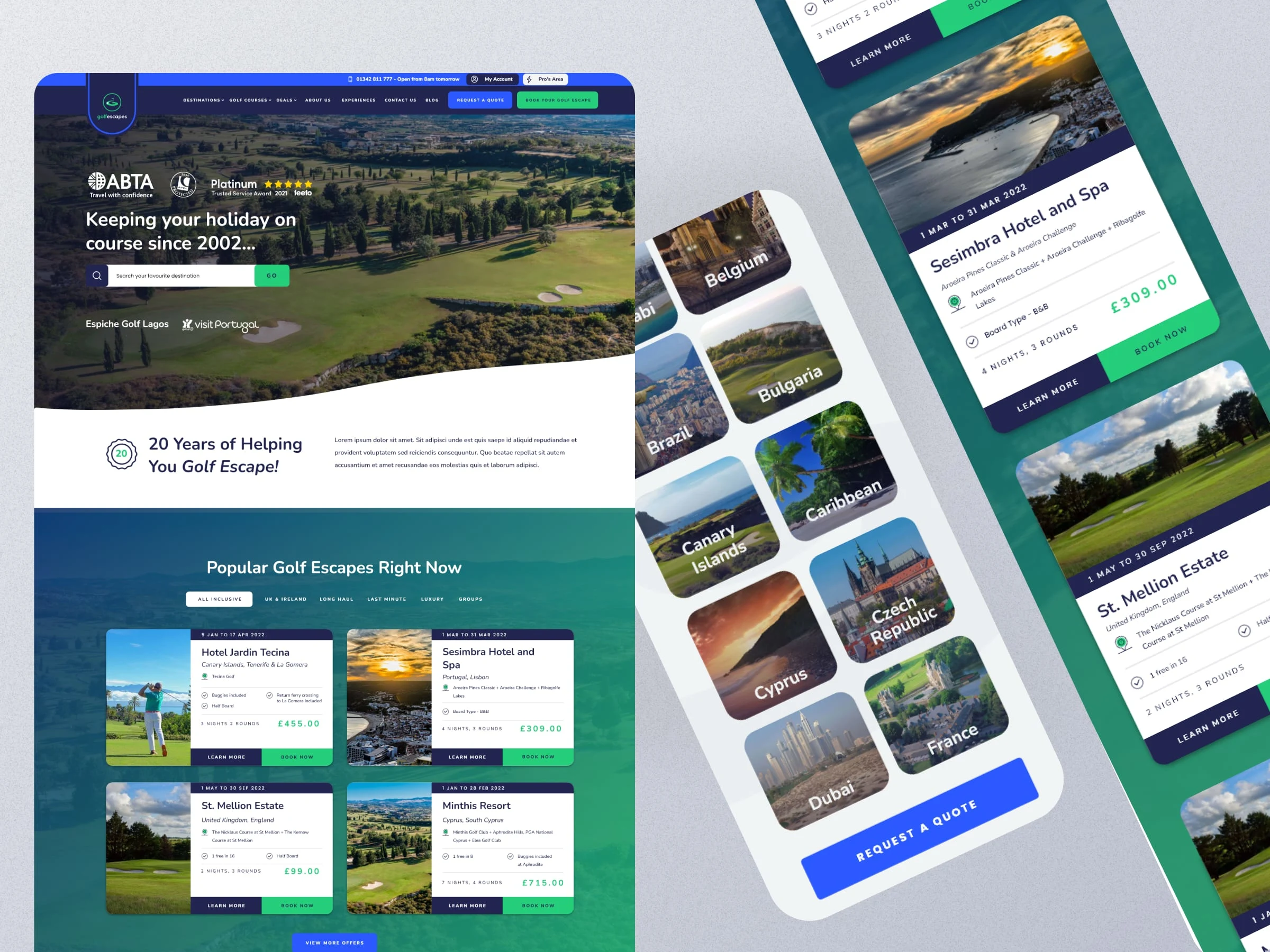
I created a consistent and compelling design language for the product pages that showcase the golf courses, hotels, and packages. We used high-quality photos, videos, and a local map with pin locations to give users a realistic and immersive experience. We also added social proof elements such as customer reviews, ratings, and testimonials to increase credibility and trust.
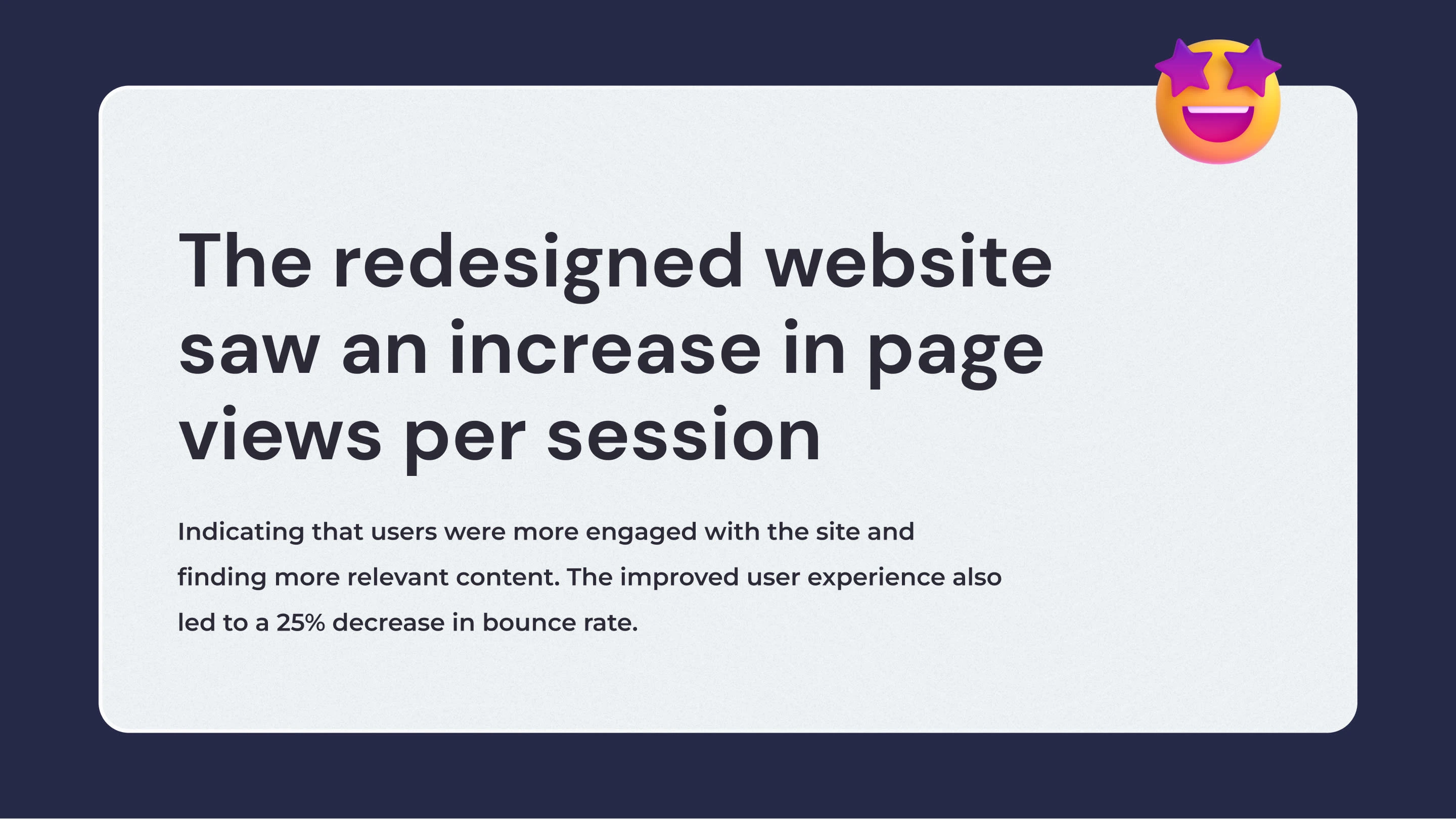
Personalising the Experience: Customising User Preferences
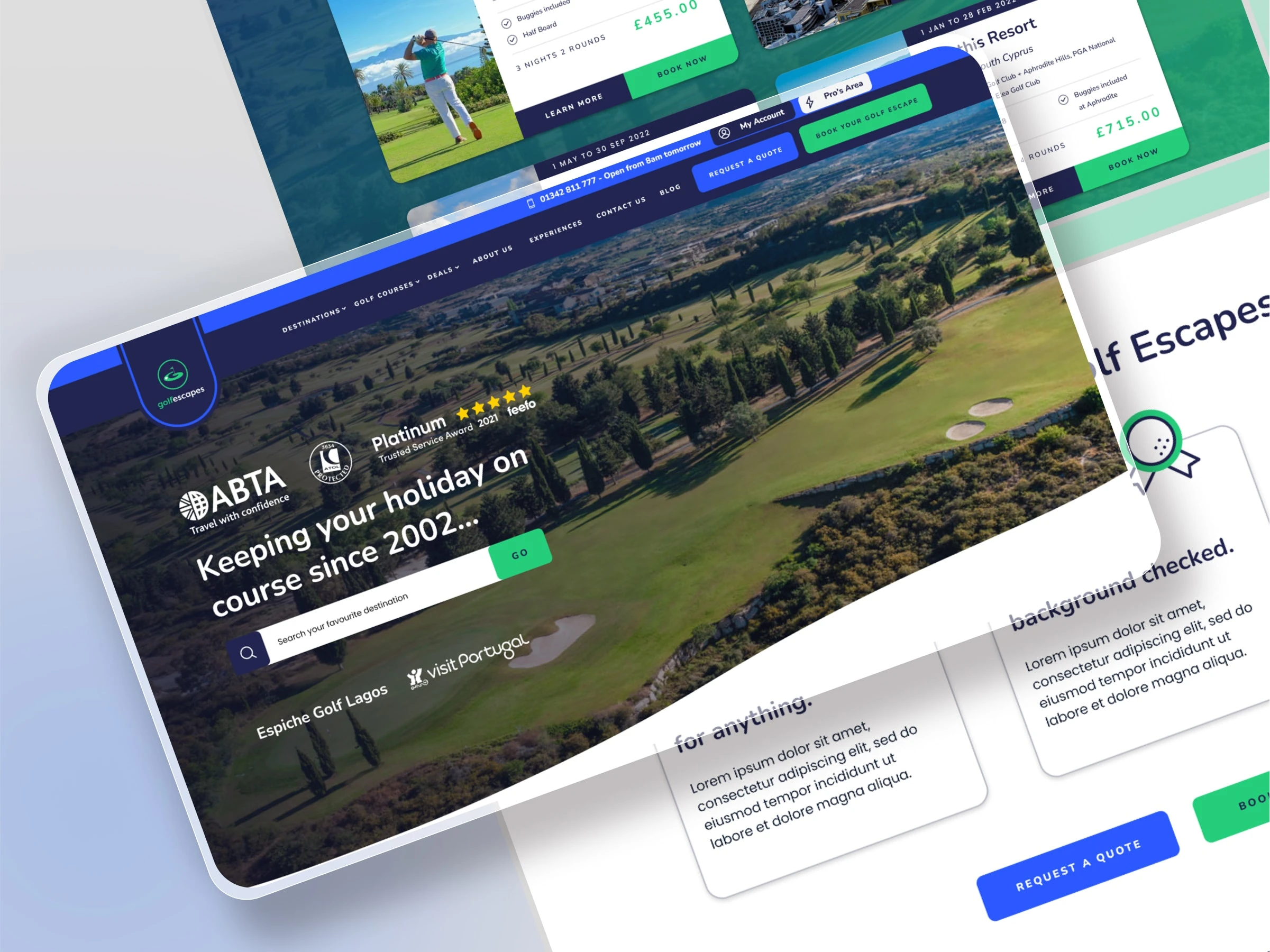
Crafted a homepage that captures the attention of visitors and guides them to the most relevant sections of the website. After that, I conducted A/B tests to compare different layouts, headlines, calls-to-action, and hero images and selected the highest-performing variations. The final design features a responsive and user-friendly interface that adapts to different devices and screen sizes.
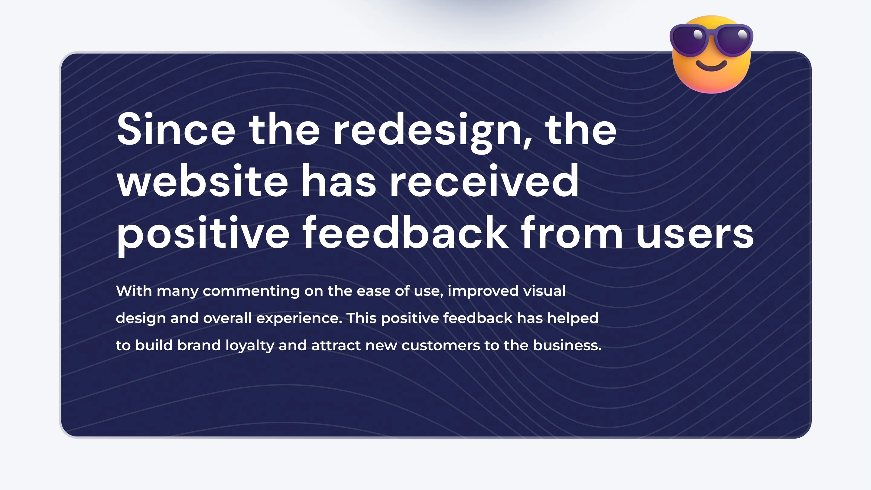
Bringing Golf Escapes to Life
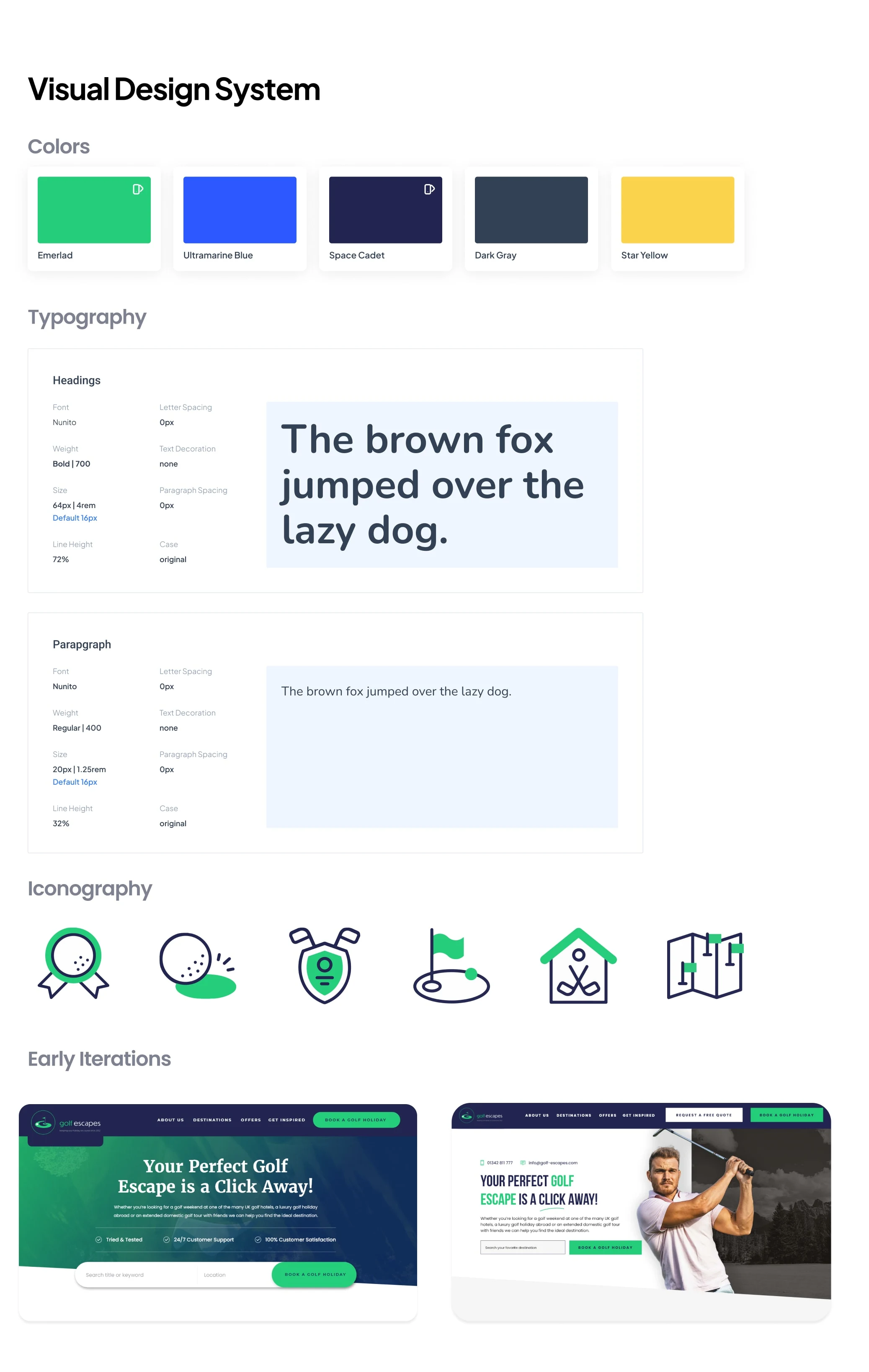
The new user interface design for Golf Escapes was created to complement the company's updated branding and visual identity. We incorporated the new brand colours and typography into the website design to create a cohesive and consistent look and feel. The updated visual identity, combined with the new UI design, gives Golf Escapes a fresh and modern look that aligns with the company's vision and values.
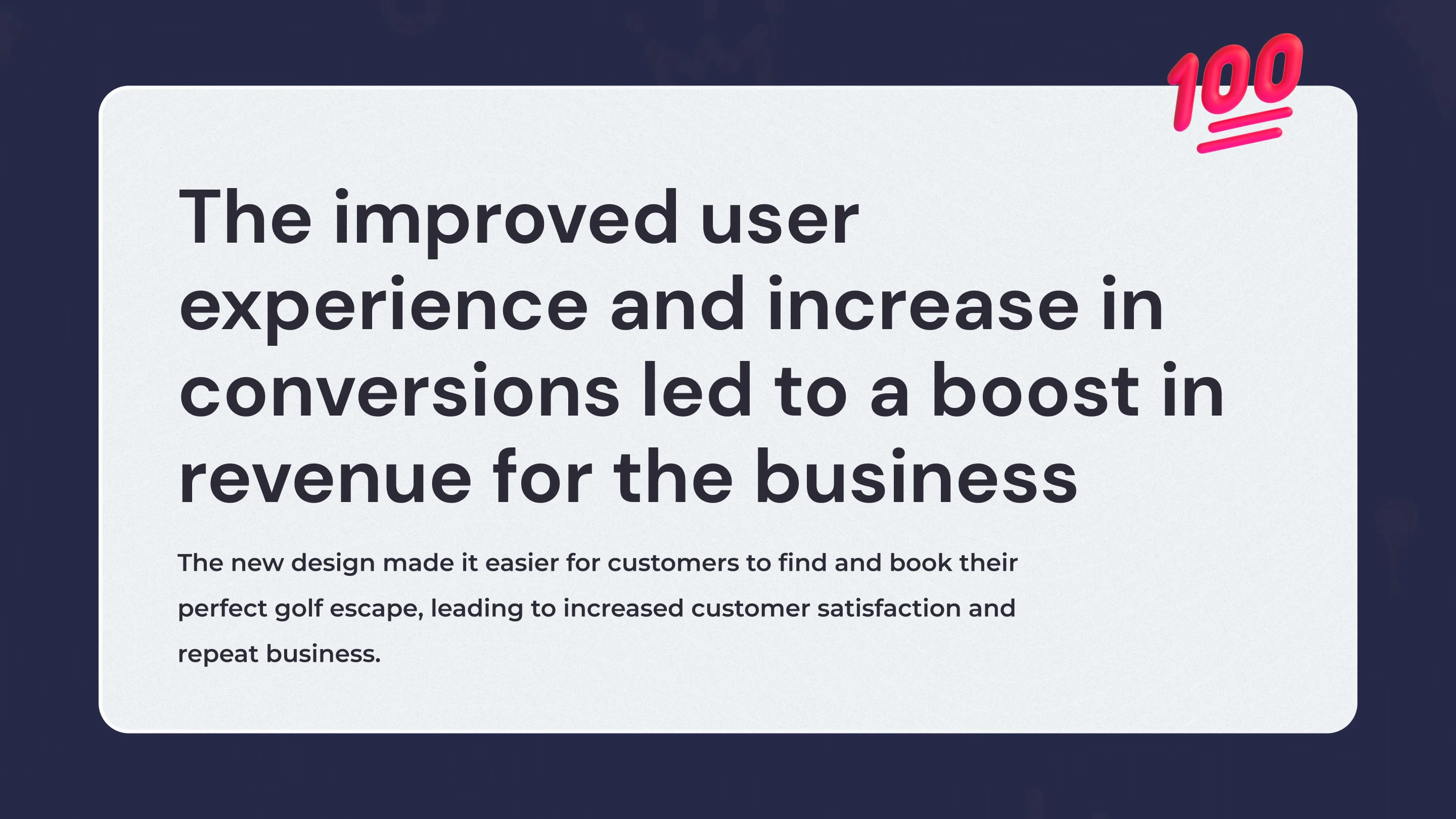
📝 What I learned
Understanding the importance of user research in UX design
The value of iterative design and prototyping
The challenges of balancing client expectations with user needs
🚀 Future
Mobile-First Design
Personalization
Continued User Testing
🔥 The Flame
Hope you enjoyed scrolling through this piece of work. I really appreciate you spending a few minutes of the day to see my thought process behind creating this brand and showcasing its different applications.
If you want to see more of my work you can visit my Instagram page or scroll on down to see my portfolio.
✅ Are you ready to kickstart your online website? Let's build a welcoming online space for your business by getting in touch.
Like this project
Posted Feb 27, 2023
The Golf Escapes website aims to provide an exceptional golf travel experience for enthusiasts looking for a comprehensive golf-tailored package vacation.
Likes
1
Views
2.1K

