💎 BrothaLuxury - eCommerce Website Design (UI/UX)
Sebastian Bistran
📝 Introduction
In addition to being widely available in upscale shopping malls and pop-ups across Transylvania (🇷🇴), BrothaLuxury's distinctive streetwear jewellery has become a phenomenon among upcoming Romanian trap artists and local influencers.
Andrew - BrothaLuxury founder - hopes to grow its web presence by exhibiting its newest jewellery line and he's hoping that a new and enhanced showcase website would increase its visibility and burgeoning fame.
💯 The Stats
Timeline: November - December 2021
My Role: UI/UX Designer, Product Designer, Web Designer
Deliverables: Responsive Website Design, Page Design (XD), User Flow & Journey
🧨 The Problem
BrothaLuxury's website had never been a top priority in their business before we started working together. They had been using templates that didn't quite feel like the brand and choosing inexpensive, short-term fixes.
Most sales that Andrew experiences come through their pop-ups across events. That's why they never gave the website's upkeep or development of new features a high priority because of its low usage.
Here's a before sneak peek of what BrothaLuxury looked like:
Outdated landing page.
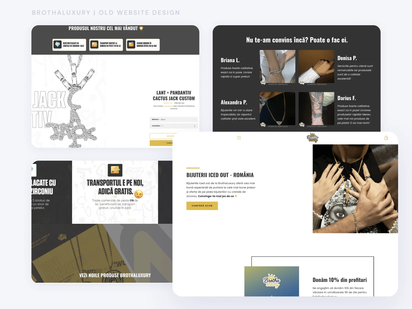
It hasn't seen a redesign in four years. The website's design language is inconsistent. Visitors cannot see other product options like their different chain collections or bracelets on the outdated landing page, which only displays one or two products.
The existing conversion metrics can be improved.
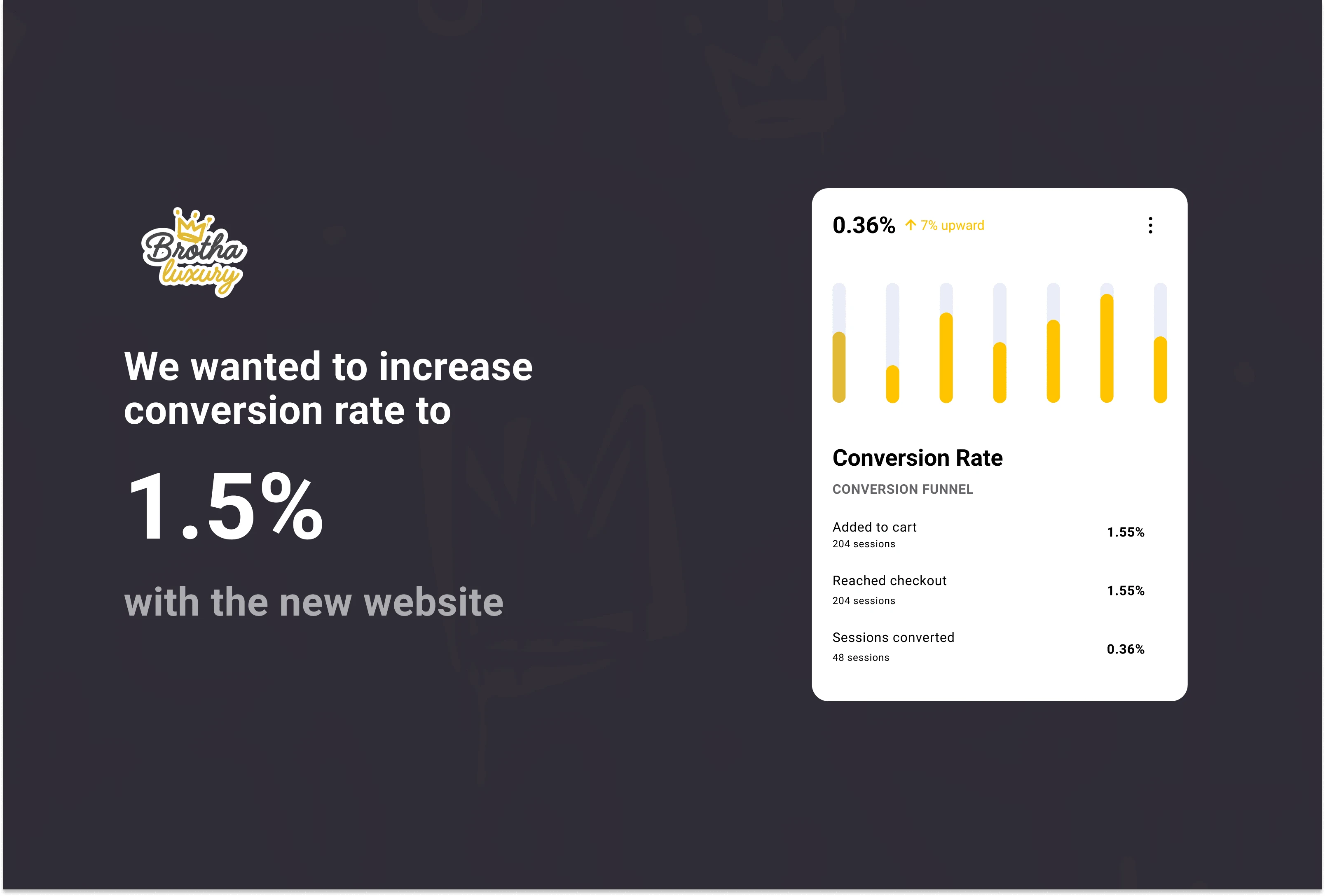
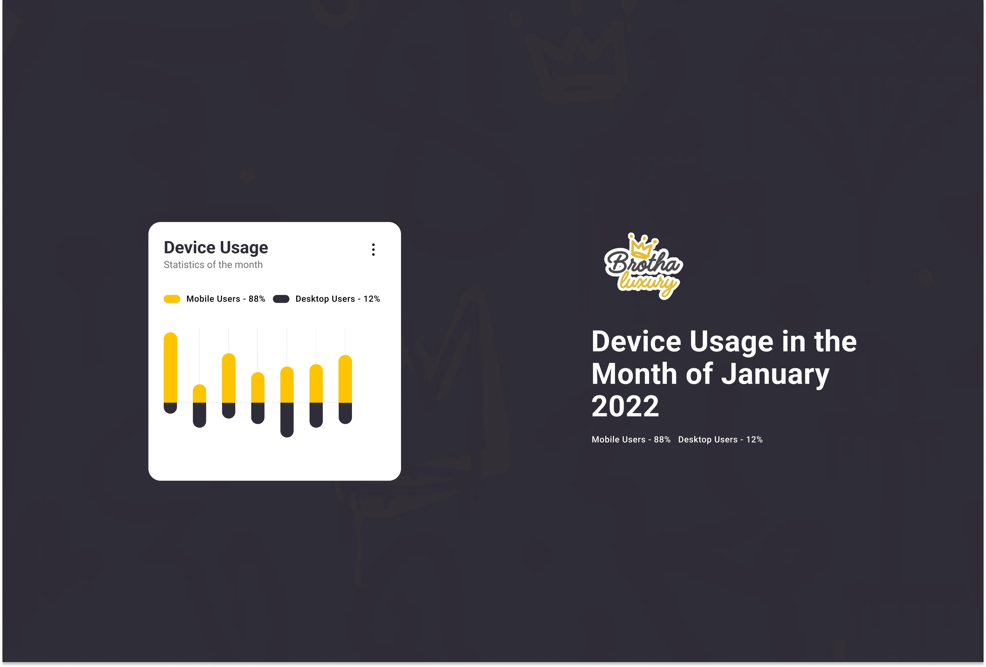
Since jewellery is their primary offering on the website, we want to encourage greater conversions. Most of their users in Romania access BrothaLuxury using a mobile web browser so developing the website with a responsive mindset was a priority.
⭐️ Objectives
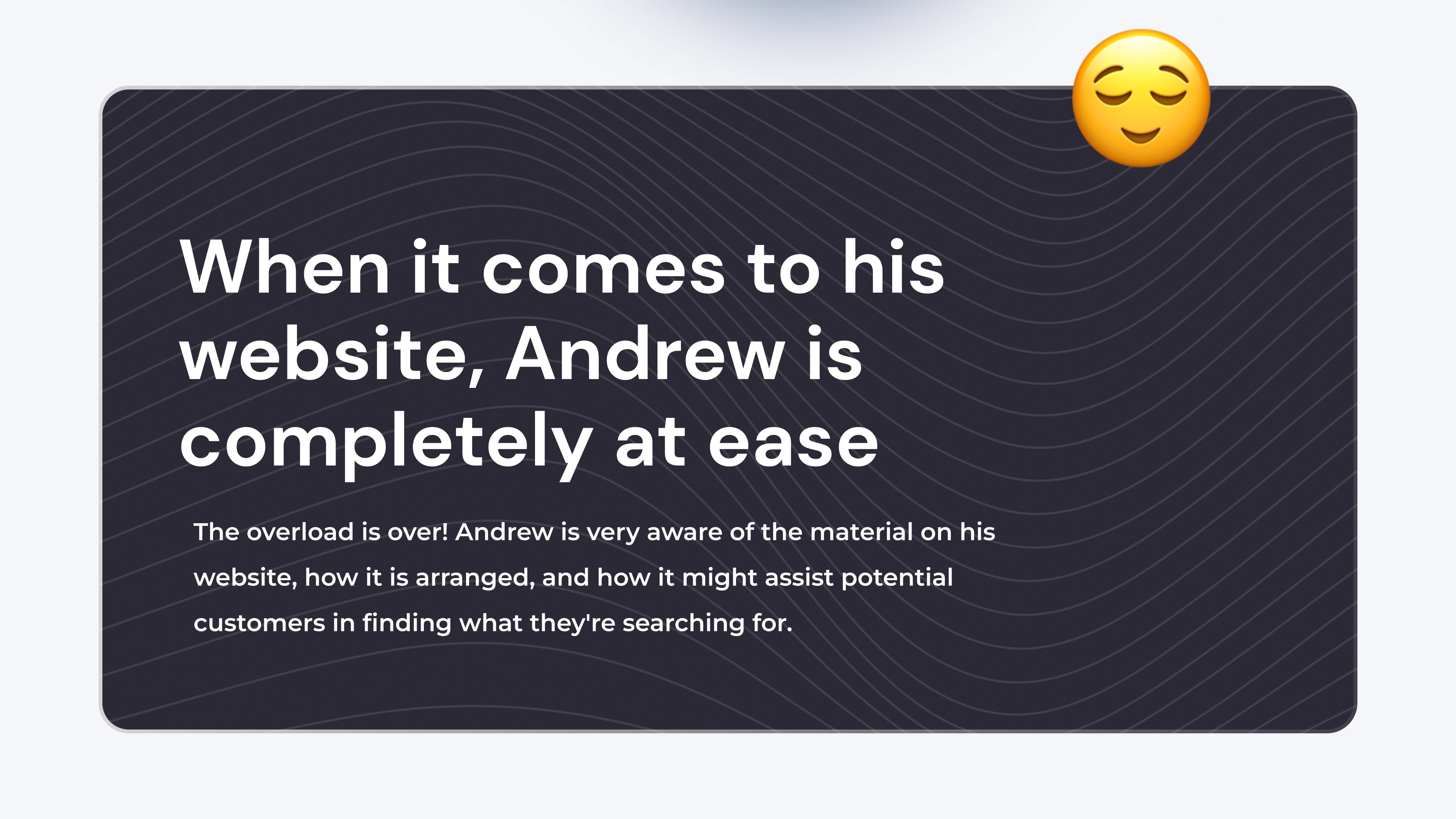
Andrew had been running his company for two years but he had never truly seized the chance to design a website that was exclusively his and reflected his values.
He anticipated visiting a website that:
Accurately reflected the name and company he had spent years building;
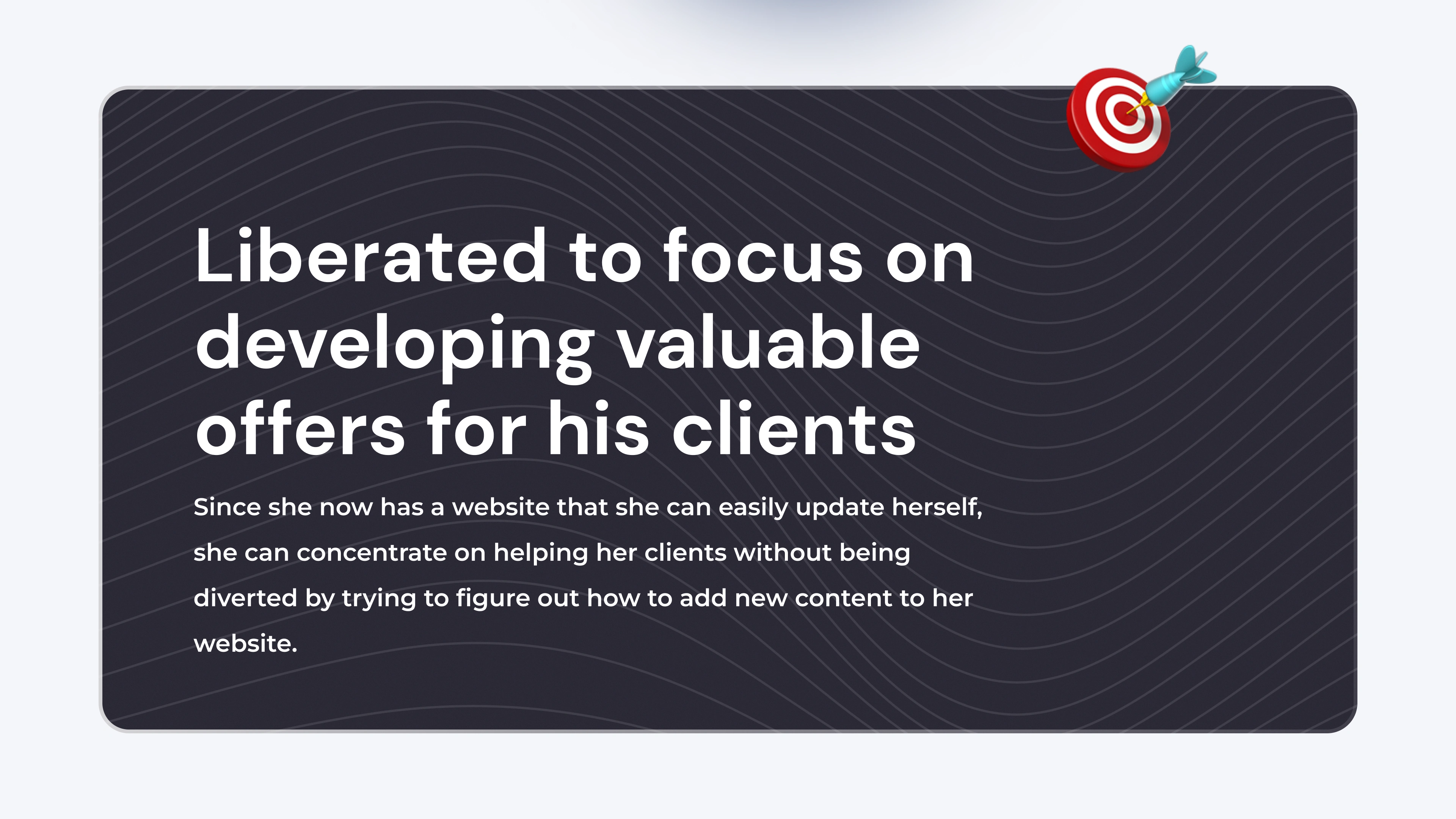
Was simple to update, making the feeling of adding fresh content less daunting;
Drew in more customers who didn't necessarily consume hip-hop and trap music.
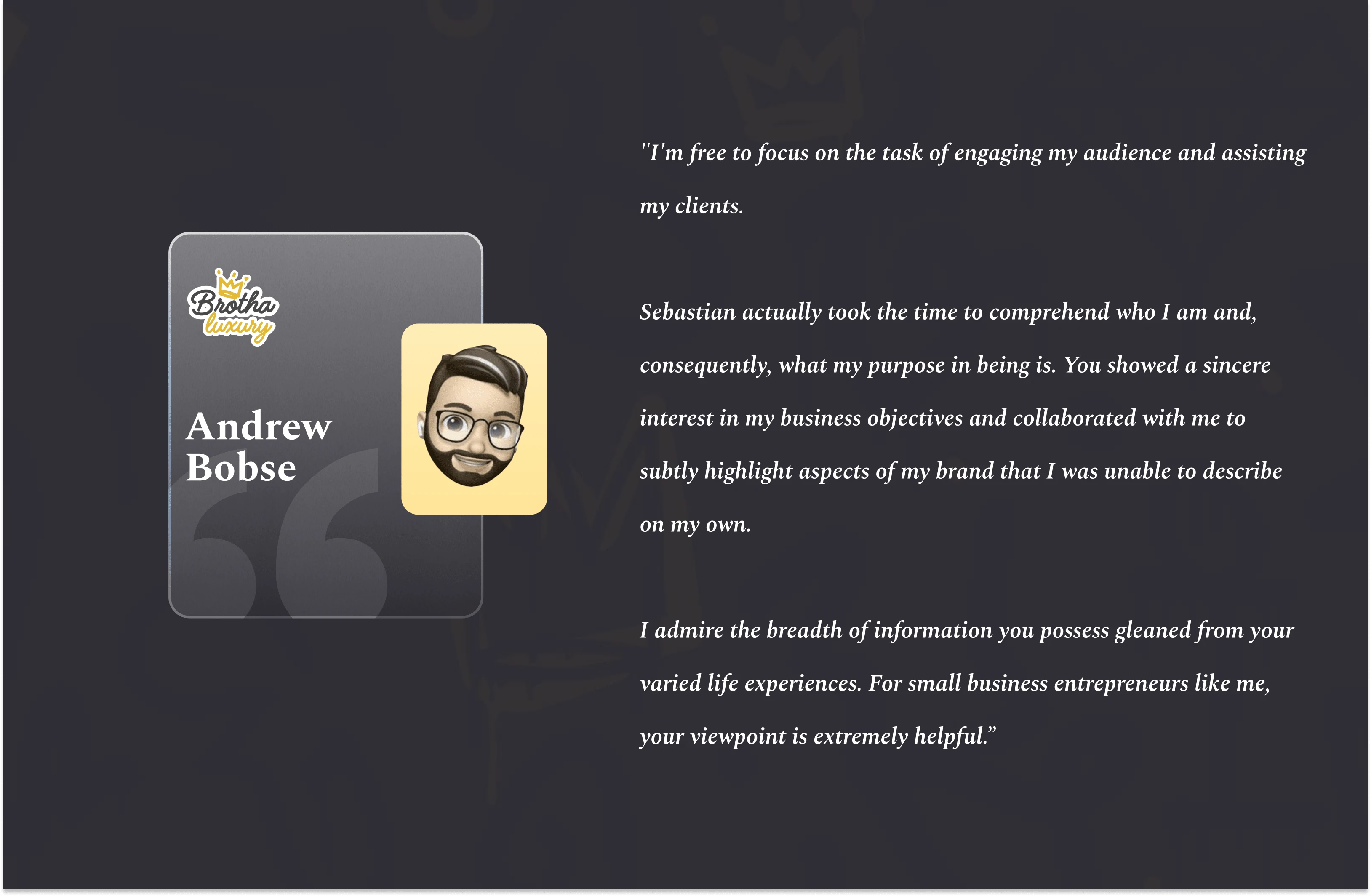
🥳 Impact
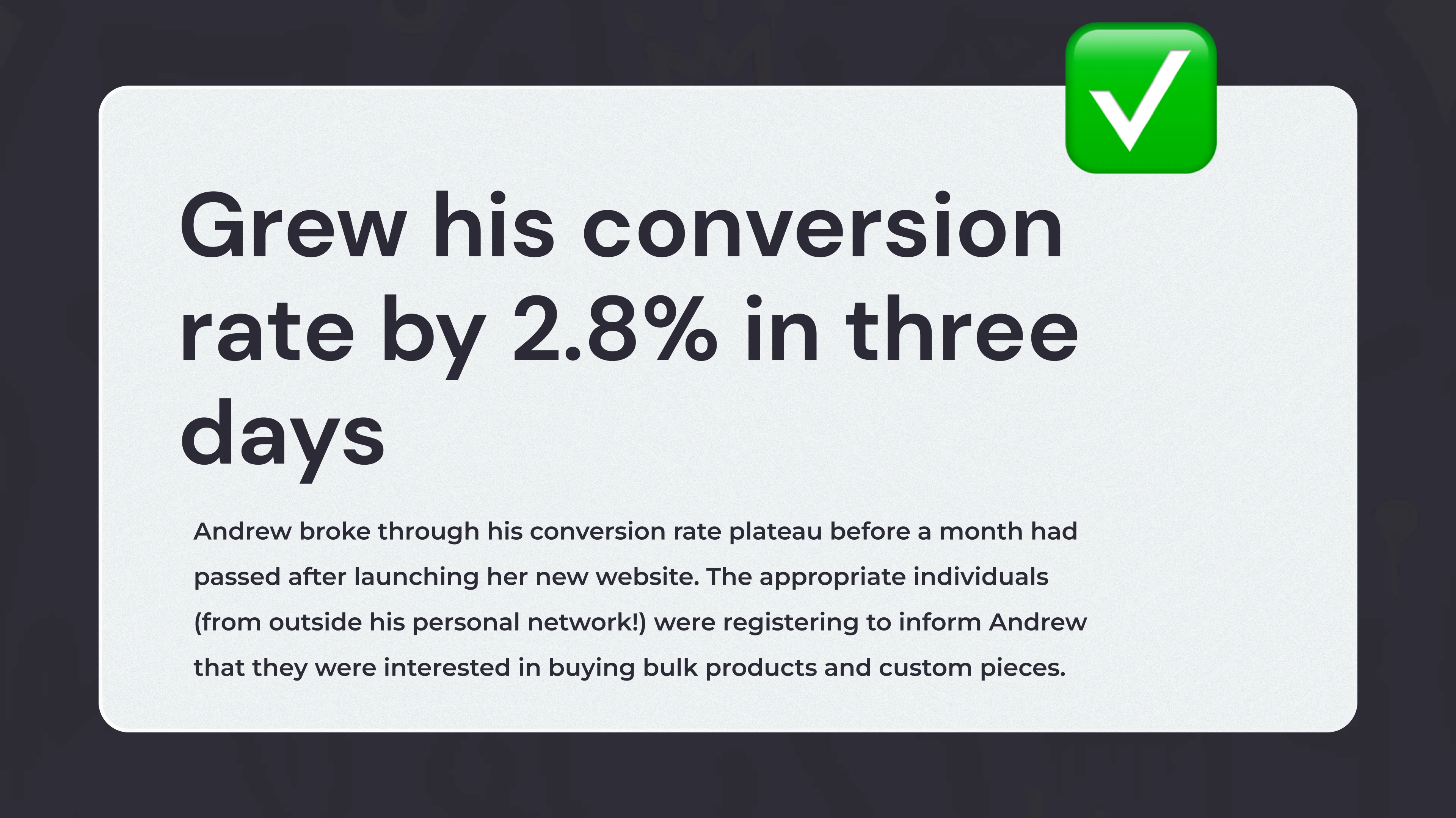
The landing page went live on December 17, 2021, hurrah!
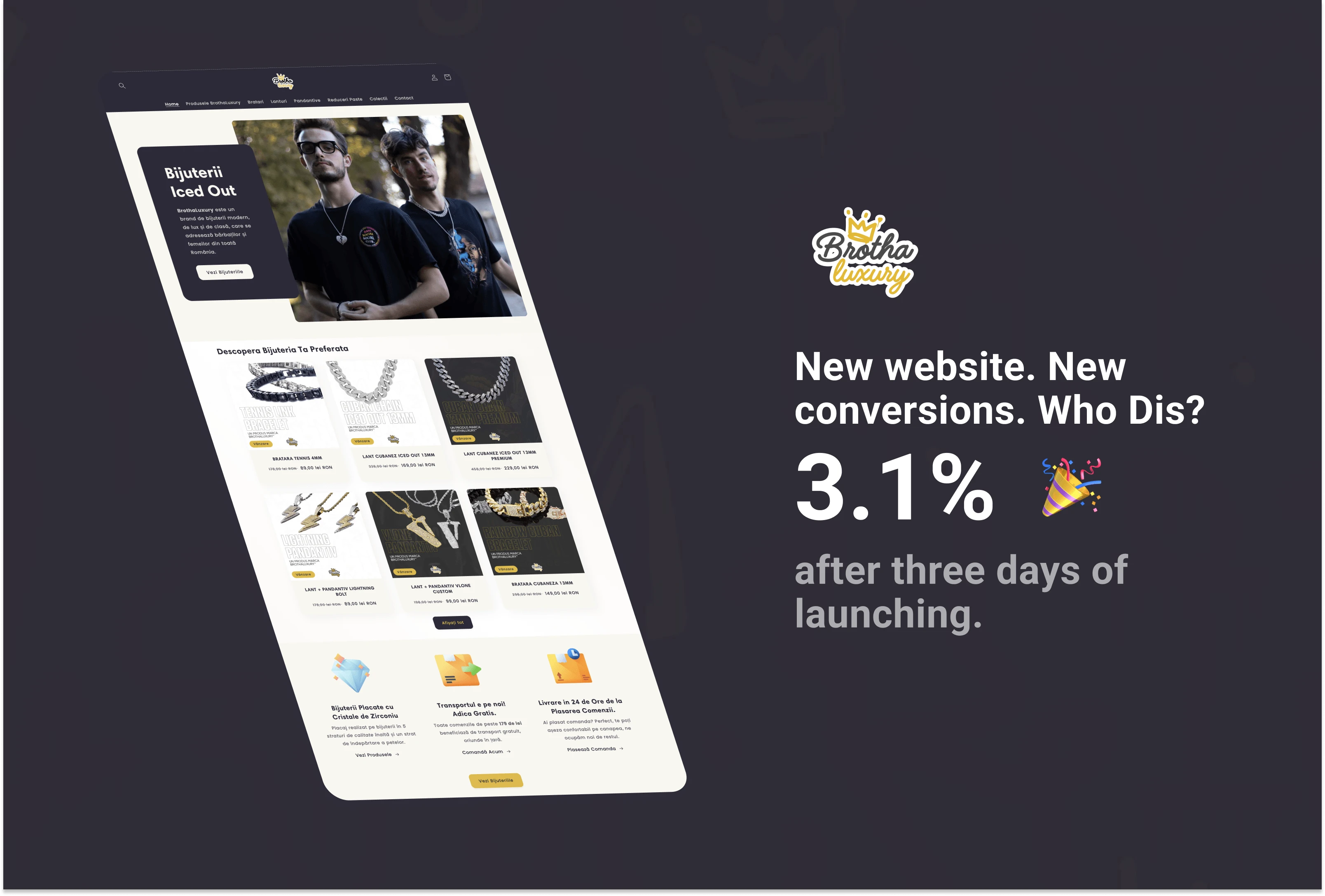
We immediately noticed a 2.8% increase in conversions from the new landing page compared to the old website after 3 days. Also, the average order value increased by 30% after two weeks of the website being live.
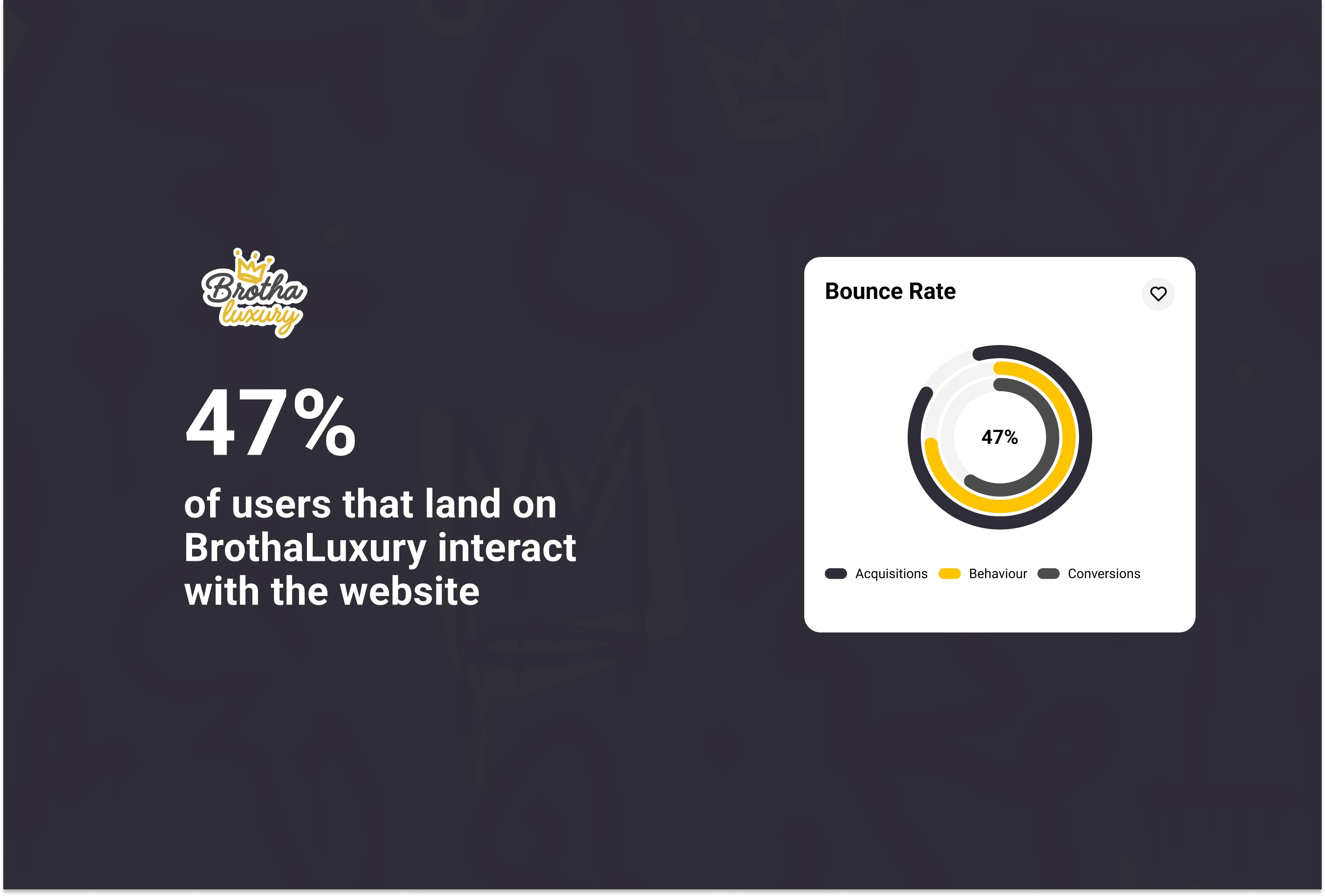
The percentage of visitors to a website that departs without taking any action is known as the "bounce rate" (such as clicking on a button). The fact that the BrothaLuxury landing page has a decent bounce rate indicates that the information is interesting, clear, and relevant to visitors. As a result, 47% of their users interacted with the page before departing.
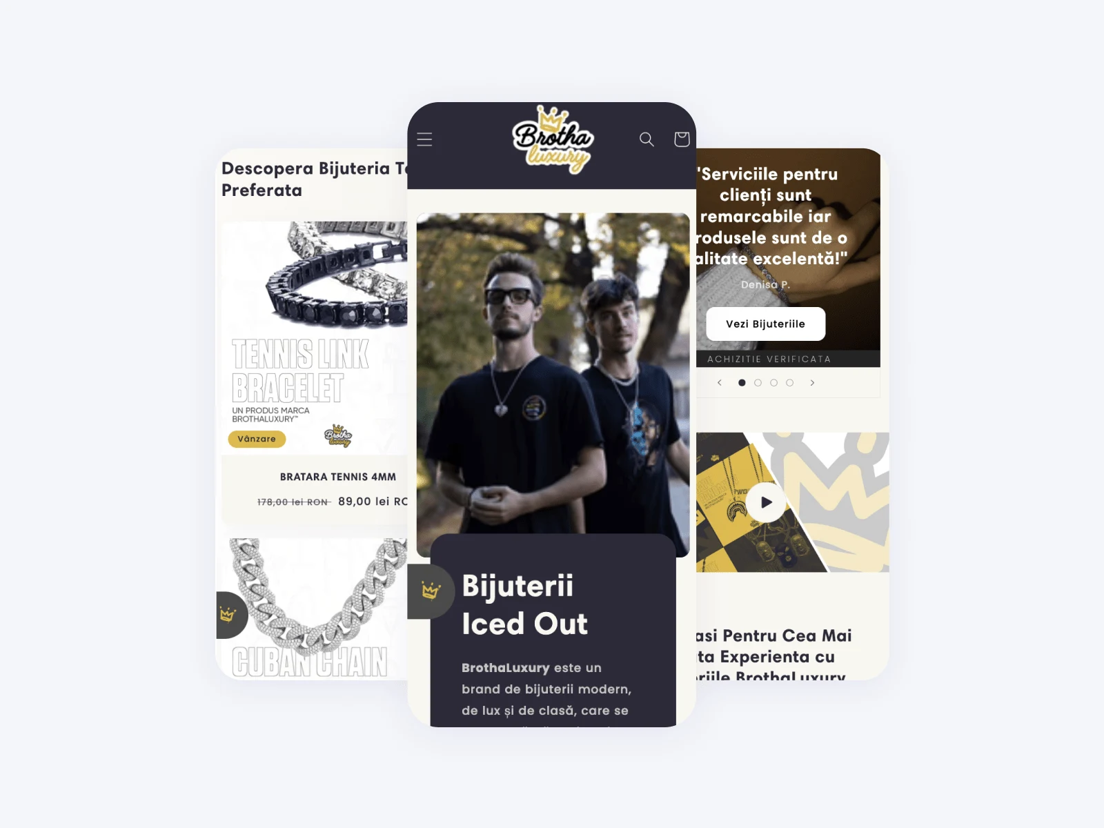
Here's the device usage of the web traffic.
🪄 The Product
Andrew and I discussed his audience, philosophy, and what makes his work so unique in-depth during our discovery call. I used these as the foundation for designing all of the website's user interface, giving the elements their own brand message and voice.
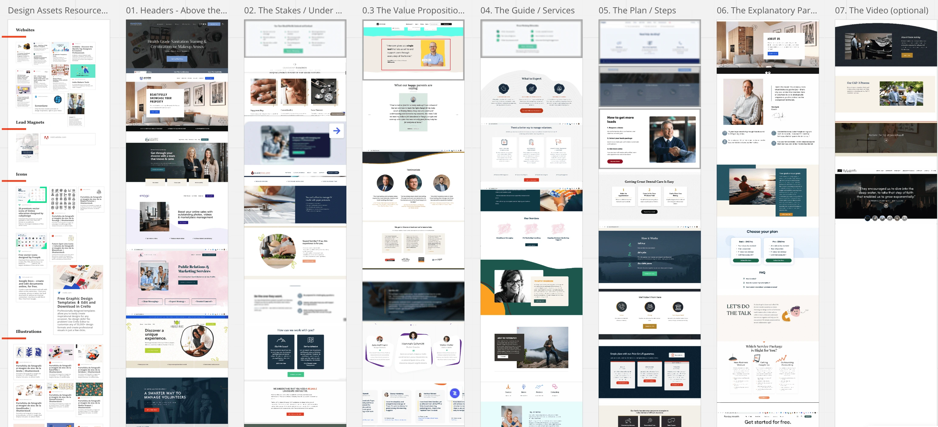
We shared what we liked about other eCommerce businesses' landing pages and collected ideas from them using Miro, a platform for remote collaboration.
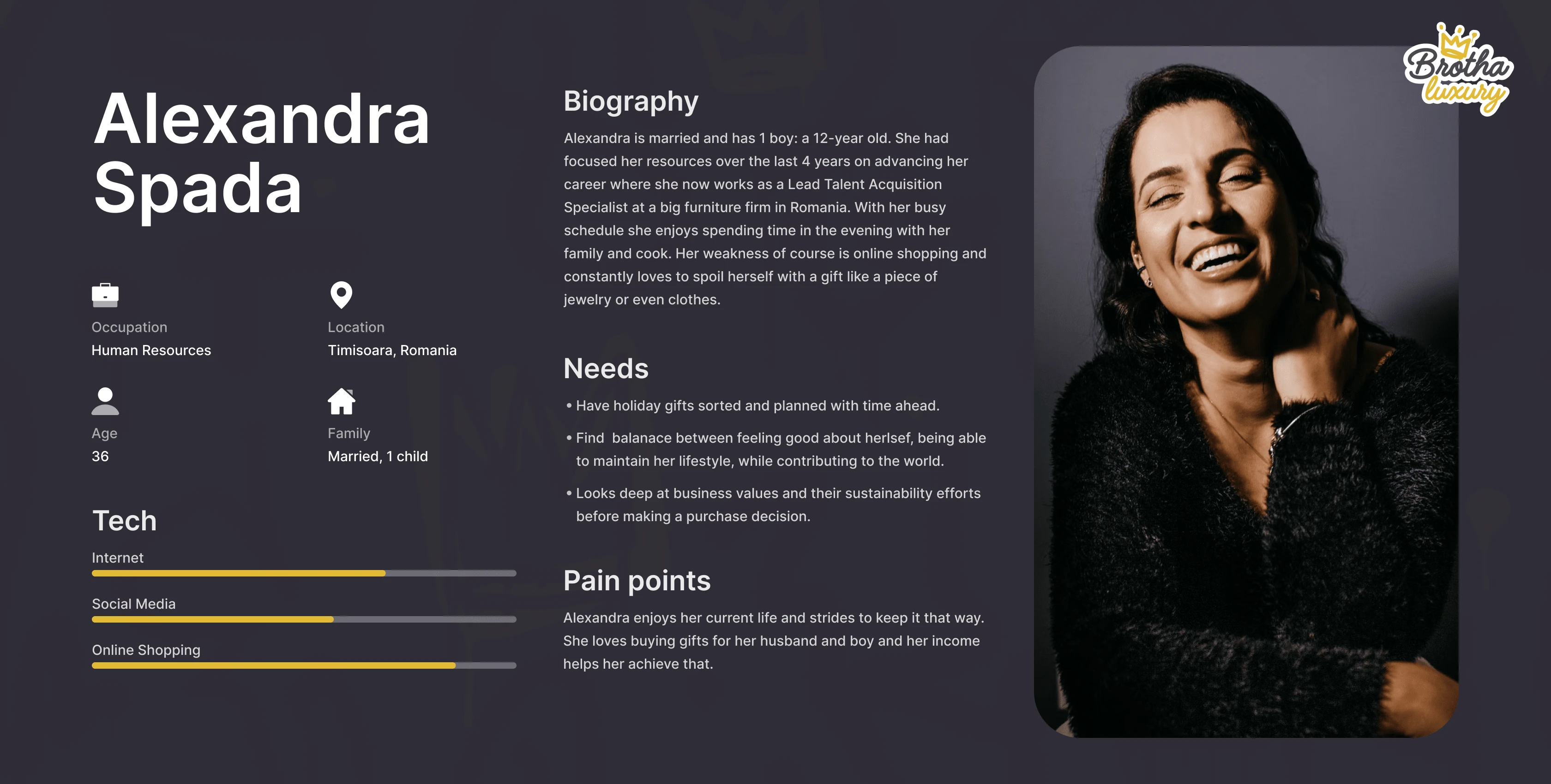
Customer Personas
The two customer types that Andrew concentrates his company on are represented by the personalities he's built. BrothaLuxury themselves contributed the information on these personalities as it was challenging for me to develop a more particular persona type on my own because I had not conducted research with actual clients in mind.

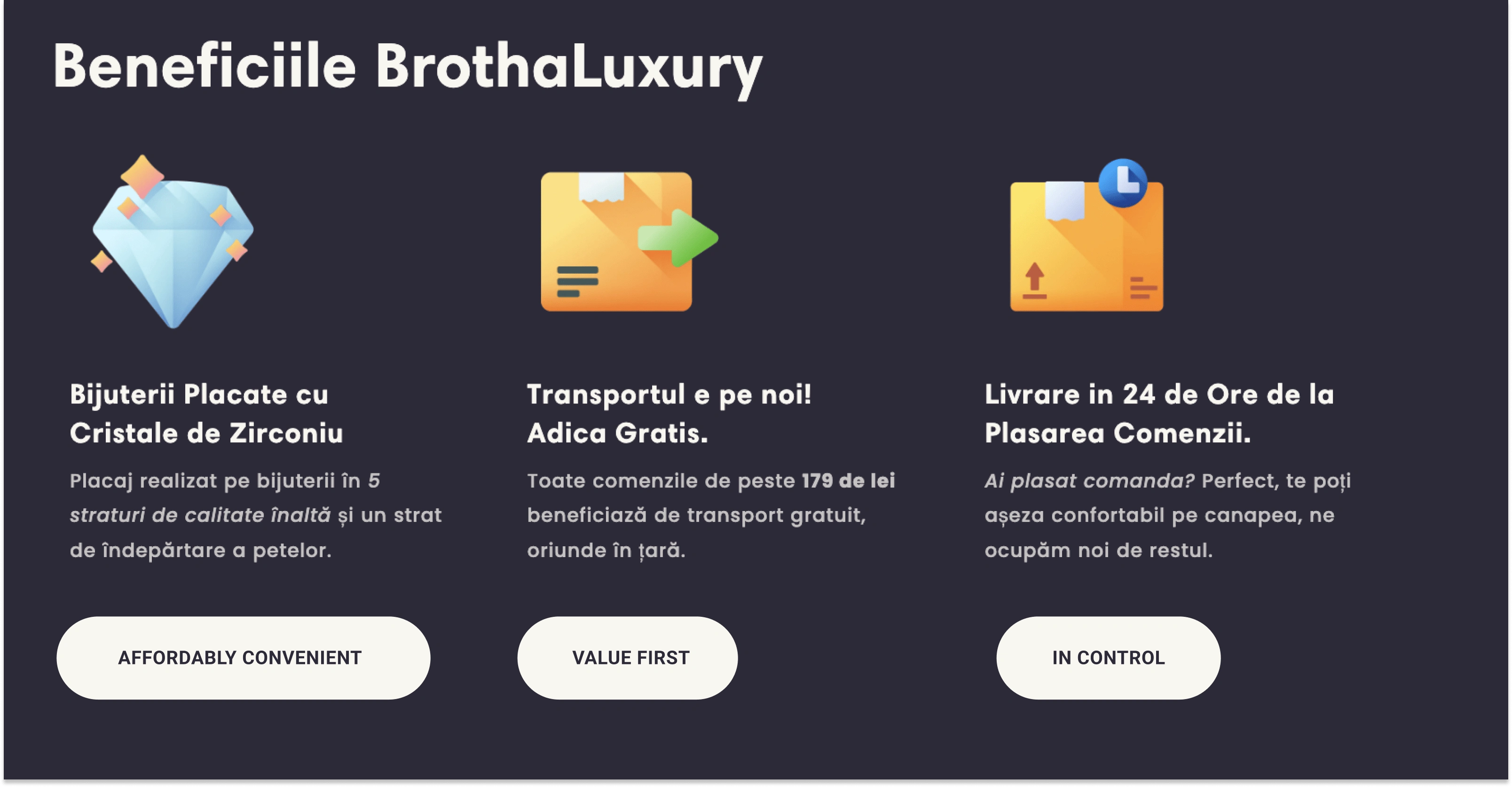
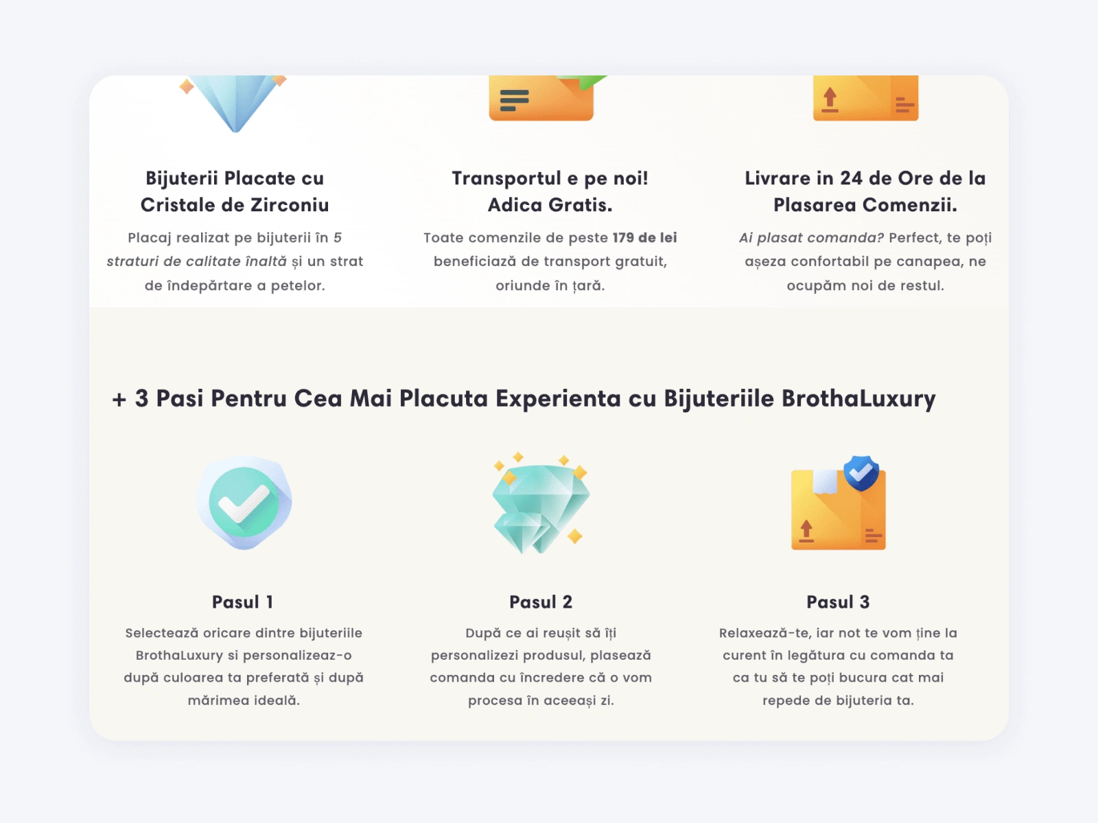
Value Proposition
To ensure that we design based on these ideas, we defined 3 design principles for the landing page during a separate session. These guidelines are based on their consumers' perceptions of their brand as a whole.
User Testing
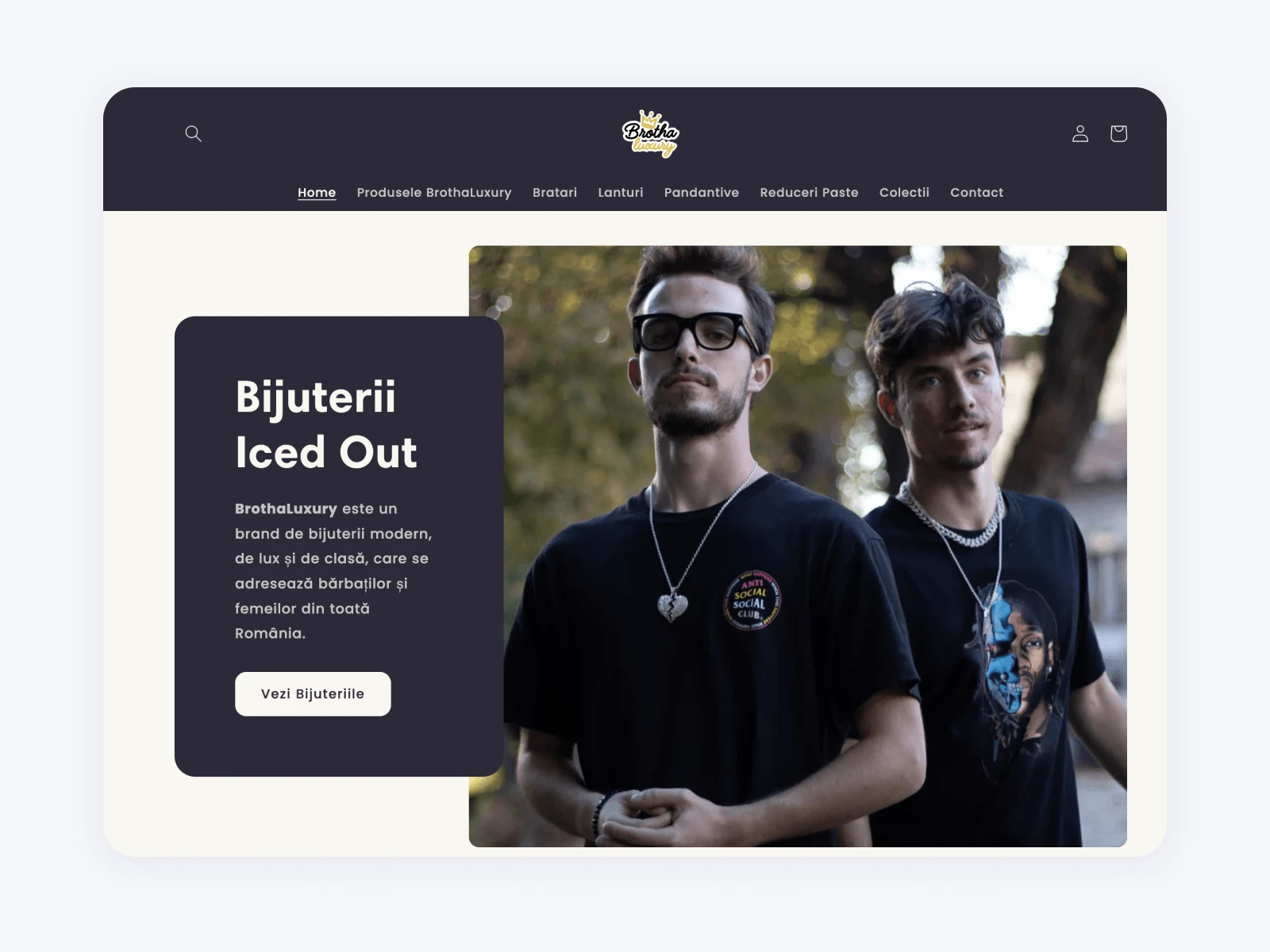
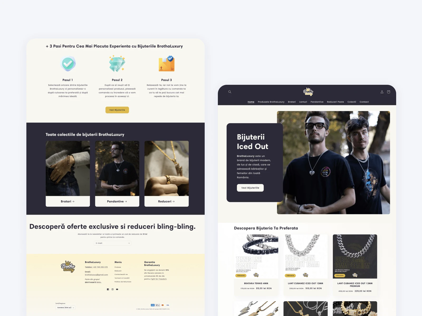
Before & After Final Designs
The lack of attention to what BrothaLuxury provides existed prior to the revamp. The web page was disorganised. The design aesthetic did not match their products. It does not accurately reflect the distinctive value that Brotha Luxury offers.
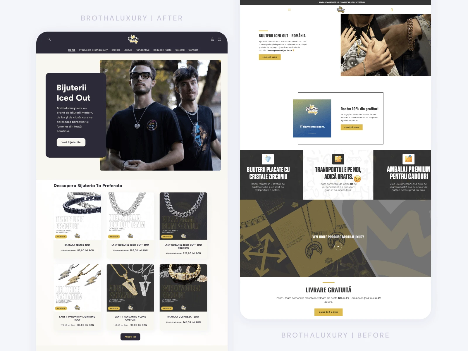
Here is a thorough explanation of the things I changed after the testing.
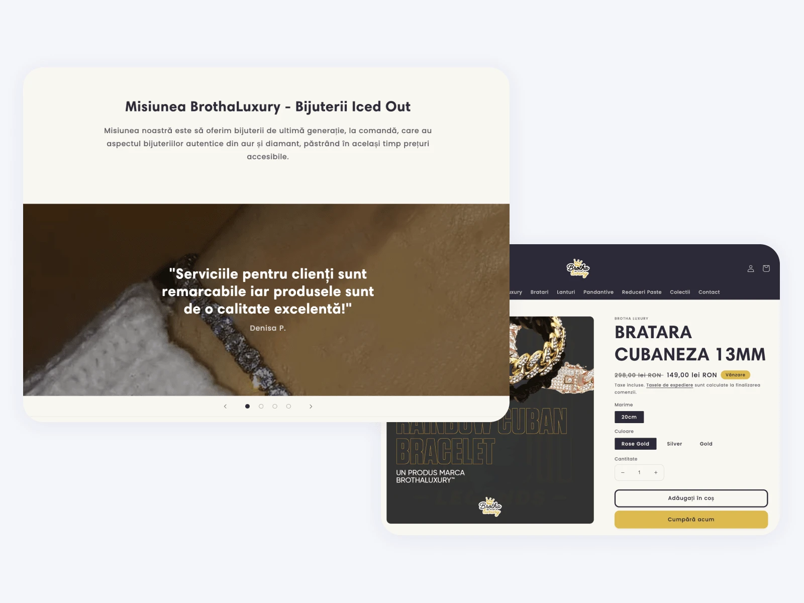
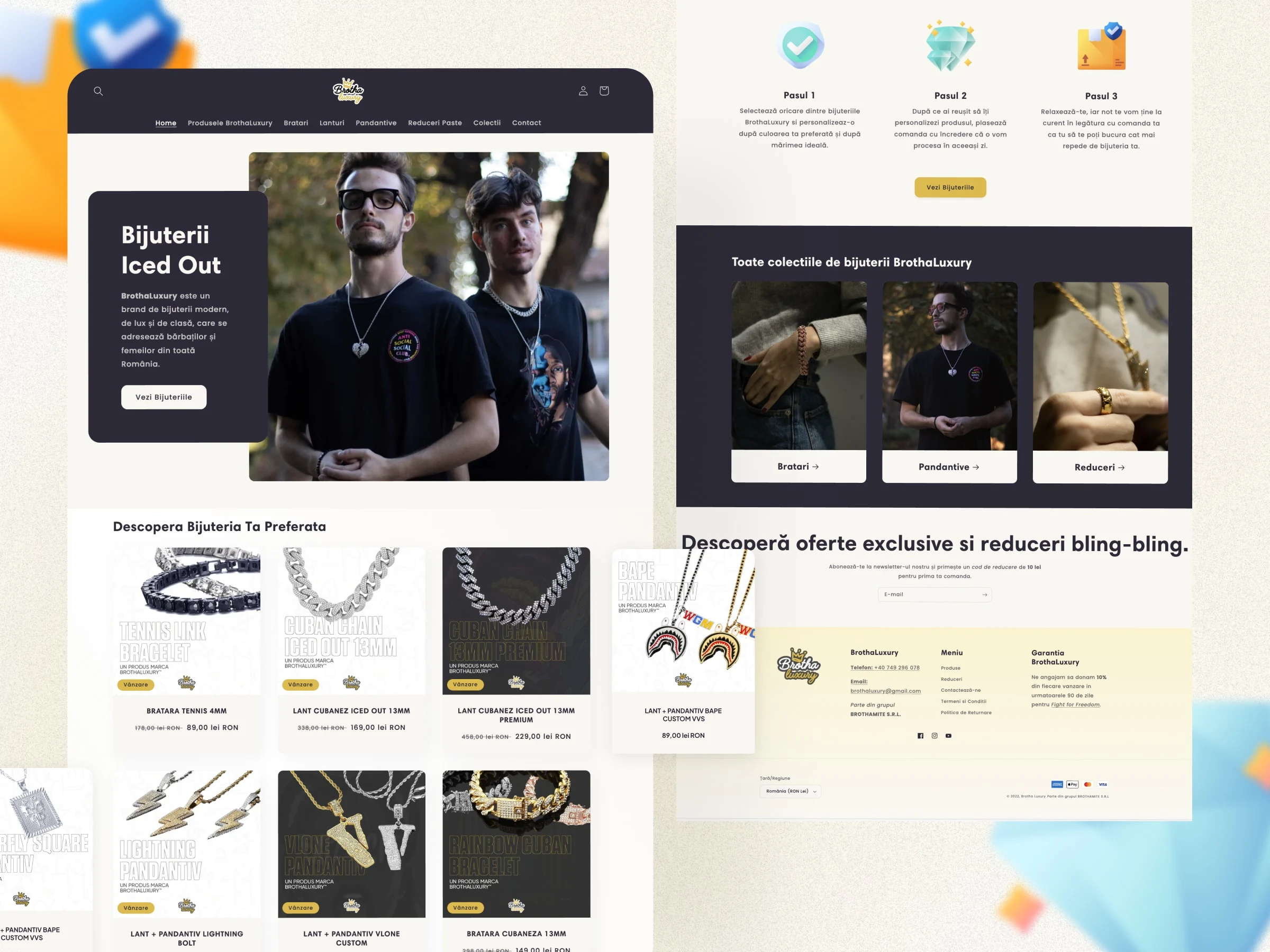
Solid Social Proof
Social proof is visible all across the pages. They have genuine photos of the products from BrothaLuxury's customers, real ratings, and user-generated photos that visitors can easily identify.
Clear Value Proposition
The messaging was based on BrothaLuxury's target market's values, which were affordable exquisite gifts and streetwear-inspired accessories. How? Select your favourite jewellery, place your order with your custom specifications, sit back and relax because in 24h you'll be wearing your freshly ordered drip. This sort of messaging set BrothaLuxury apart from its rivals.
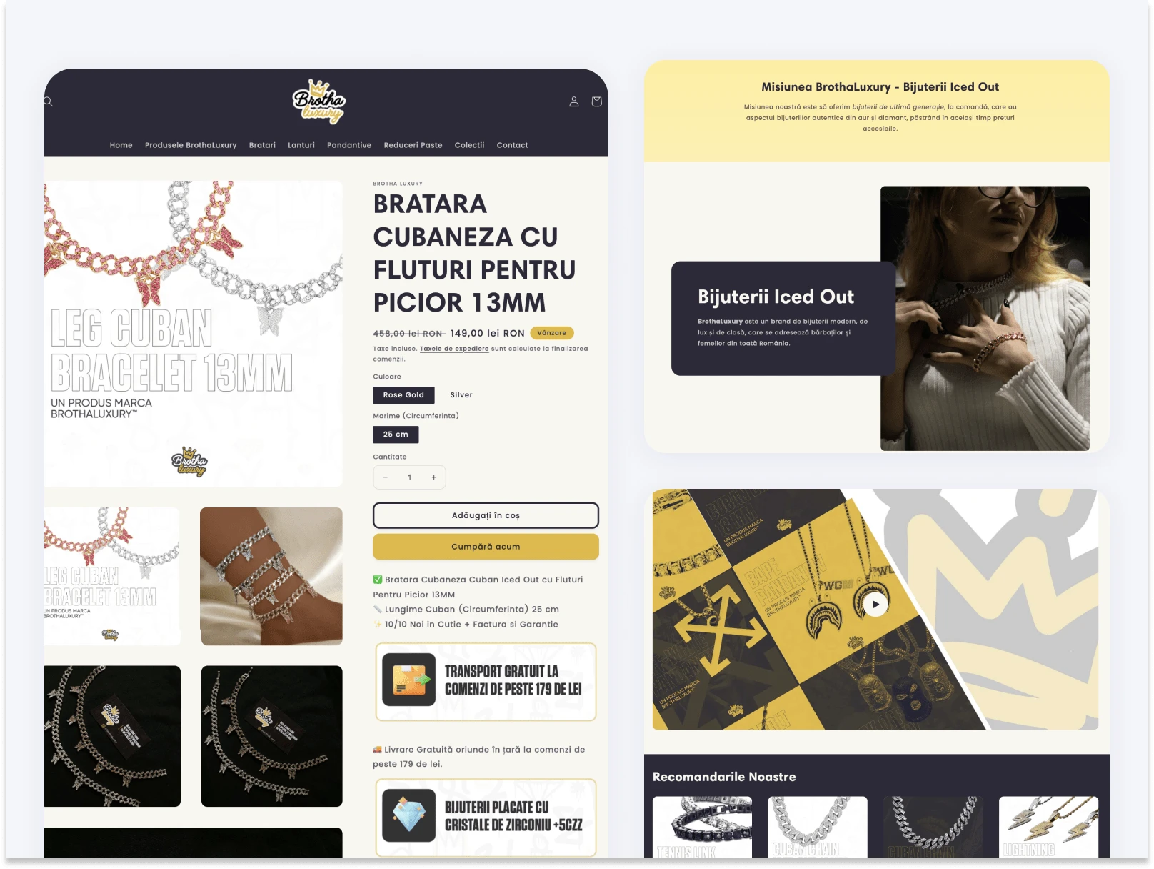
Brand New Product Page
Customers, businesses, and investors may now learn more about the products BrothaLuxury is offering through their new product page. This features useful information about the product, the ordering process and social proof from customers who have purchased the item.
Development
I combined the typefaces, colours, logos, branded photos, user-generated content and writing to produce a website that guided Andrew's customers through a simple process.
I made sure that the website only promoted clients who would be a good fit for BrothaLuxury by creating a clear route from learning about them and their products to ultimately placing an order.
Five key components make up the finished website:
The Homepage, the "about" page, and the "work with me" page;
The BrothaLuxury Collections Page;
The Contact page for general inquiries and B2B opportunities;
A blog containing one year's worth of unique content from Andrew;
Cart and Checkout Page that captures payments and allows for easy data introduction.
✅ Results
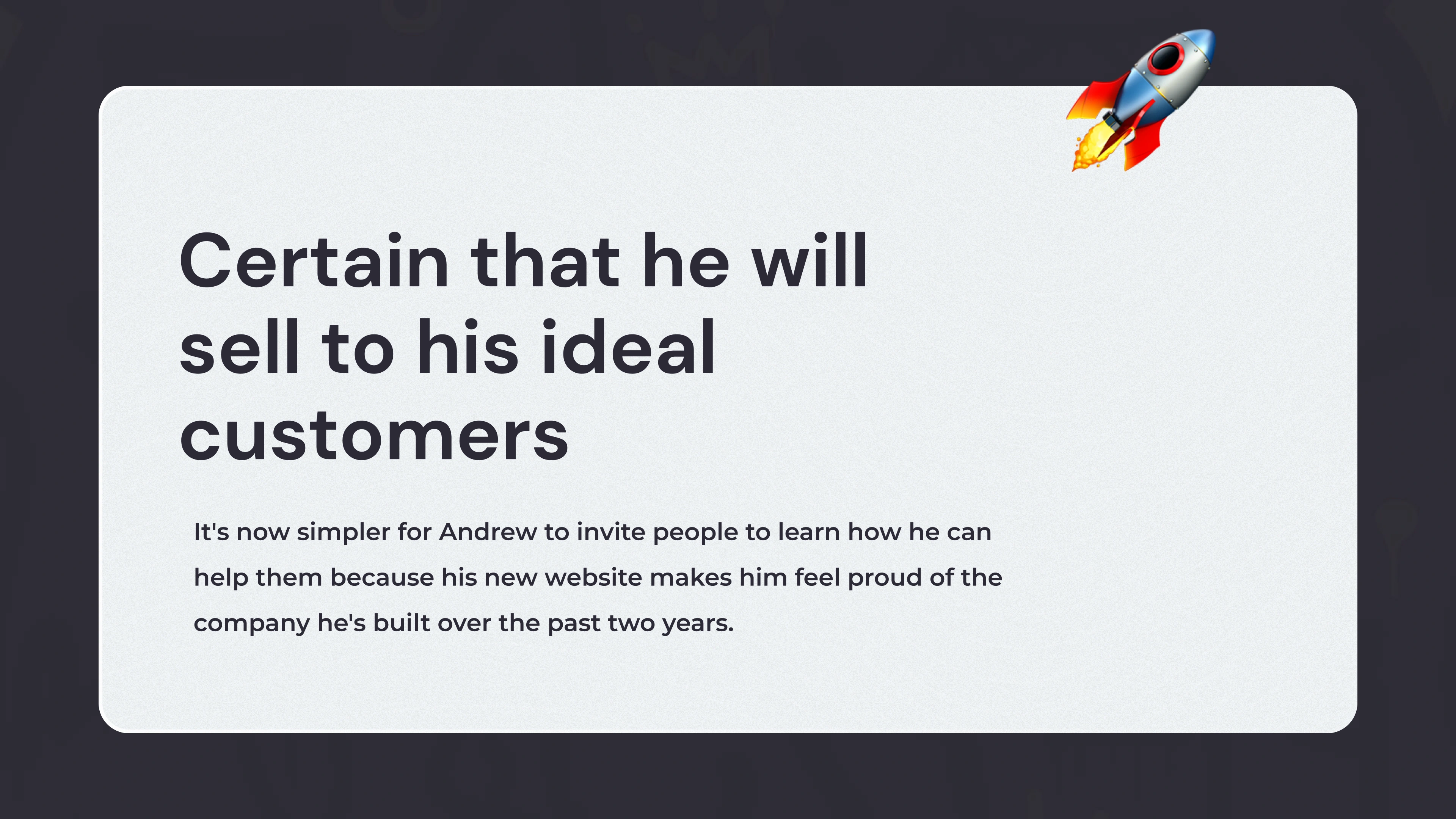
After finally launching a website that accurately represented his brand, Andrew experienced an immediate boost in motivation to work on his business.
Here are a few highlights of the project.
🔥 The Flame
Hope you enjoyed scrolling through this piece of work. I really appreciate you spending a few minutes of the day to see my thought process behind creating this brand and showcasing its different applications.
If you want to see more of my work you can visit my Instagram page or scroll on down to see my portfolio.
✅ Are you ready to kickstart your online website? Let's build a welcoming online space for your business by getting in touch.
Like this project
Posted Dec 2, 2022
Building a website that appropriately represents a jewellery e-commerce store with over two years of experience and draws in more fit clientele.
Likes
0
Views
687