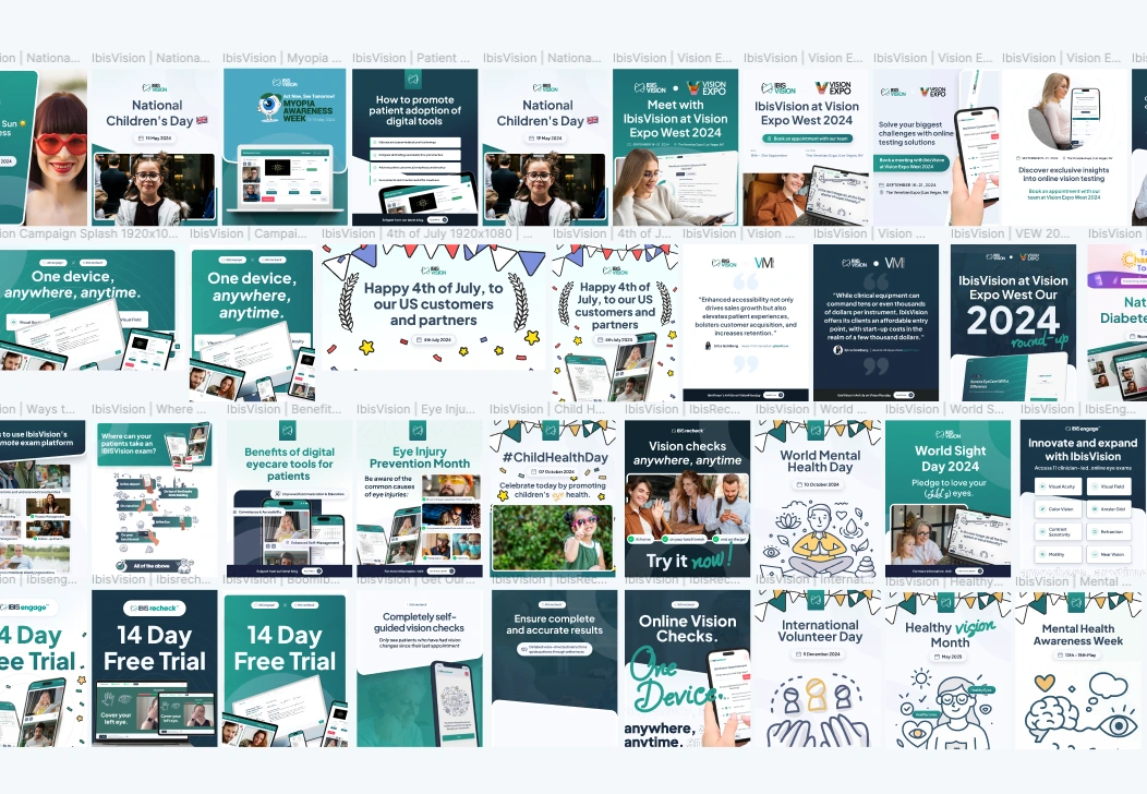
🧐 IbisRecheck | Remote Prescription Checks (UI/UX)
Sebastian Bistran
📝 Introduction💯 The Stats👥 Who We Designed For🧑💻 Patients🥼 Clinicians🔍 Research Highlights🗣️ Field Interviews📊 LogRocket Analysis🎯 What We Learned❗ Defining the Problem🛠️ Design Approach & Solutions1. Onboarding & Calibration2. Accessibility & Visual Clarity3. Clinician Dashboard4. Reducing Cognitive Load🔁 Testing & Results🤓 Free Vision Check - Try it out: Here 📈 Impact & ReflectionOutcomes🔥 The Flame
📝 Introduction
How might we design a remote eye exam experience that’s clinically sound, frictionless for patients, and intuitive for clinicians to triage?
Traditional eye care often demands in-person appointments, even for minor prescription updates. This creates friction for patients, especially those with limited mobility, busy schedules, or a preference for digital-first services.
IbisRecheck, a product from IbisVision, set out to challenge that model by delivering prescription checks online, directly through a browser. The core idea was to give patients the freedom to test their vision from home, while enabling clinicians to remotely review results and decide whether an in-person follow-up was necessary. The design needed to be fast, accessible, and trustworthy.
💯 The Stats
Timeline: April - July 2024
Company: IbisVision
Product: IbisRecheck – Remote prescription check tool
Role: Lead Product Designer
Team: Dev Team, Product Strategy Lead
Tools: Figma, LogRocket, Jira, Slack
I owned the end-to-end design process. That meant understanding two very different user groups, identifying key usability bottlenecks through analytics, and translating those into design actions that could work within a complex technical environment. I partnered closely with engineering and product strategy to ensure each decision made sense from both a UX and a clinical point of view.
The result was IbisRecheck, that not only improved patient retention but also helped IbisVision secure its first major clinical partner, turning a prototype into a platform with commercial traction.
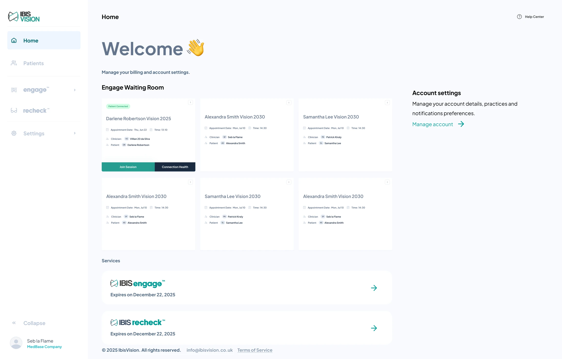
👥 Who We Designed For
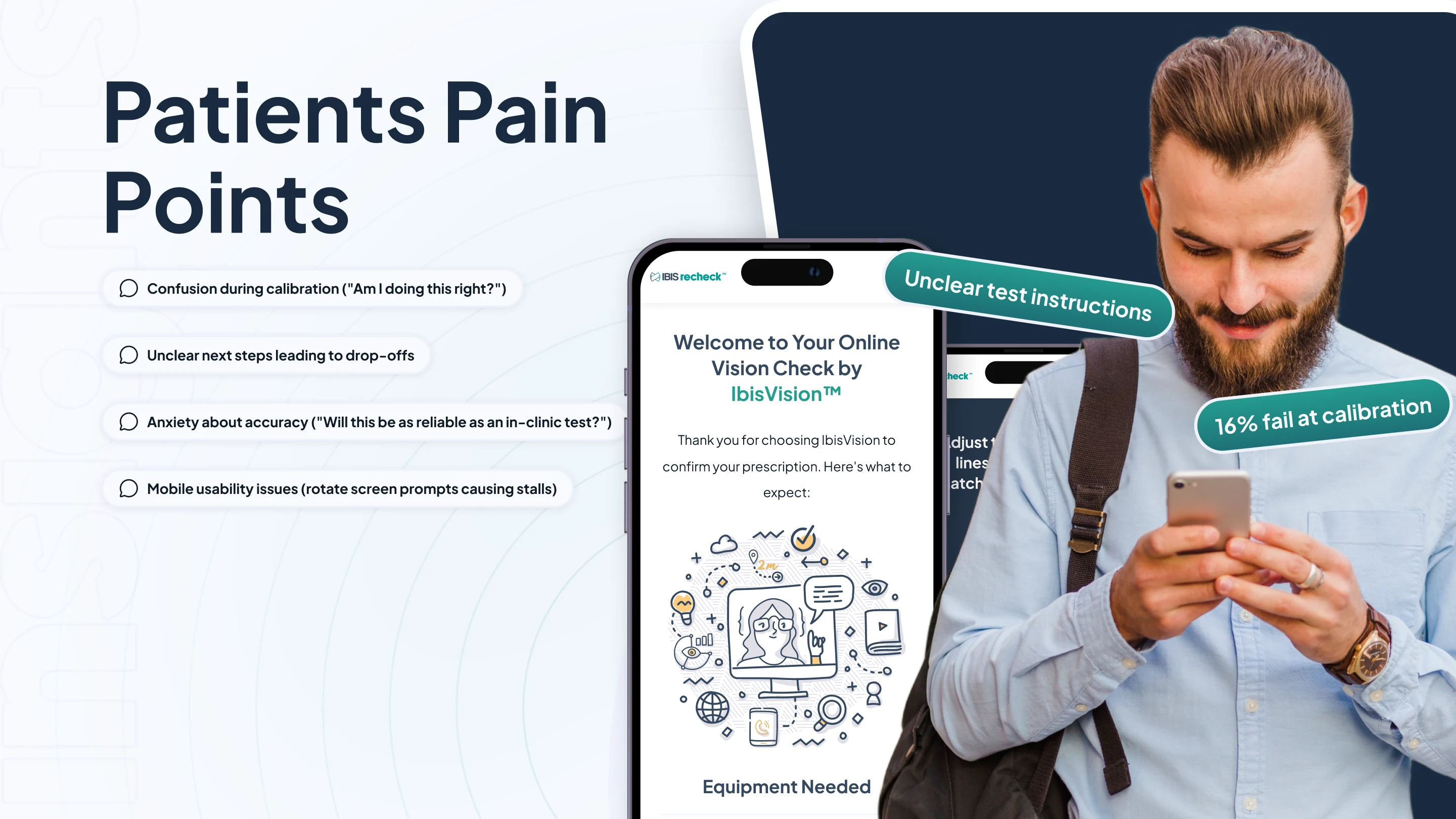
🧑💻 Patients
Our primary users were individuals looking for quick, remote prescription checks. Many were new to online vision testing, so clarity and guidance were key. The goal was to reduce drop-offs and build trust through a clean, step-by-step flow.
Top needs:
Simple onboarding
Reassurance throughout the test
Mobile-friendly, accessible UI
Accurate prescription verification
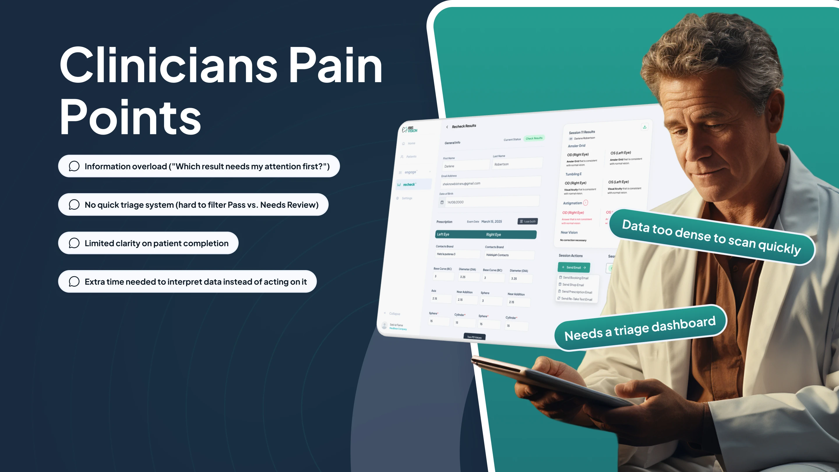
🥼 Clinicians
Clinicians used the dashboard to triage test results and decide if follow-up care was needed. They didn’t need complex data—they needed quick, confident decisions.
Top needs:
Clear result summaries
Easy-to-use filters (Pass, Review, Critical)
Exportable reports
Accurate pre-tested patients traige
Designing for both groups meant carefully balancing simplicity with clinical accuracy.
🔍 Research Highlights
We combined direct feedback with usage analytics to understand key friction points in the IbisRecheck experience.
🗣️ Field Interviews
While attending 100% Optical (London) and Vision Expo (New York), we spoke with 20+ patients and optometrists. Key takeaways:
Patients felt unsure during test calibration and needed more visual cues.
Clinicians wanted a faster way to interpret results without scanning full data sets.
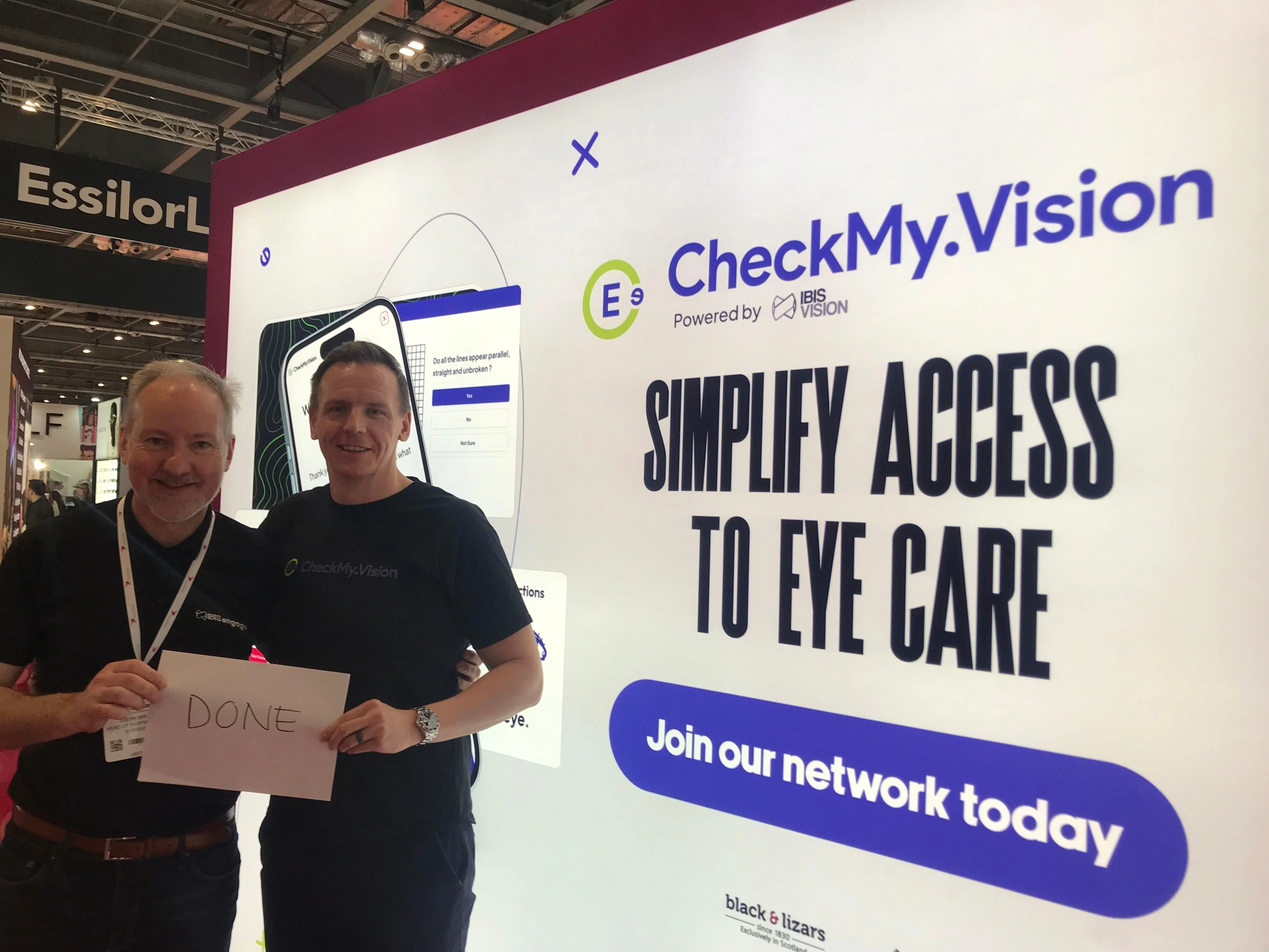
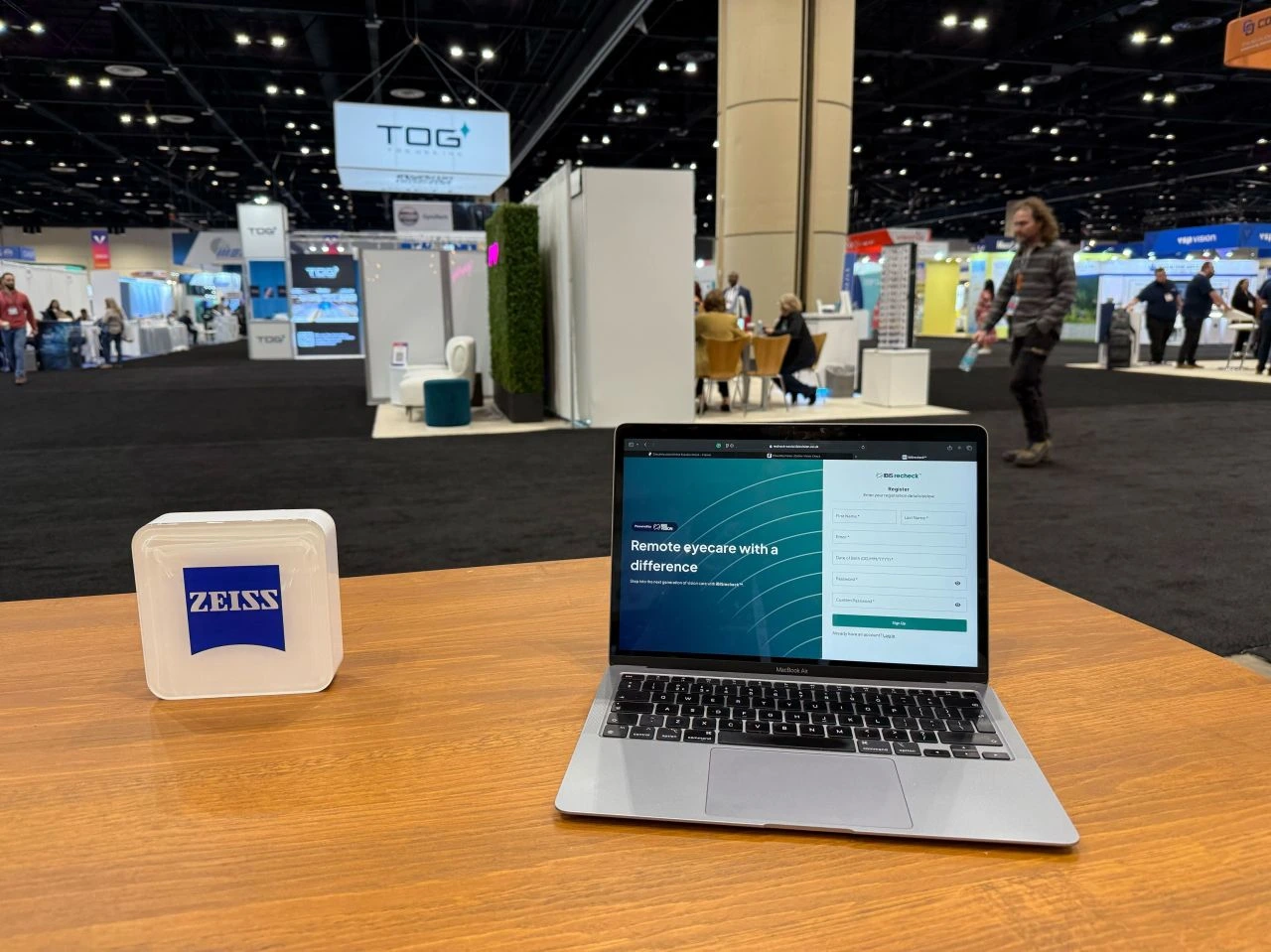
CheckMy.Vision is a whitelabelled version of IbisRecheck.
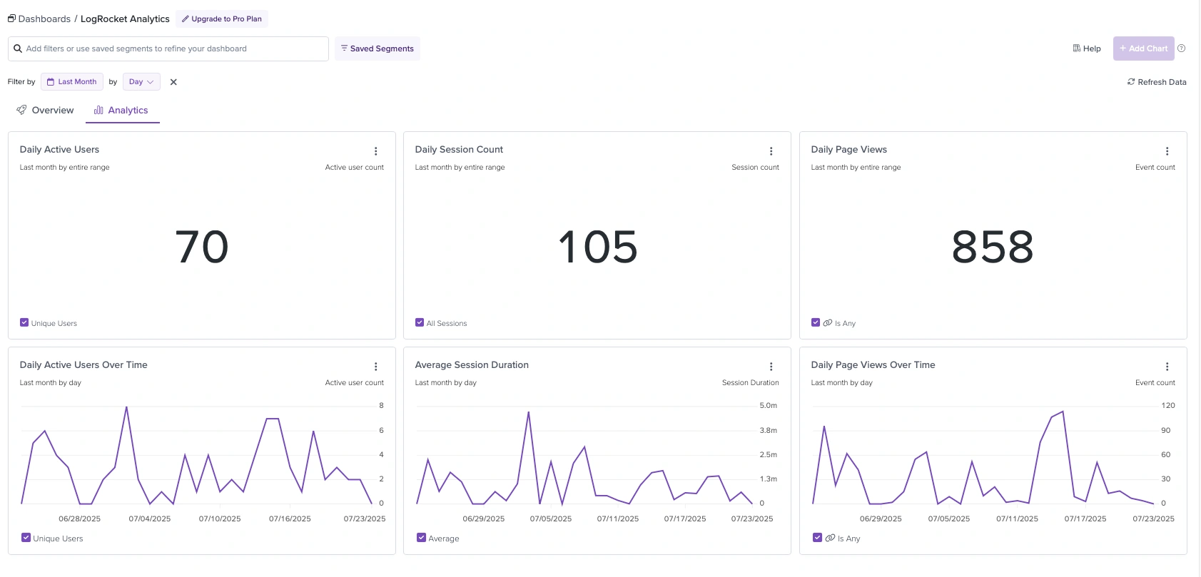
📊 LogRocket Analysis
Session Analysis: Out of 53 recorded sessions, only 15% were fully completed. The biggest friction points were:
33% of users dropped off on the home screen.
16% failed at the camera calibration stage.
5% stalled at the "Rotate Device" screen.
28% abandoned the test for other reasons.
🎯 What We Learned
Patients needed better in-flow guidance and reassurance.
Clinicians needed smarter visual hierarchy and triage filters.
These numbers confirmed what we suspected: the onboarding and calibration flows were failing to guide users through the process. With a completion rate of just 15%, it was clear the product wasn’t delivering the accessible and reliable experience we aimed for.
❗ Defining the Problem
The product was functional but losing users at key moments. Patients often dropped off mid-test due to unclear instructions or confusing interactions. Clinicians, on the other hand, faced data-heavy dashboards that made quick interpretation difficult.
This dual-friction resulted in:
Low test completion rates
Lack of clinician trust in the tool
Slower adoption by partner clinics

Problem Statement
How might we design a test flow that feels effortless for patients, while providing clinicians with clear, triage-ready results?
Our goal was to reduce friction without compromising medical credibility—creating a remote care experience people could rely on.
🛠️ Design Approach & Solutions
We tackled the redesign in focused sprints, each aimed at a specific friction point uncovered during research. Every design decision was tied to a real-world problem, with simplicity and clarity as core principles.
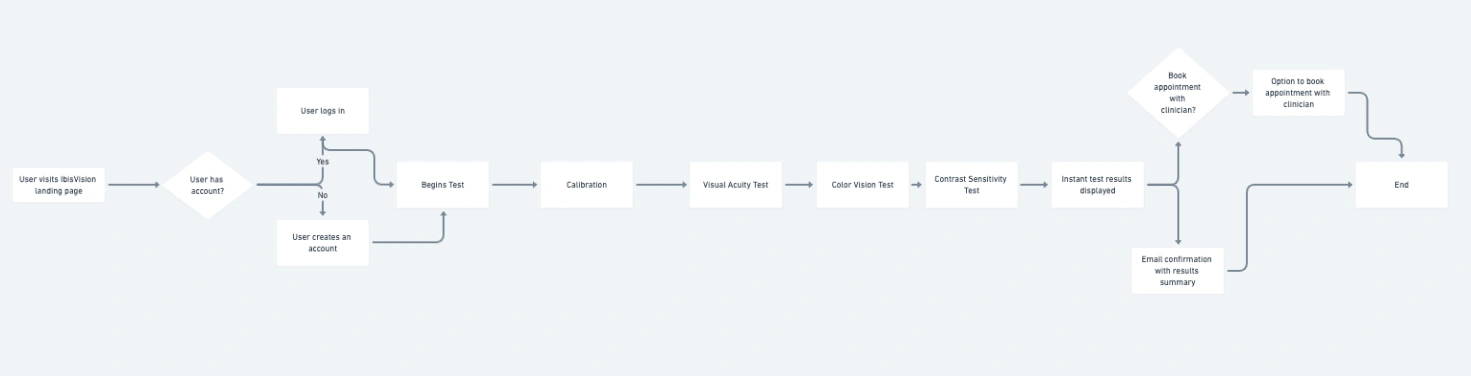
1. Onboarding & Calibration
Problem: High drop-off rates at the start of the test.
By improving the onboarding flow and simplifying calibration, our goal was to address the 16% failure rate during camera setup and increase the overall completion rate beyond the initial 15%.
2. Accessibility & Visual Clarity
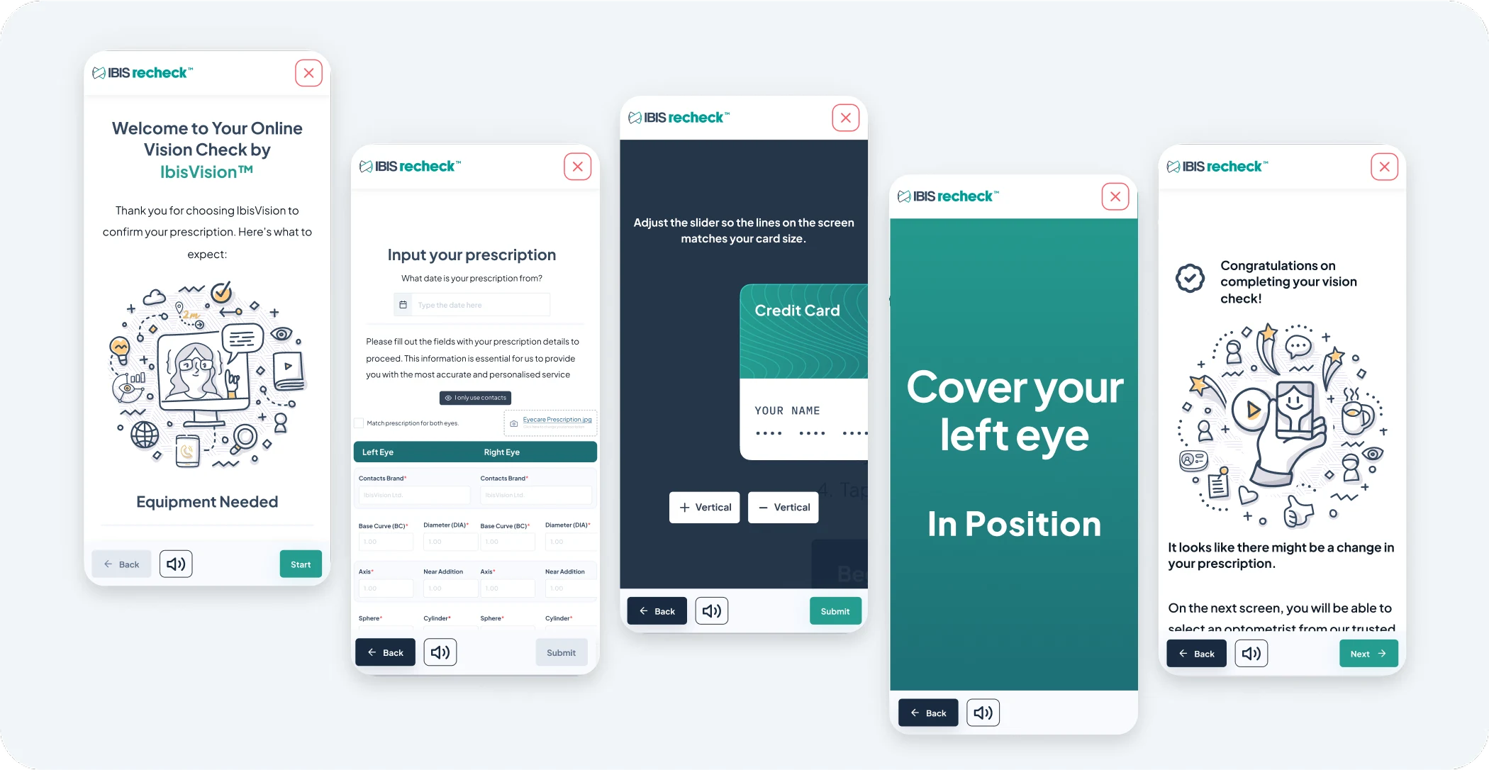
Problem: Uncertainty during the test and poor readability for some users.
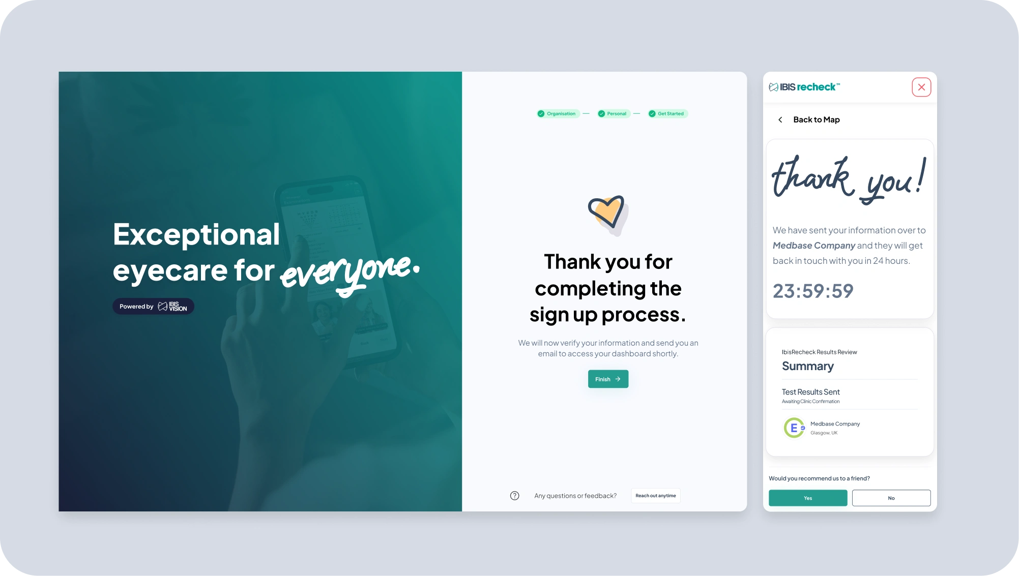
We introduced a high-contrast mode and optimized all layouts for screen readers and mobile responsiveness. Key microcopy was added throughout to reduce cognitive load and eliminate moments of hesitation.
3. Clinician Dashboard
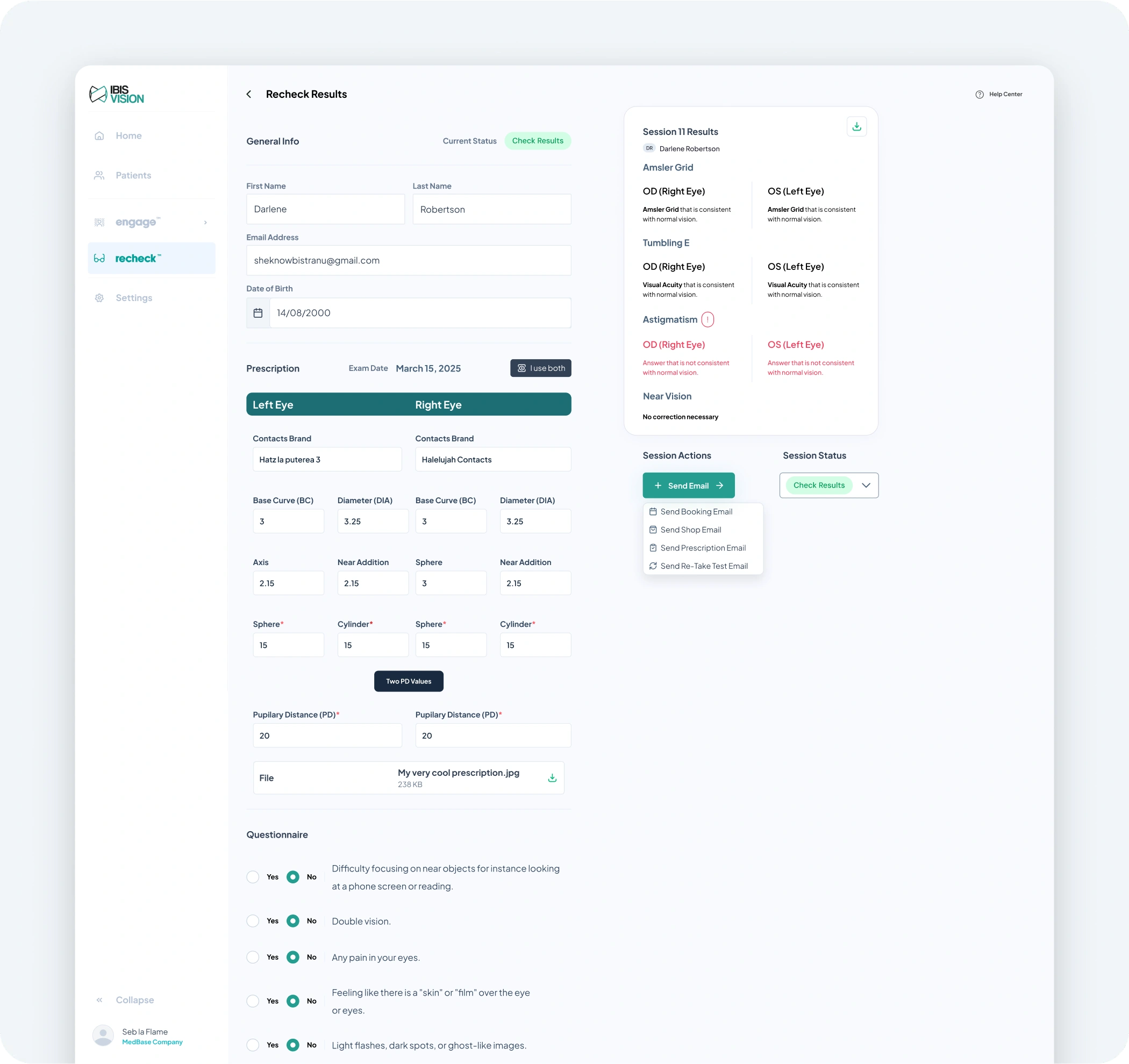
Problem: Clinicians had to dig through too much data to assess results.
We redesigned the dashboard with smart result cards, triage tagging (Pass, Needs Review, Critical), and color-coded summaries. The goal was to let a clinician know at a glance whether a patient needed follow-up care or not.
4. Reducing Cognitive Load
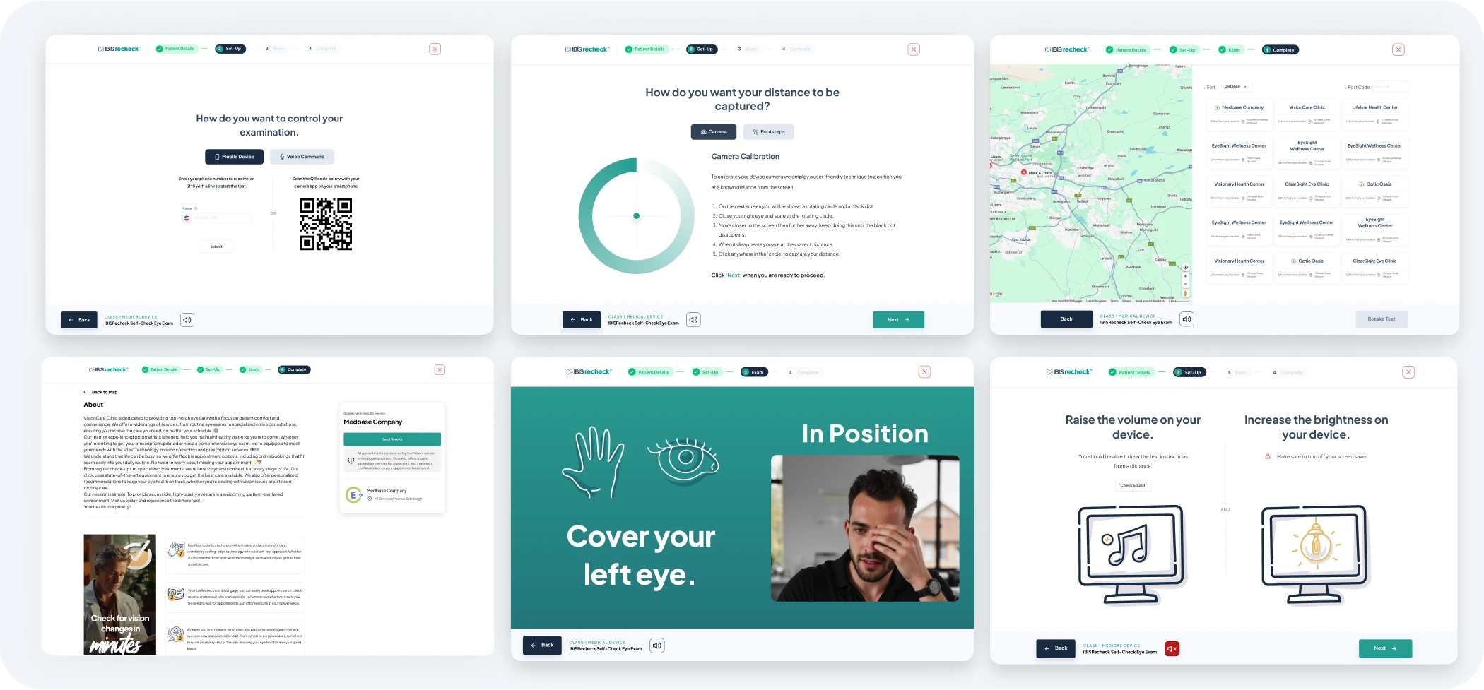
Problem: Overcomplicated interactions that added unnecessary steps.
Simplified the overall flow by cutting non-essential clicks, streamlining data presentation, and building a structure that felt more like a guided conversation than a form or spreadsheet.
Each solution was tested internally and deployed incrementally, using LogRocket data to validate improvements week over week.
🔁 Testing & Results
We didn't run formal user testing labs, but relied heavily on real-time analytics, internal QA, and clinician feedback to measure impact.
Tools & Methods
LogRocket helped us visualize user behavior, identifying friction points and validating changes post-launch.
Design Sprint Reviews allowed us to rapidly test assumptions with internal stakeholders and refine UI weekly.
Clinician Feedback Loops gave us quick responses on triage clarity and data presentation.
What Changed
27% drop-off reduction at the calibration stage
2.1× increase in test completion rates post-redesign
Clinicians reported higher confidence using results for triage, which helped unlock early partner adoption
These results validated the new flow and dashboard structure while highlighting a key takeaway: reducing uncertainty at each step has an outsized impact on user trust and retention.
🤓 Free Vision Check - Try it out: Here
📈 Impact & Reflection
The redesigned IbisRecheck experience delivered results that extended beyond just usability metrics. By reducing friction for patients and improving clarity for clinicians, we helped IbisVision move from prototype to product with real-world traction.
Outcomes
+42% patient retention after launch
27% reduction in test abandonment
Clinician adoption improved, with fewer support queries and more confidence in triage decisions
Helped IbisVision secure its first major clinic partnership with Black & Lizars
For me, this project was a crash course in designing under real constraints: clinical accuracy, accessibility, and product-market timing. It pushed me to make faster decisions, simplify aggressively, and constantly think from the user’s perspective even when those users had competing needs.
It also reinforced the value of preparation, listening to data without letting it drown out intuition, and building trust not just with users, but with your own team. Every improvement we made was a direct result of collaboration, sharp focus, and a clear understanding of what mattered most: delivering a remote vision care experience that people could rely on.
🔥 The Flame
Hope you enjoyed scrolling through this piece of work. I really appreciate you spending a few minutes of the day to see my thought process behind creating this brand and showcasing its different applications. If you want to see more of my work you can visit my Instagram page or scroll on down to see my portfolio.
✅ Are you ready to kickstart your online website? Let's build a welcoming online space for your business by getting in touch.
Like this project
Posted Jul 24, 2025
Redesigned the IbisRecheck platform to streamline remote prescription checks, resulting in a 27% reduction in drop-offs and a 42% increase in patient retention.
Likes
3
Views
80
Timeline
Jul 24, 2024 - Mar 23, 2025