Redesigned Lettuce Grow's Home Page
As the Senior Product Designer for Lettuce Grow, I turned a new leaf on their home and product pages, while keeping their sustainable vibe alive.

If you haven't heard of Lettuce Grow, they're all about sustainable home gardening.
They were itching to sell more hydroponic kits online, but their home page wasn't blooming — they were barely turning visitors into buyers.
Why? It had no punchy hook, or clear “buy this” buttons, so click-throughs tanked.
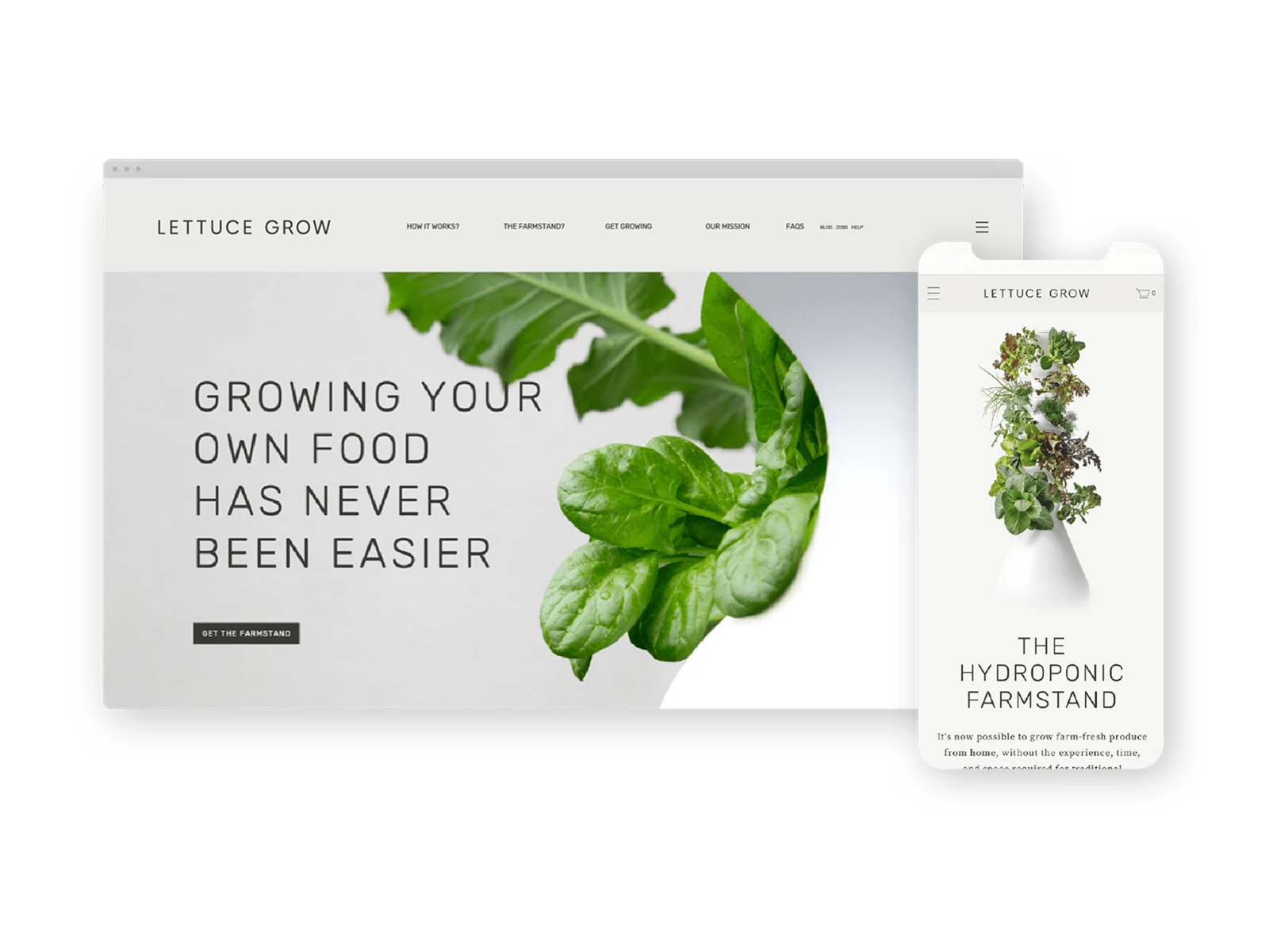
Lettuce Grow / Previous Home Page Design

As the contract senior product designer, I had to...
Create new designs that would drive traffic to product pages, boost sales, and make the user journey smooth, all while vibing with their new brand.
Lettuce Grow / New Branding
So, what did I do?
I went big on storytelling: a majestic hero section with slick pics screaming “this is the future of gardening,” bold product showcases with “Shop Now” CTAs, a benefits bit flaunting ease and eco-wins with real testimonials, simpler navigation, and some videos to hook ‘em.

After digging into user data, testing wireframes, and syncing with marketing and the frontend developers, we launched.
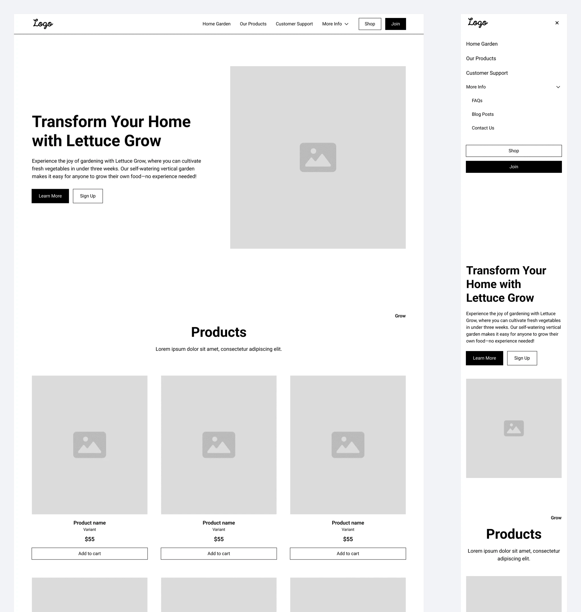
Lettuce Grow / New Home Page Initial Wireframes
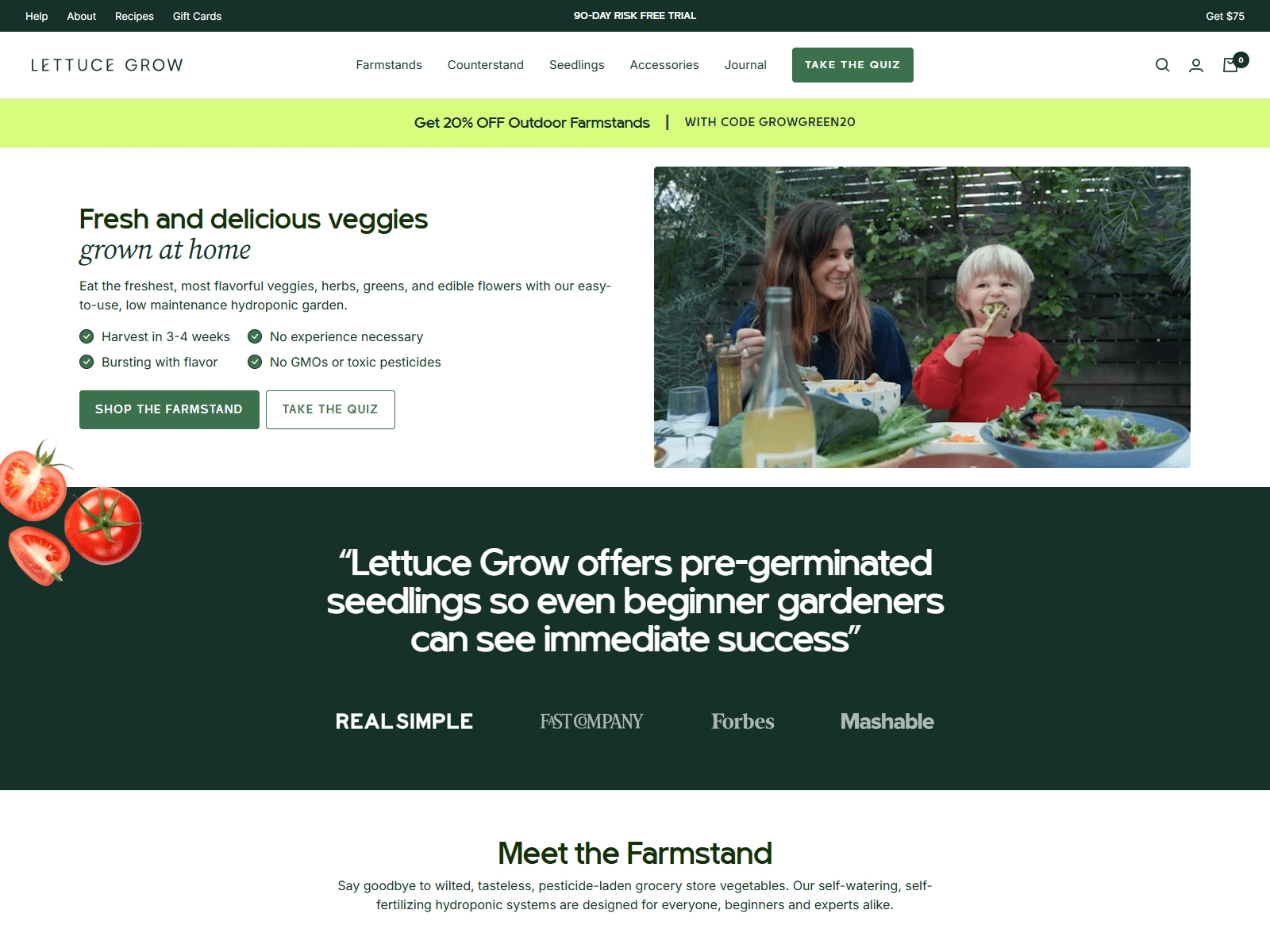
Lettuce Grow / New Home Page Redesigned

Receipts?
22% more clicks to products, 12% traffic spike, 7% sales bump.
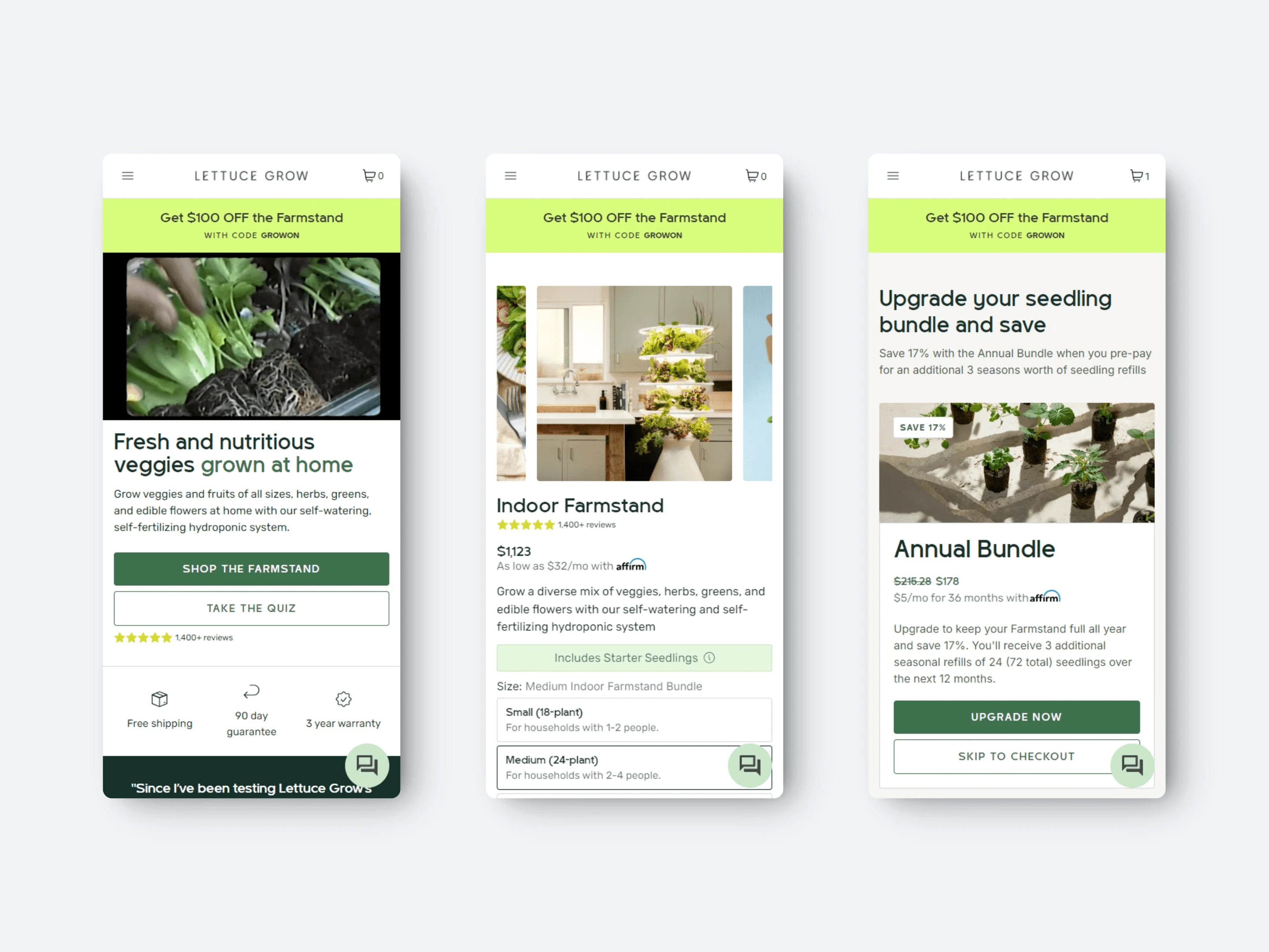
Lettuce Grow / Mobile Redesigned
Trade-off: users Tokyo Drifted to products faster, cutting home page time — lesson learned, balance the info overload.
Like this project
Posted Oct 17, 2024
As the Senior Product Designer, I turned a new leaf on their home and product pages, while keeping their sustainable vibe alive.
Likes
17
Views
185
Clients

Lettuce Grow


