Improved Quince's Order Return Flow
Ary Mega
Don't you just hate it when you're tryna return something, and it's more confusing than asking your partner where they wanna eat?
Samesies.
That's why I was brought on board Quince — to cut down their pile of support tickets, free ‘em up for bigger stuff, and make returns dead simple for consumers.

Quince, the go-to for affordable luxury, had a return process messier than a high school breakup text, or AOL away message (if you're ol' school).
As the Senior UX/UI Designer, I slid into the DMs to fix returns so support wasn’t swamped, and smooth out the product-to-checkout flow to keep folks from bailing.

Here's what I did:
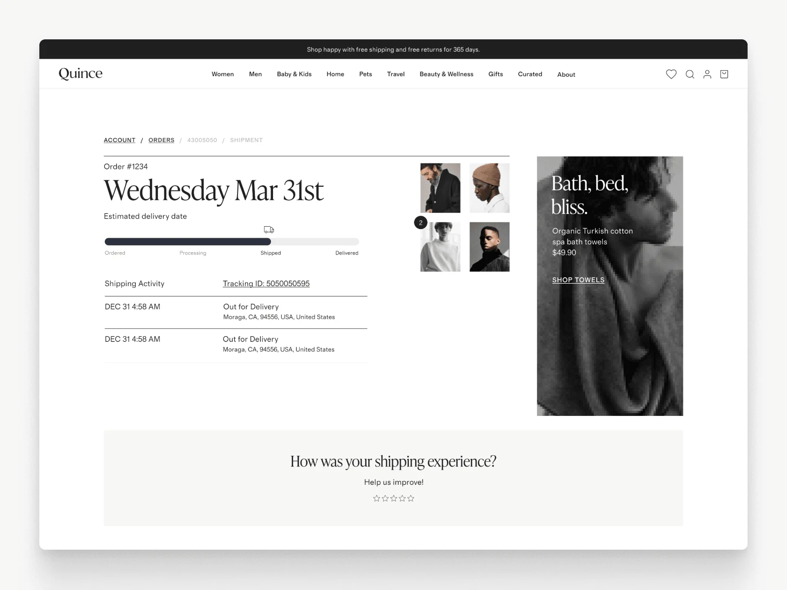
I implemented Happy Returns as an alternative solution with no-brainer instructions and auto-labels, added proactive order updates to the tracking page, so nobody felt ghosted, and juiced up product pages with better size guides and reviews to avoid “this ain’t it” returns.
After diving into data like Blue's Clues, I sketched user flows, wireframes, and designed the visuals like I was Bob Ross.
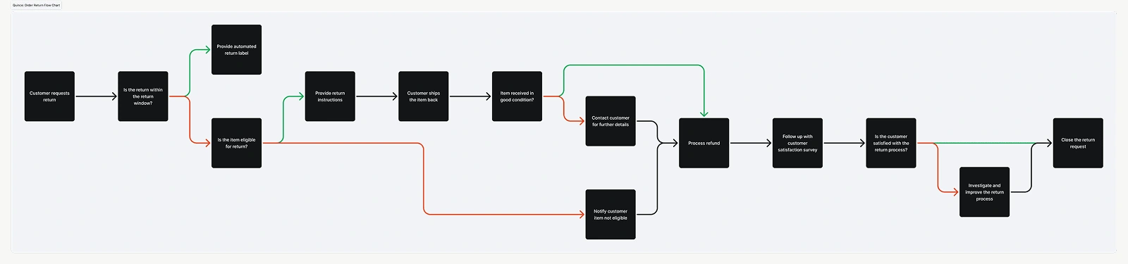
Quince / New Returns Order Flow
Mouse-around in the Figma file:

So, what happened?
Support tickets dropped 19%, cart abandonment fell 7%, mobile orders rose 5%.
Downside?
Returns spiked 8% — people actually started using it now.
But, on the flip side, they're ordering more confidently knowing if the size don't fit, they can easily, and conveniently, return their items using Happy Returns.

TL;DR
Clear UX hooks ‘em (thanks, IKEA effect), streamlined flows seal the deal, and Quince went from chaos to chill.
Like this project
Posted Dec 10, 2024
I improved Quince's order return flow that helped customer support focus on higher-priority tasks, and the consumers confidence to shop more.
Likes
0
Views
115
Timeline
Sep 2, 2024 - Dec 6, 2024
Clients
Quince