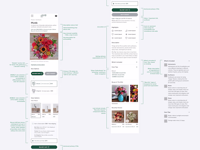
Improved Four Sigmatic's Conversion Rates
Ary Mega
Four Sigmatic, the mushroom mavens of coffee and elixirs, had a funnel that was more fungi than fun — low conversions and high bounce rates.

Visitors didn’t get why mushrooms mattered, and a muddled layout left them lost.
As the Freelance UX/UI Designer, I was tasked with brewing a home page and product page that educated, guided, and sold — all while keeping their quirky vibe alive.

Four Sigmatic / New / Home Page -> Product Page
I made the hero section "pop" with bold visuals and punchy words, carved out slick product showcases, and added an “Ingredient Education” corner.
Navigation got a clean sweep, and I A/B tested a sneaky subscription default for top picks.

The brew?
Click-throughs soared, product pages buzzed, and subscriptions spiked.
Users lingered longer, grasped the goods, and bought with gusto.
Lesson learned:
A dash of education and slick UX turns skeptics into sippers.
Video Testimonials -> Social Proof
Like this project
Posted Oct 17, 2024
Redesigned Four Sigmatic's home page to increase conversion rates with a frictionless shopping experience.
Likes
1
Views
60
Clients
Four Sigmatic