Redesigned Dave & Buster's Mobile App
Ary Mega
After getting Dave & Buster's new look and feel dialed in, I redesigned their mobile app with the new branding.

Here's the one-minute bedtime story:
Dave & Buster’s was losing ground to modern entertainment venues like Top Golf. Foot traffic was declining, and the existing mobile app was an isolated silo that provided zero value to the in-store experience.
The objective wasn’t just to update the branding; it was to drive in-store revenue, increase repeat visits, and seamlessly connect physical arcade gameplay with a digital loyalty wallet.

Dave & Buster's / Old / Mobile App

The challenges?
Legacy Tech Integration:
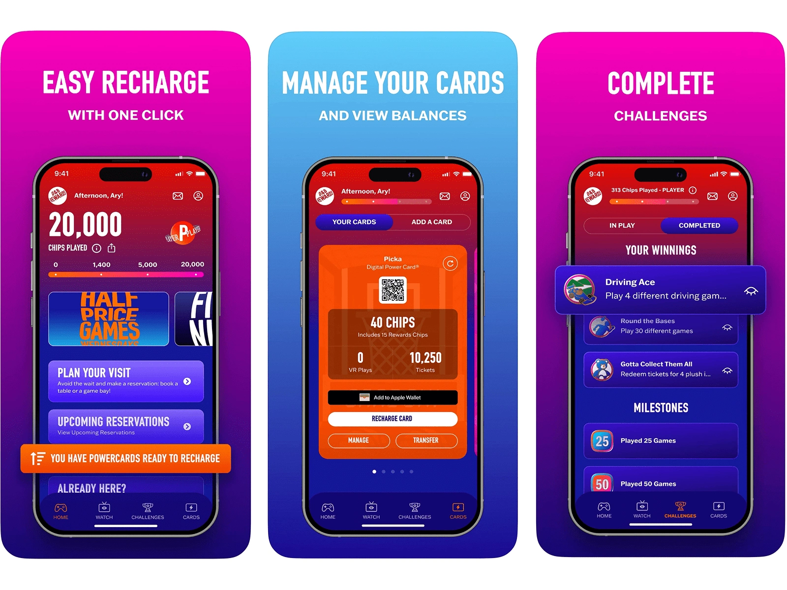
We had to figure out how to sync real-time card balances and ticket counts from legacy in-store arcade cabinets to a modern cloud-based mobile app. The legacy API had a 45-second polling delay for ticket balance updates, creating a panic-inducing lag where users thought their winnings were lost.
To solve this without forcing engineering to rewrite a 15-year-old database, I designed an optimistic UI state, essentially the UX equivalent of the iMessage "typing..." bubble.
I introduced an animated "tabulating tickets" sequence that visually bridged the latency gap, managed user expectations, and stopped them from rage-refreshing the app.
Dave & Buster's / Overview / Project Overview

As the Lead Designer, I leaned into gamification as a behavioral driver
Challenges & Leaderboards:
By introducing time-gated "Weekend Warrior" ticket multipliers and localized leaderboards (e.g., "Top Scorer in Northridge"), we created an artificial urgency that drove a 14% increase in digital game card reloads before the user even stepped foot in the building.
Cross-Functional Alignment:
Getting the new loyalty program approved required intense alignment. I had to negotiate with the marketing team to ensure the "rizz" of the new brand voice didn't cannibalize the clarity of the checkout flow. I ultimately compromised on the visual design by stripping out their heavy, animated 3D brand assets during the payment sequence, opting instead for a brutalist, high-converting UX just for the checkout to prevent cart abandonment.
Dave & Buster's / New / Plan of Action
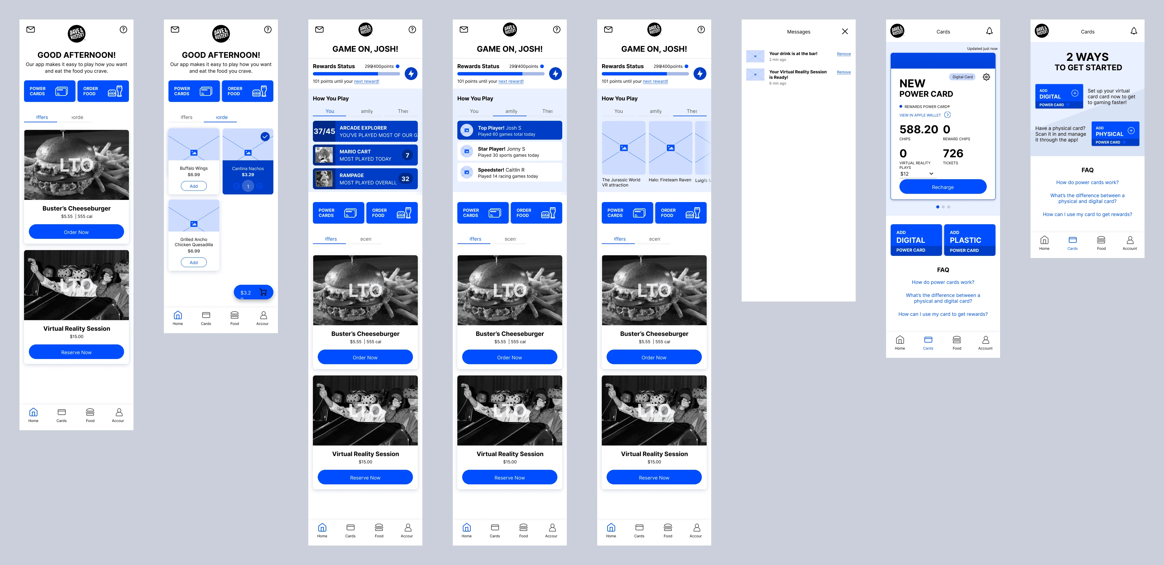
Dave & Buster's / New Mobile App Wireframes
Receipts?
By focusing on omnichannel infrastructure rather than just visual aesthetics, the redesign fundamentally shifted user behavior.
23% increase in app downloads
14% increase in digital game card purchases (Direct Revenue Impact)
11% increase in monthly active users
9% increase in mobile food and beverage orders

Before I talk about the key takeaways, may I present to y'all, the new, and improved, Dave & Buster's mobile app:
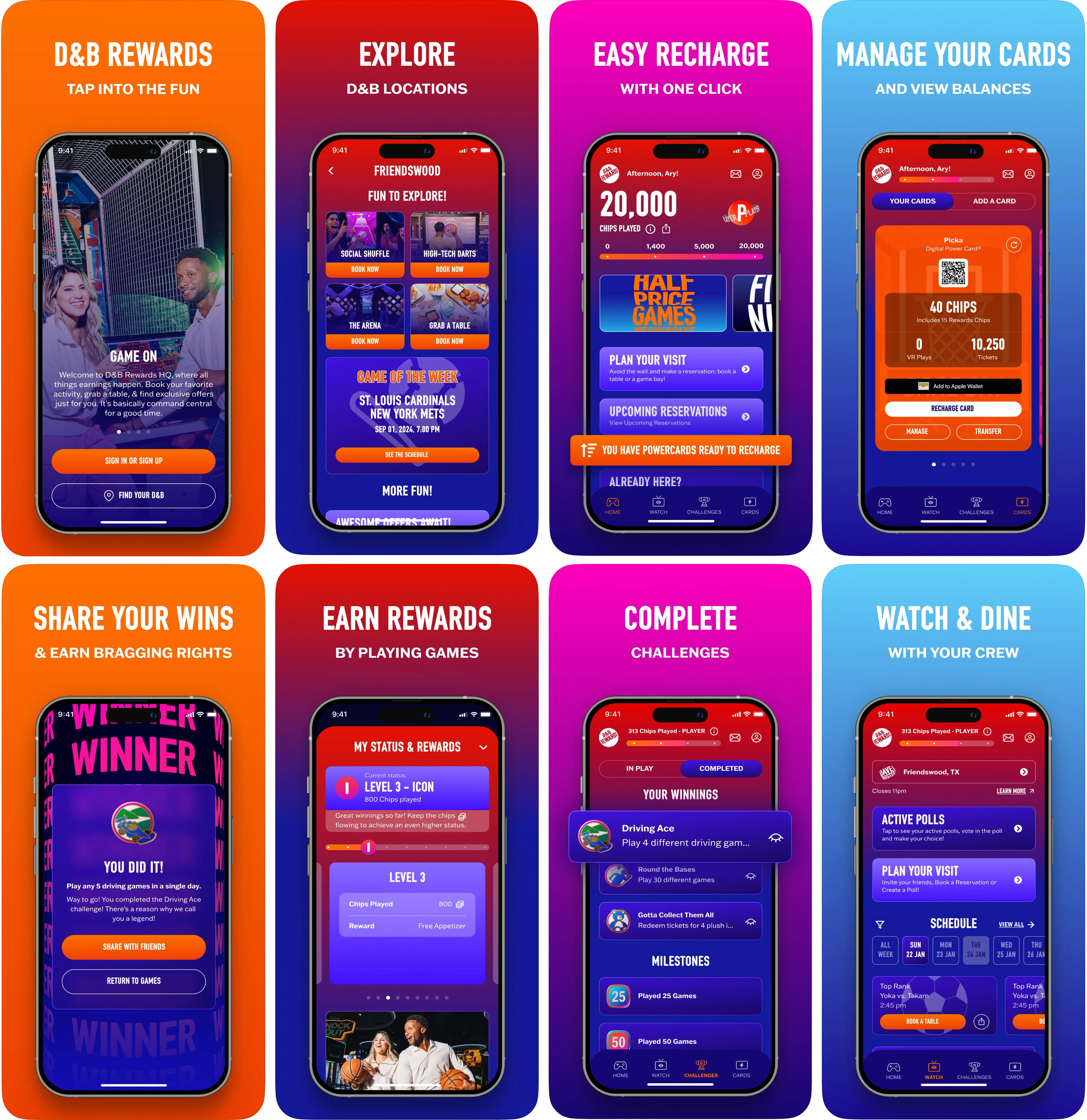
Dave & Buster's / New / Mobile App Redesigned

So, what were the lessons learned from this project?
Gamify it, simplify it, and personalize it — people stick around and spend more.

Download the app, meet the crew at your nearest location, and play some skee-ball with some 🍔 and 🍻
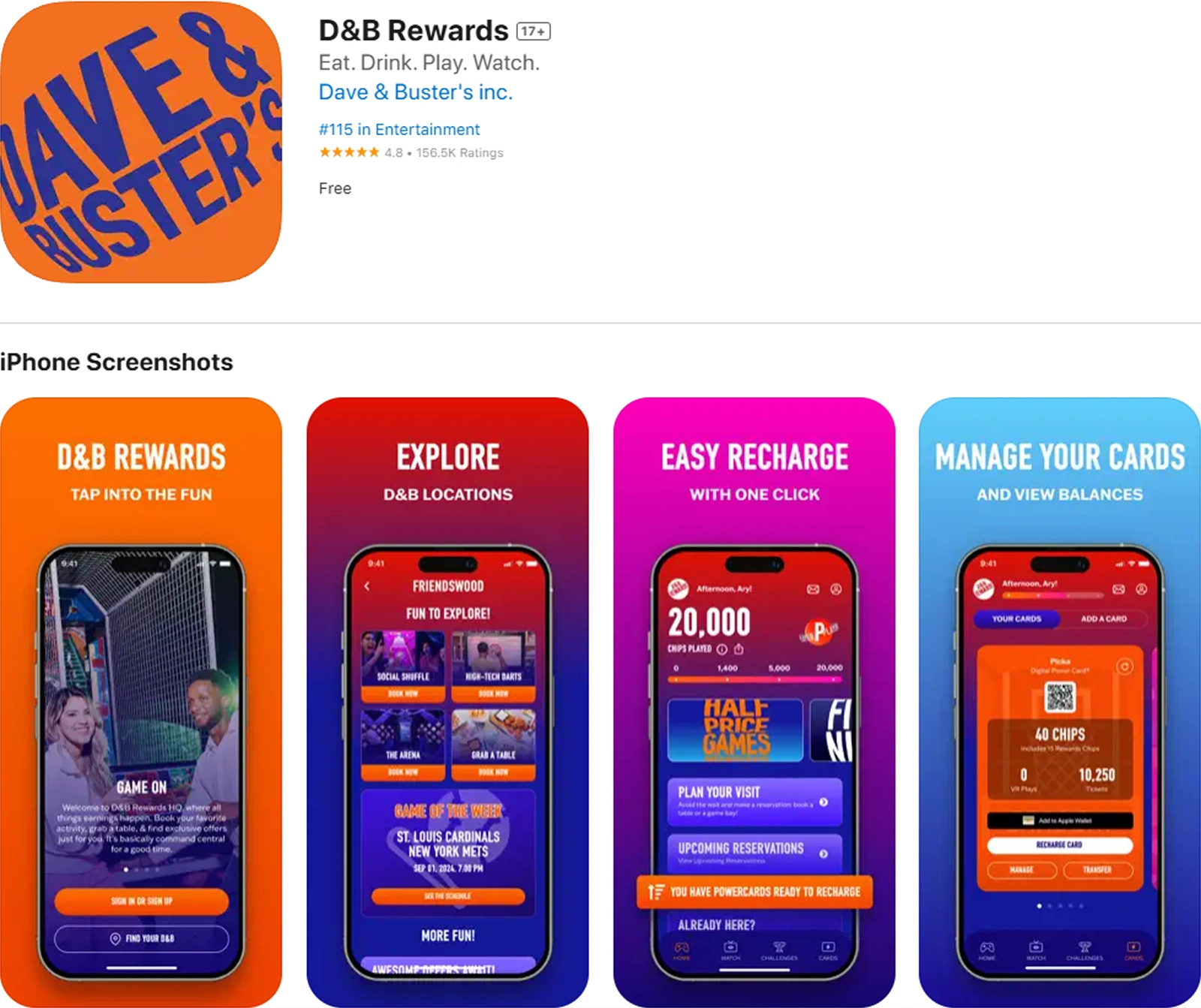
Dave & Buster's on the App Store
Like this project
Posted Oct 16, 2024
After getting Dave & Buster's new look and feel dialed in, I redesigned their mobile app.
Likes
2
Views
253
Clients
Dave & Buster