
Why Your Website Buttons and Forms Should Be Easy to Use on Mobile
Imagine a potential customer visiting your website, ready to contact you, but struggling to tap your tiny contact button or complete your enquiry form.
What happens next? They may simply leave.
Mobile usability goes beyond making your website fit a smaller screen. Every interaction should feel effortless.
Here are 5 things every business website should get right
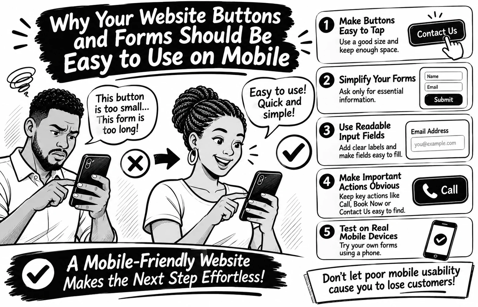
Make buttons easy to tap. Avoid tiny buttons and keep enough space between clickable elements to prevent accidental taps.
Simplify your forms. Ask only for information you genuinely need. Too many fields can make enquiries feel like hard work.
Use readable input fields. Make text clear, provide visible labels, and ensure fields are easy to select and complete.
Make important actions obvious. Your Call, Book Now, Contact Us, and Submit buttons should be easy to find.
Test on real mobile devices. Don't rely only on desktop previews. Try completing your own contact form using your phone.
Here's an important detail WCAG 2.2 recommends a minimum target size of 24 × 24 CSS pixels for many interactive controls, with certain exceptions. Bigger, well-spaced buttons can make mobile interactions even easier.
Remember: A website shouldn't just attract visitors; it should make taking the next step easy.
Have you ever abandoned a website because its buttons or forms were difficult to use on your phone? Share your experience
0 likes · 0 views · Nov 4, 2026
Why Your Website Buttons and Forms Should Be Easy to Use on Mobile Imagine a potential customer visiting your website, ready to contact you, but struggling t...


