
10 Common Mobile Website Design Mistakes and How to Fix Them
Your website may look perfect on a computer but frustrate visitors on their phones. And that matters: Google uses the mobile version of your website for indexing and ranking.
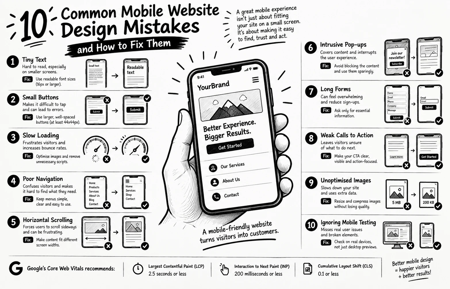
Here are 10 mistakes to check:
1. Tiny text Use readable font sizes.
2. Small buttons Make taps easy and comfortable.
3. Slow loading Optimise images and remove unnecessary scripts.
4. Poor navigation Keep menus simple and clear.
5. Horizontal scrolling Make content fit different screen widths.
6. Intrusive pop-ups Avoid covering the content visitors came to see.
7. Long forms Ask only for essential information.
8. Weak calls to action Make the next step obvious.
9. Unoptimised images Resize and compress images without sacrificing quality.
10. Ignoring mobile testing Check real devices, not just desktop previews.
Here's a fact worth remembering: Google recommends a Largest Contentful Paint (LCP) of 2.5 seconds or less, an Interaction to Next Paint (INP) of 200 milliseconds or less, and a Cumulative Layout Shift (CLS) of 0.1 or less for a good user experience.
A mobile-friendly website isn't simply one that fits a small screen. It should help visitors find information, trust your business, and take action with ease.
Question: Which of these mistakes have you noticed on a business website recently?
#WordPress #WebDesign #MobileUX #WebsiteTips #WooCommerce
0 likes · 0 views · Oct 29, 2026
10 Common Mobile Website Design Mistakes and How to Fix Them Your website may look perfect on a computer but frustrate visitors on their phones. And that ma...

