
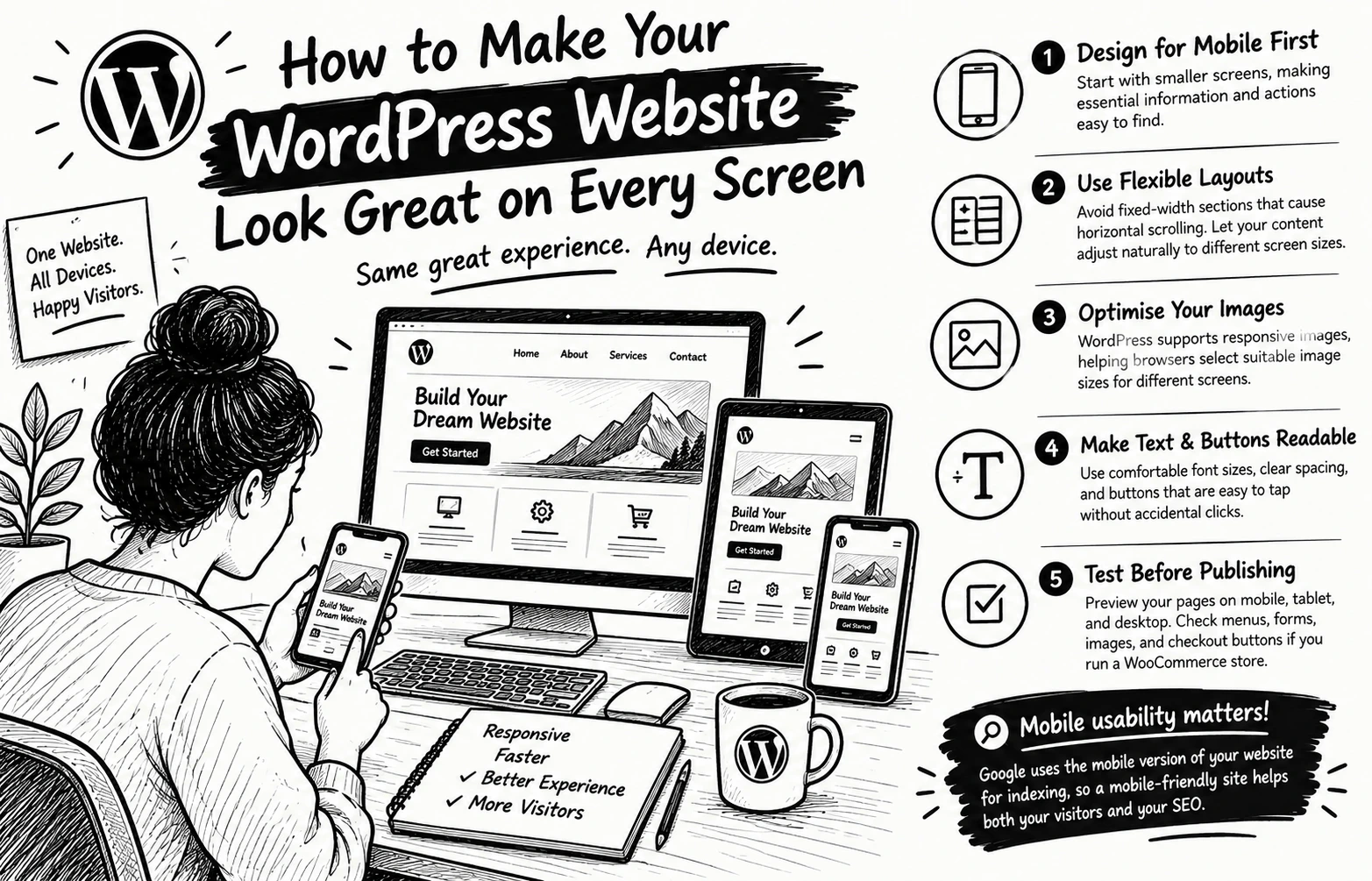
How to Make Your WordPress Website Look Great on Every Screen
Have you ever opened a website on your phone and had to zoom in just to read the text or tap a button? Your visitors shouldn't have to struggle with your website.
A professional WordPress website must work beautifully on phones, tablets, and desktops not just on the designer's computer.
Here are 5 practical ways to achieve that:
1. Design for mobile first. Start with smaller screens, making essential information and actions easy to find.
2. Use flexible layouts. Avoid fixed-width sections that cause horizontal scrolling. Let your content adjust naturally to different screen sizes.
3. Optimise your images. WordPress supports responsive images, helping browsers select suitable image sizes for different screens.
4. Make text and buttons readable. Use comfortable font sizes, clear spacing, and buttons that are easy to tap without accidentally clicking something else.
5. Test before publishing. Preview your pages on mobile, tablet, and desktop. Check menus, forms, images, and checkout buttons if you run a WooCommerce store.
Here's something important: Google uses the mobile version of a website's content for indexing.
So mobile usability isn't just about appearance; it also matters for how your website is understood by search engines.
Your turn: When you visit a website on your phone, what frustrates you most tiny text, slow loading, or confusing navigation? Share your answer below
0 likes · 0 views · Oct 30, 2026
How to Make Your WordPress Website Look Great on Every Screen Have you ever opened a website on your phone and had to zoom in just to read the text or tap a...

