
How to Improve Mobile Navigation on a WordPress Website
Ever tried to find a service on a website, only to give up because the menu was confusing? Visitors can face the same frustration on mobile.
Here are 5 practical fixes
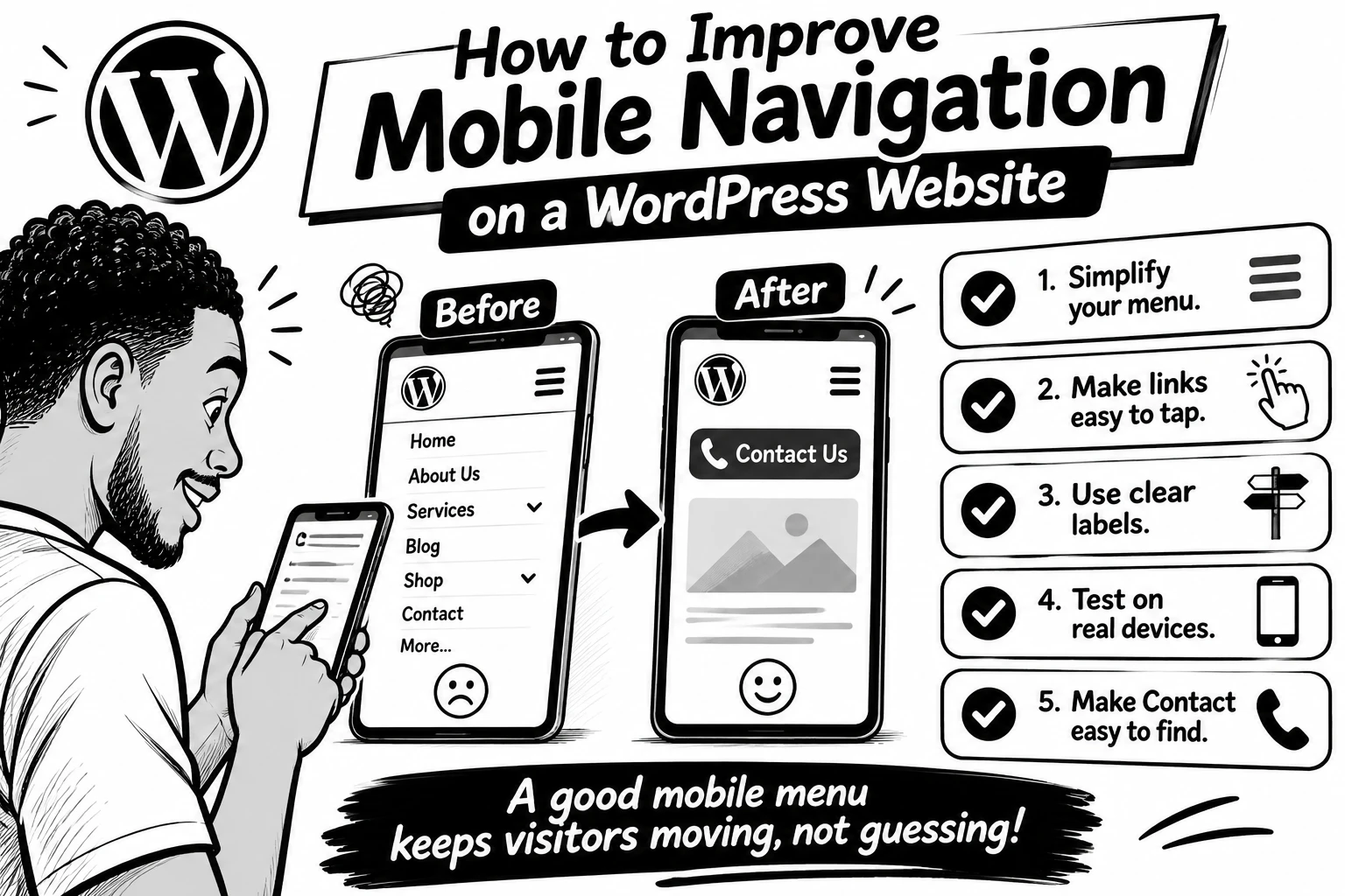
1. Keep the menu simple. Prioritise pages people need most: Services, About, Contact, or Shop. Too many options make decisions harder.
2. Make links easy to tap. Digital.gov recommends touch targets around 48 CSS pixels, with enough space between them to reduce accidental taps.
3. Use clear labels. “Get a Quote” tells visitors more than “Explore.” Make each menu item’s destination obvious.
4. Test on a real phone. Try every link, check submenus, and make sure the menu opens and closes easily.
5. Make the next step easy to find. If calls or bookings matter, keep Contact, Book Now, or Call visible without crowding the menu.
WordPress’s Navigation block lets you control how menus collapse into a mobile icon and how submenus open so check those settings in your editor.
💬 What frustrates you most on mobile websites: tiny links, confusing menus, or too many options? Tell me below.
0 likes · 0 views · Nov 5, 2026
How to Improve Mobile Navigation on a WordPress Website Ever tried to find a service on a website, only to give up because the menu was confusing? Visitors ...


