Il Prof Che Ci Piace
Summary
I collaborated with a group of Italian teachers who transformed their popular YouTube channels into Italy’s first online school.
The project involved creating a comprehensive video platform for mobile and desktop and web tools for admins and teachers.
Through extensive research and user feedback, we designed an intuitive, engaging interface inspired by popular social media and streaming platforms, focusing initially on essential features to meet tight deadlines.
Despite some challenges, the project successfully delivered a high-fidelity prototype, ready for further iteration based on real-world use and feedback.
Please note: this project is protected by NDA. Some elements have been slightly altered to protect the client's right to privacy.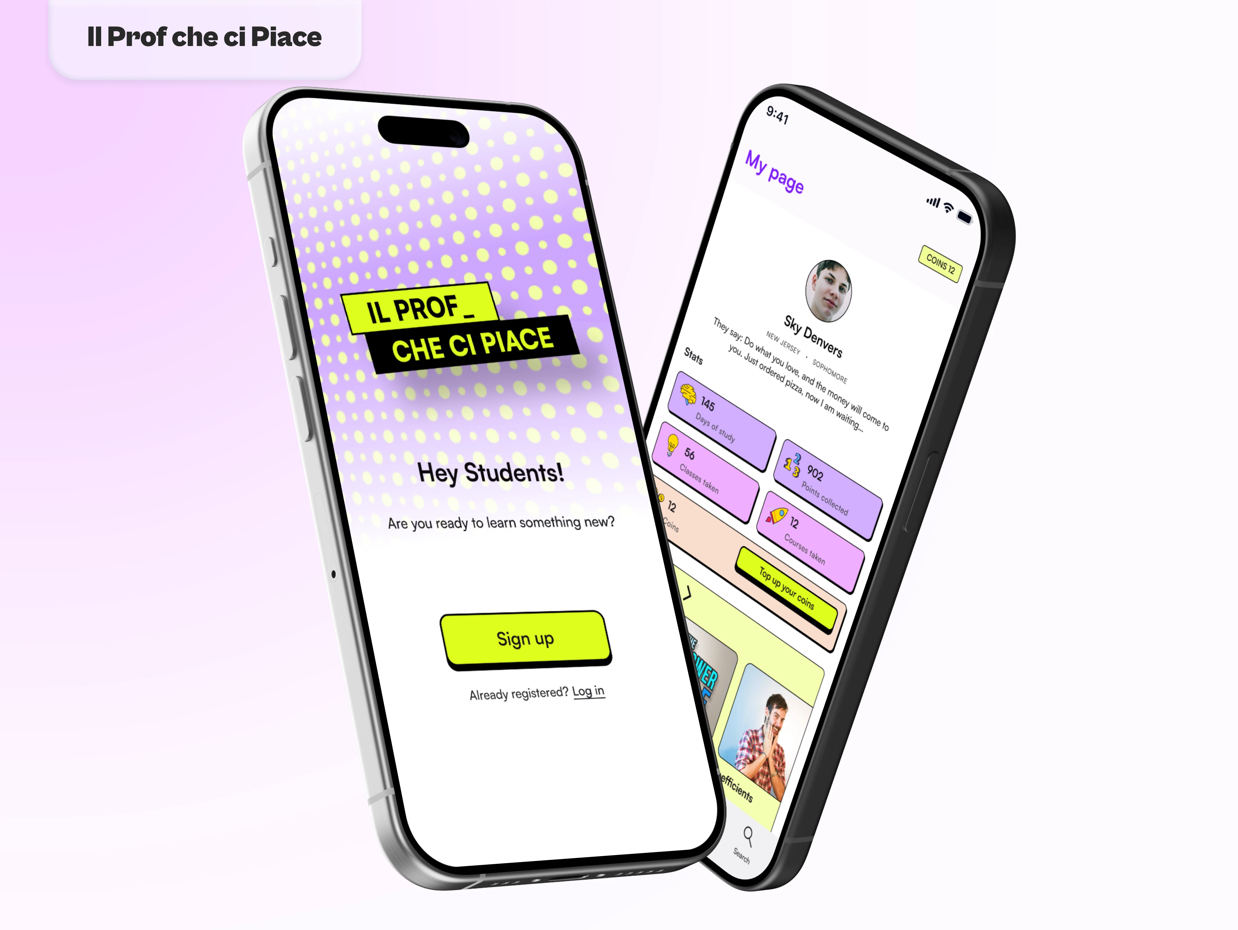
The Client
I was approached by this energetic group of Italian teachers who created YouTube channels to help kids catch up with their studies during the pandemic, and since they've amassed roughly around 3 million followers, they've decided to create their video platform and turn their passion project into the first online school in Italy.
"Well, that's ambitiously crazy!" I thought. But the more they talked about it, the more I saw their passion, and the more I was convinced it would be a fun challenge to work on. I was even more invested once I realized that my niece and nephew were following them and they were finally getting good grades in math and physics after watching their video lessons.
You know you're getting old when you realize that moms now have to encourage kids to watch YouTube videos to study instead of locking down their computers!
The Project Scope
First, we needed to establish the scope of this project and understand how we could reach an MVP which is quite the task when you want to create a whole new video-sharing platform from scratch!
After hours of Zoom calls and liters of coffee we ended up with a plan:
Create a management software accessible online
Build the mobile and desktop versions of the platform
Give teachers a creation tool to upload their lessons and manage their classes
It was clear from this outline that the seven-month time frame they suggested would not be nearly enough, so I advised them to keep it simple for the first iteration and implement non-necessary elements (gamification, content creation, student chat, etc...) with the following updates.
Ideation
We spent the first four months going through a long phase of research, outlining a detailed user journey, and finally sketching. We decided to focus our energies on the mobile and desktop app for students first to understand what was our end goal and work our way back from there.
Research
Despite the many FaceTime calls with my niece and nephew talking about their experience with my clients, we opted for a more traditional survey and interrogated a wider group of students aged between 14 and 22.
From the answers received, we concluded that:
Students liked the fresh approach to teaching and felt they understood difficult topics better because they could pause the video and rewind it when needed.
Teenagers were more likely to find their YouTube playlists difficult to navigate because they lacked coherence and categorization making it hard to create a study path.
Students spent on average 4 to 8 hours a day using social media (Instagram, TikTok, Snapchat).
On a daily average, they also spend 6 to 10 hours watching videos on streaming or video-sharing platforms (Netflix, YouTube, TikTok).
Although I fear some of these kids have no concept of how much time they spend glued to their phones, these findings combined with the client's requests gave us enough information to proceed to the next phase.
User Journey
Mobile / Desktop App for Students
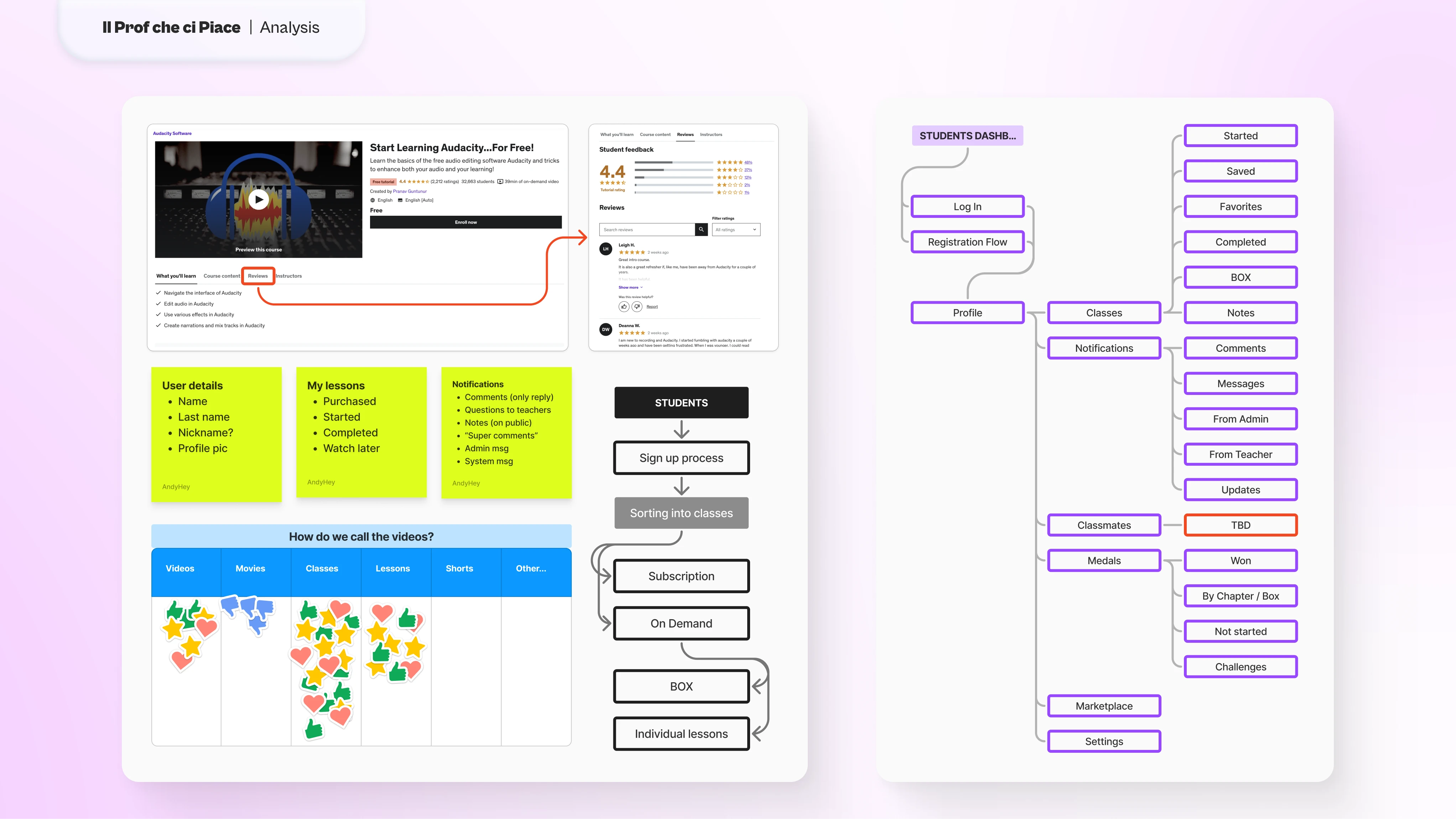
As I mentioned before, we decided to keep things simple for our first iteration of this new product, so we took the cue from all the social media and streaming platforms teenagers already use every day adapting them to our needs. This choice helped us make the portal intuitive and easy to use thanks to the familiarity of its elements, leaving us ample room to integrate new functionalities that required little to no explanation.
Our sources of inspiration were:
Netflix and the Apple TV app. The rigorous and well-categorized structure would help us address some of the students' concerns when browsing the list of classes on YouTube.
Duolingo and Udemy. The gamified learning path of Duolingo combined with the complexity of Udemy courses would help convey the client's idea of "fun learning for all ages"
YouTube, Instagram, and TikTok. Each of these services has its unique spin on video sharing, from the player and how users interact with it to messaging and comment systems. These would prove to be essential to create an engaging and familiar product.
We now had a clearer idea of the direction we wanted to take. It was time to take our tablets (or pen and paper for the traditionalists) and start jotting down ideas to combine all these elements into something that would make sense for students to use.
Web Apps for Admins and Teachers
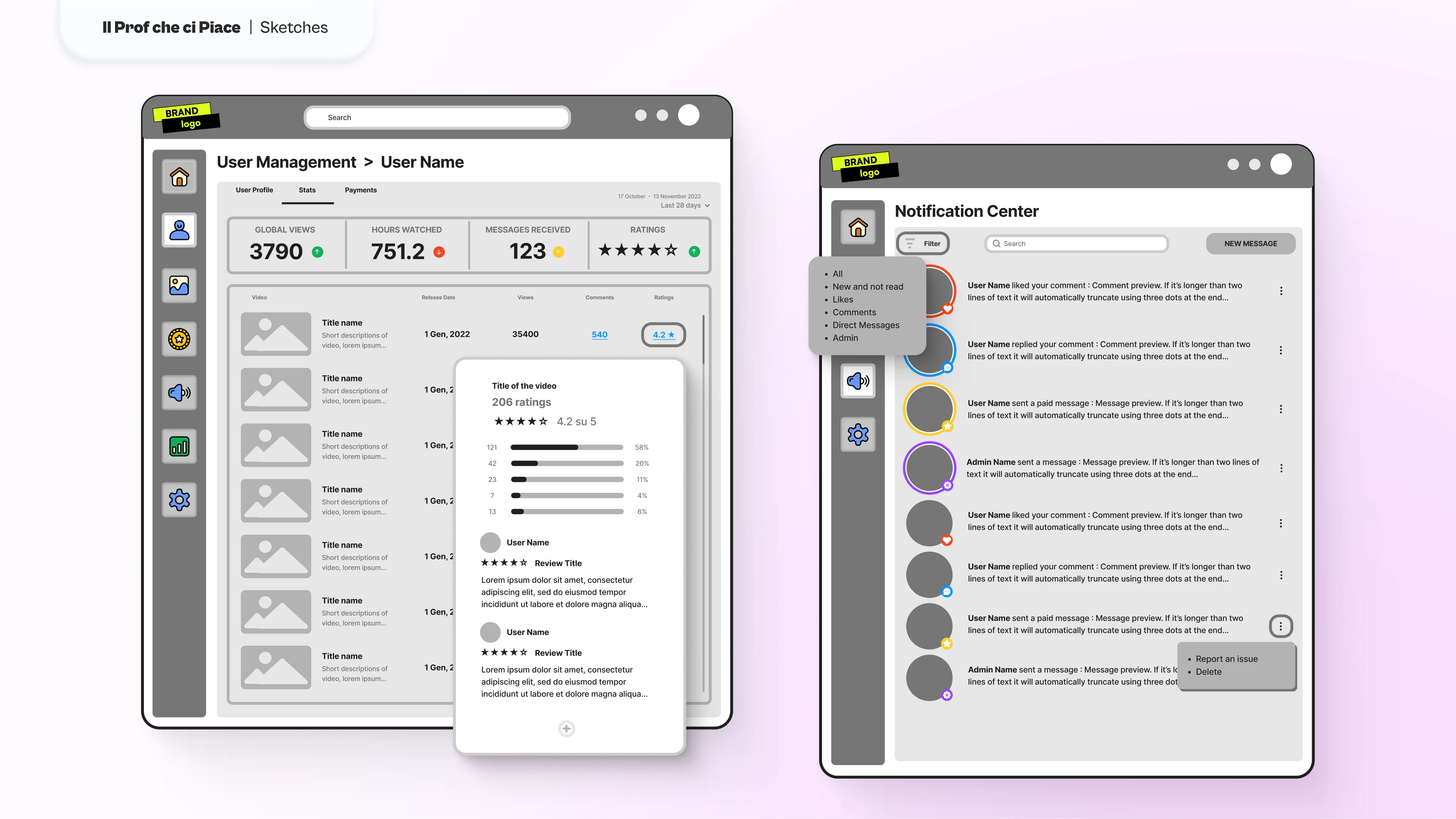
Meanwhile, we also started working on the web app that would manage the platform and the content creation. I decided to speak directly with the group of people who hired me to understand their current workflow both as administrators and content creators.
The main takeaway from our conversations, at first, was:
There was a need for two distinct products, one for admins and one for teachers.
Admins needed to:
Teachers, instead, needed a dedicated tool for:
We continued in this direction for a while until it became clear that we could merge these two apps into one, making the teachers' tool a stripped-down version of the admins' website.
This decision allowed us to almost halve the developing time and the overall workload of the whole team, and at the same time, provide a useful product that could adapt to the client's different needs and scale with their new business.
Sketching
This is when the fun begins! I'm a strong advocate for spending as much time as possible sketching before creating a prototype. This way, any problem arising during the creation phase can be addressed and iterated upon quickly.
And let me tell you, there were a lot of problems to take care of!
Two worth mentioning (mostly because I've lost way too many hours of sleep on it to count them) were the onboarding experience and the video player page.
Onboarding
In my first draft, I made the fatal mistake of assuming that users would only need to register or sign in to their profile and that a quick onboarding experience during the first time opening the app would suffice.
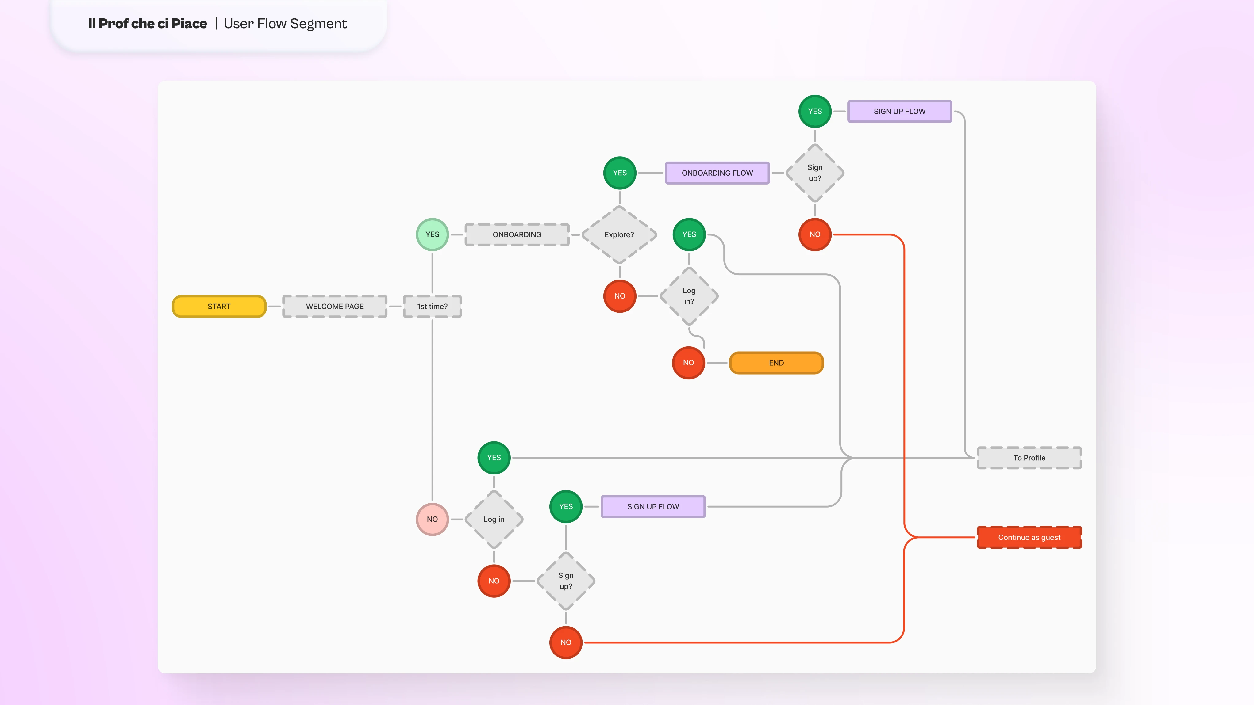
However, the initial phase would see lots of students migrate from the current website to the new portal. At the same time, the marketing team advised us to be prepared for a steep influx of new subscribers during the first months. On top of that, the client requested that the students could explore the app without an account but they could access all the functionalities with a registered profile.
This meant that we had to accommodate:
New users with no profile or prior knowledge of the app
Returning users without a profile
Returning users with a profile
Users with or without profiles exploring the app
Without overloading the users, we created a single page dividing students into "with a profile" and "without a profile". This way, those without one would be asked to register, and those who already had it could simply log in. They would then go through the onboarding process and finally, they could either register or just explore the app.
Funneling the students into these categories allowed us to keep the choices they had to make to a minimum while managing to address all the different scenarios the client might encounter.
In a future iteration
I'd probably have suggested adopting a magic link system, something I was not familiar with at the time. I believe it would have made this process quicker without having so many different paths to take care of while at the same time providing a better level of security, even if a 2-step verification was already in our plans.
Video Player
According to our findings and the client's idea, each lesson would contain a video player and a series of actions listed in a menu underneath the video: a test, a notepad, a section with extra material (like PDF files or readings), a voting system with comments, questions from students, and a comment section. That was definitely a lot, but we somehow convinced ourselves these were all necessary features that should exist under the video player.
Once we tested an early low-res prototype with a small group of target users, this huge menu list was unanimously considered a bad idea.
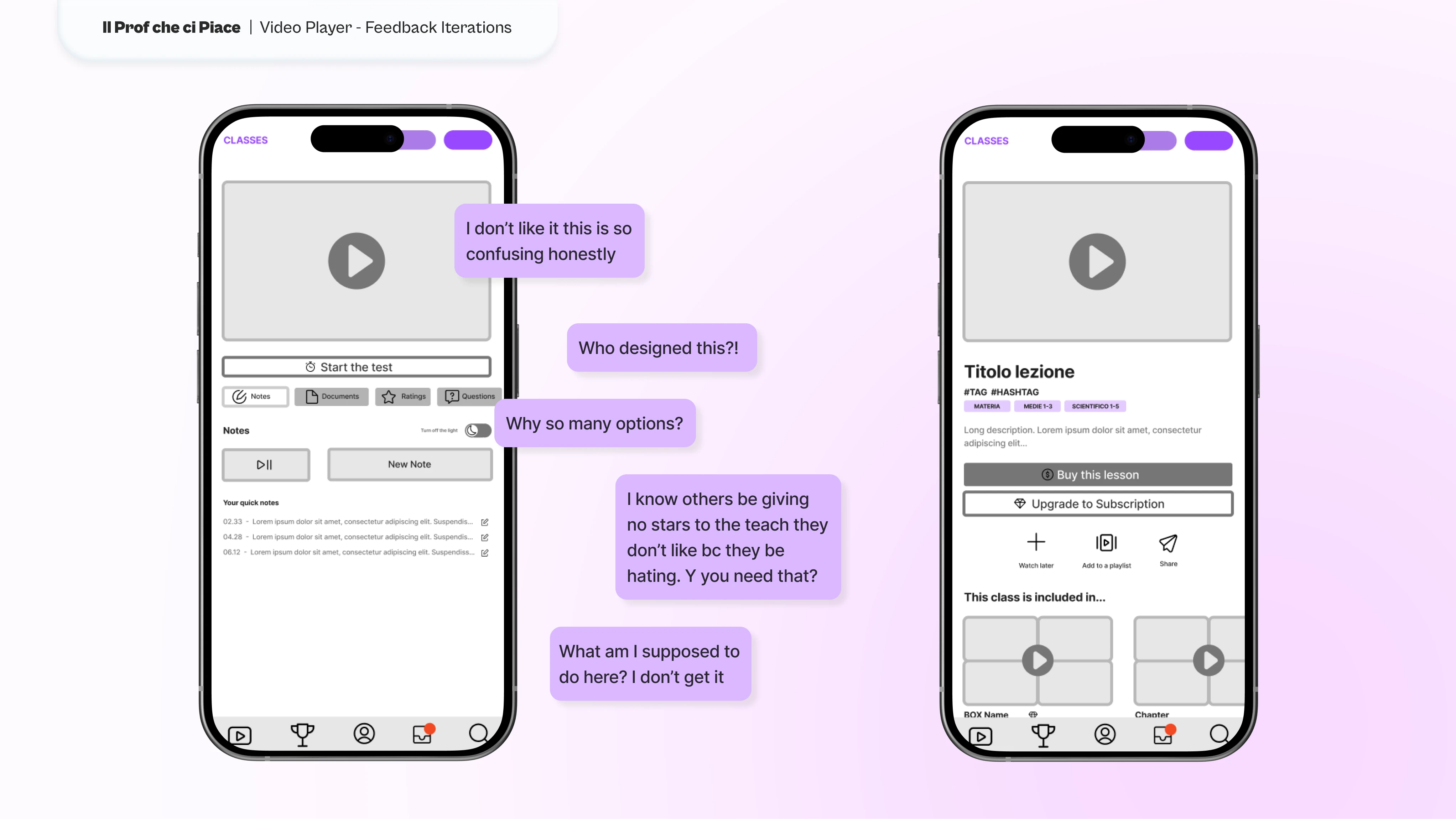
But despite the negative feedback, the client was adamant they needed all these features.
At that point, the only way to make everyone happy was to:
Remove the rating system. It didn't need a dedicated tab on the menu. Instead, a modal would appear at the end of each video asking for feedback to improve the app. This change would reduce the cognitive load and give the rating experience a positive meaning.
Reorganize the tabs. We asked ourselves which features were essential under the player and we recognized that the test and the extra material were essential. So we decided to make these tabs more evident and give the menu a clear and organized hierarchy.
In our second round of feedback, these changes were welcomed more favorably with 87% of the answer liking the new structure while the remaining 13% considered it still too cluttered.
In a future iteration
I would have suggested gathering more in-depth feedback about how students interact with this section of the app. Understanding their behavior and their needs would have perhaps shown us what could be improved or removed to simplify their experience.
Copies
The Italian language, like all those based on Latin, is beautiful but unfortunately, it doesn't have room for gender-neutral expressions. Every word in its vocabulary has a gender and plural words often adopt the male version of it.
In the past few years, some Queer activists have worked tirelessly to modernize the Italian vocabulary. Two notable examples are:
The use of "*" instead of the gendered vowel at the end of a word.
The use of the symbol "ə" to represent a neutral vowel at the end of a word.
Recent studies show that teenagers are more aware and open to gender diversity and, therefore more prone to use neutral language where possible.
To achieve this, I suggested introducing these elements in the copies of the app. However, the clients were not sure this could be well accepted by everyone due to the very difficult socio-political and religious environment in Italy.
Instead, I minimized the use of gendered words by using informal language that addressed the reader using the "you" or plural form. This stylistic choice helped maintain the colloquial and youthful tone set by the client and at the same time provided a sense of neutrality aimed at making every student feel welcome.
High Fidelity Prototype
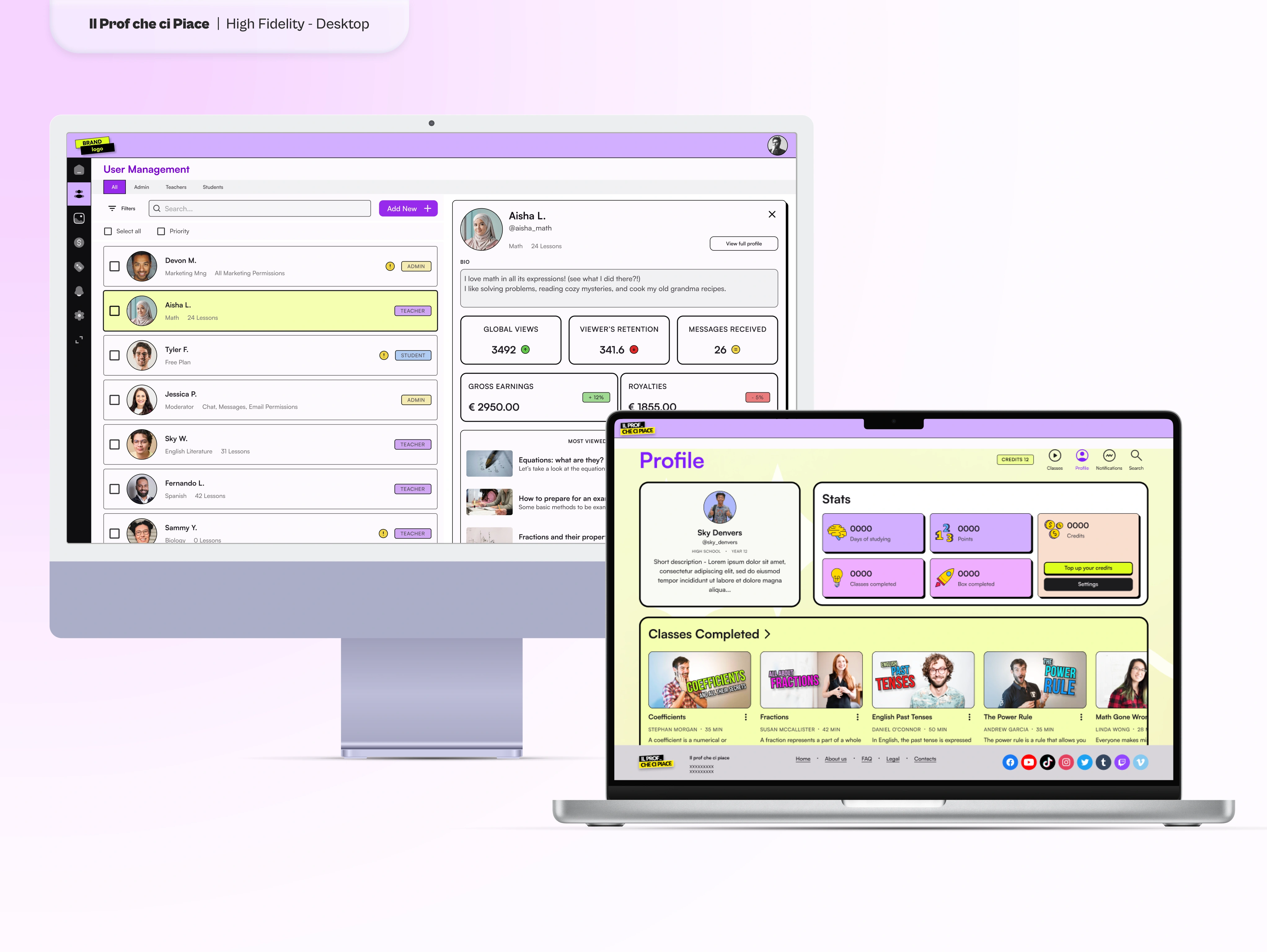
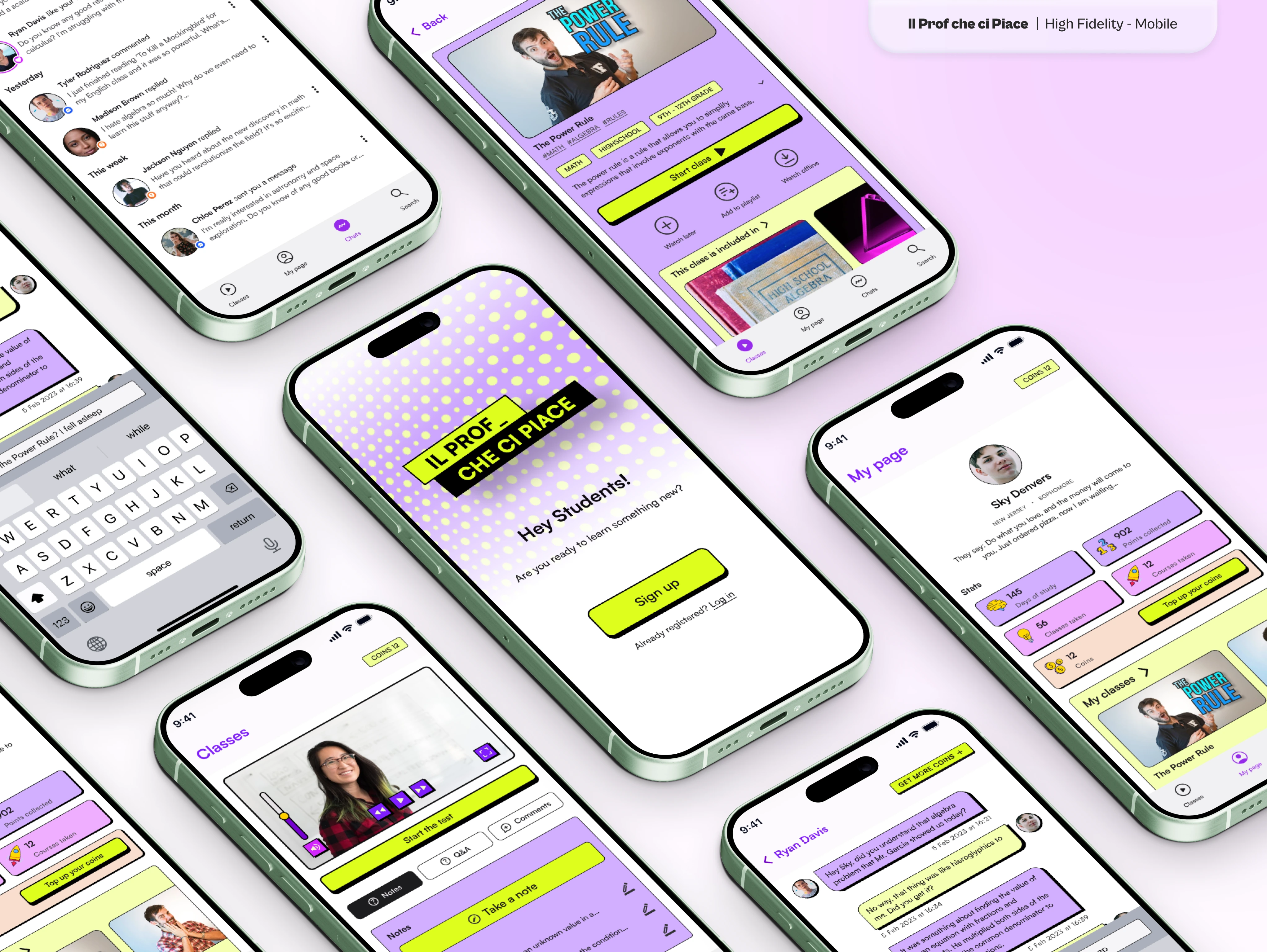
At the end of the four months spent ideating and iterating, we reached a point where we could safely start to create a high-fidelity prototype to give the developer team.
We decided to adopt a minimalist look with bright colors to give a sense of playfulness and joy, two feelings mostly associated with gaming rather than studying. The idea was to make learning feel fun like a game and not like a daily burden.
It also tied in with the client's logo which resembled text on a book highlighted in yellow.
Final Thoughts
Due to time constraints, we weren't able to test the prototypes further and thoroughly.
Once all three products are ready for their first release, I would love to hear from students, teachers, and admins and perhaps work with them again to refine these apps.
UPDATE: after more than a year from the end of the project, the product was launched. However, it is my understanding that another designer, who didn't share the same vision, was involved in the process. Therefore, both the website and app retain only certain UX aspects of my version of the project while the UI and feel are... well, something else.
Like this project
Posted May 17, 2024
The project involved a comprehensive video platform for online learning and web tools for admins and teachers.

