Catellani & Smith
Summary
I had the pleasure of working with this international luxury brand that creates artisanal designer lamps.
They needed to refresh their website and simplify some of its flows to make them more efficient and in line with modern best practices.
The main focus was on the navigation menu, the product list, and the product page, plus some minor changes on the brand page.
Please note: this project is protected by NDA. Some elements have been slightly altered to protect the client's right to privacy.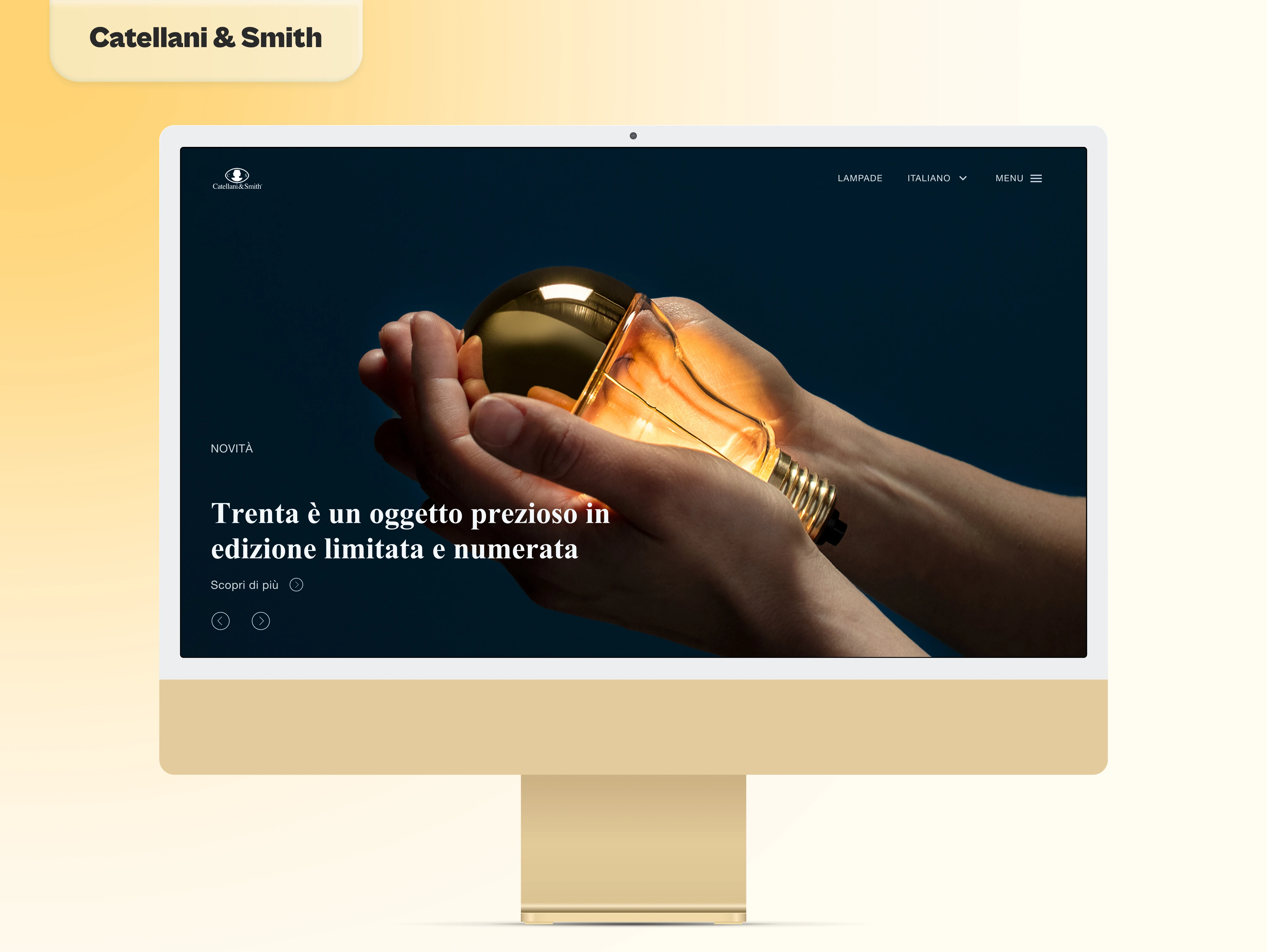
Home Page
The Client
I had the pleasure to work with Catellani&Smith, an international luxury brand that creates artisanal designer lamps.
They needed to refresh their website and simplify some of its flows to make them more efficient and in line with modern best practices. To be specific, they asked me to focus mainly on the navigation menu, the product list, and the structure of the product page.
With the imminent launch of their new collection and the upcoming exhibition Euroluce 2023, it was imperative to have the website ready as soon as possible.
Which was in two weeks, according to their brief, but it became almost four weeks, according to reality.
The Project Scope
After our first meeting and following their detailed suggestions on the brief, we established that our main focus should be on unifying the user experience across the entire website.
The current site was, at its core, still the one deployed more than a decade ago. Over the years, some adjustments and additions have been made and in time, they have affected the overall flow of its content.
Our strategy, based on the client's brief, was to rework:
Landing page
Menu
Catalog and Product Page
The client also imposed some limitations based on their brand identity, besides the quick turnaround. The established color scheme could not be modified, which was not a problem at all since it worked beautifully, and the font pairing adopted could not be changed. That proved to be more challenging to work with, especially for accessibility purposes, since the fonts in question were Times New Roman and Helvetica. I tried to persuade them to adopt a more accessible font like Comic Sans, but alas, I had to follow the client's guidelines.
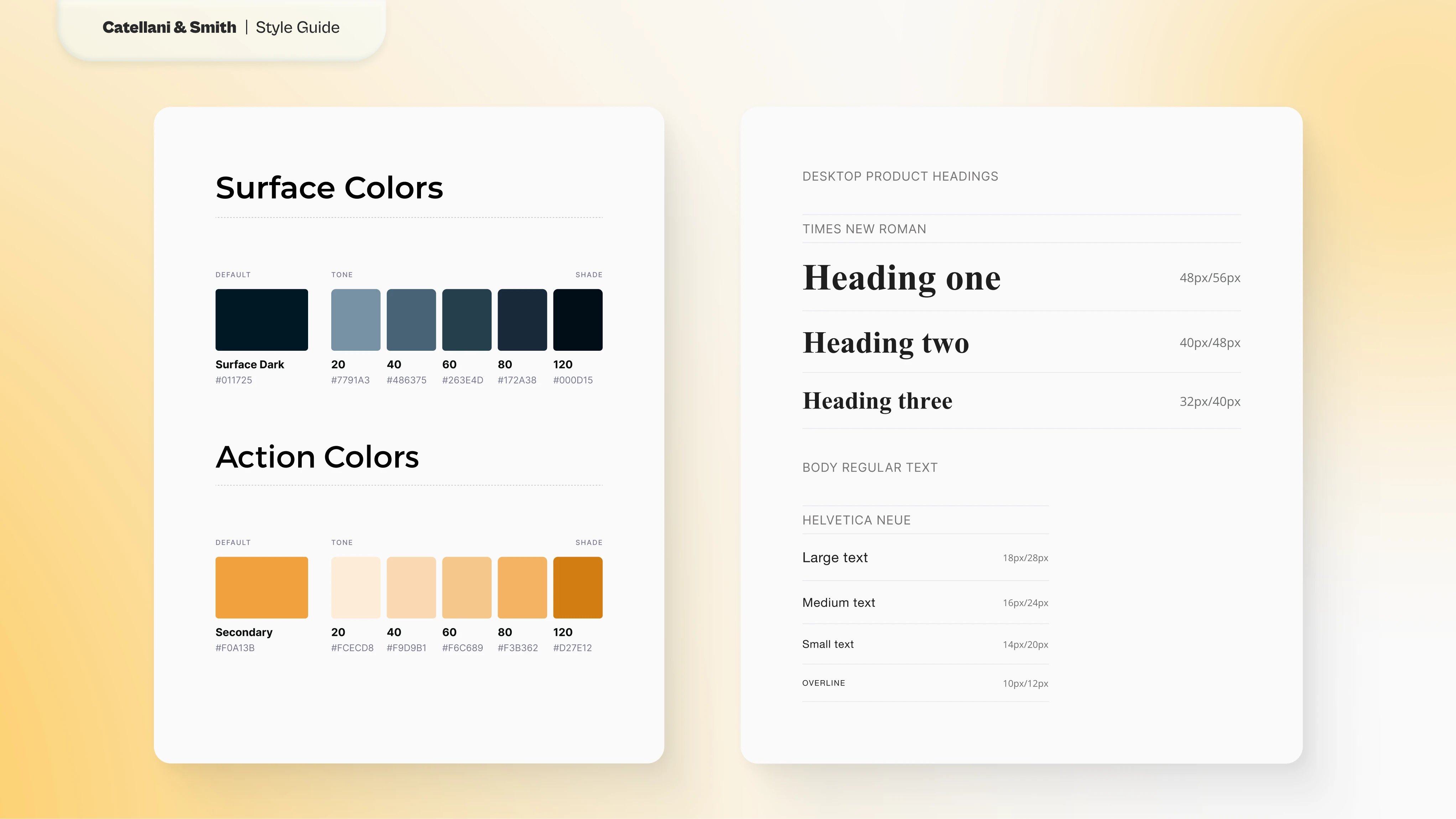
Style Guide for colors and text
Ideation
We spent the first week iterating through various options for the menu and establishing how reusable design blocks could look like.
Inspiration
Catellani&Smith is a well-established luxury brand. Their approach so far was to create a website that reflected their minimalistic and elegant image.
To improve their website I wanted to take inspiration from other luxury brands to understand how they tackled some common design patterns making them feel special.
The brands analyzed were:
Richard Mille
Giorgio Armani
Hill West
Despite the client's request to redesign their website in a couple of weeks making it Awwwards worthy, I opted to dedicate the short time available to the task at hand and make an harmonious user flow.
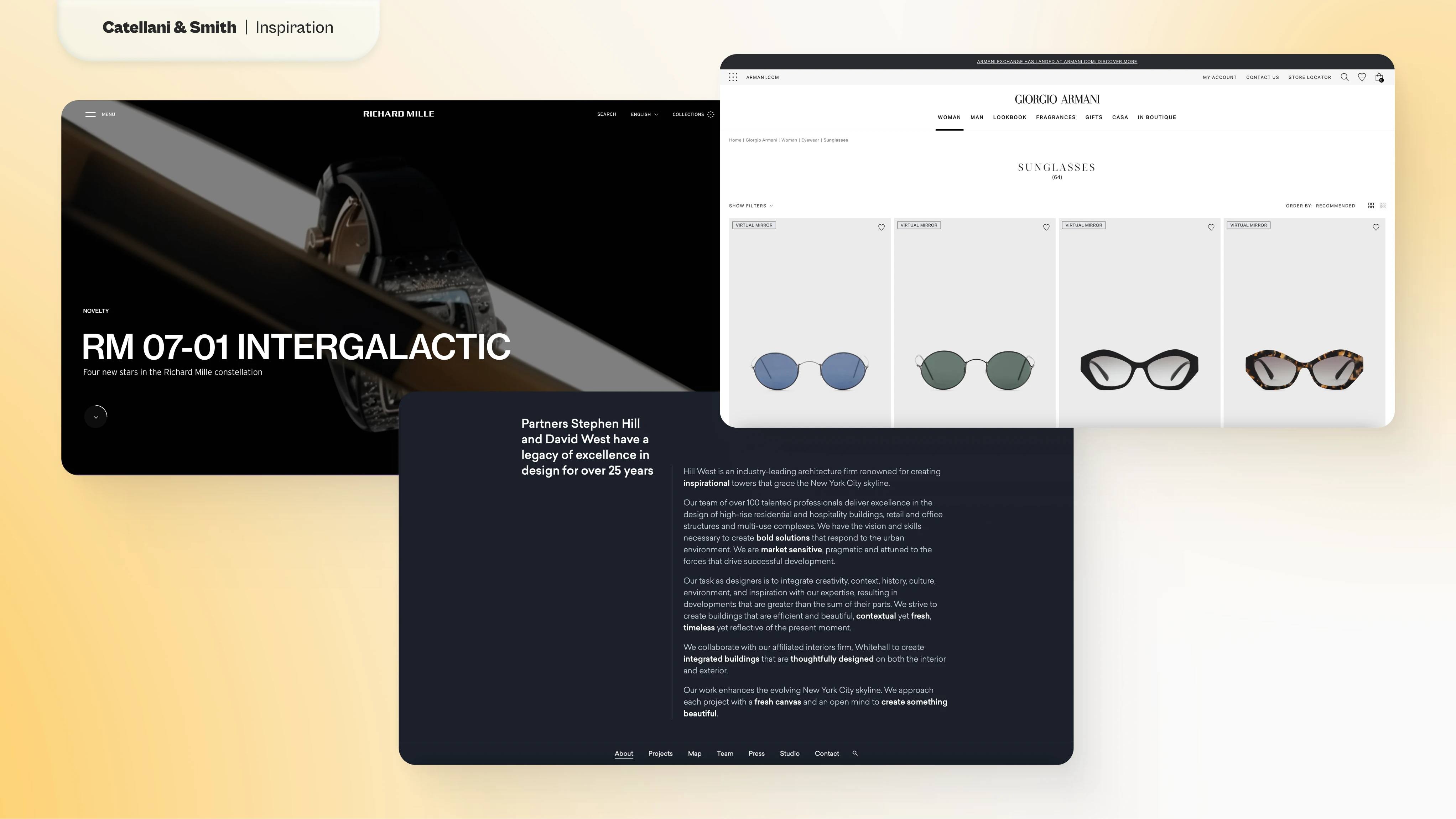
Screenshots of website used for inspiration: Richard Mille, Giorgio Armani, Hill West
Sketching
The first thing I noticed analyzing their website was that it lacked cohesion from one page to another despite having noticeable recurring patterns.
So I suggested to consolidate those patterns and create a modular set of elements that could be combined into unlimited types of pages.
Elements
The initial idea was to divide the page into two sides: a bigger, squared one where the most important information would be displayed, and a smaller, rectangualr one for secondary details.
This would allow us to create two tipes of blocks:
Image block. The large image would take over the page while its description appears on the side, so that user don't have to scroll to find it.
Text block. The title would appear on the side leaving the rest of the space to large paragraphs.
Tweaking these two basic blocks would allow me to create more specific ones to cover all possible solutions throughout the website.
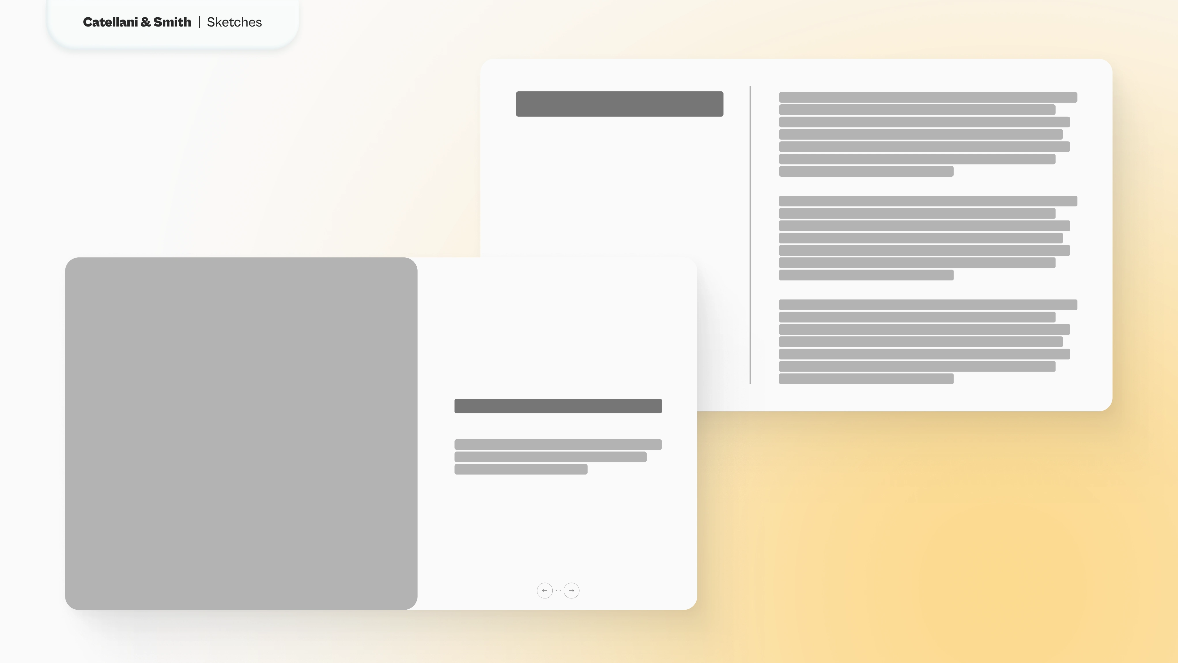
Sketches of Image and Text Blocks
Product and About page
The concept could be better understood with two specific pages: Product and About.
The Product page needed:
Hero image
Description of the product
Pictures of the product
Technical description
"Turn on the light" feature
Using the two baseline blocks allowed me to create a coherent structure that showcased the product in all its beauty without compromizing on the detailed information required.
The About page needed:
Long paragraphs
Lots of pictures
A timeline of the company, complete with pitcures, dates and text
Again, the blocks created helped me structure the page quickly and easily, creating a section that doesn't overwhelm the viewer.
It was also easy to make the timeline by creating a carousel dived by years displayed on the top of the section.
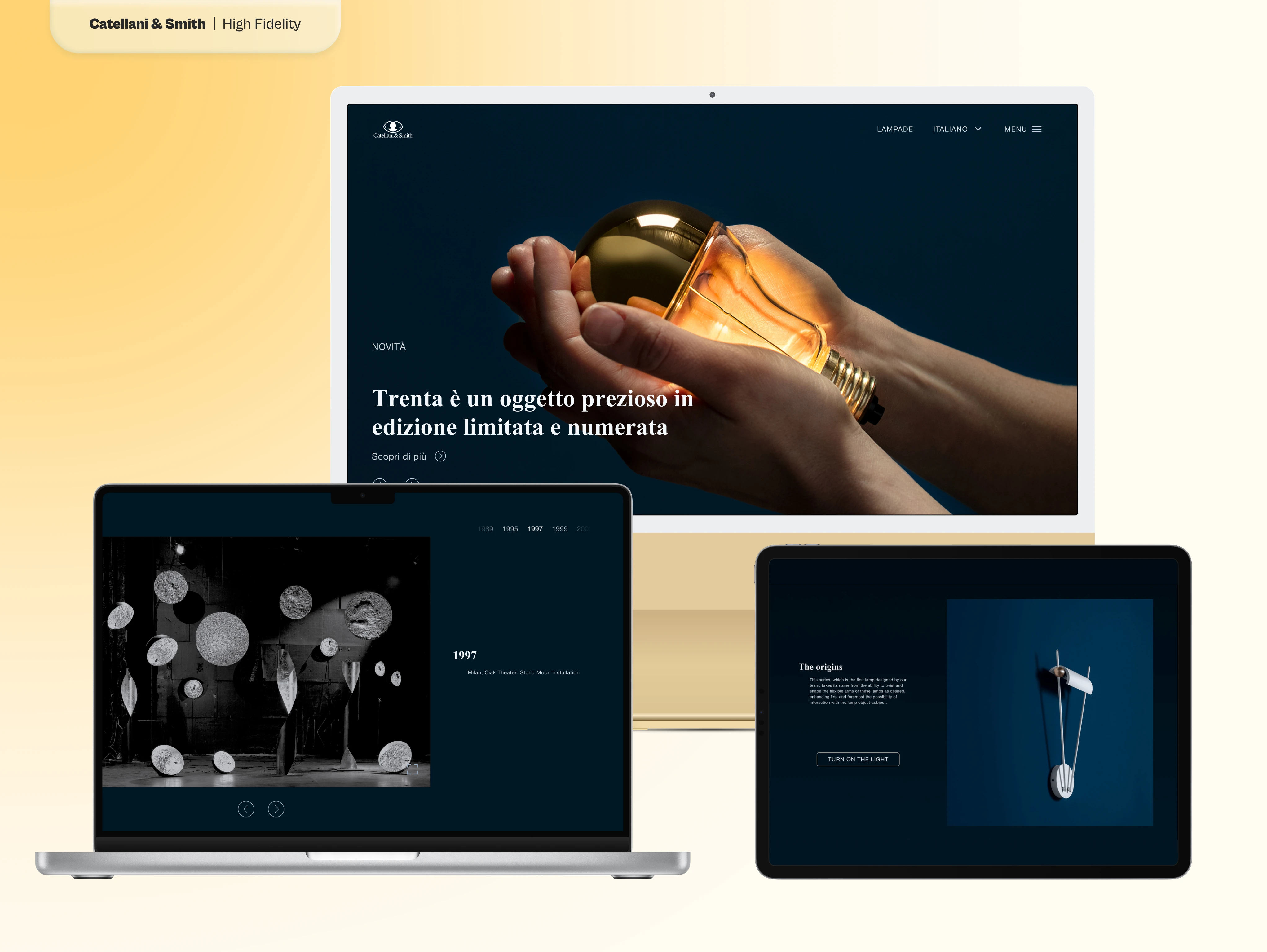
High Fidelity Prototype
Once the idea was approved, I dedicated the rest of the time creating the prototype.
I adopted a color palette based on the brand color adding a darker shade to expand its variety, and added warm orange as accent color based on the picture provided.
Considering that the current website had mostly white backgrounds, I suggested to use instead a darker shade of the brand color blue. Not only a dark themed site is more current, but it would also help making the product sold "pop": due to a common optical illusion, the images of the lamps with warm lights turned on seem brighter over a dark background, while appear rather dull on a light setting.
As per request of the client, the font and the content remained unchanged.
Final Thoughts
Considering the very short amount of time, it was impossible to measure the results of this redesign.
UPDATE: When the website was relaunched after several months, I learned that the client stuck to its roots and only adopted some of the changes proposed. Which is unfortunate, but still in line with their brand.
Like this project
Posted Sep 11, 2024
Partial redesign and modernization of an internationally renowned artisanal luxury lamp maker.

