Foodies
Project Overview
I worked with this US-based food delivery startup that connects local restaurants with customers through personalized experiences. As a food delivery aficionado, I was excited to help refresh their website and mobile app to make them more functional and user-friendly.
The main issues were a confusing navigation system and a lack of filtering options.
With a limited budget and a tight four-week timeline, I focused on unifying the UI elements, improving usability, and implementing the features users complained were missing.
Please note: this project is protected by NDA. Some elements have been slightly altered to protect the client's right to privacy.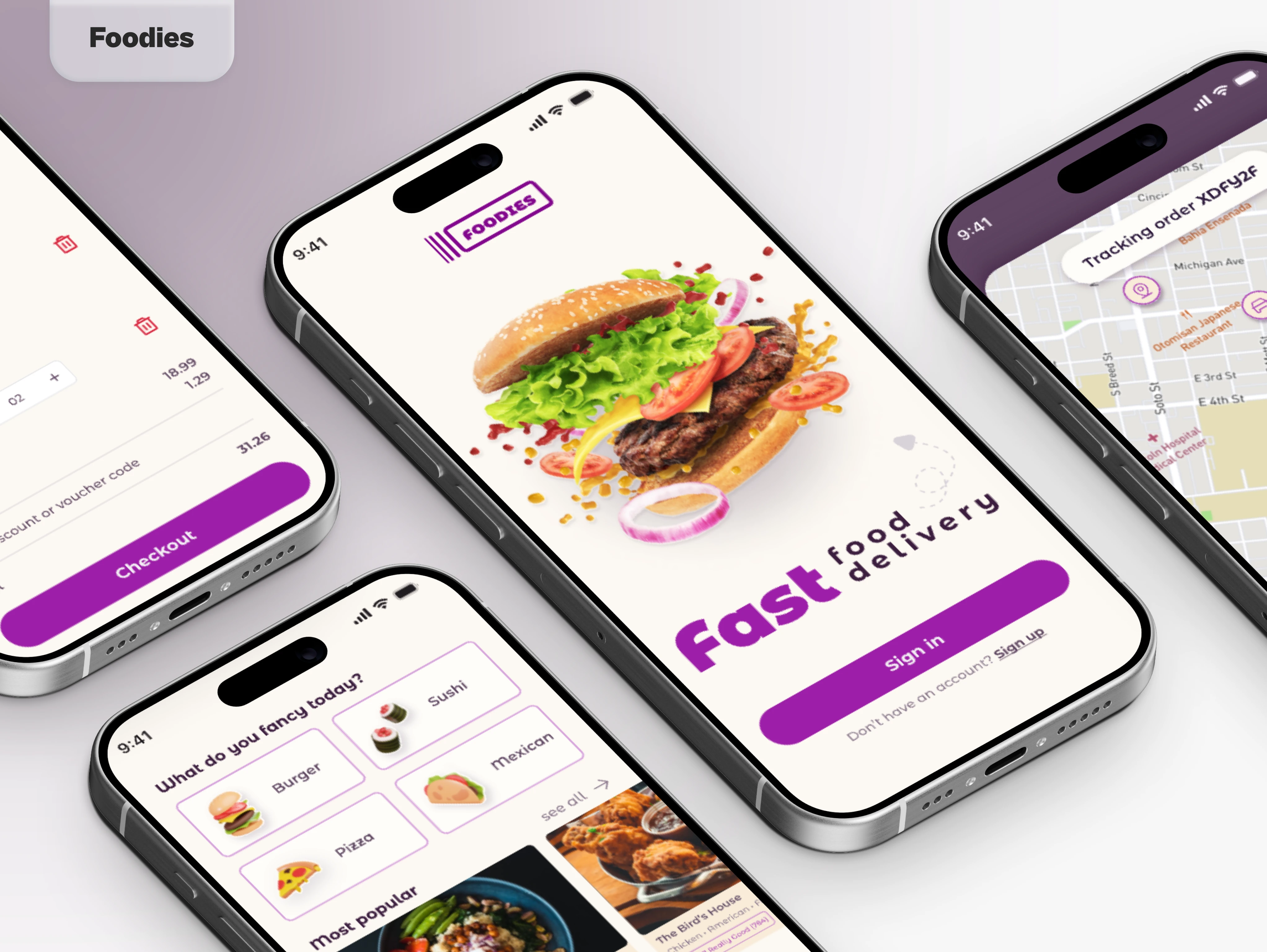
The Client
This US-based food delivery startup company connects local restaurants with customers through personalized and hand-picked experiences.
They needed help to refresh their website and their mobile app to make it more functional and being a great connoisseur of food deliveries myself, I was very intrigued by their product.
The Project Scope
I was introduced to this company by a mutual LinkedIn acquaintance. Alas, this was the proof I needed to understand that networking is the best way to survive in this industry.
The business was not satisfied with their previous designer and asked me to take over the project. Luckily, I was provided with research and their initial design files.
From a quick analysis of the data, users found both the website and the app very confusing to navigate. On the website, they were presented with too many options at once without the possibility to filter their search, while the mobile app was nothing but a stripped-down not-optimized version of the site, making it even more complicated to navigate on a small device.
Considering the limited budget available for this project and the 4 weeks schedule, we agreed that designing a cohesive and scalable UI would be the most important course of action. Focusing on unifying every element using basic design principles would dramatically improve usability and reduce friction.
Ideation
Although I was provided with thorough research and more data than I actually needed, I decided to conduct my own audit of the product to evaluate the situation.
I wouldn’t say the previous design was bad, but it was clear they hadn't invested much in it.
Research
From the data provided and my audit, I’ve discovered that:
The average user is between 30 and 40 years old. These are people interested in finding small restaurants that can provide better food experiences than mainstream food chains.
Customers have concerns about food quality. Since the recommended venues are all local sometimes they lack credibility, unlike big chain restaurants. On top of that, the images used on the food cards were all selected from stock websites.
It's impossible to use the service without an account. The recommendations are based on hand-picked for each user after an initial survey. This type of curated experience is what differentiates the business from other competitors. However, the complicated and time-consuming onboarding process is causing a higher abandonment rate for first-time and occasional users.
Competitive Analysis
These insights were a great starting point for the project, but they were not exhaustive. With limited time and resources, we turned to major competitors like Uber, JustEat, and Deliveroo for inspiration, considering they had extensive market research.
This approach led us to make the following decisions:
Taking the cue from brands such as Uber, JustEat, and Deliveroo* we decided to:
Allow users to browse without registering. We introduced a landing page with a search field to allow first-time users to have a taste of the service (pun absolutely intended) without registering. They could place the order as guests or register to receive personalized recommendations hand-picked just for them. Only then the survey would become essential to create the best customization for each client.
Add filters to the result page. Users would now be able to refine their search based on several parameters including type of kitchen, discount offered, and hygiene rate.
Improve restaurant cards. To address users' concerns about food quality, we added to each venue the official hygiene rate and allowed customer reviews. The client also informed restaurants that original pictures for the menus would now be required.
These improvements would help increase authenticity and build more trust.
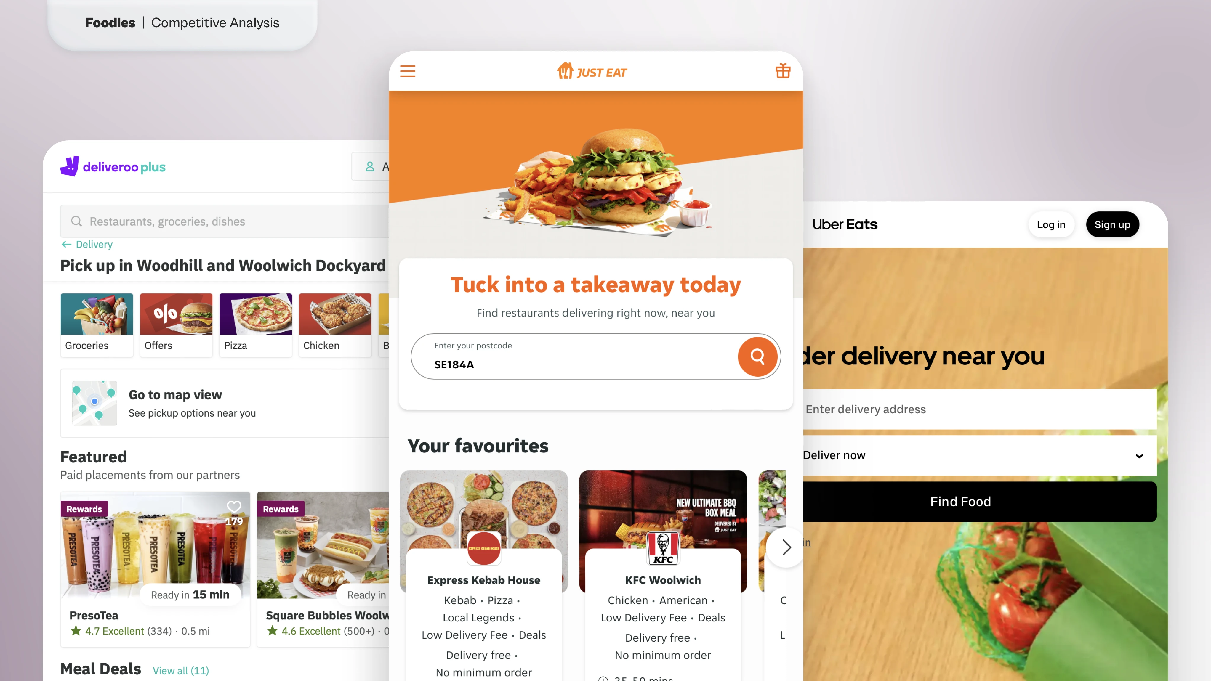
*At the time of writing, these were the major competitors available in the UK. Due to geolocalization limits, we were unable to test other services in such a short time.
Sketching
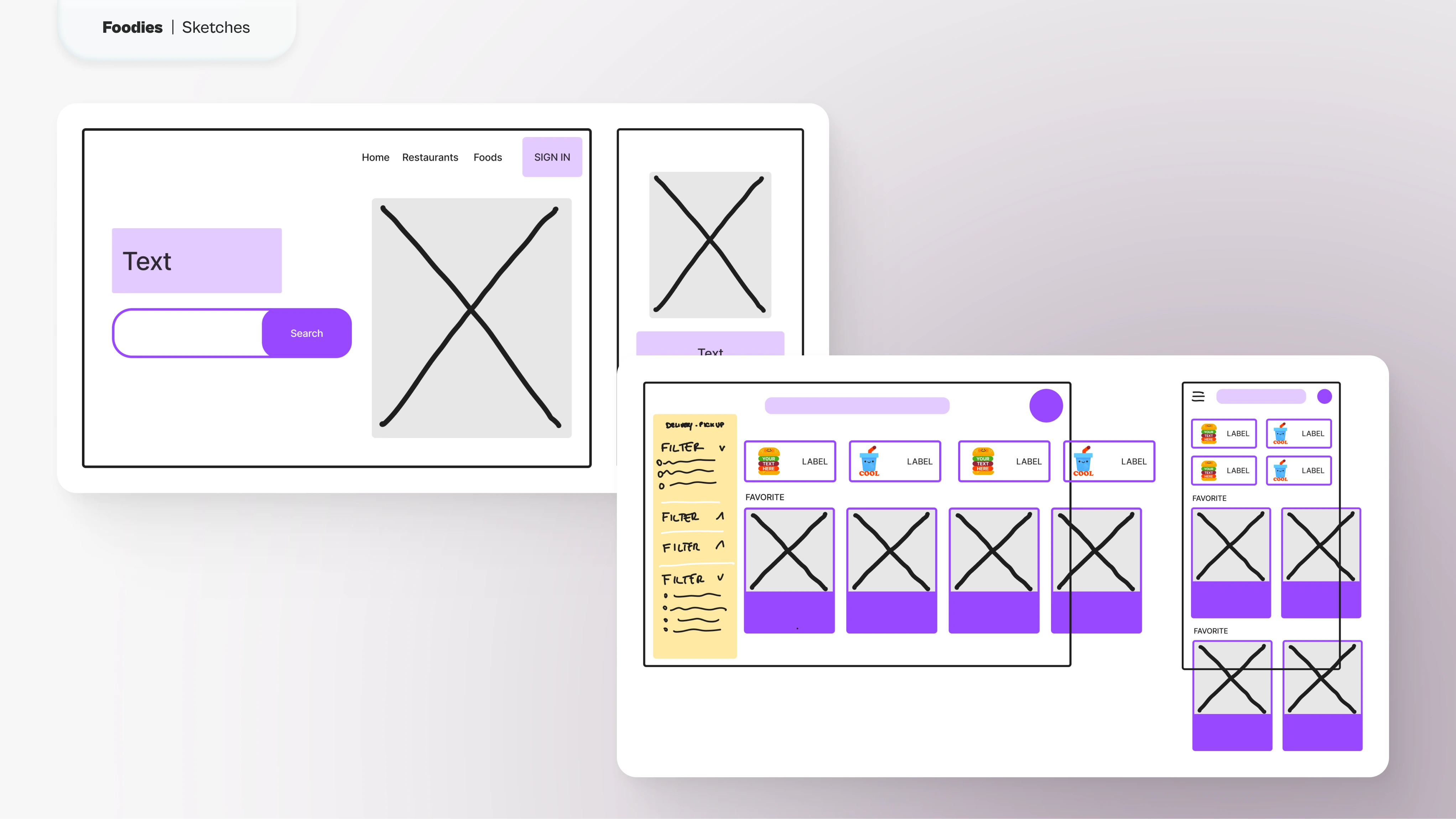
For this project, I quickly outlined some screens without going into great detail to save time for prototyping. The structure was already there and needed to just be polished or refined.
On the landing page, visitors were invited to start a new search right away or log into their account in case they were returning customers.
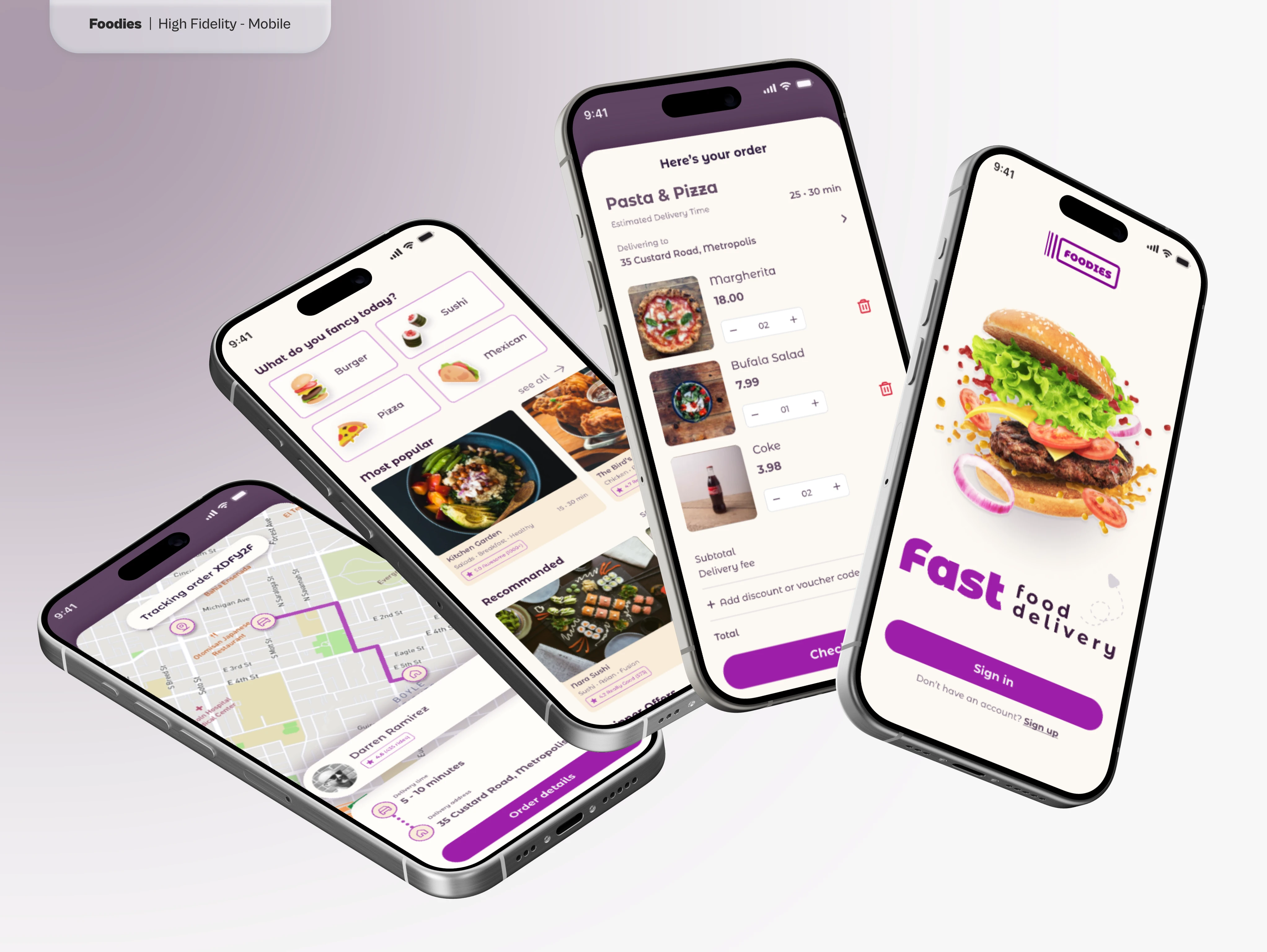
The mobile version, instead, asked users to sign in or sign up directly from the first screen.
The search page has a new list of filters to refine the results, giving users more flexibility to refine their search.
The results were shown as a grid of cards grouped by interests or topics. This not only emphasized what made this service stand out but also improved discoverability and incentivized other restaurants to join the platform.
The mobile experience had the same approach.
High Fidelity Prototype
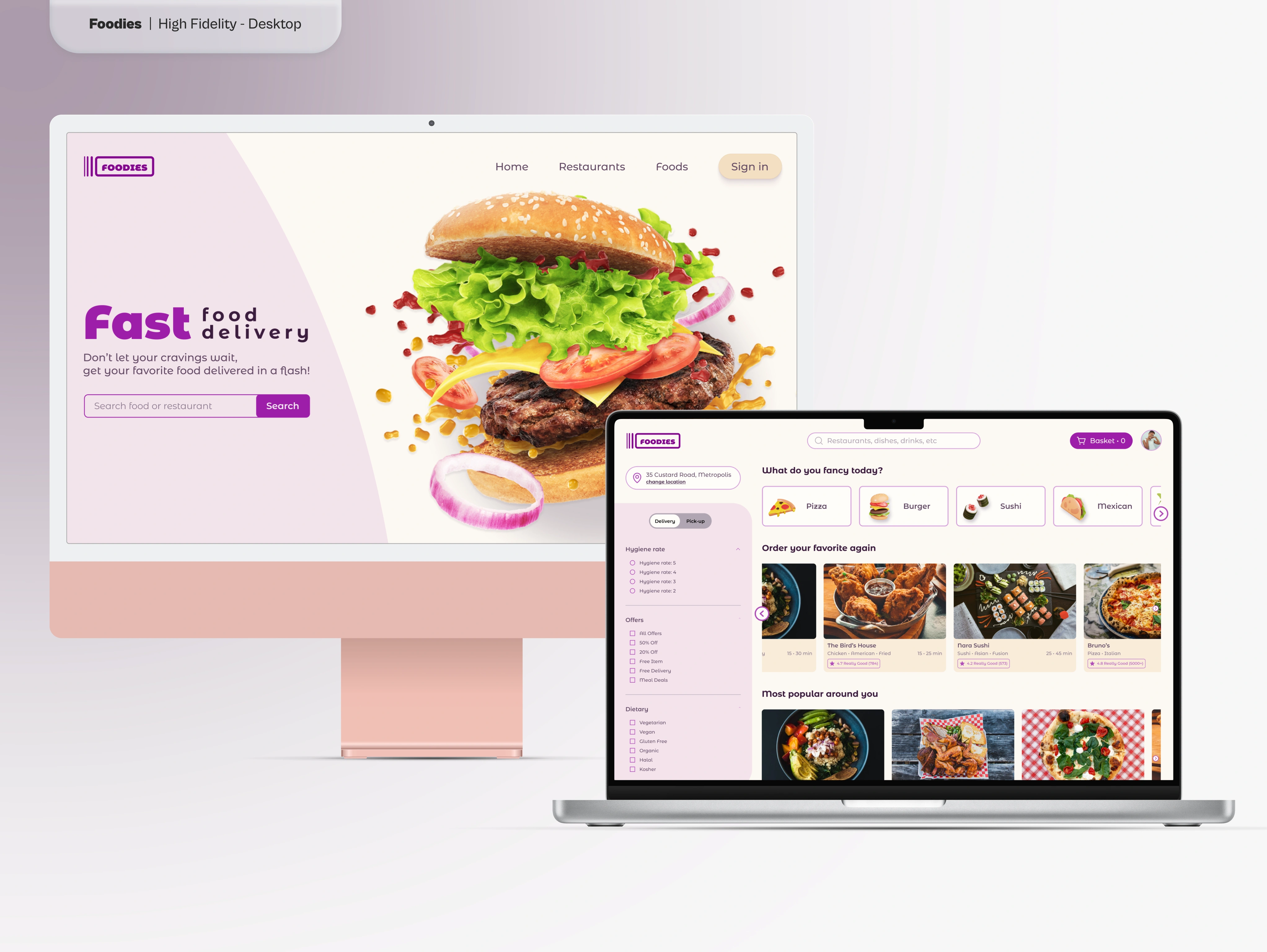
After presenting the stakeholders with a semi-functioning lo-fi prototype, we worked on a basic UI Kit, polishing what was already present and making sure that it was scalable. This decision allowed us to quickly and confidently iterate on a functioning high-fidelity prototype for both web and mobile.
Final Thoughts
Working with a half-baked project on a tight budget is never ideal, but in this case, we made it work. I stand by the decision to adopt solutions based on competitors to save time, but if I ever have the chance to work again with this client, I would love to conduct my own research and understand their users better.
I believe this service has an edge over some of its competitors and I did my best to showcase it with the means at my disposal.
UPDATE: The startup never started, so the product eventually has never gone online
Like this project
Posted May 27, 2024
Refreshed a food delivery website and app by improving navigation, adding search filters, and enhancing restaurant profiles within a four-week timeline
Likes
0
Views
79
Clients
Foodies

