Unplugged
Project Overview
A UK-based company offering digital detox retreats needed to increase bookings on their website. They faced issues with unclear messaging and a frustrating search experience. I redesigned the site to clarify their value proposition, improve the booking process, and enhance user engagement. The revamped site now offers a seamless, user-friendly experience that effectively converts visitors into customers.
Please note: this project is protected by NDA. Some elements have been slightly altered to protect the client's right to privacy.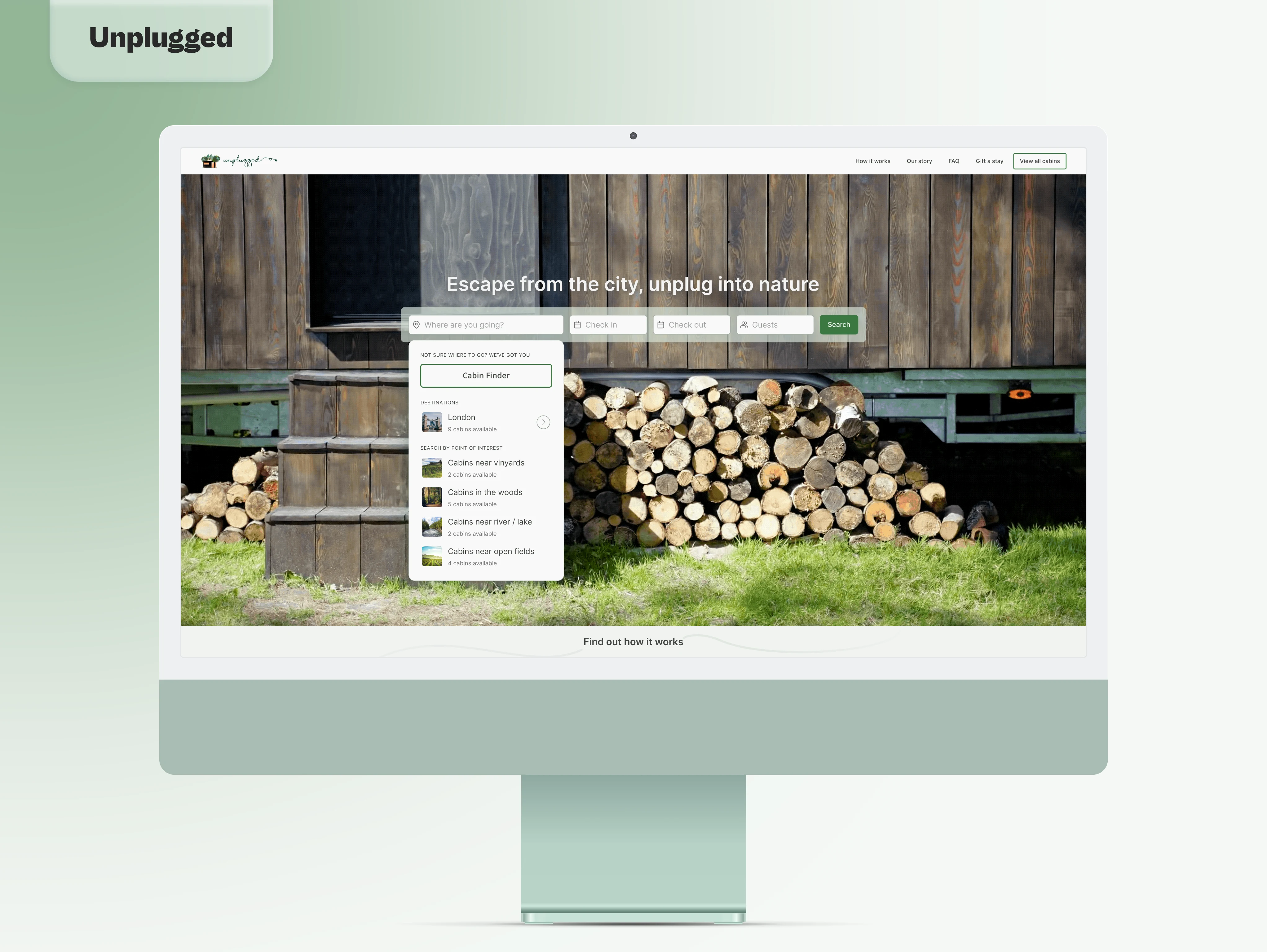
The Client
Right after the first major lockdowns during the pandemic, I was introduced to this UK-based company that offers digital detox retreats in sustainable off-grid cabins around London.
I admit that I accepted the job hoping to get paid in free cabin bookings! I really needed some time away from screens and responsibilities.
Once travel was possible again, they saw a surge of requests for their cabins but a lower conversion rate compared to the traffic their website was generating. Combined with the planned expansion of their business, they decided to renovate the website focusing on increasing the number of bookings after the first visit.
The Project Scope
I decided to assess the problem for myself with a brief audit of the existing website.
At first glance, it was quite clear that the main issue people visiting the website had was that it wasn't clear what this company was selling. On top of that, users had to go through a series of drop-down options with confusing copies to search for a place to stay and scroll through all the results without a way of filtering them.
That was unpleasant to navigate as a designer, I suspect it was even more frustrating as a potential customer.
Therefore, we decided that the best course of action based on the 8 weeks timeframe offered by the client would be to focus on:
Clarify the business ToV.
Increase conversion rate.
Improve the booking experience.
Ideation
Since we were on a very tight schedule, we had to rely on our intuition and assumptions based on a brief survey to understand how people who book hotels or rooms online behave.
However, this review proved to be less effective than hoped. It only confirmed our initial hypothesis that clarity and a better way to search through the cabins available should be our main focus.
Research
We did not let the failure of our questionnaire discourage us. To be fair, it was not a total fiasco, we were able to salvage a portion of it to our advantage and tackle the problem from another angle.
Most answers pointed us toward some direct and indirect competitors, so we decided to analyze them to identify patterns and trends that we could apply to this project.
We focused on the customers’ journey when searching, filtering, browsing, and selecting a destination.
Comparative analysis
GATEAWAY is an American company offering a service similar to the one proposed by the client. Their website is thoughtful and easy to use, however, the search can only begin once an outpost (city) has been selected making it complicated for users to browse freely.
AIRBNB is the leading company for booking a short stay. Their UX and UI are impeccable, and the new “I’m flexible” feature is a great tool to surprise and delight their users. A downside is that the selected search parameters do not stay visible somewhere on the page once a selection has been made to view.
BOOKING is another leading company for booking experiences. They provide the users with lots of information and filters, perhaps too many. The amount of information to sort through every step of the way while searching, browsing, and selecting a stay is overwhelming.
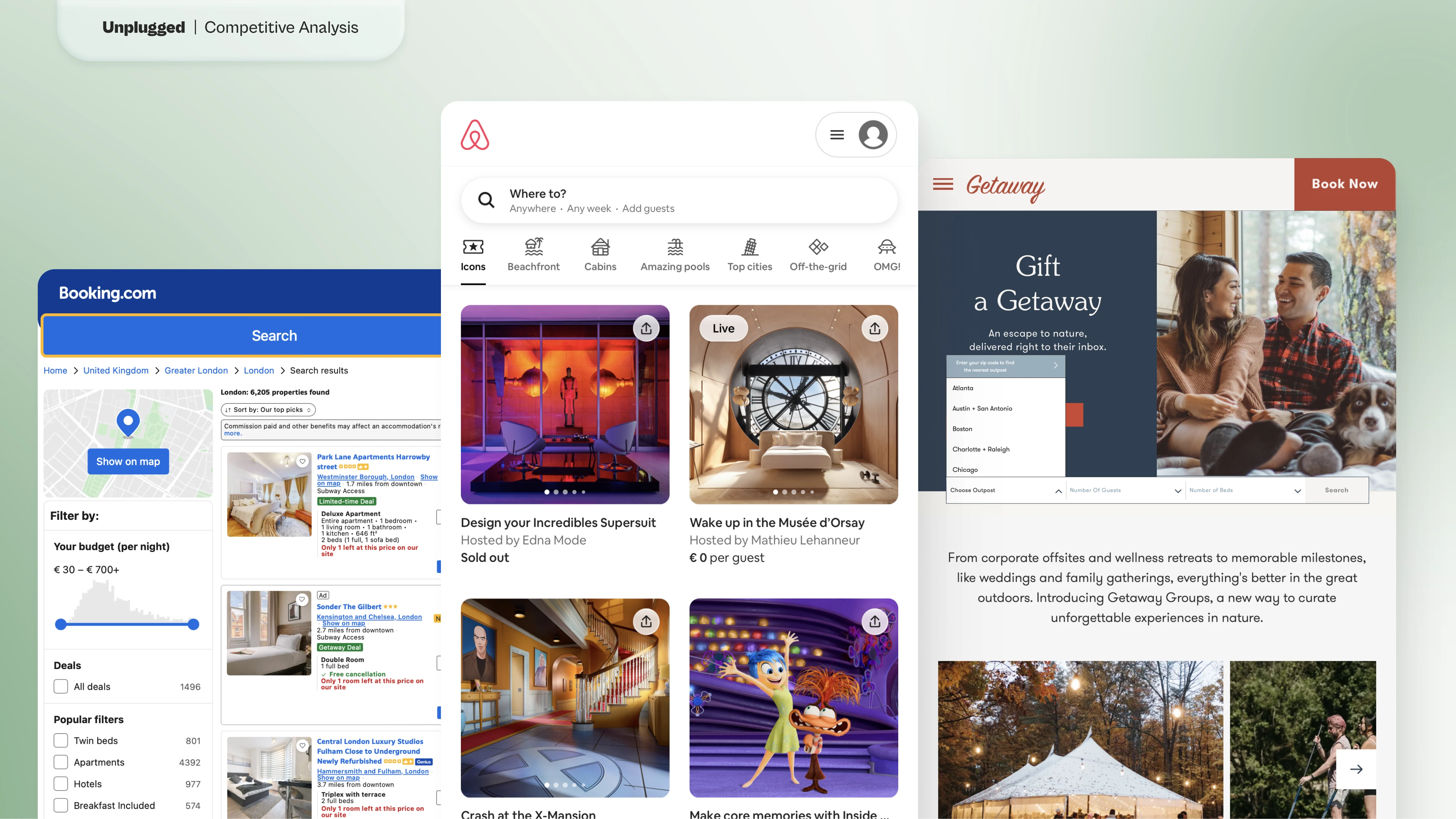
Competitive Analysis - (Left to Right) Booking, Airbnb, Getaway
User Journey
Following our analysis, we decided to:
Implement a search field on the landing page. All the competitors have adopted this solution in some form which makes it easy for visitors to recognize and interact with.
Add filters to the result page. Considering the future expansion of the business in other cities, it's imperative to offer a way to filter results to help users find what they need faster before they lose interest in the process.
Create a tool to help first-time users. Upon request of the client, we decided to integrate a tool that could surprise and delight those who visit the website for the first time without prior knowledge of the services offered. This feature was later discarded from the final product.
Sketching
With the initial research complete, it was time to sketch some ideas and iterate through them quickly. However, during this phase, the client made me aware of some information that was not disclosed in the briefing.
The website has been built with an online tool that uses fixed templates. Therefore, the structure of the website itself could not be modified, only the individual elements that composed it.
Furthermore, the client requested to use their presentation video as the main image for the landing page.
These choices required a slightly different approach from what was initially planned, however, they did not cause too much disruption, only a higher fee!
Hero Image
The main element introduced in the landing page was the search field. Users were prompted to select a location (or use the "Cabin Finder" to let AI suggest a place to stay), pick up a date range, and finally the number of guests. The system would then recommend the cabin matching these selections and offer results with pre-selected filters.
At first, we thought it would be ideal to use a great image of a cabin from their catalog as the hero image while positioning the search field in the middle of the screen. However, we had to abandon this design once the client expressed their intent to use a video instead.
So, we decided to expand the video and allow it to occupy most of the space, positioning the search bar at the top. While this solution beautifully showcased the product, it failed to address the very problem we were trying to solve: conversion rate.
When people visit a website, their gaze falls naturally in the middle of the screen. So, it makes more sense to position the most important element of the design at the center of the screen.
We finally decided to go full screen with the video and overlay the search field in the middle of it. The product is still displayed clearly on the whole page and at the same time, users can easily start searching for a cabin to visit.
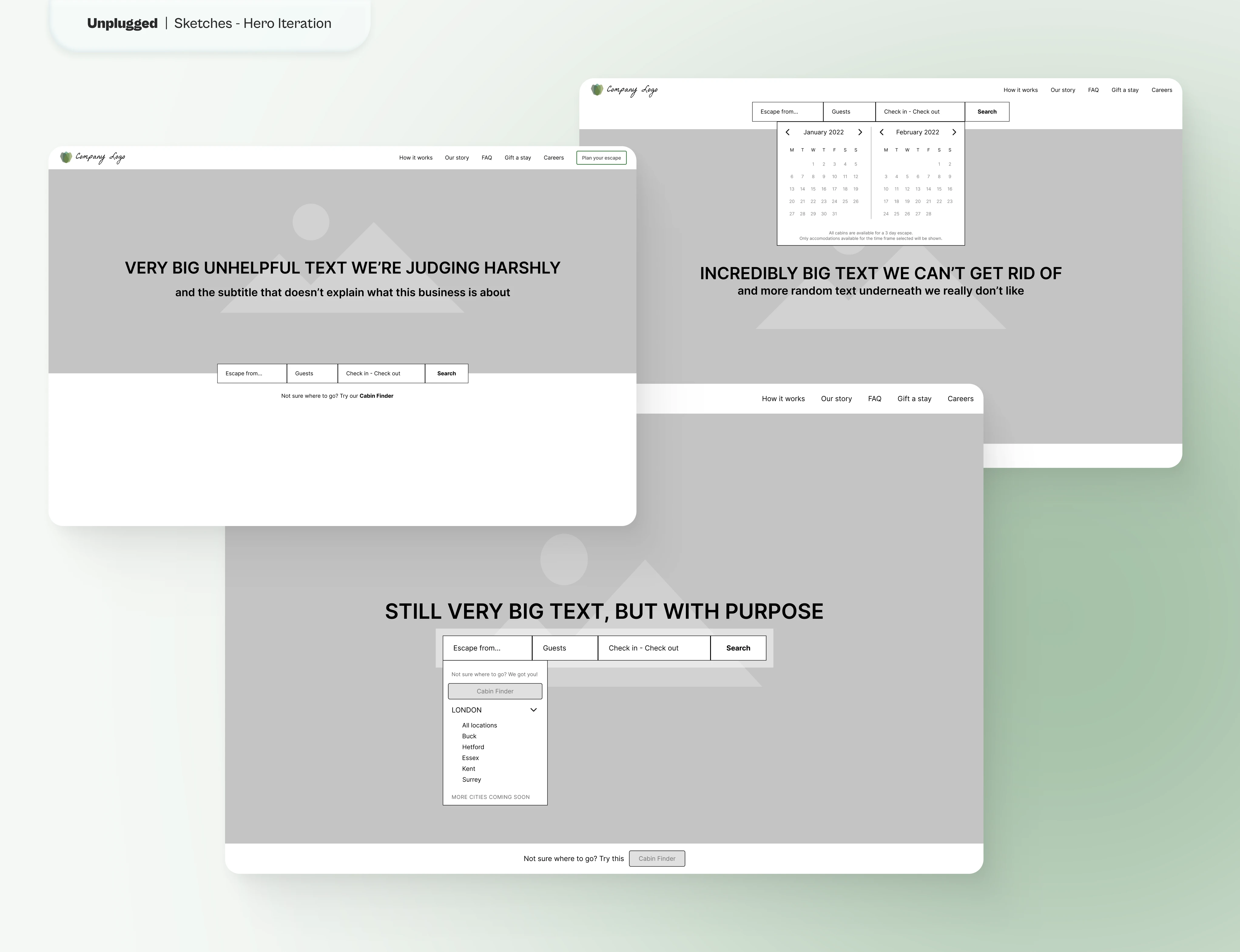
Hero Image - Iterations
Search Results
Some of the answers to our survey pointed out the need for a feature we did not think of in the beginning: showing results on a map.
We wanted to create a unique experience not used by any other competitor, but as it turned out, it was not a practical solution. Sometimes you have to learn the hard way that innovating is not always the right path to take!
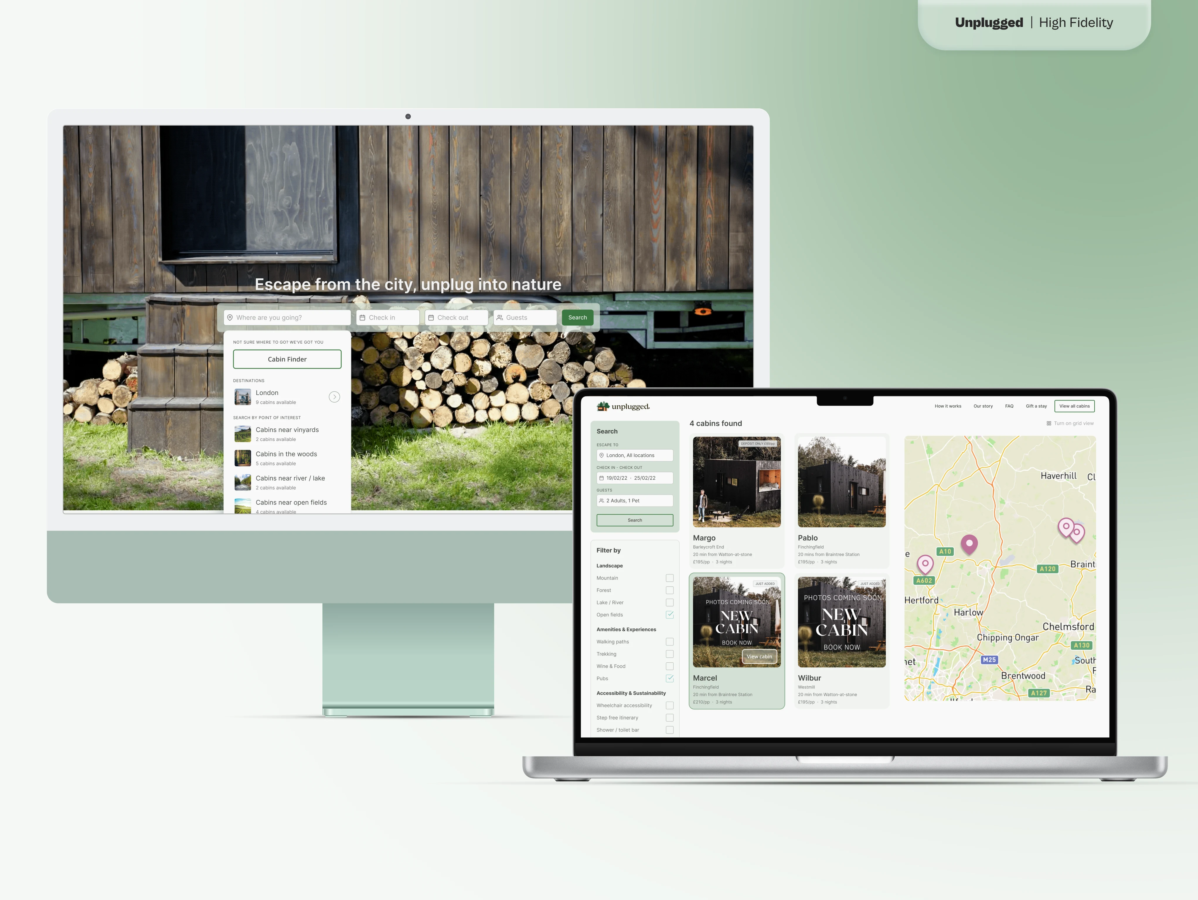
We decided to settle for a functional design that could give users a familiar way of filtering the results of their research. We turned each result into an interactive card so it'd be easy to book it without even having to open the cabin card. Then we positioned the filters on the side in a collapsible slide-over and allowed users to see the results on a map instead of a grid view. This decision would give them the chance to choose what works best for them.
Cabin Finder
One feature we explored was the "Cabin Finder" tool, designed to help first-time users discover locations based on their interests. This tool utilized AI to suggest retreats tailored to user preferences, making the booking process more personalized and engaging.
The main challenge we faced was to keep the tool simple. To achieve that, we reduced the choice to three parameters: location, number of guests, and dates.
We also focused on inclusivity using shapes instead of human figures, and avoiding any assumption of relationships between guests.
Despite the tight timeline, we managed to create a prototype that the client was enthusiastic about, though it was ultimately not included in the final release.
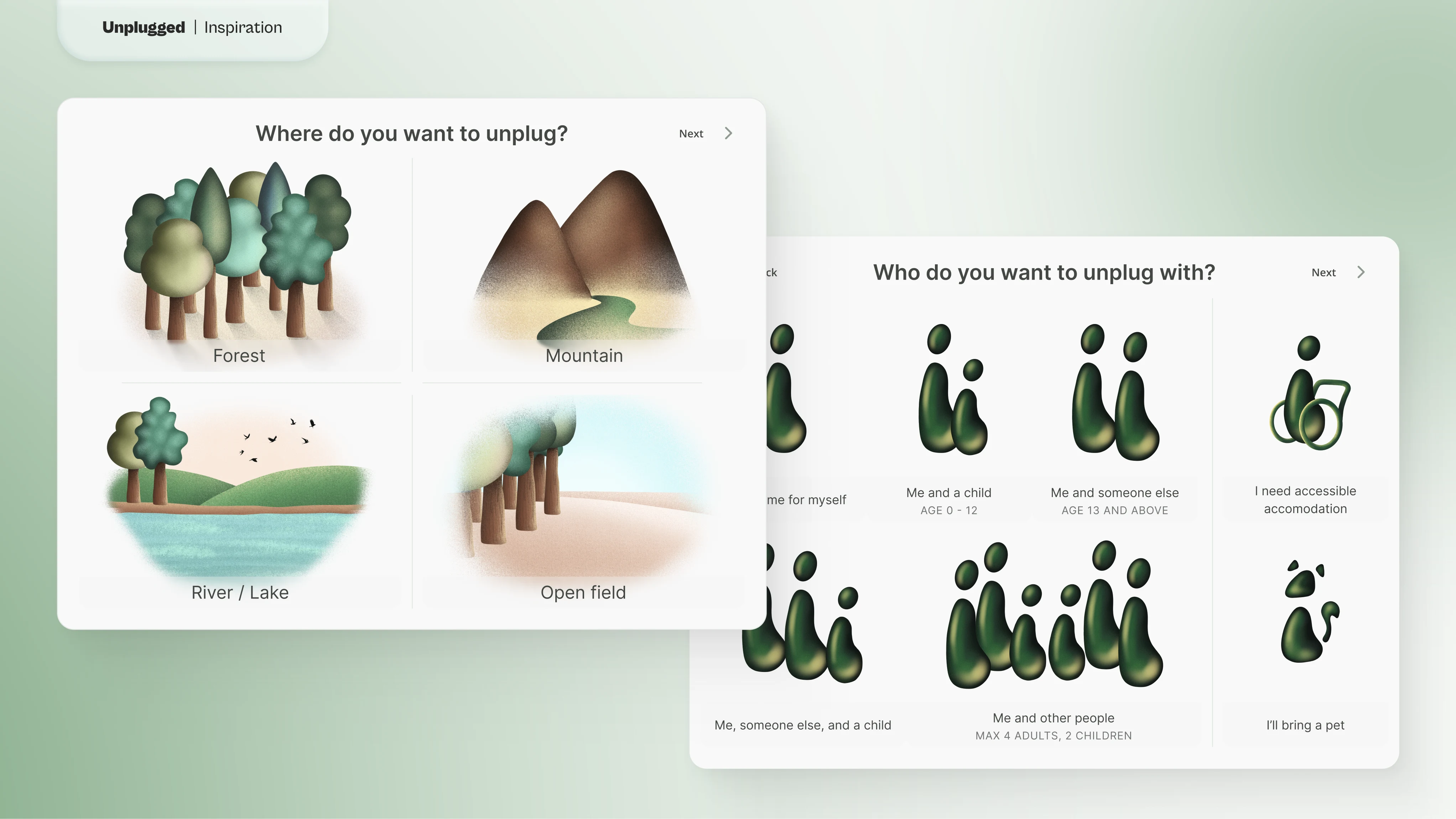
Cabin Finder - Location & Guests
Copywriting
In addition, we worked on the tagline and some of the copies used on the landing page.
The client used "Escape" on the main button which reminded of the escape button on a keyboard. Using a more intuitive "Search" made immediate sense. We continued using the word "escape" in the selection of the location to clarify its intent.
The original tagline "Escape from endless Zoom calls. Lock your phone away in an off-grid cabin so you can completely recharge" was wordy and not engaging.
We agreed on reducing the word count for simplicity, focusing on the idea of "unplugging" electronic devices and allowing people to immerse themselves in nature.
The final tagline became "Unplug from the city, escape into nature".
This encapsulates the idea of leaving behind the stress and technology of modern life and finding peace in nature. It allows readers to dream of a relaxing escape from hectic city life.
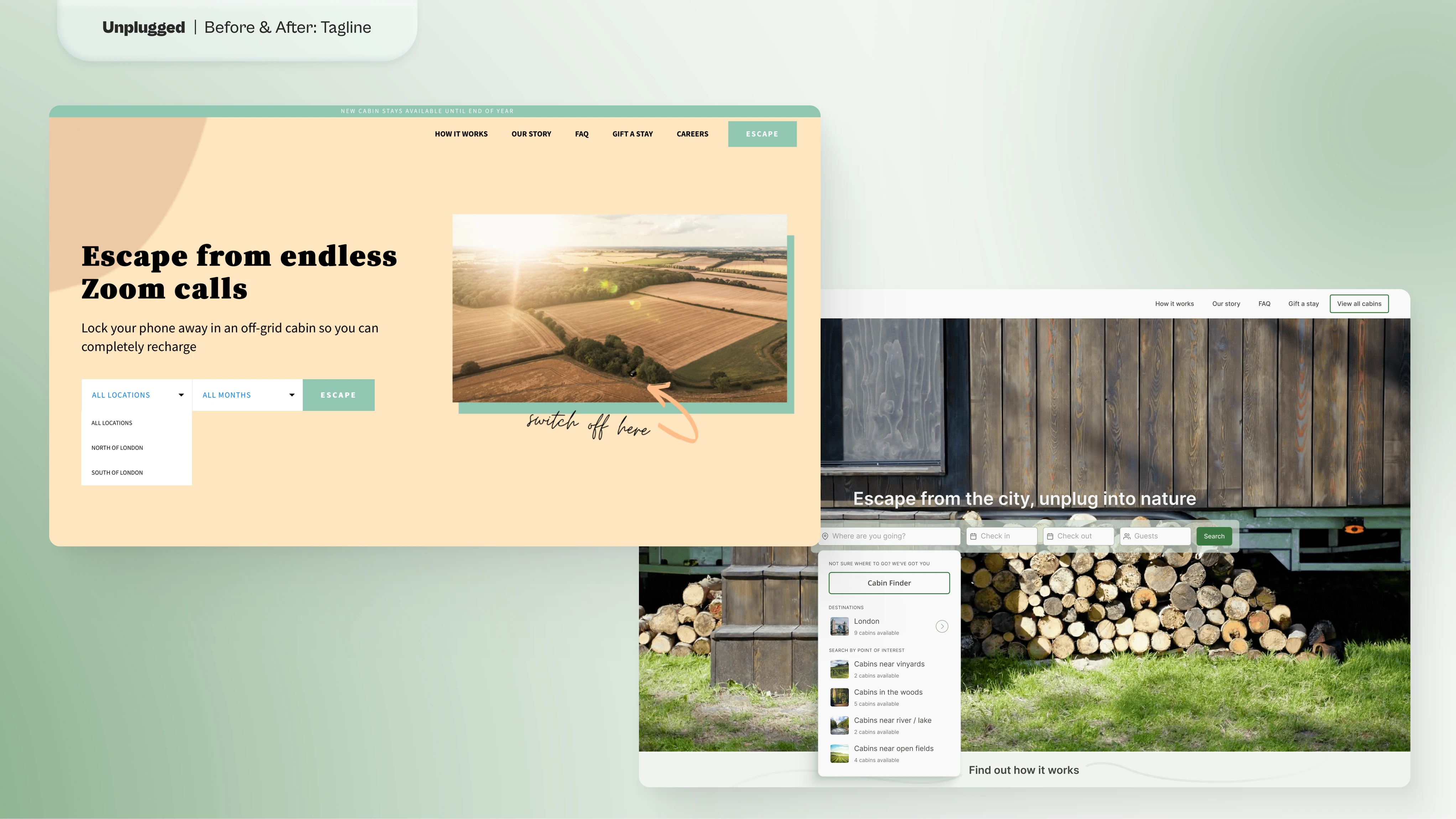
Tagline - Before & After
High Fidelity Prototype
Once the client approved the final sketches, we began working on a UI Kit making sure that it could be easily turned into a full Design System with future updates.
We decided to adopt a clean look with a warm color palette that reminded of nature. We wanted the colors to evoke a feeling of calmness and relaxation, something that clients could find in the cabins offered.
This was inspired by the images provided which were also connected to the client's logo.
Final Thoughts
Due to time constraints, we were not able to test how these design changes performed in the real world.
However, I would have loved to have the time to listen to customers' feedback and quantify how much this redesign impacted their experience and in what ways.
UPDATE: The client eventually designed the website themselves to their own liking. I assume it went well because they're still doing business and went forward with the expansion in new cities and countries.
Like this project
Posted May 22, 2024
Redesign of a UK retreat site to boost bookings by clarifying messaging and enhancing the search experience for a seamless user journey.
