
pro
Min Bui
Shopify CRO Designer | Fix Low Conversion
- $5k+
- Earned
- 4x
- Hired
- 4.90
- Rating
- 21
- Followers

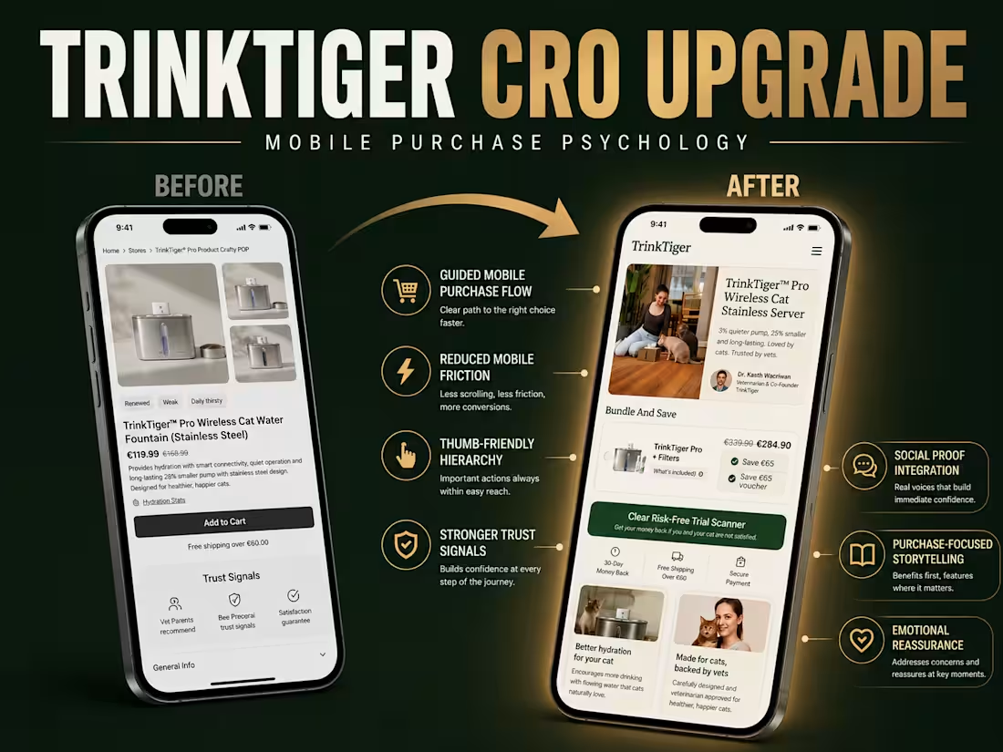
Trinktiger | Shopify CRO Redesign | Ecommerce Pet Brand Website
0
6

Pasture & Paws Brand Identity and Design
0
0
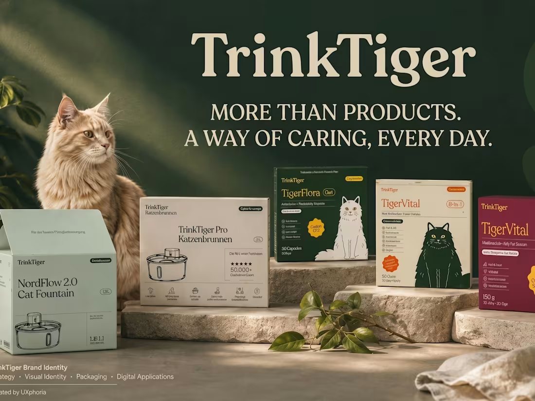
Pet Fountain Brand Book & Identity Design Case Study
1
7
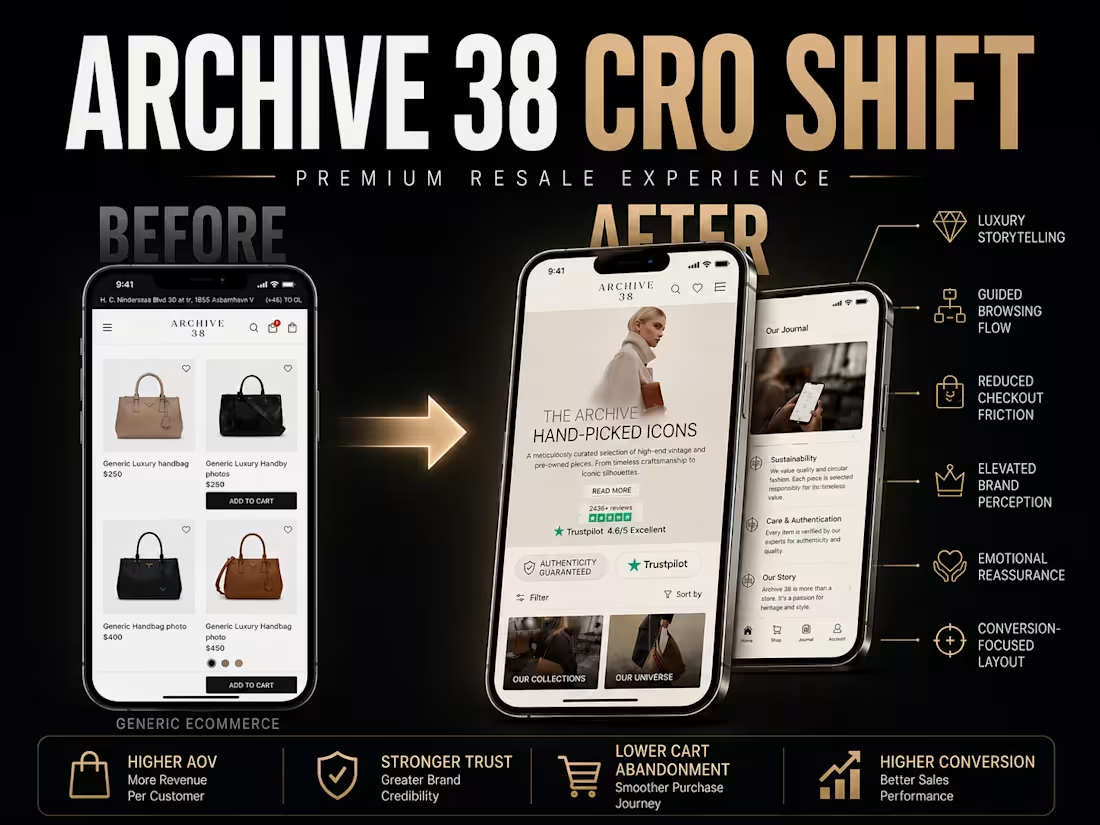
Archive38 Luxury Resale E-commerce CRO | Shopify Web Redesign
1
2
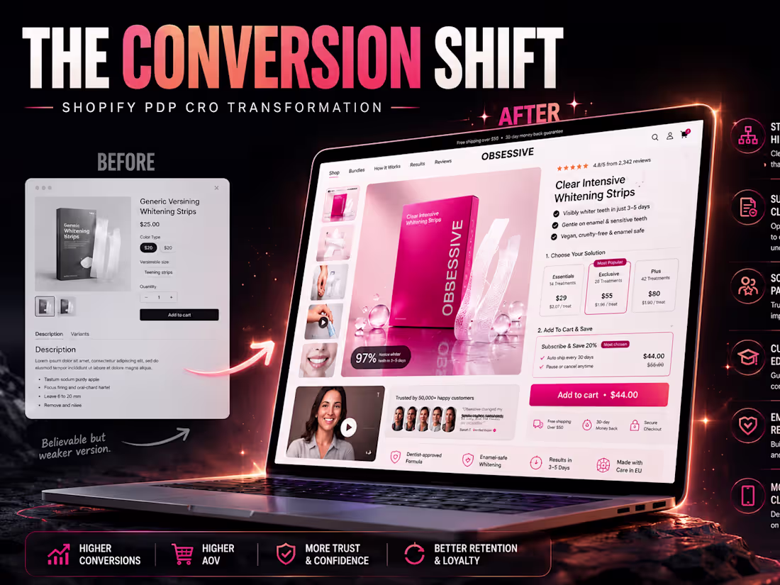
Obsessive Smiles Website UX Design & CRO | Shopify Ecommerce
0
6
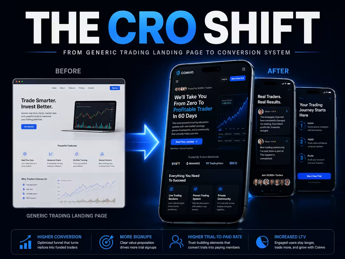
CoinVo Trading Fintech Landing Page Design
1
31
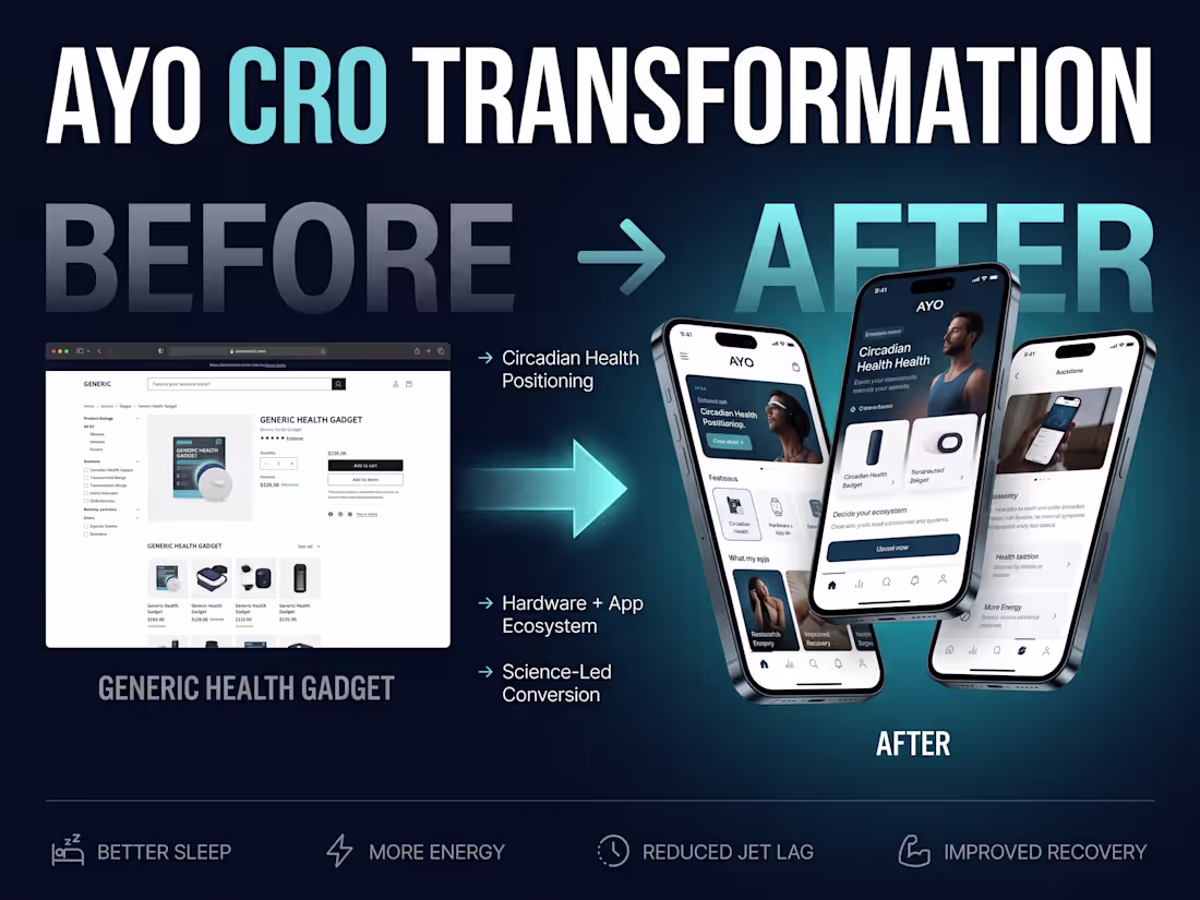
AYO Light Therapy Ecommerce UX & Shopify CRO Redesign
2
24