Brand Book & Visual Guidelines for DTC Pet Brand
Min Bui
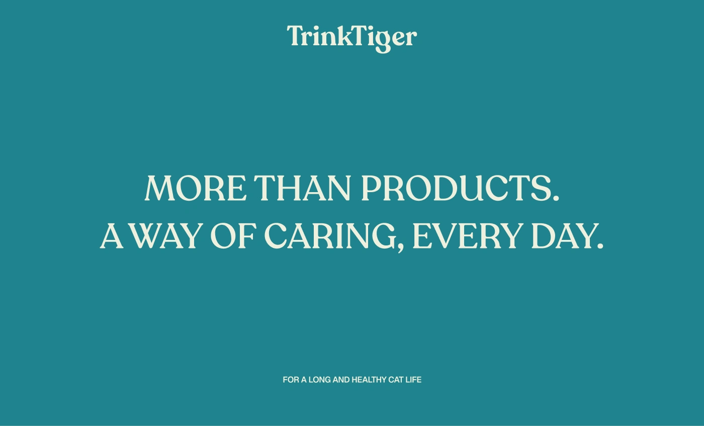
Take better care of your cat, with simple wellness tools you can trust.
OVERVIEW
TrinkTiger - a growing cat care brand evolving from a hydration-focused product into a broader cat wellness ecosystem.
The goal of this project is to create a clear, recognisable identity that helps customers feel confident about the care they provide for their cats, and positions TrinkTiger as a reliable wellness brand people can trust for years.
BRAND FOUNDATION
Mission
Our mission is to help cats live healthier, happier lives with simple, well-designed products that give our customers confidence in the care they provide.
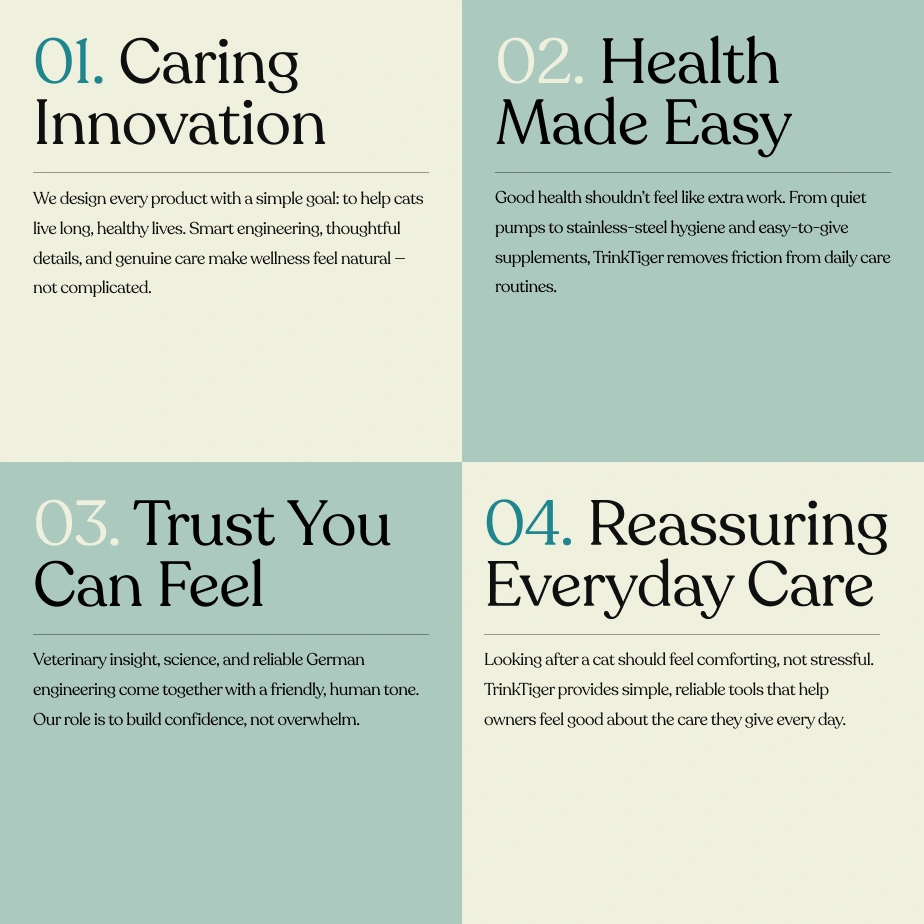
Brand Values
TrinkTiger’s values sit at the centre of everything we do. They guide decision-making, build trust, and ensure every product makes a meaningful difference to cats and the people who love them.
BRAND STRATEGY & POSITIONING
TrinkTiger operates within the Cat Wellness / Pet Care category, with a clear focus on everyday health and prevention rather than reactive treatment.
The brand speaks to caring cat owners who want to do the right thing for their pets, but don’t want complexity or clinical experiences. TrinkTiger positions itself as a calm, knowledgeable companion , expert-backed, yet approachable.
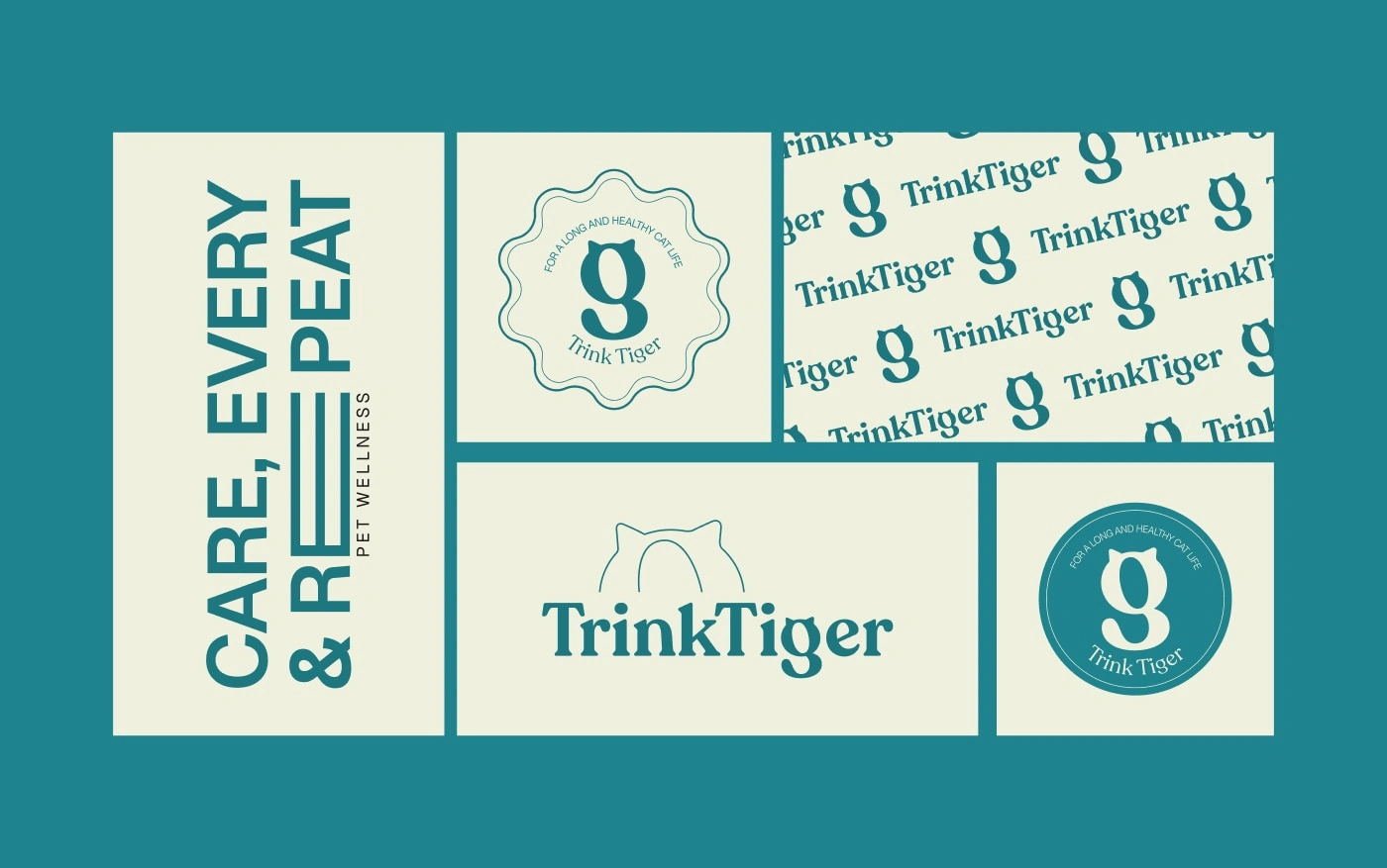
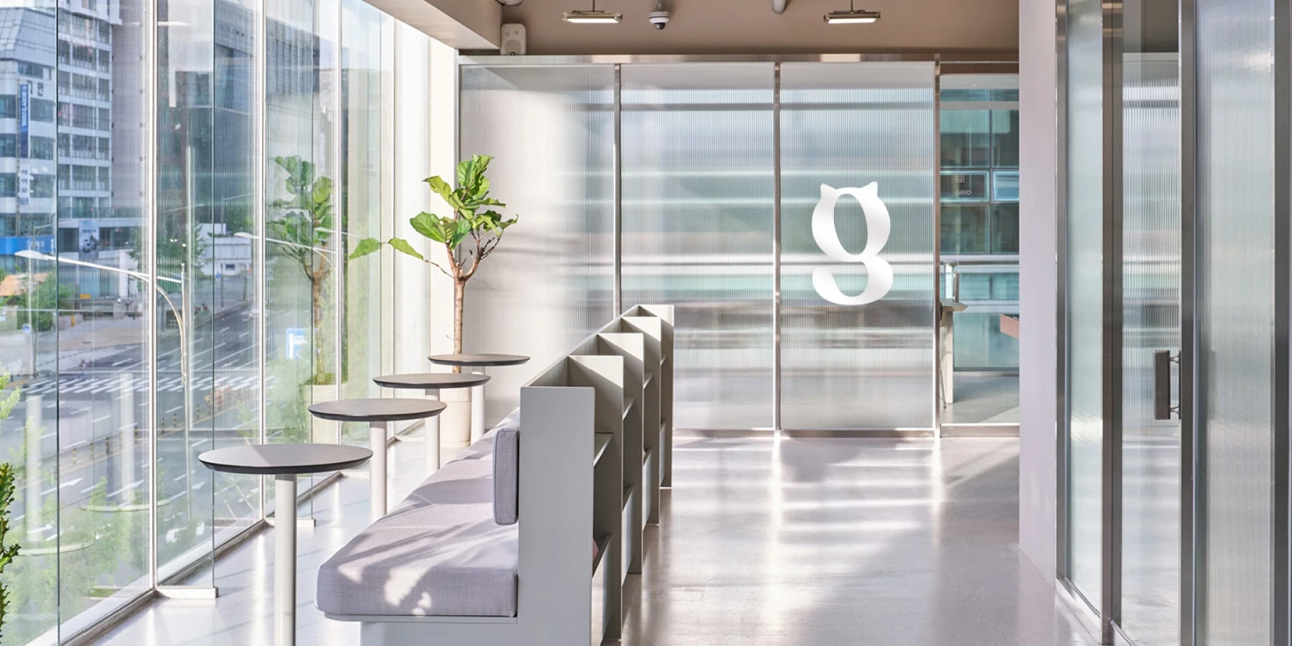
VISUAL IDENTITY SYSTEM
Following the brand workshop, TrinkTiger required an identity that could support its transition from a single hydration product to a broader wellness brand.
This system is practical for your team, scalable for futur products, and built to create long-term recognition.
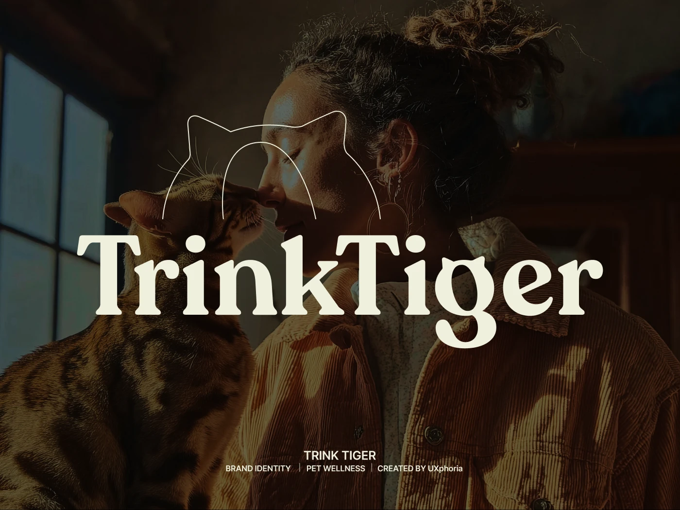
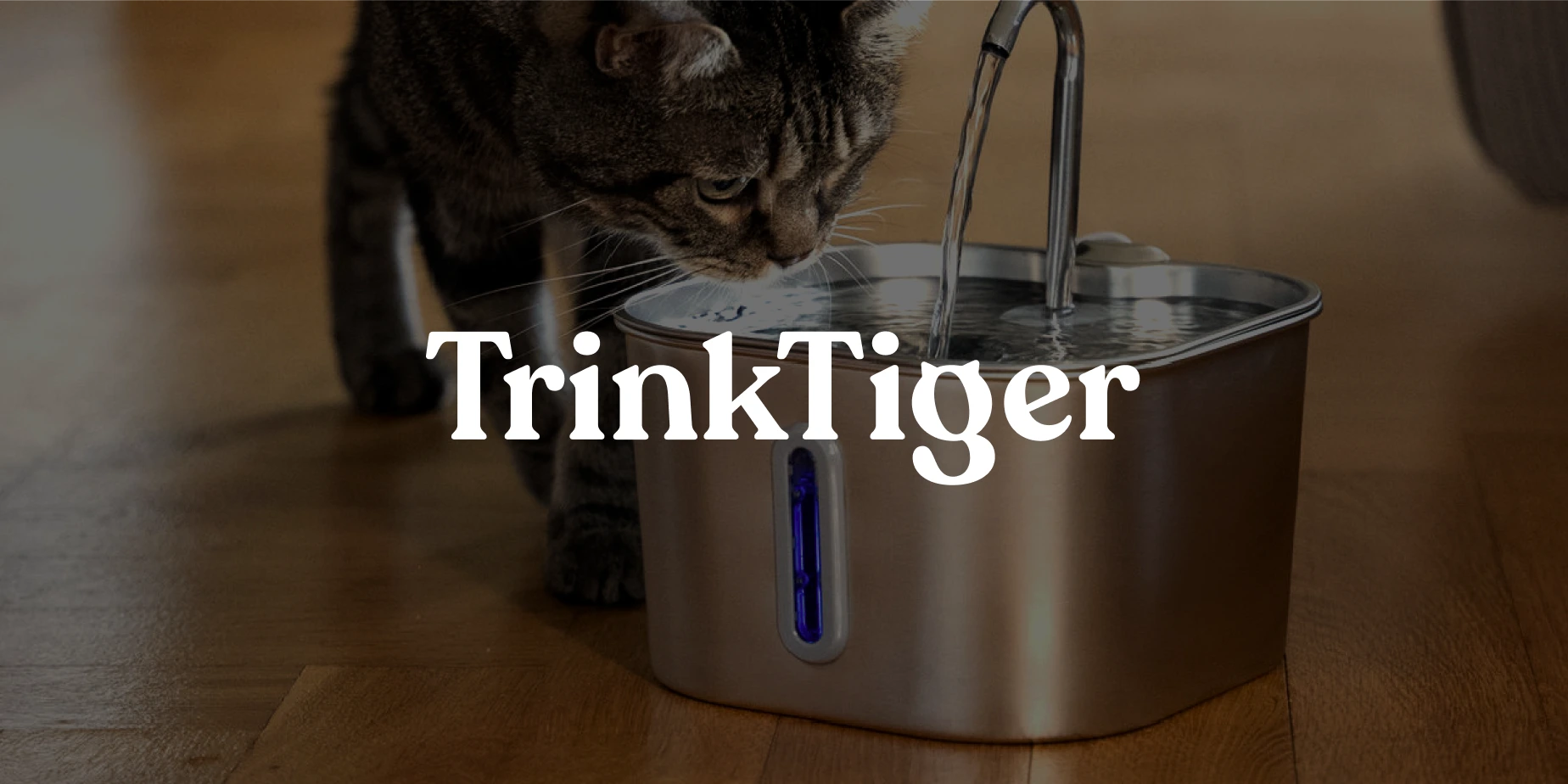
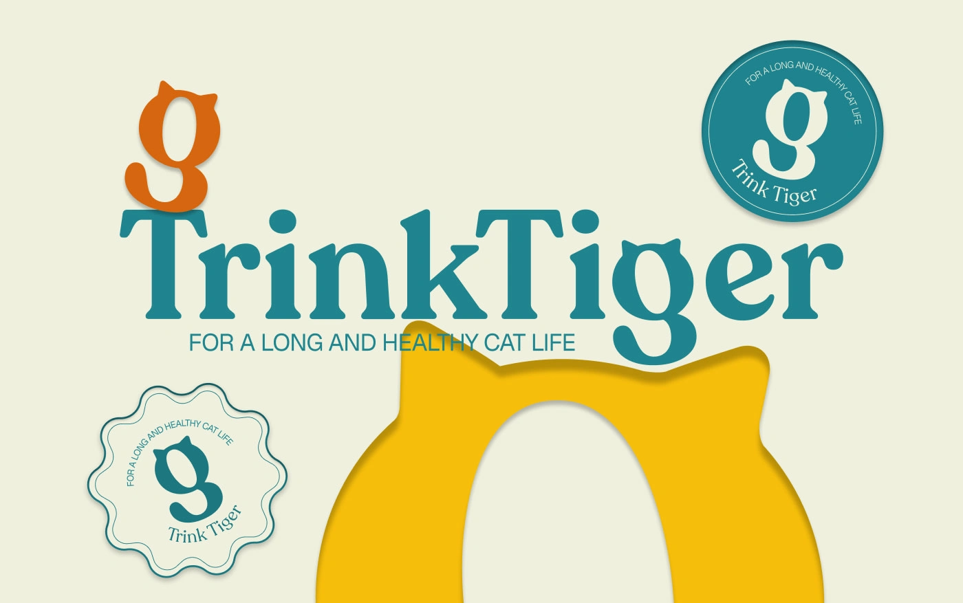
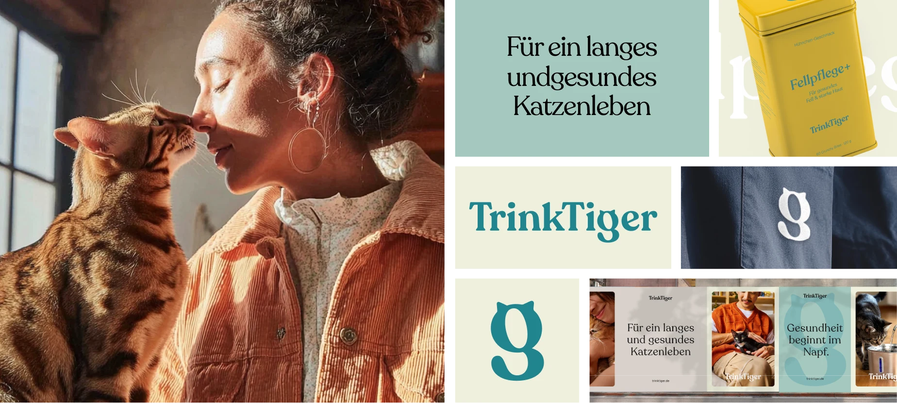
At the centre of the system is a refined wordmark using a softer serif style. The design introduces warmth, approachability, and personality, while maintaining clarity and reliability.
It reflects TrinkTiger’s evolution into a wellness brand customers can rely on long term.
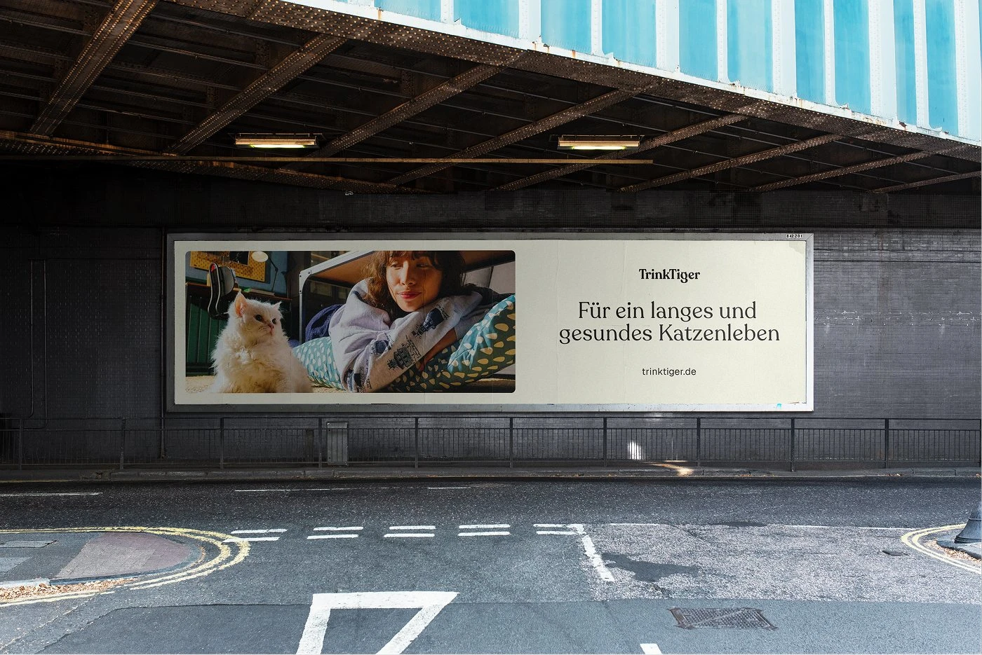
The wordmark is flexible across digital, packaging, and print , strong in hero moments, yet unobtrusive when needed.
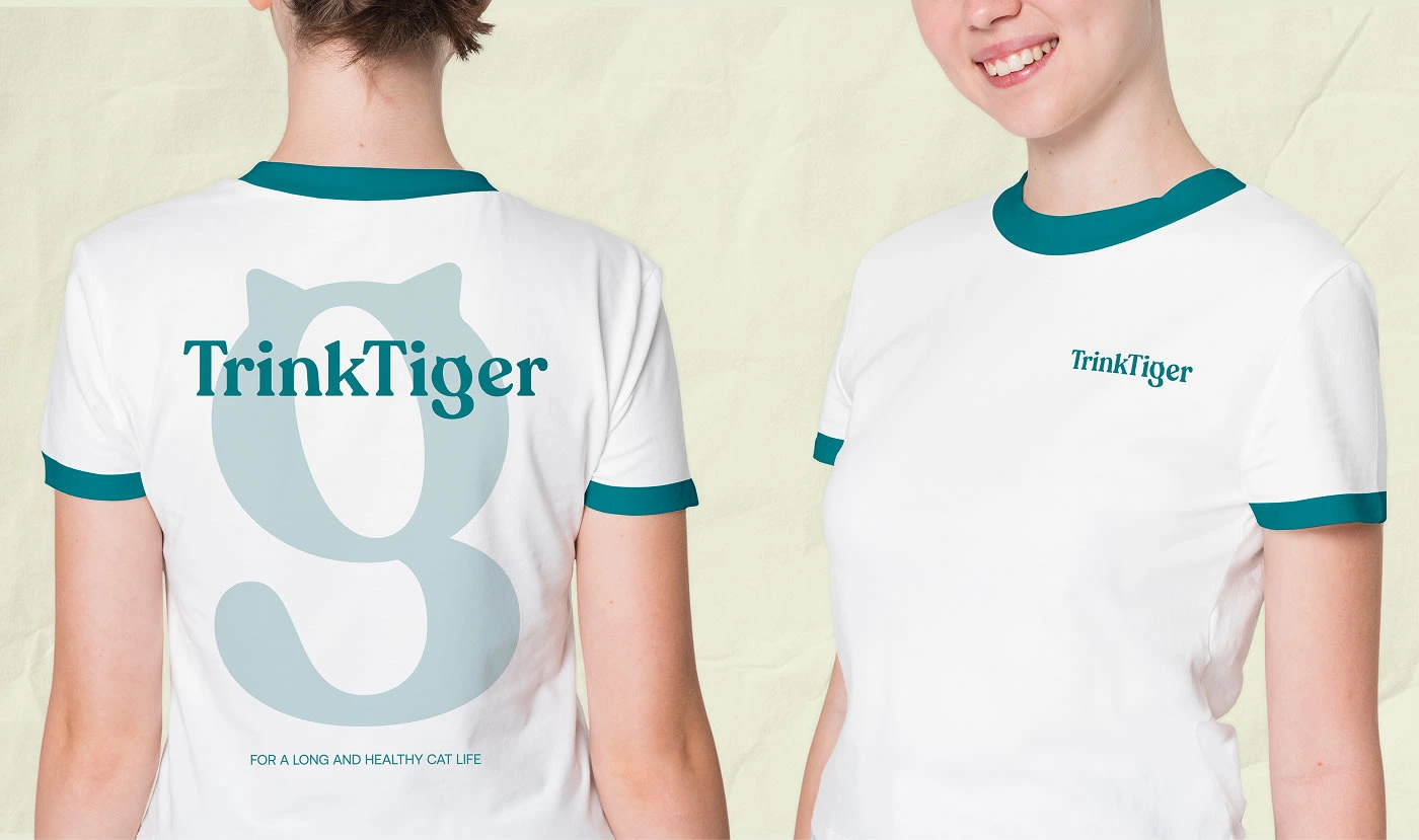
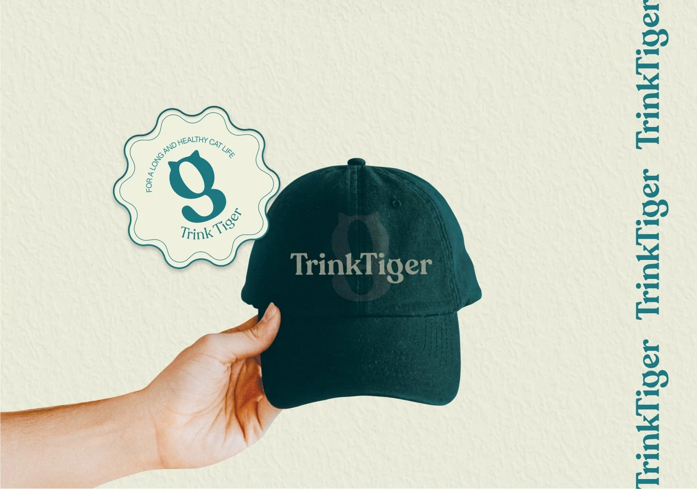
VISUAL LANGUAGE & APPLICATION
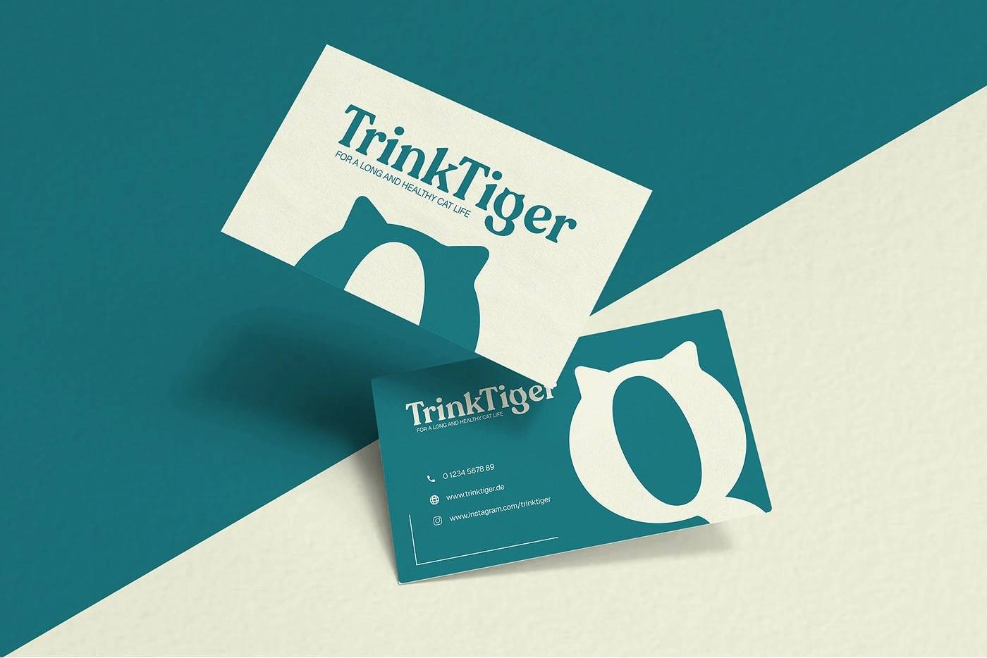
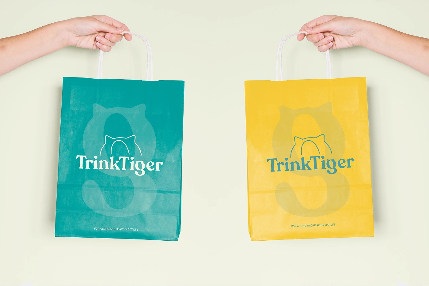
Logo

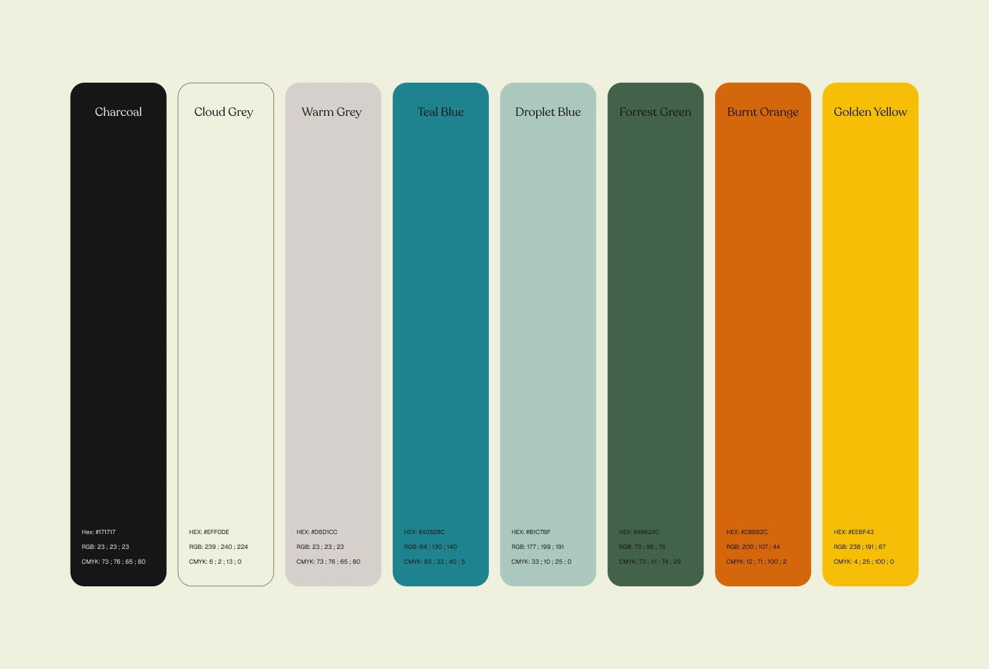
Colours
A refined palette of warm neutrals forms the foundation, supported by deeper accent tones such as teal blue, forest green, burnt orange, and golden yellow.
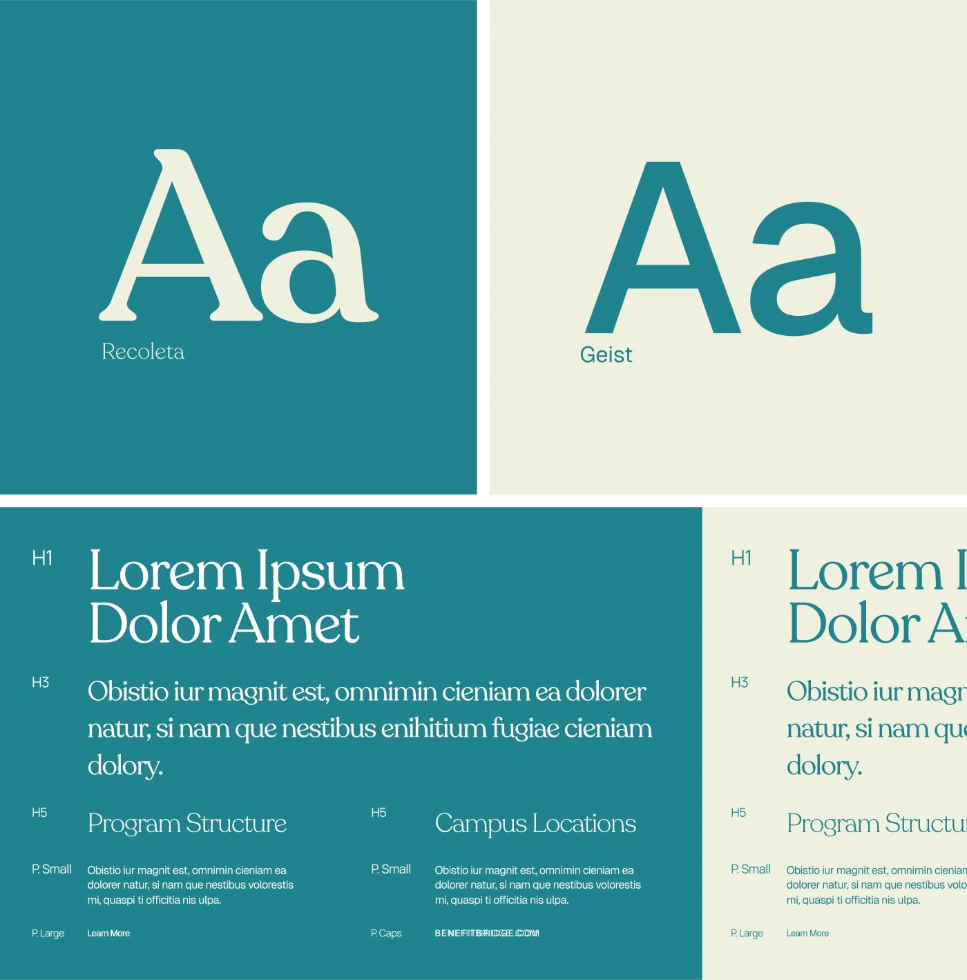
Typography
The identity is built around a dual-type system:
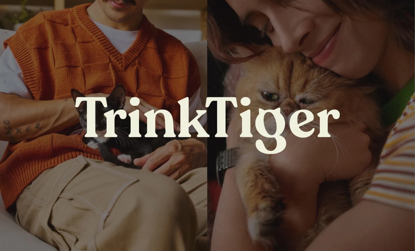
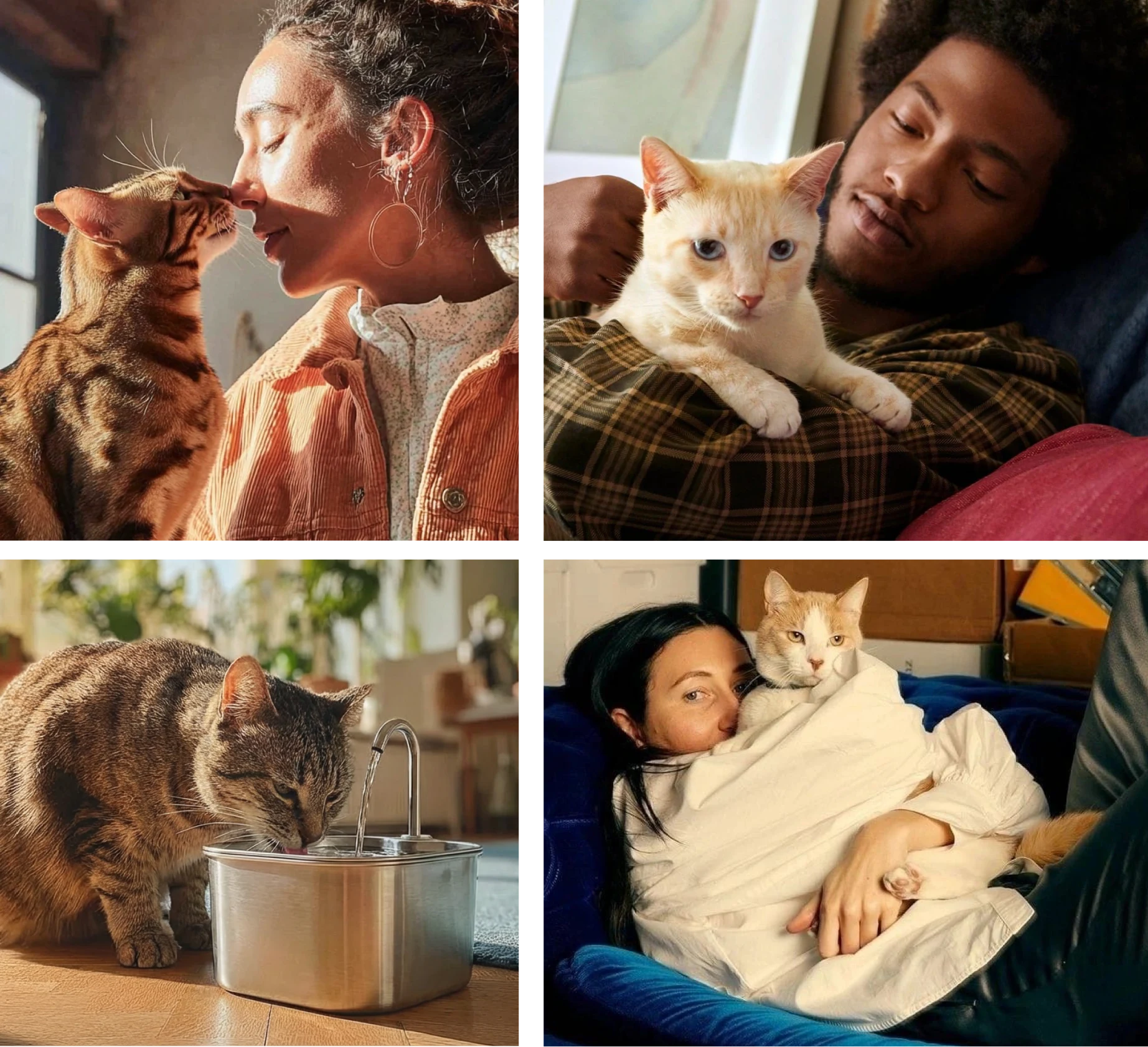
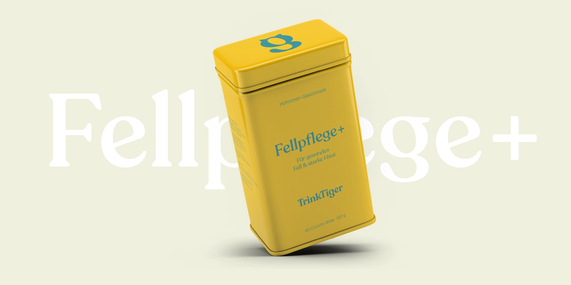
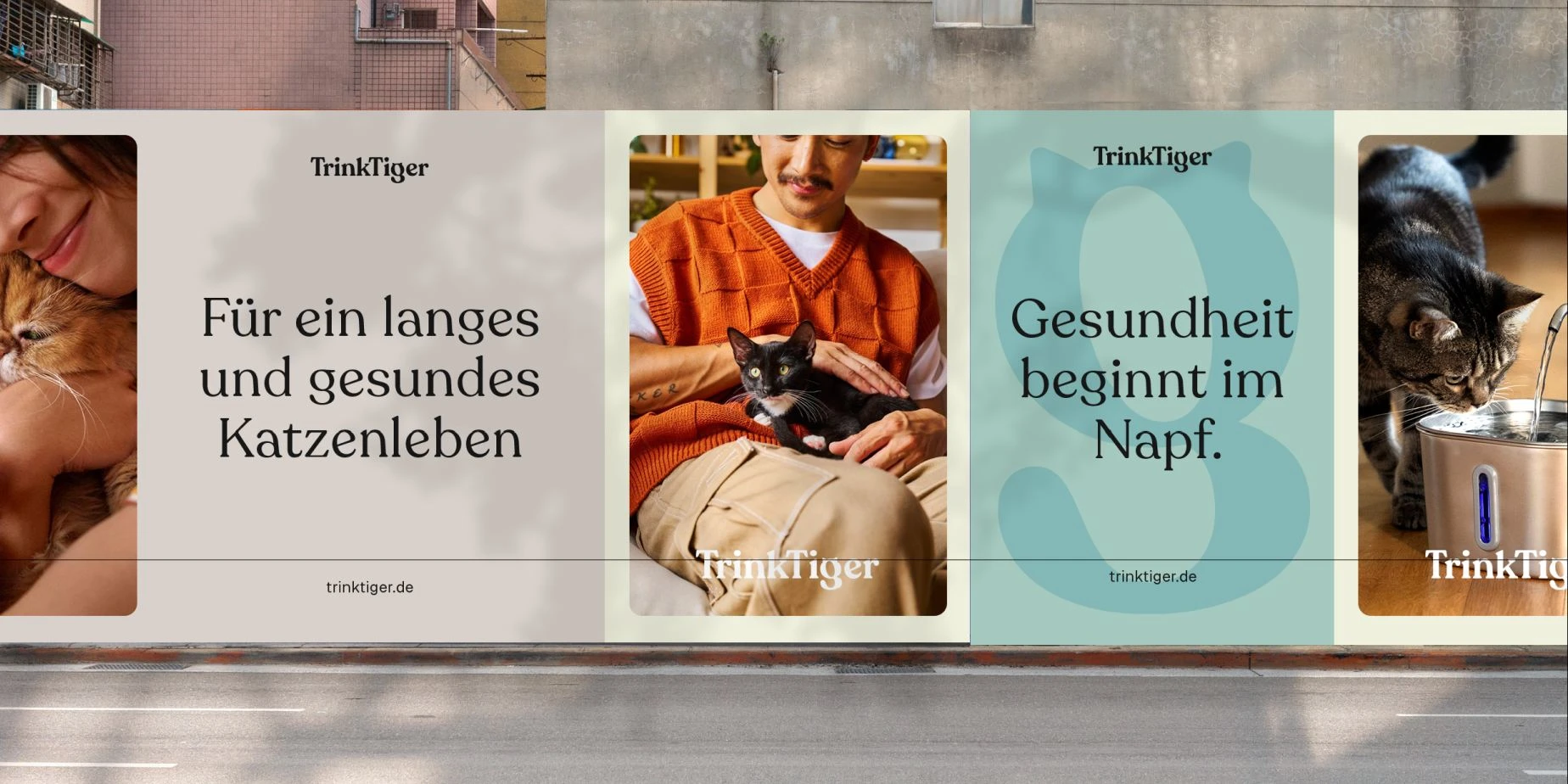
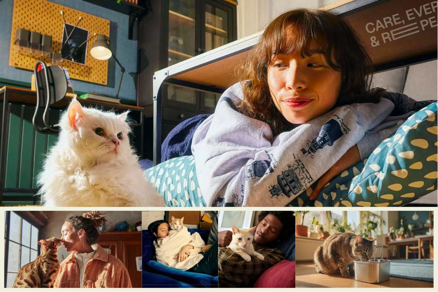
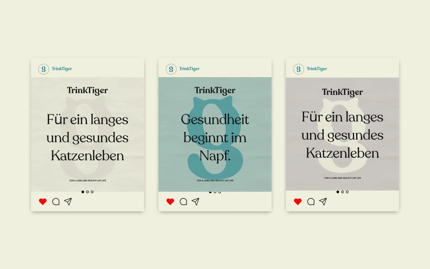
Photography & Applications
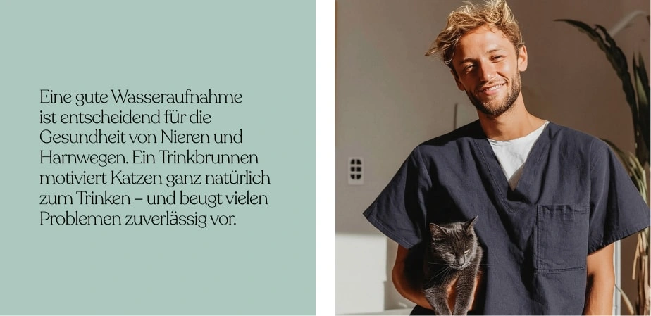
Lifestyle photography feels honest and natural , real cats, real owners, real moments. Product photography follows the same principles to maintain trust and consistency.
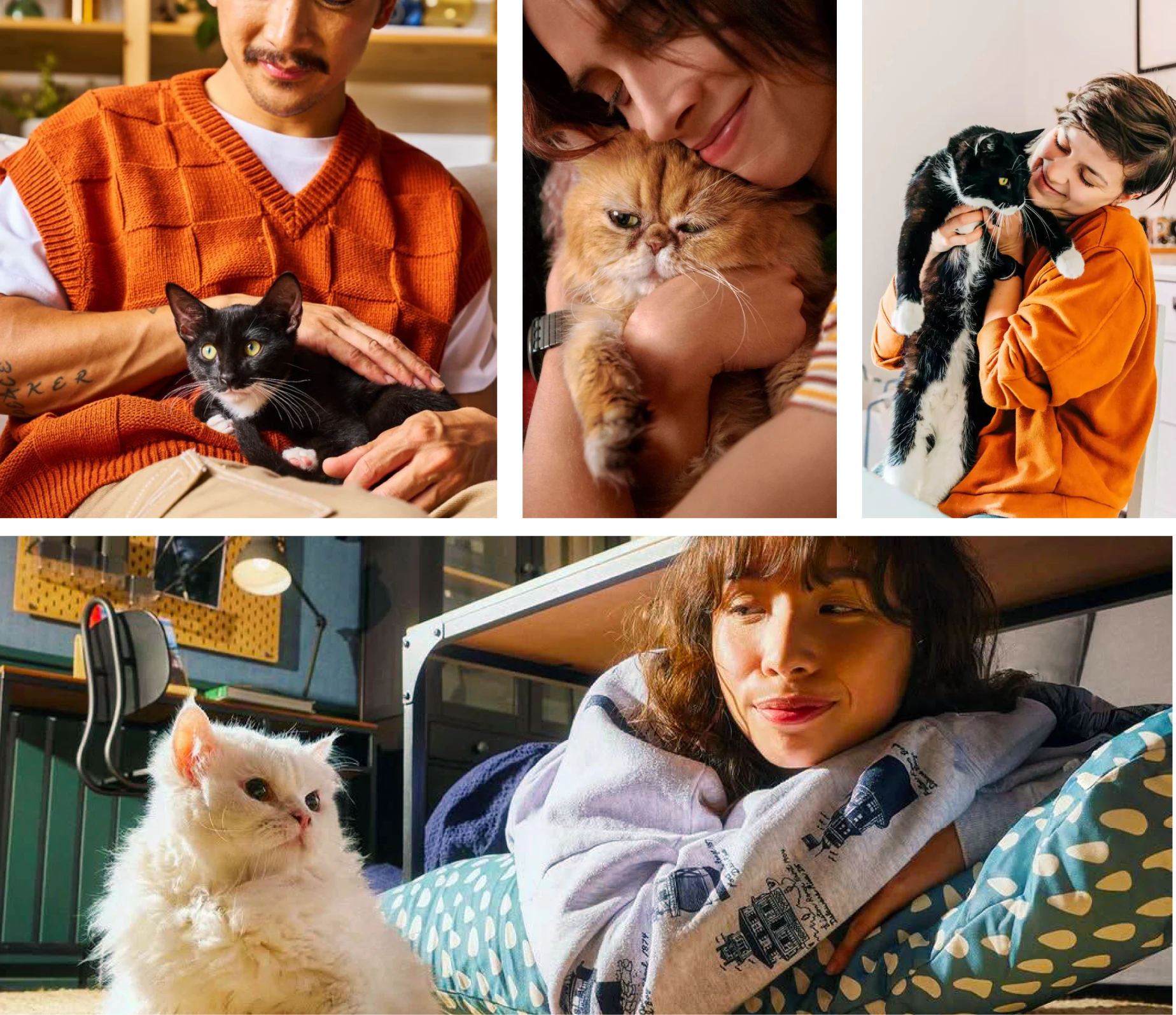
This balance avoids clinical coldness while keeping the brand clean and premium.
Packaging and supplement examples demonstrate how typography, colour, and iconography work together within the system.
SCALABILITY & FUTURE GROWTH
The TrinkTiger identity is built as a modular system. Typography, colour, iconography, and photography can adapt as new products and categories are introduced.
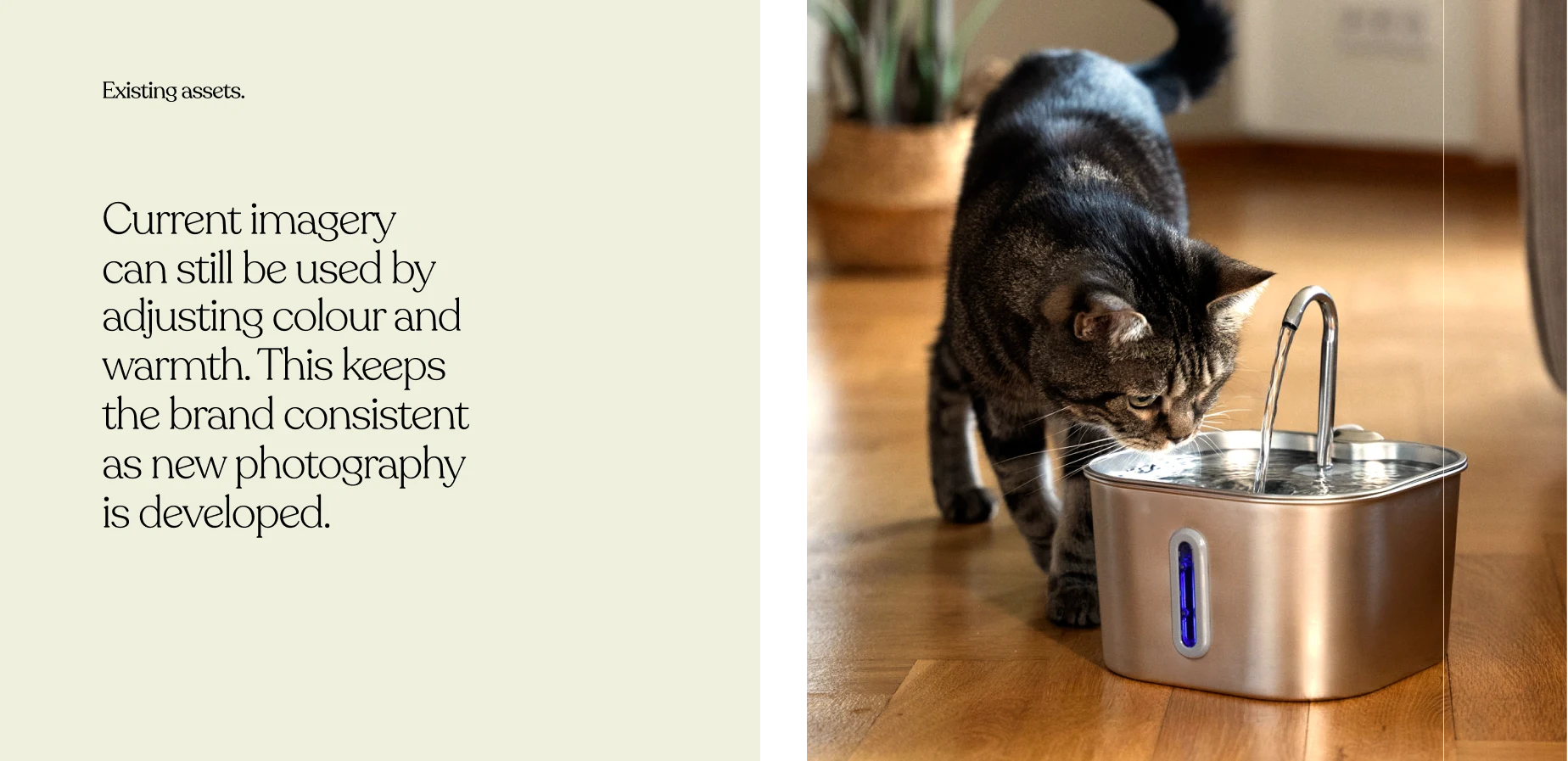
Existing assets can be retained and refined through colour and warmth adjustments, ensuring continuity during growth.
This flexibility allows TrinkTiger to expand confidently beyond hydration into wider cat wellness, while maintaining strong recognition and consistency over time.
READY TO BUILD A BRAND CUSTOMERS ACTUALLY REMEMBER?
Most teams wait too long to fix unclear branding. They launch new campaigns, tweak their website, and wonder why nothing feels consistent , or why customers don’t remember them.
You don’t need another “logo designer”.
You need a brand partner who thinks strategically, uncovers what makes you unique, and turns it into a system your entire company can confidently use.
At UXphoria, we shape scattered ideas into cohesive, recognizable brand identities , the kind that feel instantly clear, deeply memorable, and built to scale across every touchpoint.
If you’re ready to build a brand people trust, believe in, and come back to…
Like this project
Posted Jan 20, 2026
This project involved creating a comprehensive brand book for a DTC brand, defining logo usage, typography, color systems, and visual rules.
Likes
2
Views
13
Timeline
Nov 13, 2025 - Ongoing