Brand Book & Identity System for Startup | Fintech
Min Bui
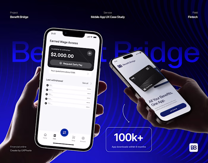
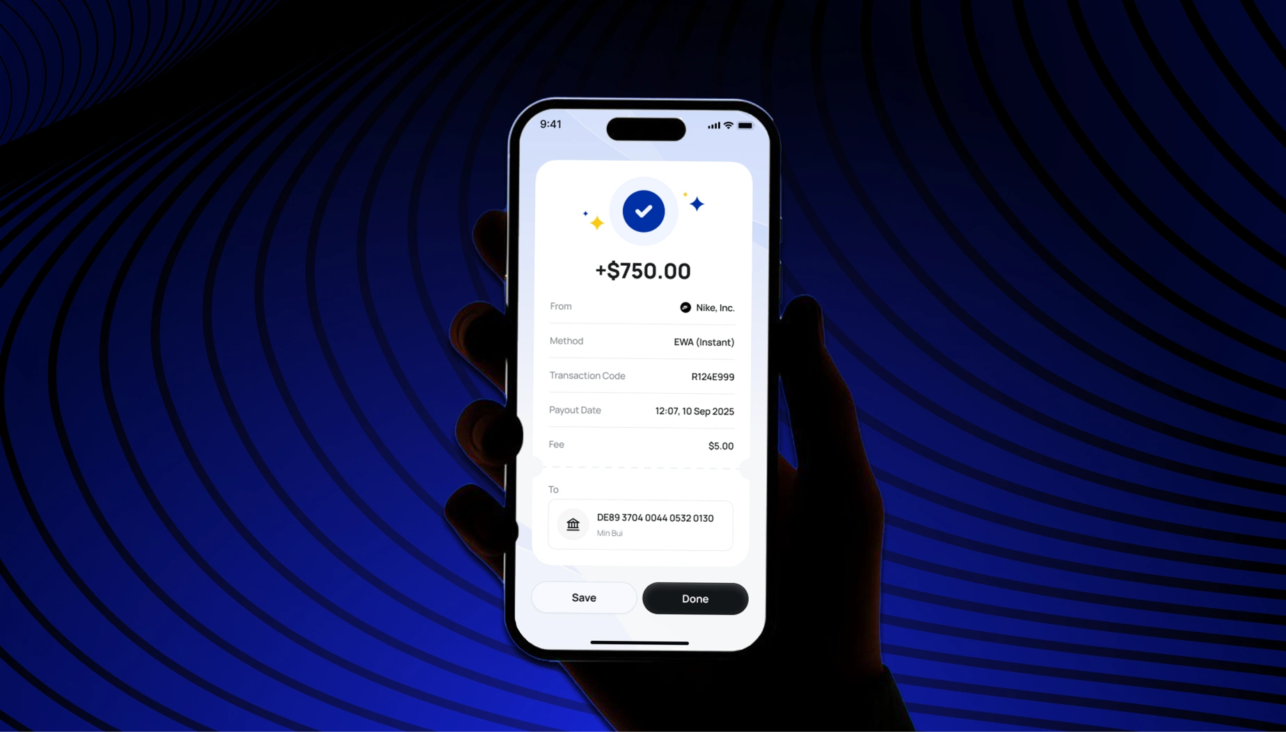
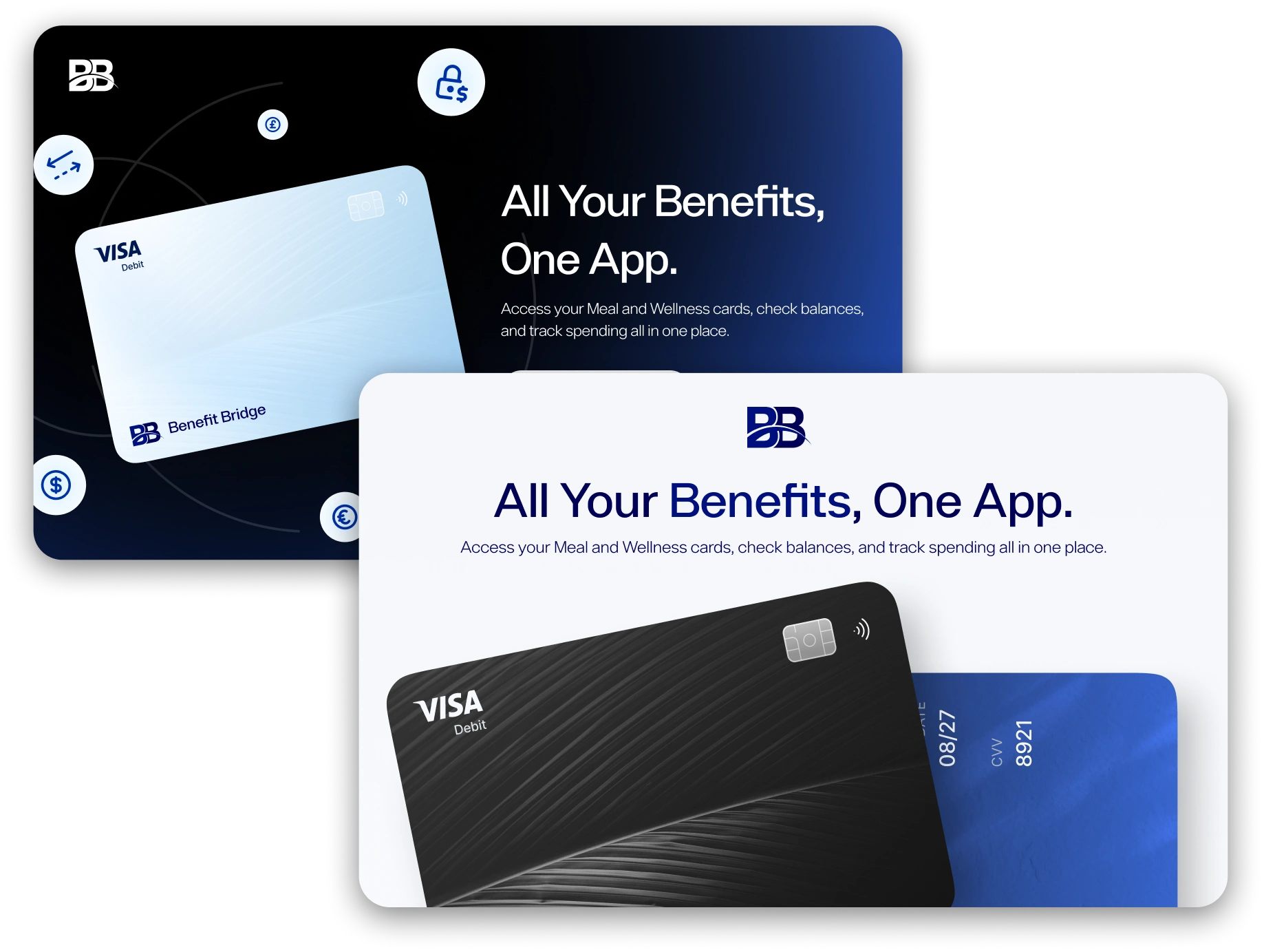
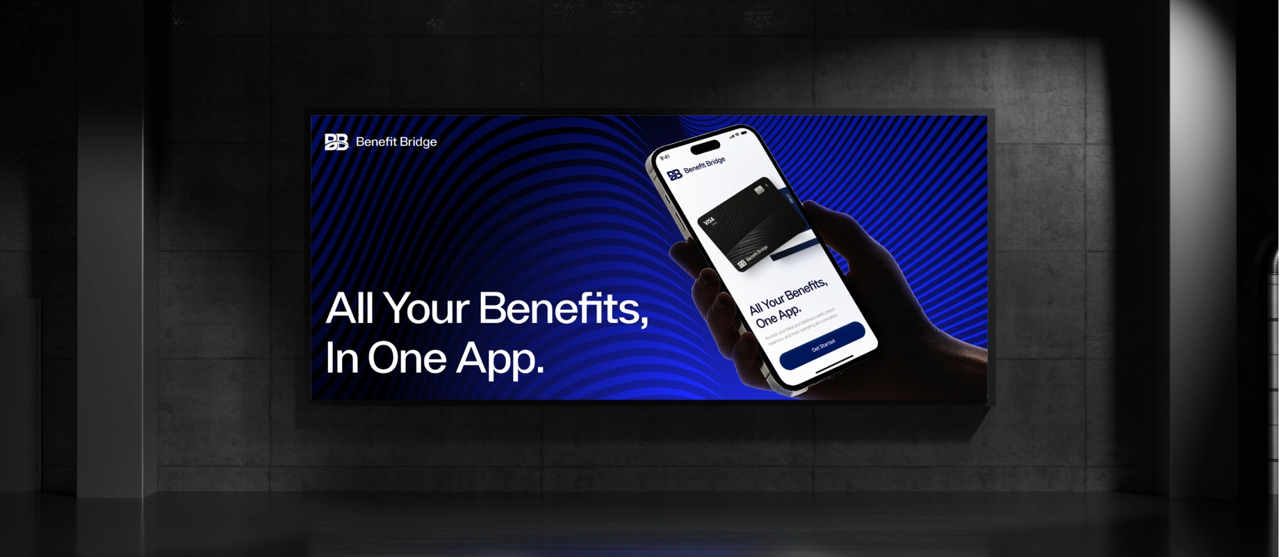
Take control of your finances with instant access to earnings and all your benefit cards
OVERVIEW
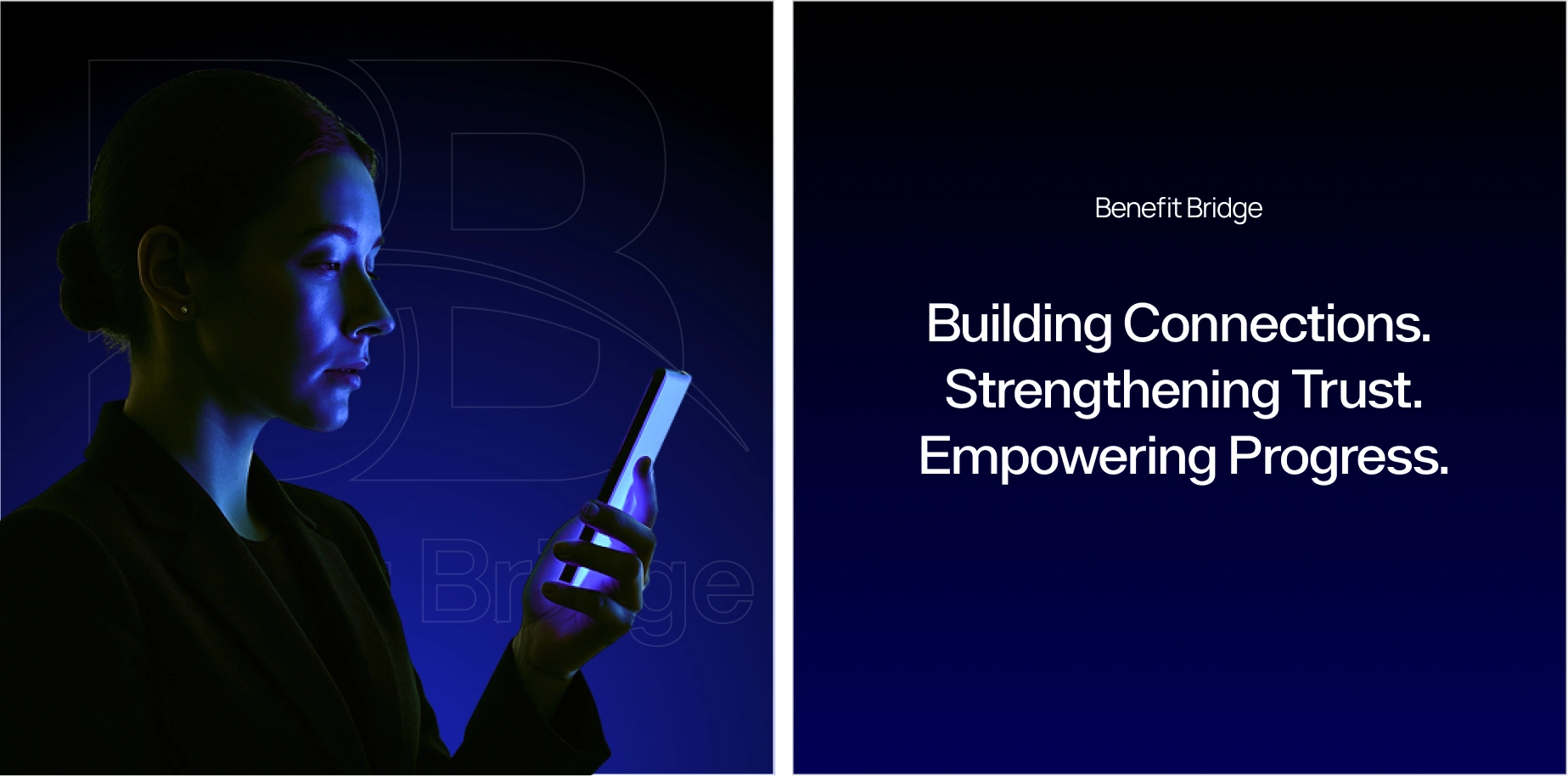
Benefit Bridge , Your Financial Wellness, Connected.
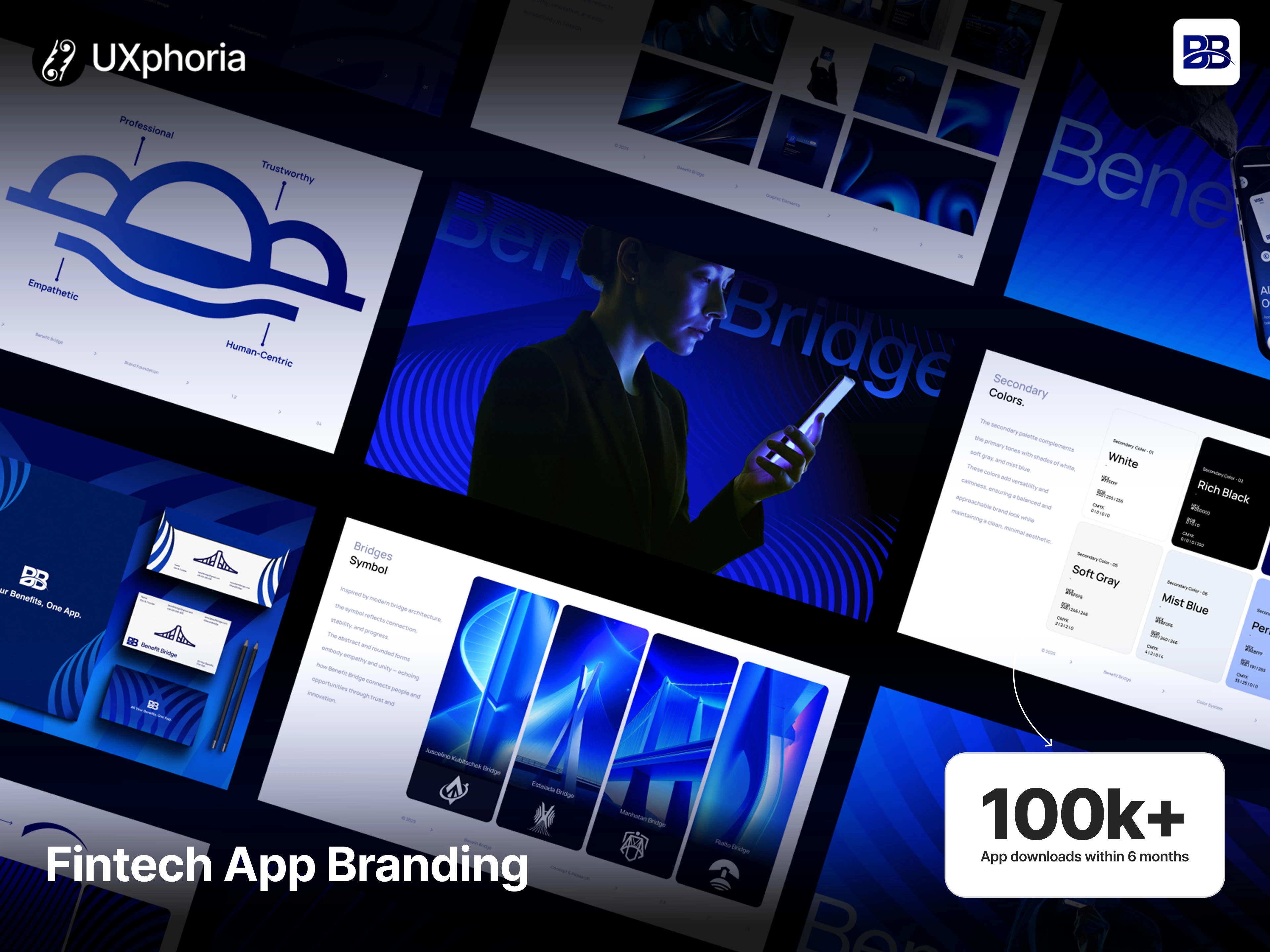
We elevated the brand's visual system to align with its refined strategic direction, delivering an enhanced logo, a cohesive style guide, and an expanded iconography system , along with design frameworks for key website experiences.
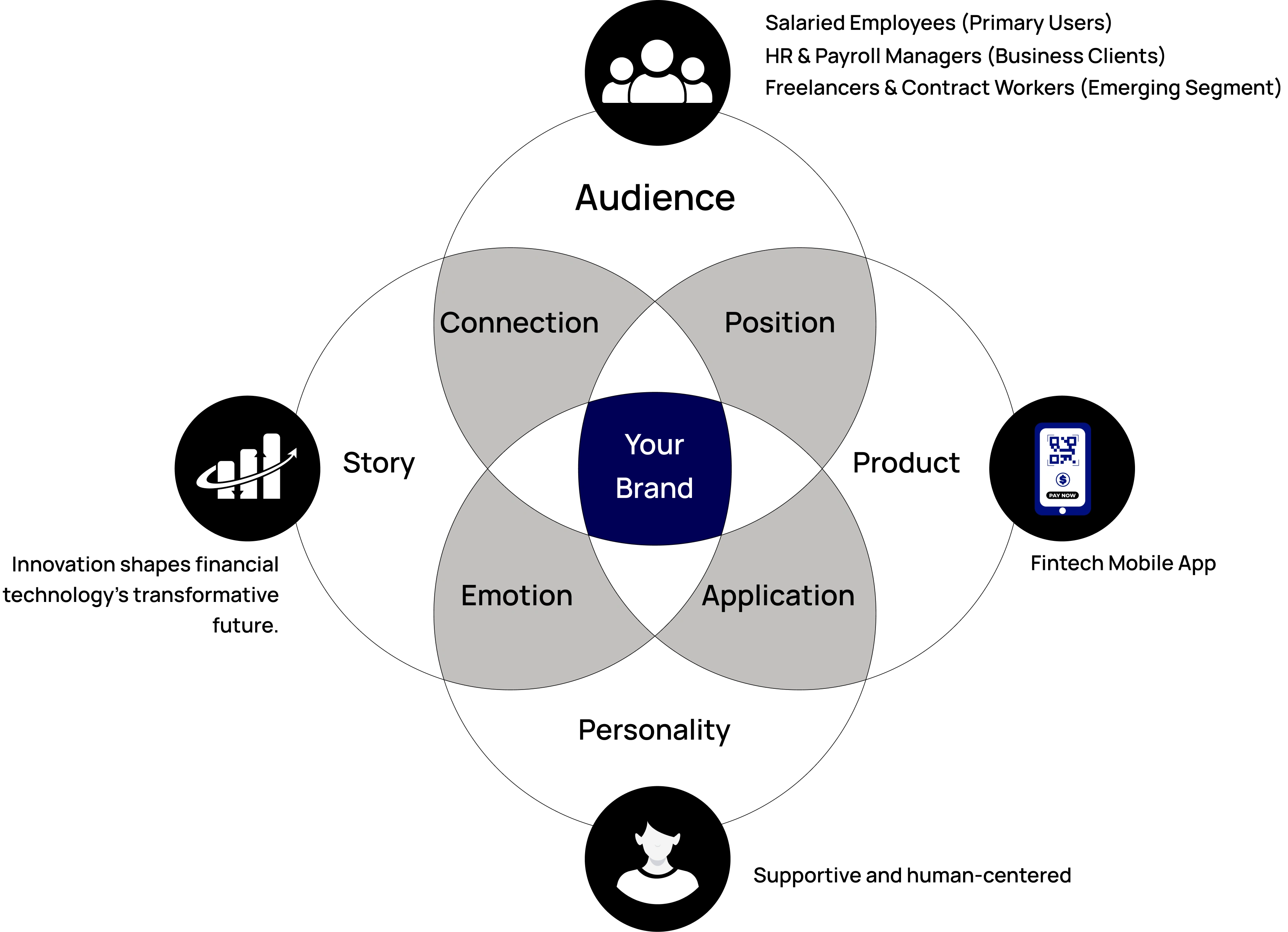
BRAND STRATEGY & POSITIONING
We refined the brand identity to align with Benefit Bridge’s updated strategic direction.
The goal was to build a visual presence that communicates trust, clarity, and human-centered innovation , core values of a financial product that empowers users with everyday financial control.
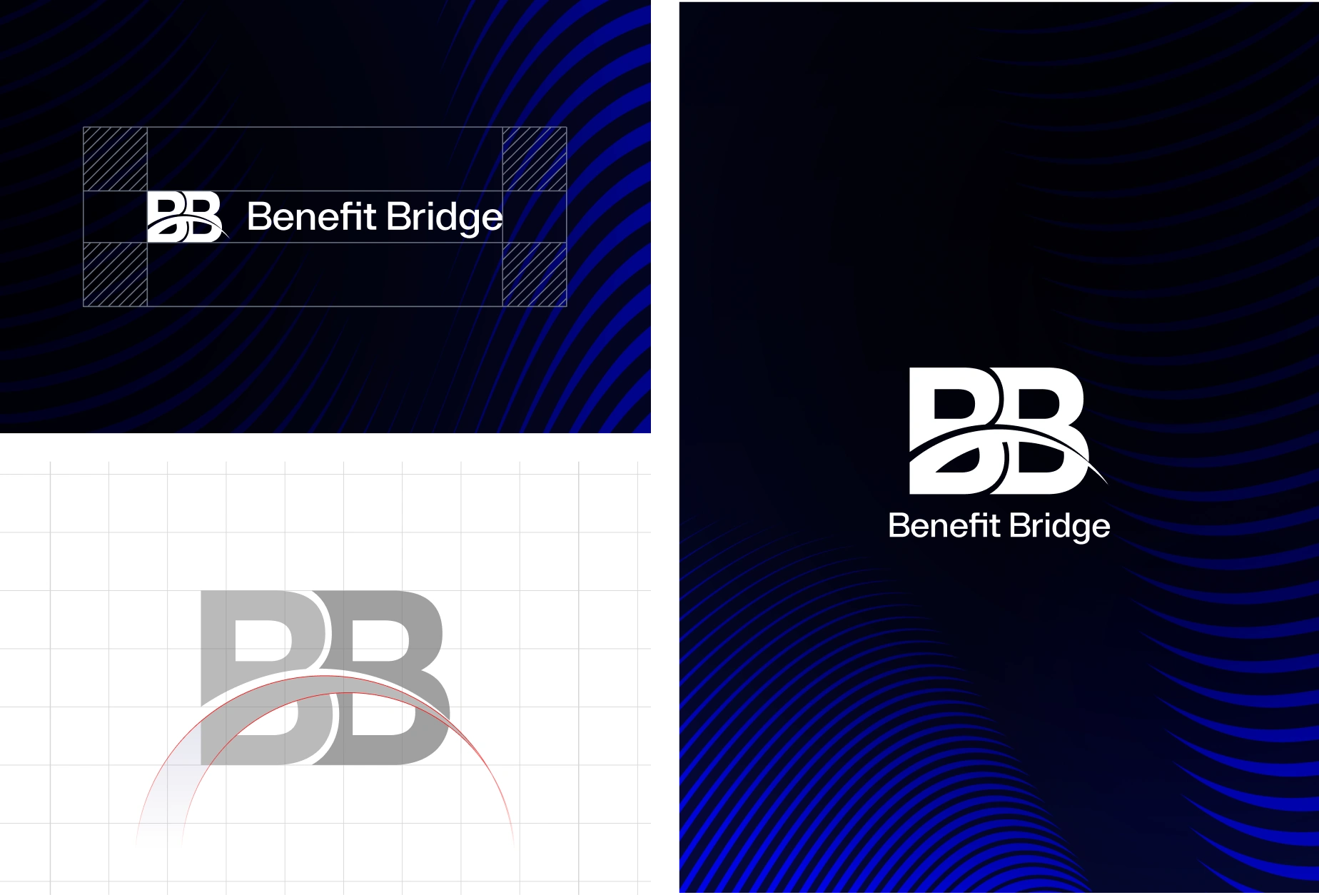
The updated identity system features a more defined logo structure, a balanced visual language, and a unified tone that positions Benefit Bridge as a supportive, modern, and forward-thinking fintech solution.
The updated identity system features a more defined logo structure, a balanced visual language, and a unified tone that positions Benefit Bridge as a supportive, modern, and forward-thinking fintech solution.
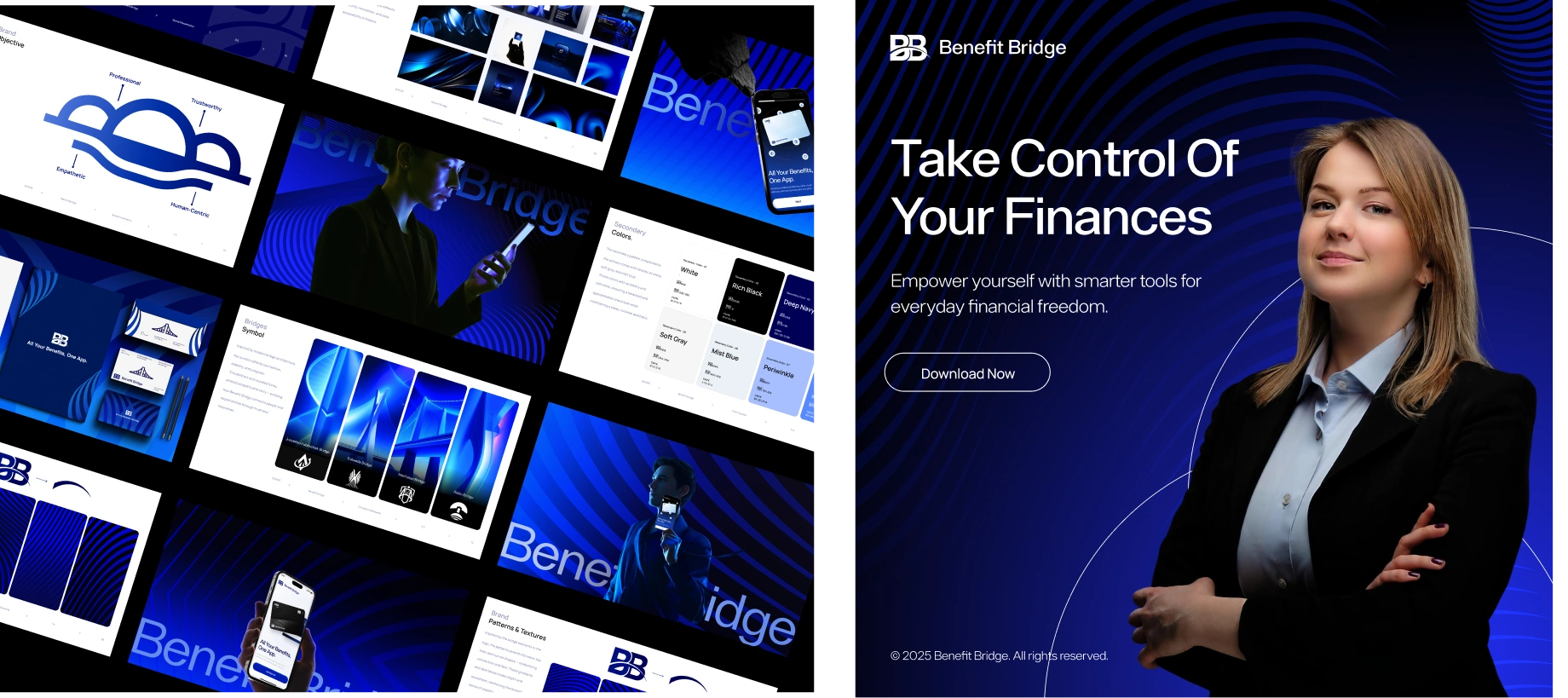
VISUAL IDENTITY SYSTEM
To ensure consistency across app and web platforms, we developed a comprehensive design system that supports scalability and clarity.
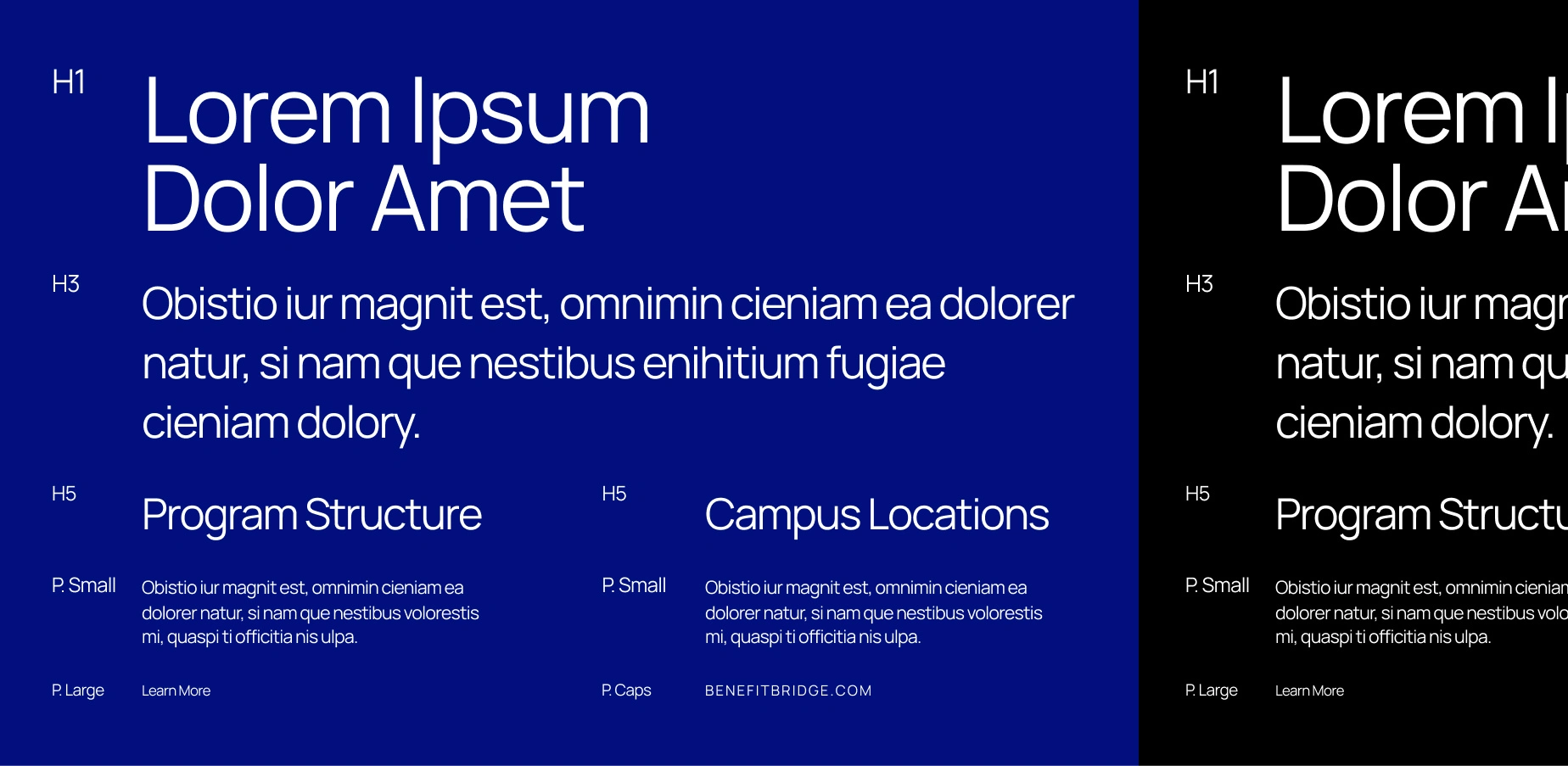
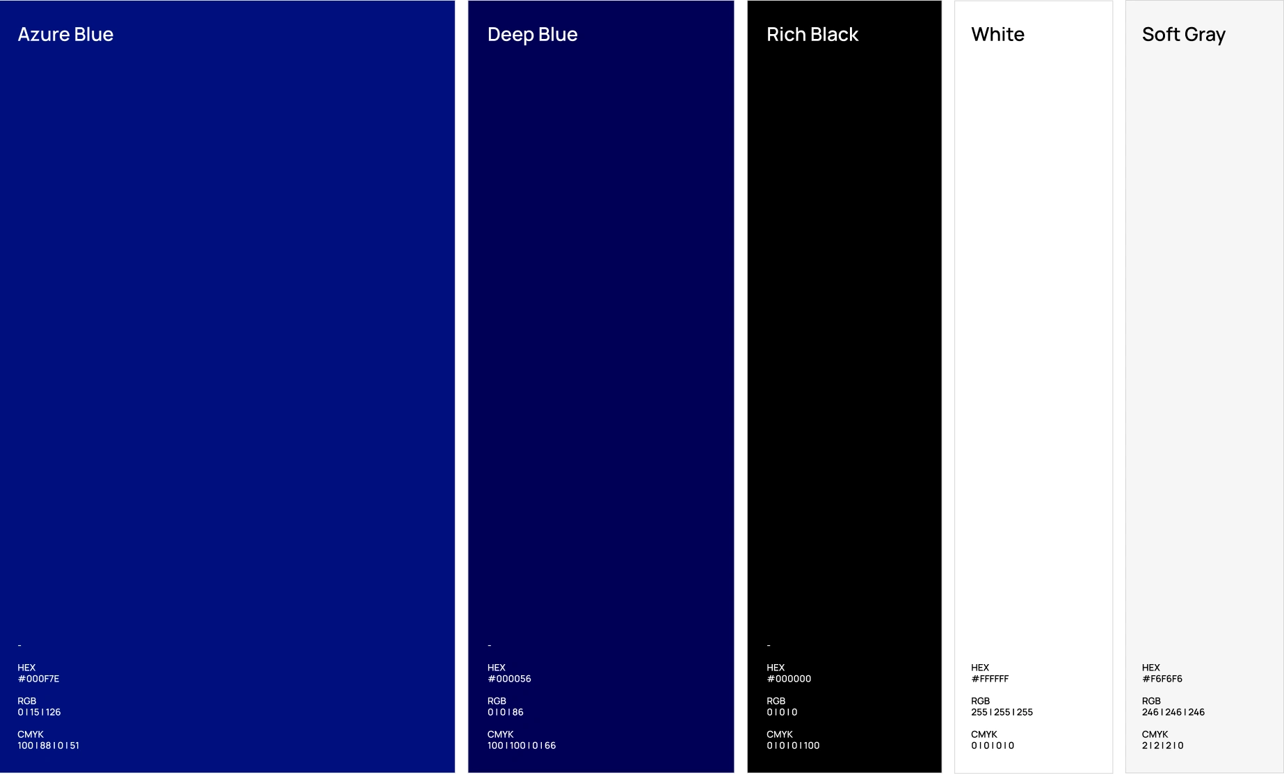
This system includes color architecture, typography hierarchy, grid structure, spacing rules, and reusable UI components.
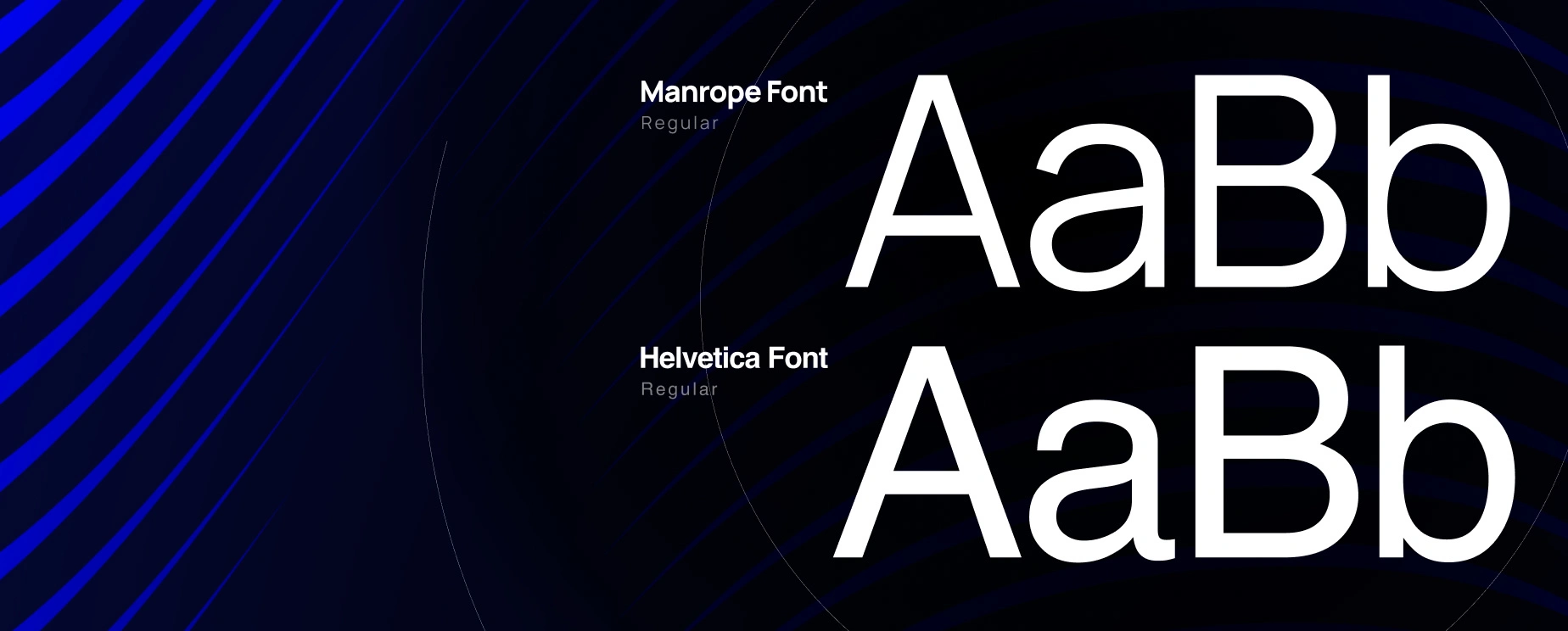
Typography
Colours
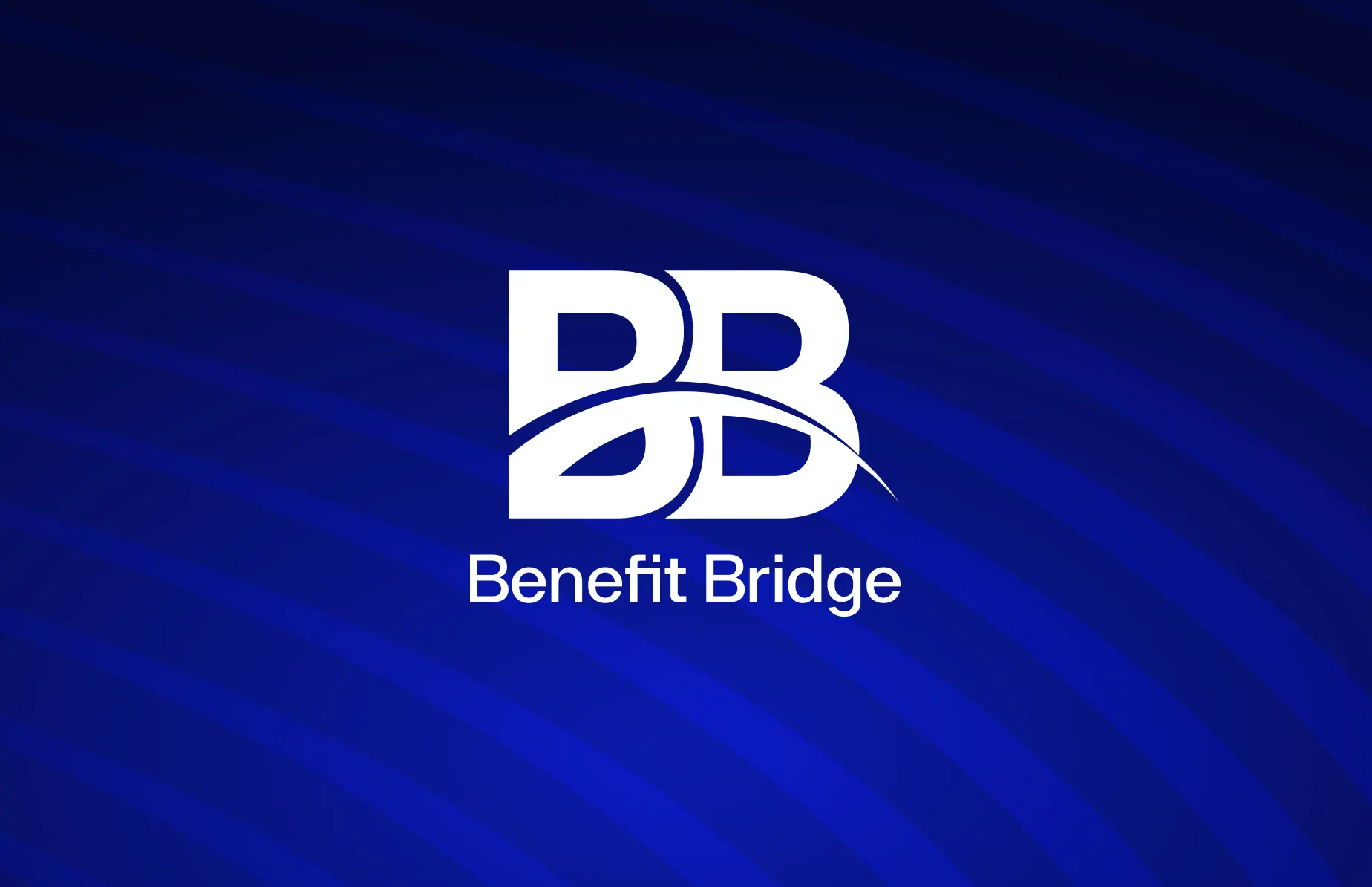
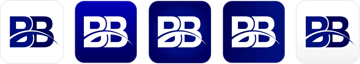
Logo
By establishing clear visual patterns, the system allows the product to evolve smoothly while maintaining a professional, intuitive, and modern interface.
Visual Language Development
To establish a distinctive and cohesive identity, we developed a visual language that defines the brand’s core expression across both product and marketing touchpoint
This system includes shape architecture, graphic motifs, spacing patterns, and atmospheric elements that build the bridge between brand strategy and user experience.
Packaging and supplement examples demonstrate how typography, colour, and iconography work together within the system.

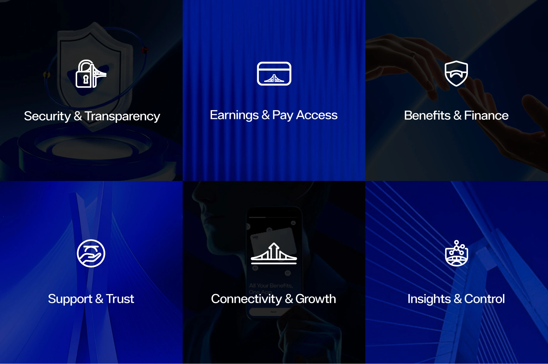
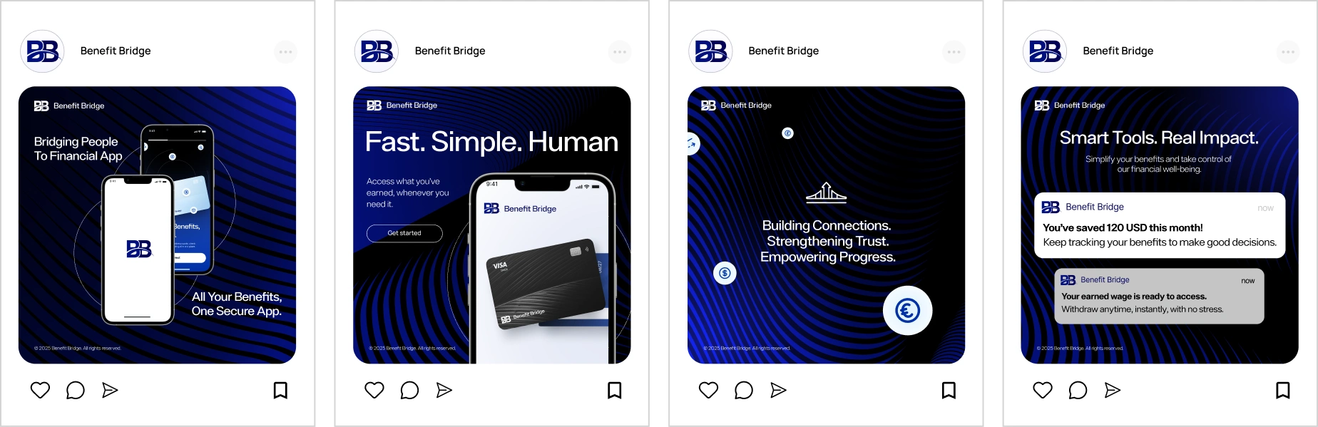
Iconography & Illustration System
We expanded the brand expression through a consistent icon and illustration system designed to feel modern, empathetic, and easy to interpret.
Depicting people illustrates Interos's collaborative environment, while real-life objects connected through supply chains highlight the brand's regulatory influence and impact.
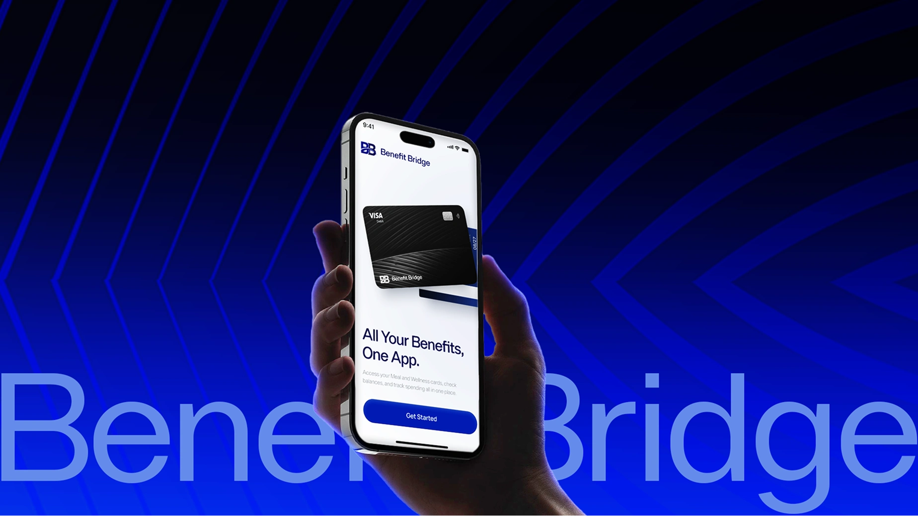
App Experience Concepts
The concepts explore key user flows, interaction patterns, and how visual elements , from iconography to typography and color , work together to create a seamless everyday financial experience.
To bring the brand and design system into a real product environment, we developed app experience concepts showcasing how users interact with Benefit Bridge through a clear, intuitive, and human-centered interface.
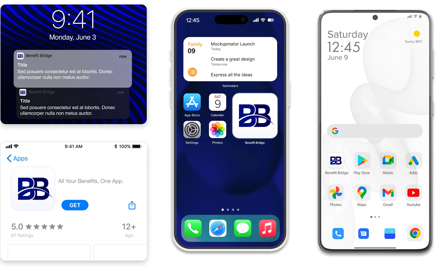
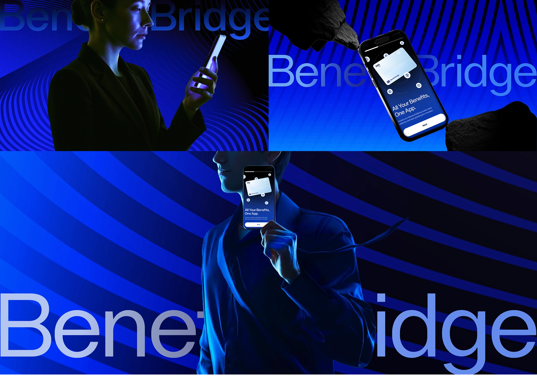
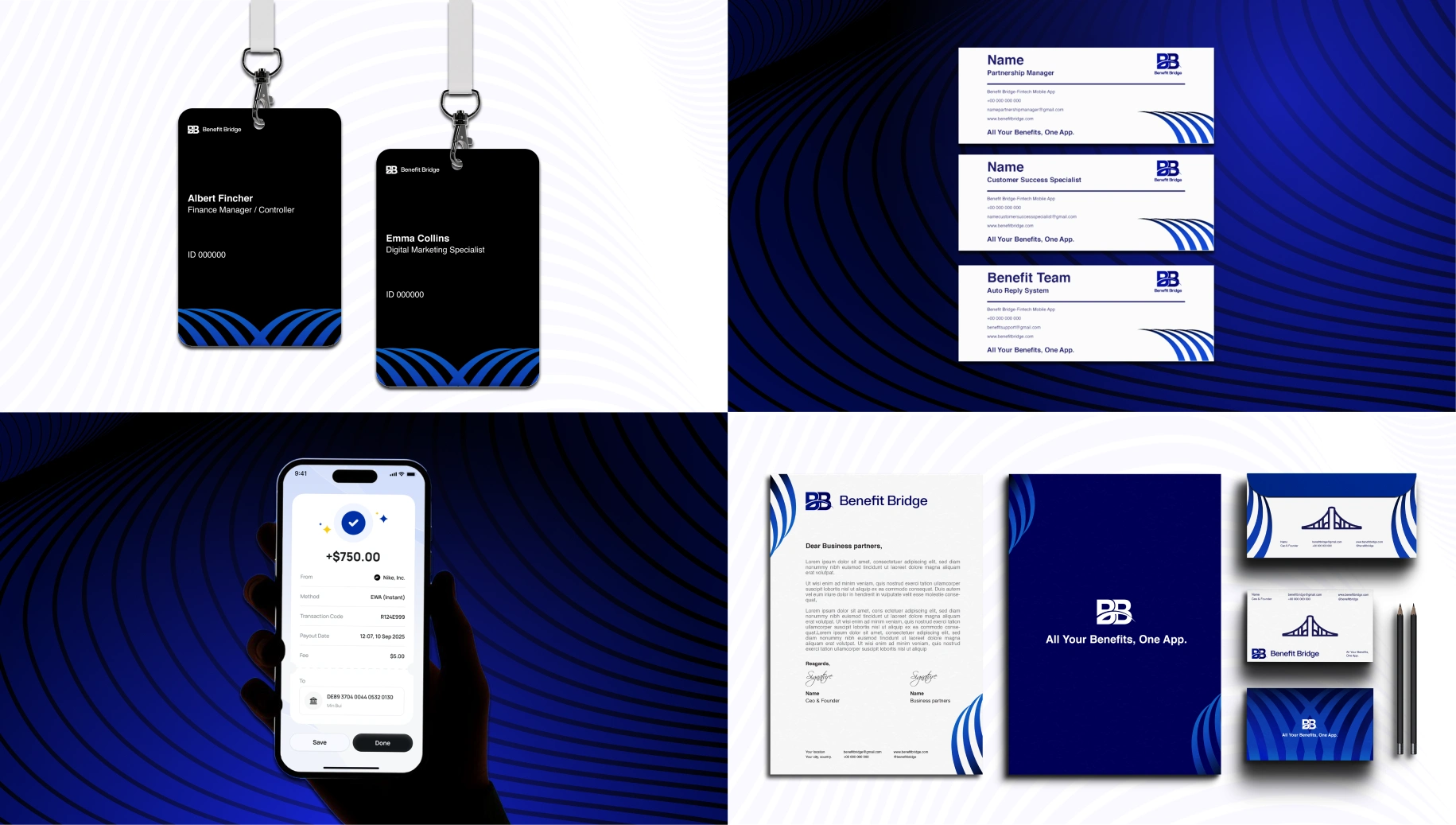
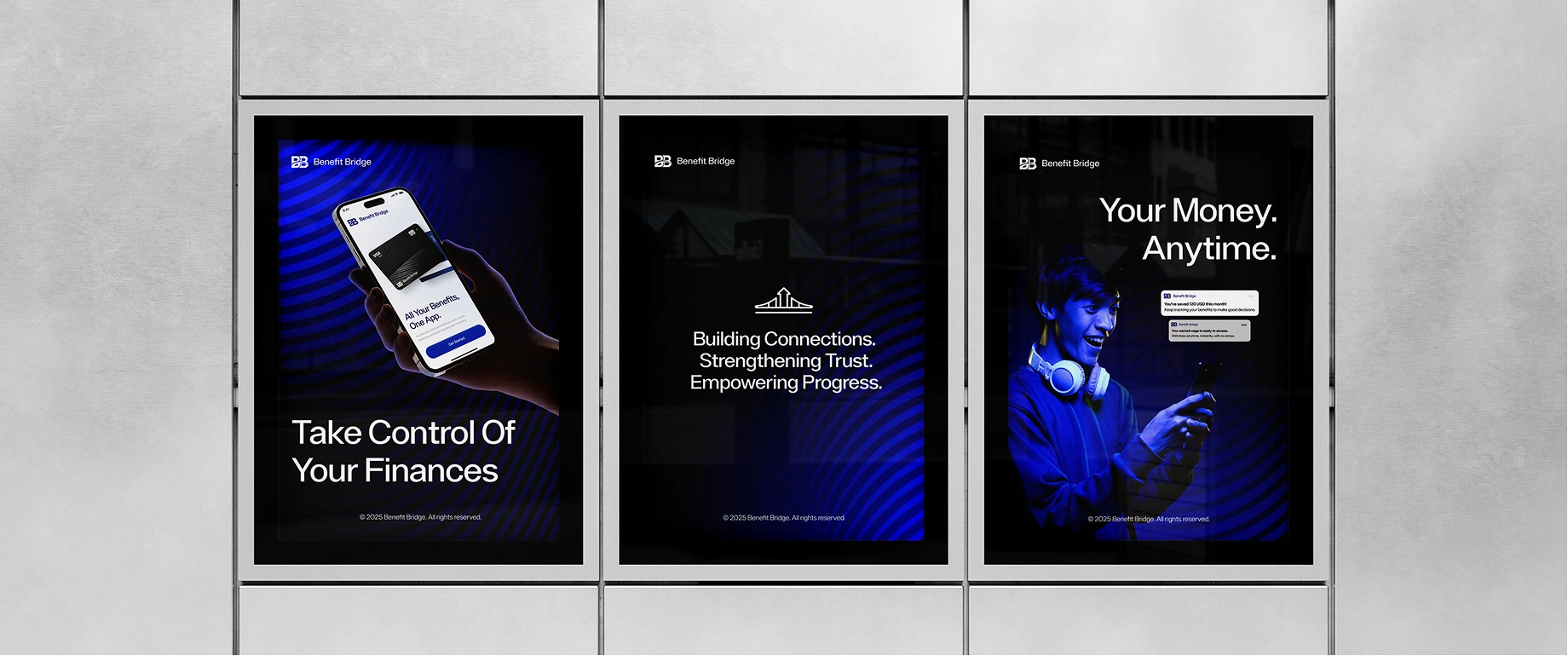
Application Branding
These applications showcase how the identity system performs across marketing, product communication, and branded environments , ensuring a seamless and recognizable presence at every user interaction.
READY TO BUILD A BRAND CUSTOMERS ACTUALLY REMEMBER?
Most teams wait too long to fix unclear branding. They launch new campaigns, tweak their website, and wonder why nothing feels consistent , or why customers don’t remember them.
You don’t need another “logo designer”.
You need a brand partner who thinks strategically, uncovers what makes you unique, and turns it into a system your entire company can confidently use.
At UXphoria, we shape scattered ideas into cohesive, recognizable brand identities , the kind that feel instantly clear, deeply memorable, and built to scale across every touchpoint.
If you’re ready to build a brand people trust, believe in, and come back to…
Like this project
Posted Jan 21, 2026
Benefit Bridge: Your Financial Wellness, Connected. We elevated the brand's visual system, delivered an enhanced logo, and a cohesive style guide.
Likes
0
Views
2
Timeline
Nov 28, 2025 - Ongoing