iOS & Android App UX/UI Design for Fintech App
Min Bui
How UXphoria Designed a Fintech App That Users Trust in Under 3 Taps
PROJECT OVERVIEW
Project: End-to-End Mobile App & Brand Design
Platform: iOS & Android (React Native–ready Figma system)
Services: UX Strategy, Mobile UX/UI Design, Design System, Branding, Prototyping, Developer Handoff
“We knew our product had to handle sensitive financial actions, but we didn’t want it to feel intimidating or complicated. UXphoria helped us turn a complex fintech idea into a calm, clear mobile experience. Every flow now feels intentional, secure, and easy to use , exactly what our users need when dealing with money.” -BenefitBridge Team
THE CLIENT
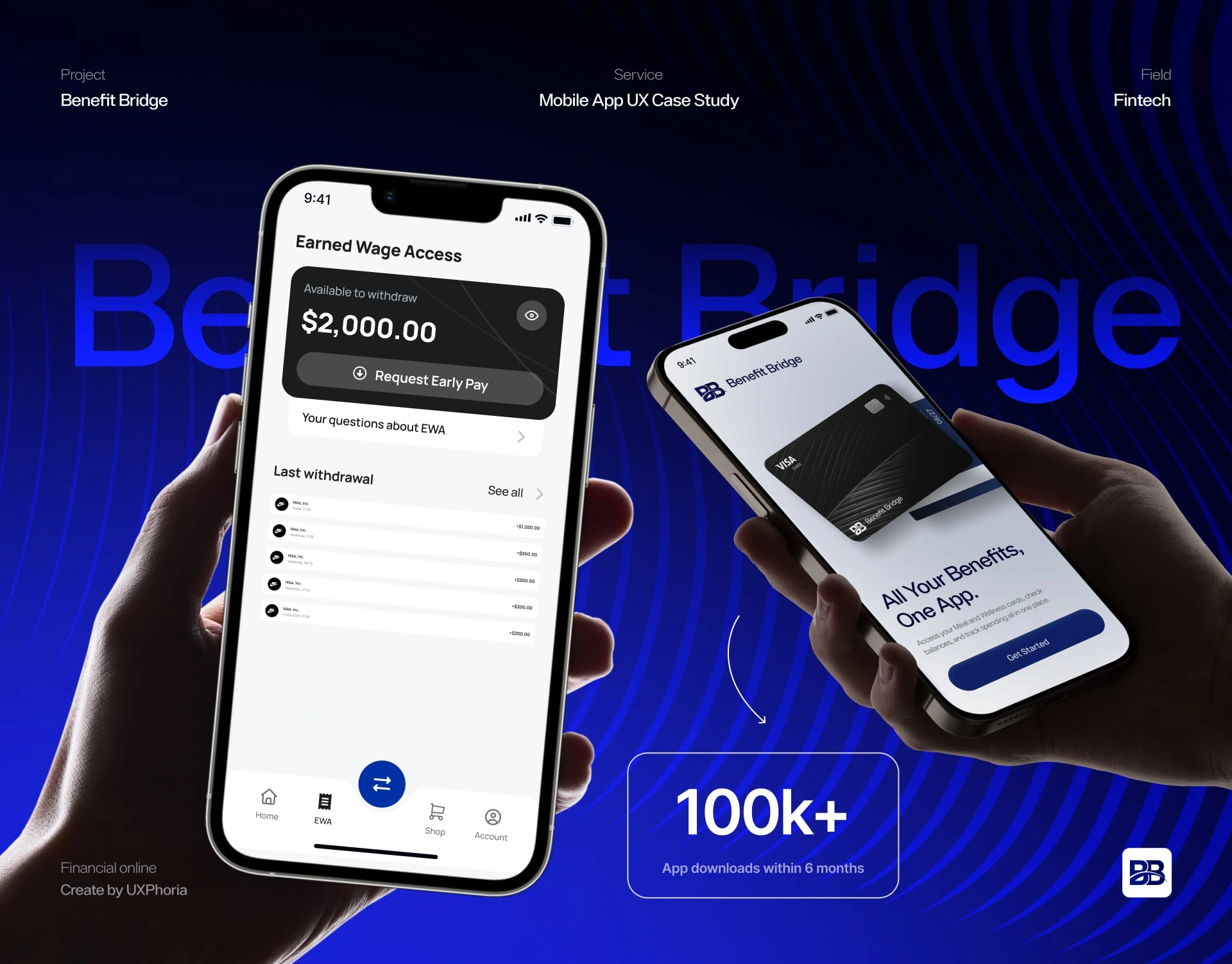
BenefitBridge is a fintech platform built for employees.
The app gives users access to benefit cards (meal, wellness) and Earned Wage Access (EWA), allowing them to check balances, manage cards, and request earned wages directly from their phone.
Before partnering with UXphoria, BenefitBridge had:

They had a strong idea , but no digital product behind it.
Their goal was clear:
“Design a secure, modern fintech app that feels simple, trustworthy, and ready to scale.”
THE CHALLENGE
Designing a fintech app from SCRATCH is never just about screens.
It’s about earning trust before users even think about it.
BenefitBridge faced several real-world challenges:
1. High Trust, Zero Interface
Users would be handling wages, cards, and payouts , but there was no interface yet to reassure them. Trust had to be designed visually, structurally, and emotionally from the first tap, especially for a product positioned as a digital wallet interface.
2. Complex Actions Needed to Feel Simple
Requesting earned wages, confirming IBAN details, locking cards, and adjusting security settings all involve risk. These flows needed to feel obvious and safe, not overwhelming or technical , a common challenge in card management UX.
3. Security Without Friction
Two-factor authentication, biometrics, and confirmations were essential. But if handled poorly, they could slow users down or increase anxiety instead of confidence.
4. Speed Was Non-Negotiable
Employees use the app in real moments , during breaks, on commutes, or between shifts. Core actions needed to happen fast, without digging through menus or guessing what comes next , a critical requirement for mobile-first fintech UX.
5. A Tight Timeline With High Standards
The entire product , UX, UI, branding, system, and developer-ready assets , had to be designed from scratch in about one month. There was no room for wasted effort or unclear decisions.
THE SOLUTION
UXphoria designed BenefitBridge from the ground up , not just how it looks, but how it behaves in real financial moments.
UXphoria’s mission was simple:
Turn a complex fintech product into a calm, predictable mobile experience users trust instantly.
To get there, we focused on removing uncertainty at every step and replacing it with clarity, reassurance, and speed , the foundation of strong fintech app design.
Fobe gained:
A clear, friendly fintech brand that feels human, not corporate
Mobile-first flows built for real daily use
A reusable design system aligned with React Native patterns
Consistent feedback for every financial action
A scalable foundation ready for development and long-term growth
Everything was designed to answer one question:
“Does this feel safe, clear, and easy in the moment?”
THE PROCESS
Phase 1 : Research & Fintech Foundations
To design BenefitBridge from zero, every insight needed to support trust, clarity, and speed in a high-risk environment. This phase grounded the product in real employee behaviour and modern fintech mobile experience expectations.
1 Product & Regulatory Context Analysis
We mapped how benefit cards and earned wage access (EWA) intersect with trust, compliance expectations, and user anxiety. This ensured the product felt legitimate and serious from the first interaction.
2 Understanding Employee Behaviour on Mobile
We studied how employees interact with financial tools in daily life , quick checks, fast decisions, and the need for reassurance after sensitive actions. These insights shaped flows that prioritise visibility and confirmation over feature depth.
3 Fintech & Wallet App Benchmarking
By analysing modern wallet and payroll apps, BenefitBridge aligned with proven patterns users already trust, avoiding common friction points found in weak, secure fintech UX implementations.
Phase 2: Core User Flows & Journey Definition
With a strong foundation in place, we defined the core journeys that the app had to get right from day one. Every flow was designed to feel natural, quick, and safe on mobile.
Defining the Primary User Journeys
UXphoria mapped the essential paths users would repeat most often:
Signing in securely
Viewing balances and cards
Requesting earned wages
Managing security and preferences
Each journey was intentionally reduced to the fewest steps possible without sacrificing clarity.
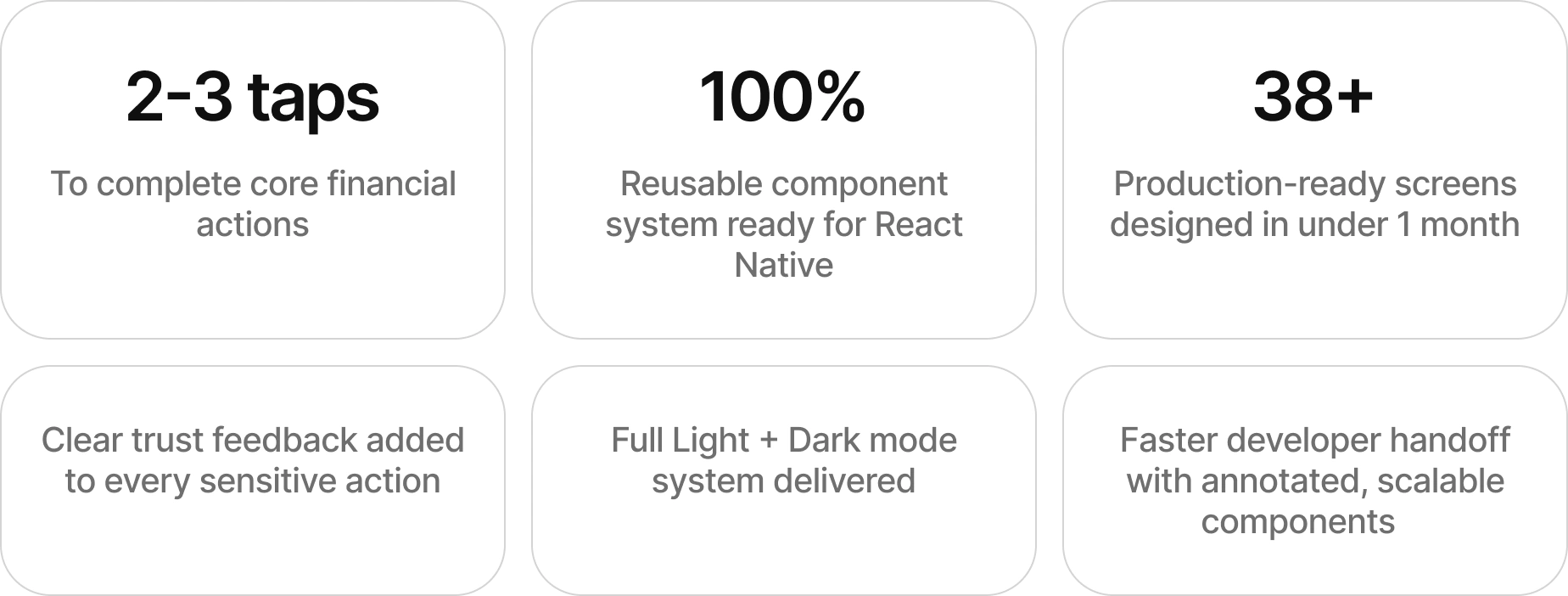
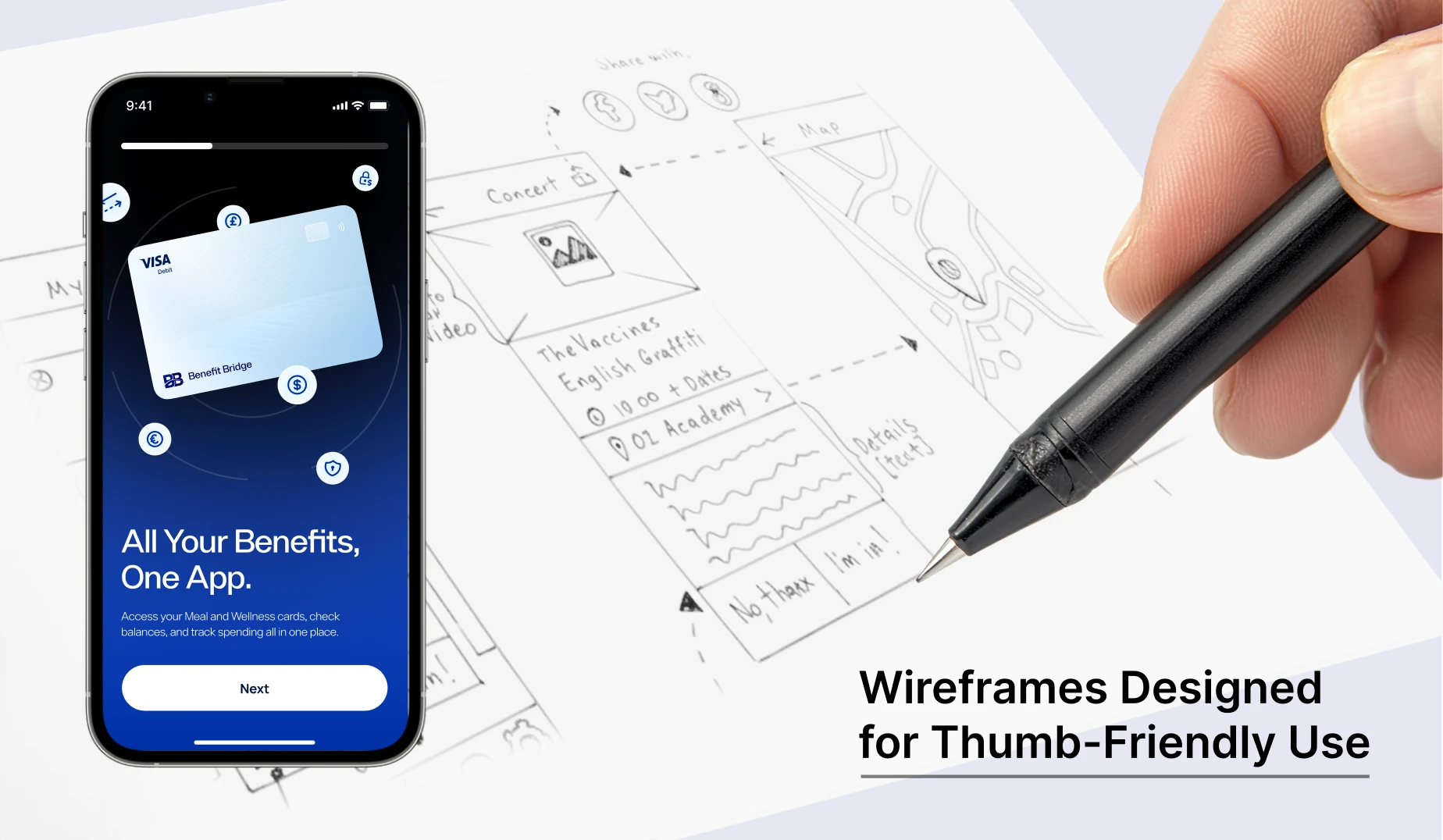
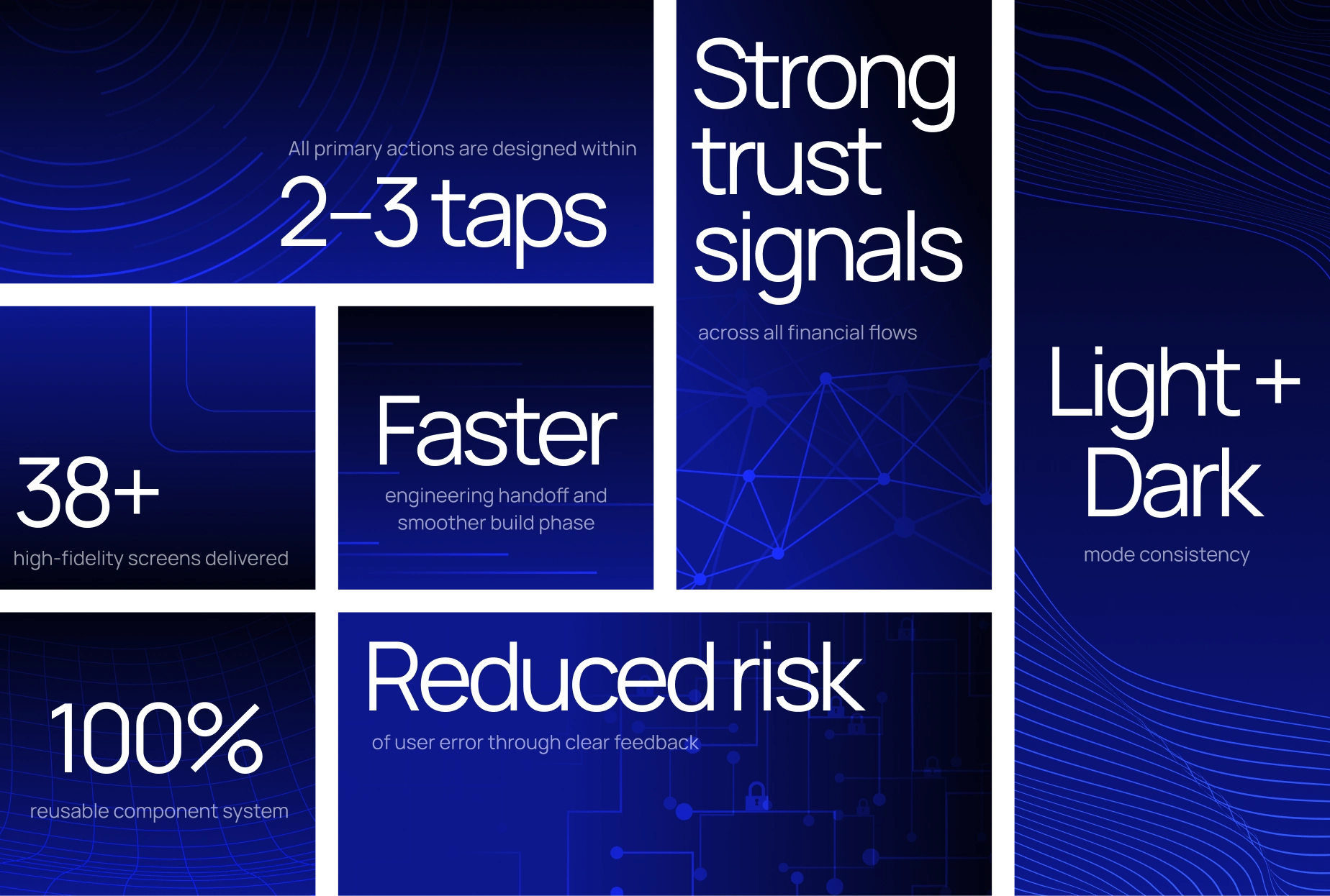
Designing for 2–3 Tap Completion
Every key action was pressure-tested against a simple rule:
“If this takes more than a few taps, it’s too slow.”
This ensured the app fits real employee routines, where speed and confidence matter more than depth.
Building Predictable Navigation & Structure
A clear dashboard structure with visible balances and quick actions eliminated hesitation and supported smooth fintech UX design across all key moments.
Phase 3: UX Foundations & Interaction Clarity
Fintech UX lives and dies on feedback. This phase focused on making every action feel acknowledged, confirmed, and safe.
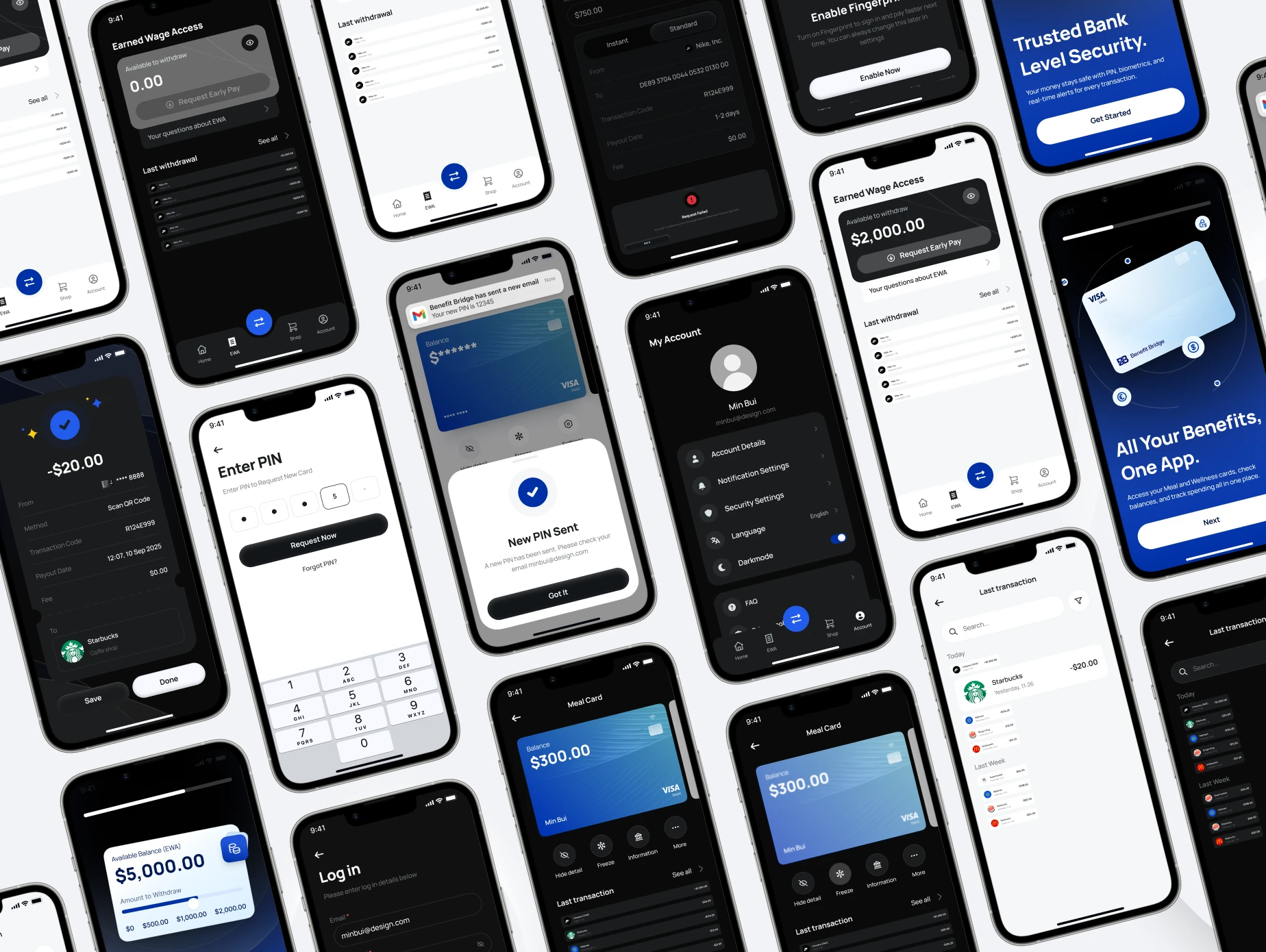
Clear System Feedback for Financial Actions
UXphoria designed explicit loading, success, and error states for all sensitive actions , especially EWA requests and card controls. Users never wonder whether something worked.
Trust-Building Microcopy & States
Language was written to reassure, not intimidate. Clear explanations replaced jargon, supporting a trust-driven fintech design approach.
Error Prevention & Recovery
We designed flows that help users avoid mistakes before they happen, and recover easily if something goes wrong. This reduced anxiety and support dependency.
Phase 4: Visual Identity & Mobile UI System
BenefitBridge needed a visual identity that balances financial credibility with employee wellness , without feeling cold or corporate.
Fintech-Ready Brand Expression

UXphoria developed a clean, modern visual language using trusted fintech colour foundations, softened with wellness-friendly accents. The result feels professional, calm, and approachable.
Typography, Iconography & Hierarchy
We selected scalable sans-serif typography and applied Font Awesome icons consistently. A clear hierarchy ensures important information stands out instantly, even on small screens.
Light & Dark Mode Designed Together
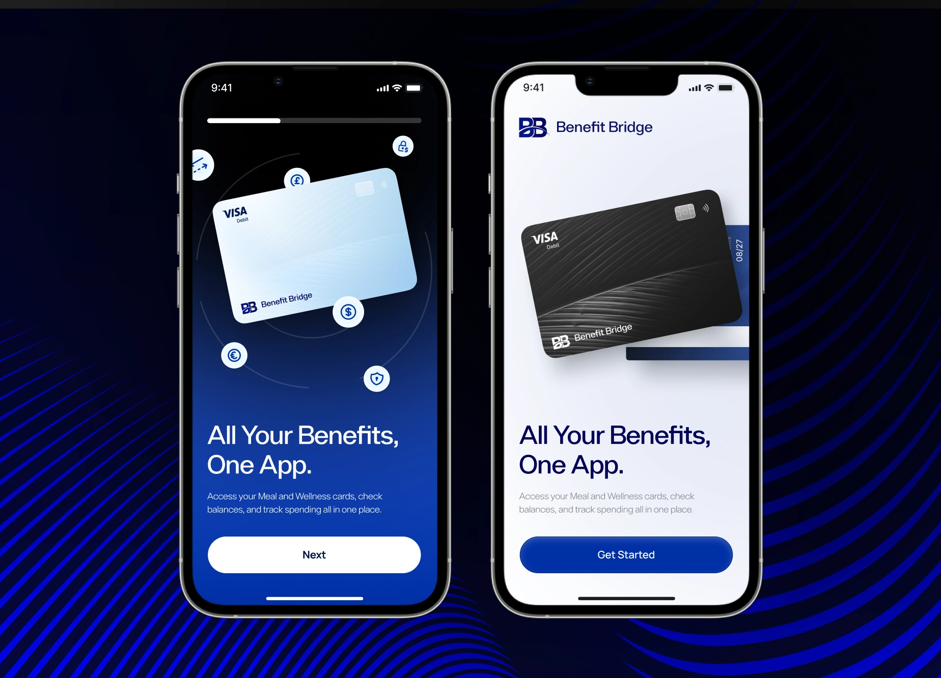
Both modes were designed in parallel to ensure consistency, readability, and trust across environments , not as an afterthought.
Phase 5: Design System & Developer-Ready Delivery
To support fast development and long-term scale, everything was systemised.
Component-Driven Design System
We delivered a full fintech design system aligned with React Native, covering buttons, cards, inputs, states, and layouts.
High-Fidelity Screens Across All Flows
38+ production-ready screens were delivered across all flows, supporting a complete fintech app case study from zero to launch-ready.
Prototype & Developer Handoff
A clickable prototype allowed stakeholders to experience real flows, while annotated Figma files ensured developers could build quickly with minimal ambiguity.
THE RESULTS
BenefitBridge launched not as a concept, but as a fully formed product , proving that strong fintech app design starts with clarity, not complexity.
Key outcomes include:

THE OUTCOME
Today, BenefitBridge has a mobile app that:
Feels calm, secure, and predictable
Makes complex financial actions simple
Builds trust from the first interaction
Scales cleanly as features grow
Supports both iOS and Android development
BenefitBridge didn’t just get designs.
They gained a fintech-ready product foundation built for real employees, real money, and real daily use.
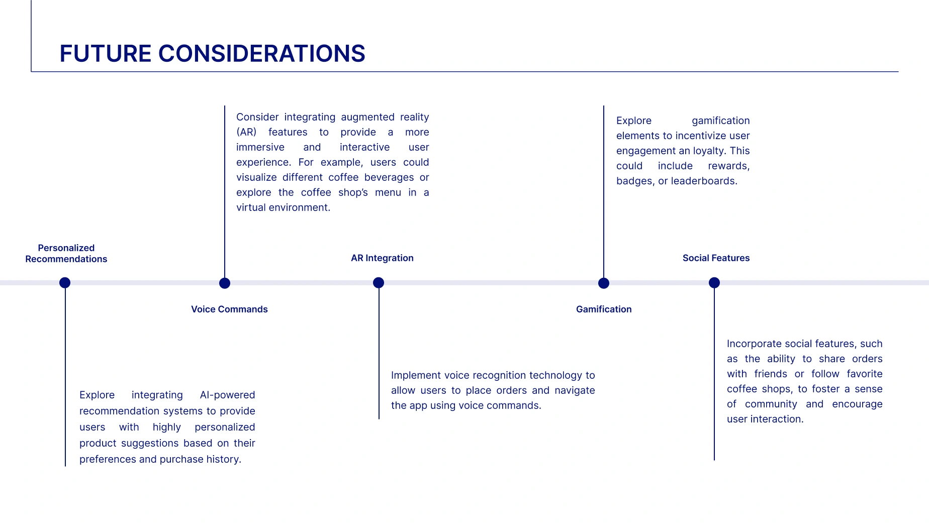
FUTURE CONSIDERATIONS
To continue evolving the product, BenefitBridge can explore
Usage insights and in-app guidance
Smarter onboarding based on user behaviour
Spending insights and summaries
Expanded card controls and notifications
Localisation and compliance scaling
Each step builds confidence and long-term adoption.
READY TO BUILD YOUR NEXT BREAKTHROUGH APP?
Most fintech products struggle not because the idea is weak, but because the experience feels unclear, slow, or unsafe.
You DON’T need more features.
You DON’T need more screens.
You DON’T need another complicated flow.
You NEED clarity, trust, and a product that helps users act with confidence.
That’s the same clarity that helped BenefitBridge turn a complex financial product into a simple, secure mobile app built from zero, ready for real users and real money.
At UXphoria, we turn complex, high-risk products into calm, trustworthy mobile experiences users actually understand , and actually use.
Like this project
Posted Jan 20, 2026
This mobile app design project translates product goals into intuitive user journeys, balancing UX structure, clean UI, and usability across iOS and Android.
Likes
1
Views
5
Timeline
Oct 2, 2025 - Ongoing