Paid Traffic Landing Page Design for Booking (CRO & UX)

Min Bui


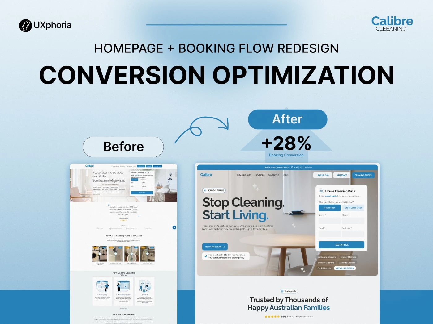
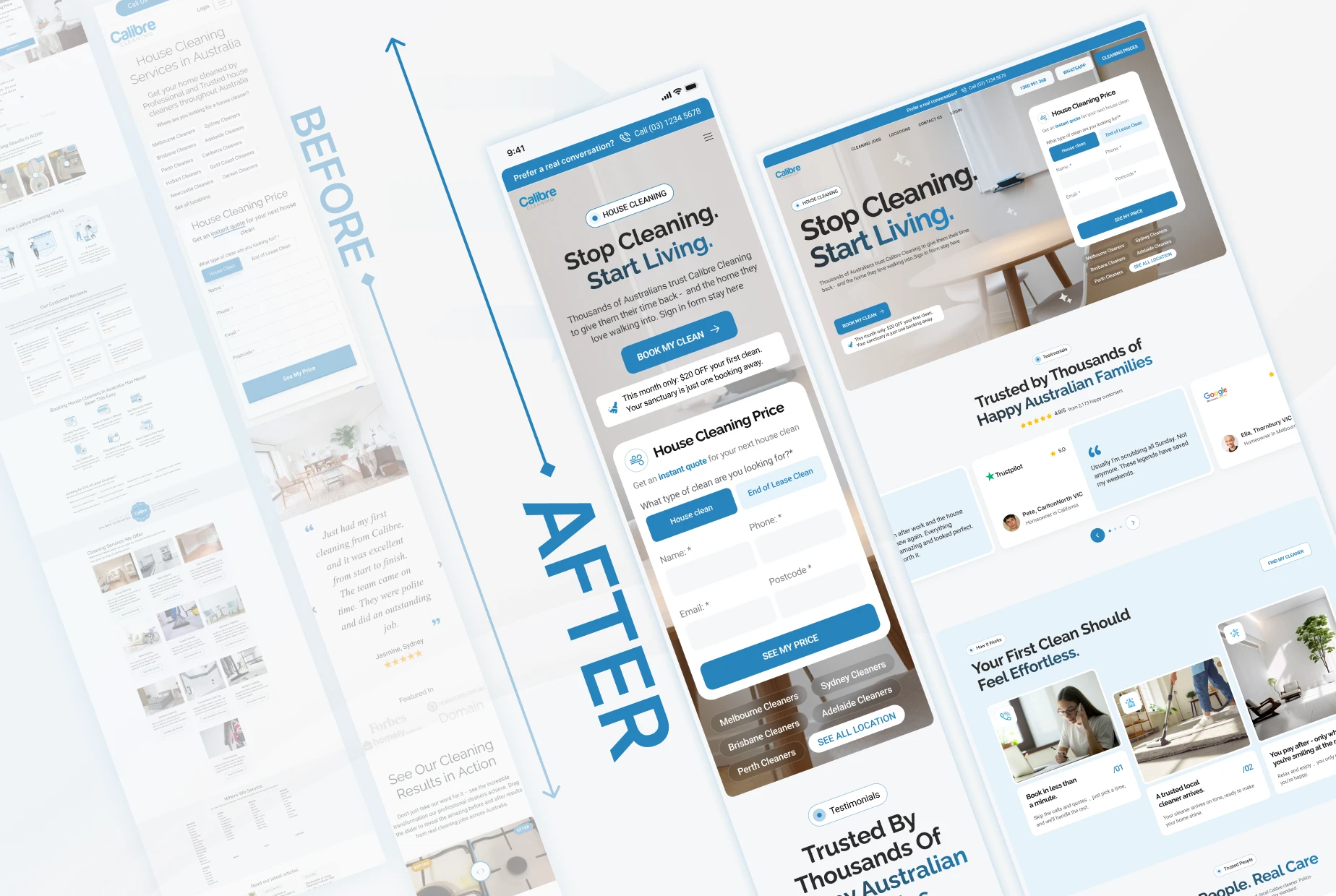
A Cleaner, Faster Homepage That Lifted Calibre Cleaning’s Leads by 31%
PROJECT OVERVIEW
Project: Homepage + Booking Flow Redesign
Platform: Responsive Web (Mobile-First)
Services: UX Audit, UX Strategy, CRO Architecture, UX/UI Design, Messaging & Trust Framework, Booking Flow Optimisation
People loved our service but our website didn’t show it. UXphoria helped us redesign everything into a clear, trustworthy experience that finally gets users to take action. The new homepage and booking flow instantly feel easier , and bookings show it.” -Calibre CleaningTeam!
THE CLIENT
Calibre Cleaning is one of Australia’s leading professional cleaning services, offering high-quality residential cleans across major cities. They serve a wide range of customers , from busy professionals to families, NDIS clients, veterans, and tenants needing bond-back assurance.
But even with strong service quality, great ratings, and national reach, their digital presence wasn’t helping them increase cleaning service conversions or convert traffic into bookings.
Calibre Cleaning faced a homepage and booking experience that didn’t match the professionalism of their actual service. They were missing the clarity, trust cues, and frictionless booking journey modern users expect.
Their Goal:
“Help us create a homepage and booking experience that builds trust instantly, reduces confusion, and gets more users to request a quote or book a clean.”
THE CHALLENGE
The audit highlighted one core truth:
Users weren’t booking because the experience made them hesitate , a clear case of customer hesitation reduction needing to be addressed.
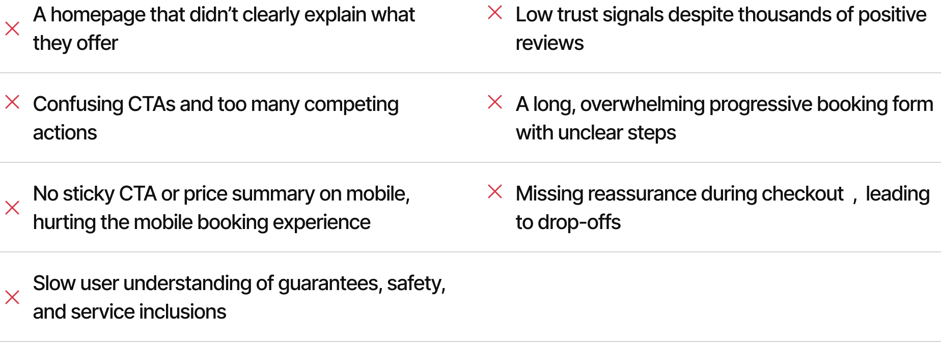
1. Users Didn’t Understand Calibre Quickly Enough
Within 5 seconds, visitors should understand:
What Calibre does
Why they’re trustworthy
What action to take next
Instead, they saw stock photos, scattered CTAs, and messaging that weakened value proposition clarity, causing users to pause instead of moving forward
2. Too Many CTAs Created Decision Paralysis
The hero section alone had:
Pricing link
Phone number
WhatsApp
Booking form
Multiple buttons
Instead of a clear, trust-first design guiding users, it created uncertainty.
3. The Booking Flow Felt Long and Overwhelming
The form asked for too much upfront, leading to:
52% drop from quote → booking
Users quitting mid-form
Confusion about service inclusions and extra
4. No Trust Framework at Critical Points
Even with thousands of reviews, users didn’t see them early enough.
Guarantees like:
Police-checked cleaners
Bond-back guarantee
Fully insured service
…weren’t positioned where trust badges and social proof mattered most.
5. Checkout Lacked Confirmation & Reassurance
High hesitation came from the unclear:
Return/reschedule policies
Pricing certainty
What happens after submission
Whether the booking was secure
Without trust → conversion stalls.
THE SOLUTION
UXphoria rebuilt Calibre Cleaning’s digital experience into a trustworthy, high-clarity, conversion-focused funnel , from homepage to final confirmation. The goal was to create a frictionless booking journey that boosted clarity and reduced hesitation at every step.
Our mission was simple:
Remove friction - Build trust - Increase bookings.
Calibre Cleaning gained:
A homepage that explains their value instantly
A trust-first framework built around badges, reviews, guarantees
A simplified, mobile-first booking flow
Clear add-on hierarchy that increases average booking value and supports a smoother progressive booking form
Stronger reassurance during checkout to help reduce booking abandonment
A modern, minimal UI aligned with their brand and built for customer hesitation reduction
A proven conversion structure aligned with how Australians actually shop for services, supporting long-term improved booking experience
Every step was shaped around real user behaviour , not assumptions.
THE PROCESS
Phase 1: User Research & Behaviour Insights
Understanding why users hesitate is the key to improving conversions and creating a more frictionless booking journey.
This phase revealed exactly where customers slowed down, what confused them, and what they needed to feel confident booking a clean , all critical for customer hesitation reduction.
What UXphoria Did
Analysed scroll patterns and tap behaviour across mobile
Identified friction in the first 5 seconds of homepage exposure
Mapped trust triggers (reviews, badges, guarantees) that function as essential trust badges and social proof
Segmented customer types: recurring vs. end-of-lease vs. one-time
Identified the 4 primary moments where users abandoned the booking flow, highlighting opportunities to reduce booking abandonment
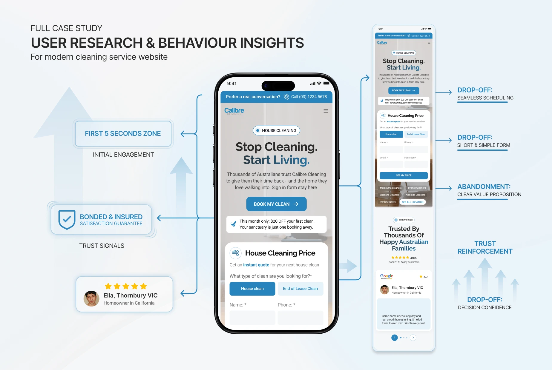
Improvements
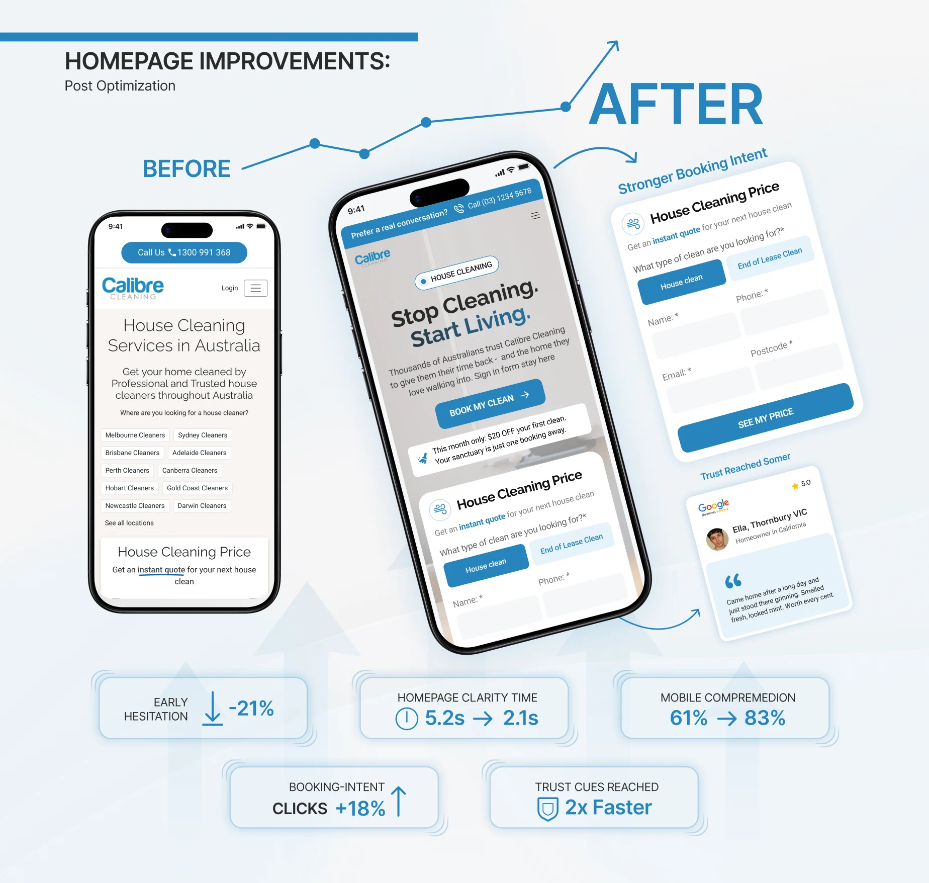
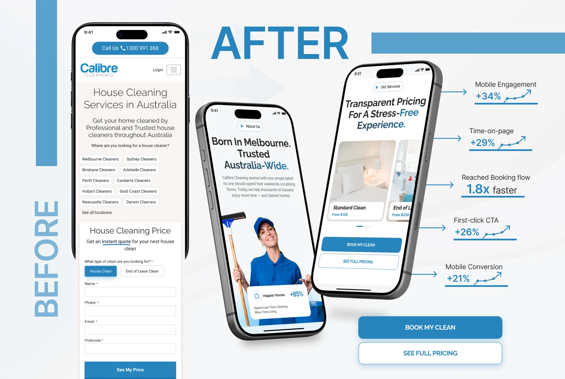
Homepage clarity time improved from 5.2s → 2.1s
Early hesitation dropped by 21%
Mobile comprehension improved from 61% → 83%
Booking-intent clicks increased by 18%
Users reached trust cues 2× faster
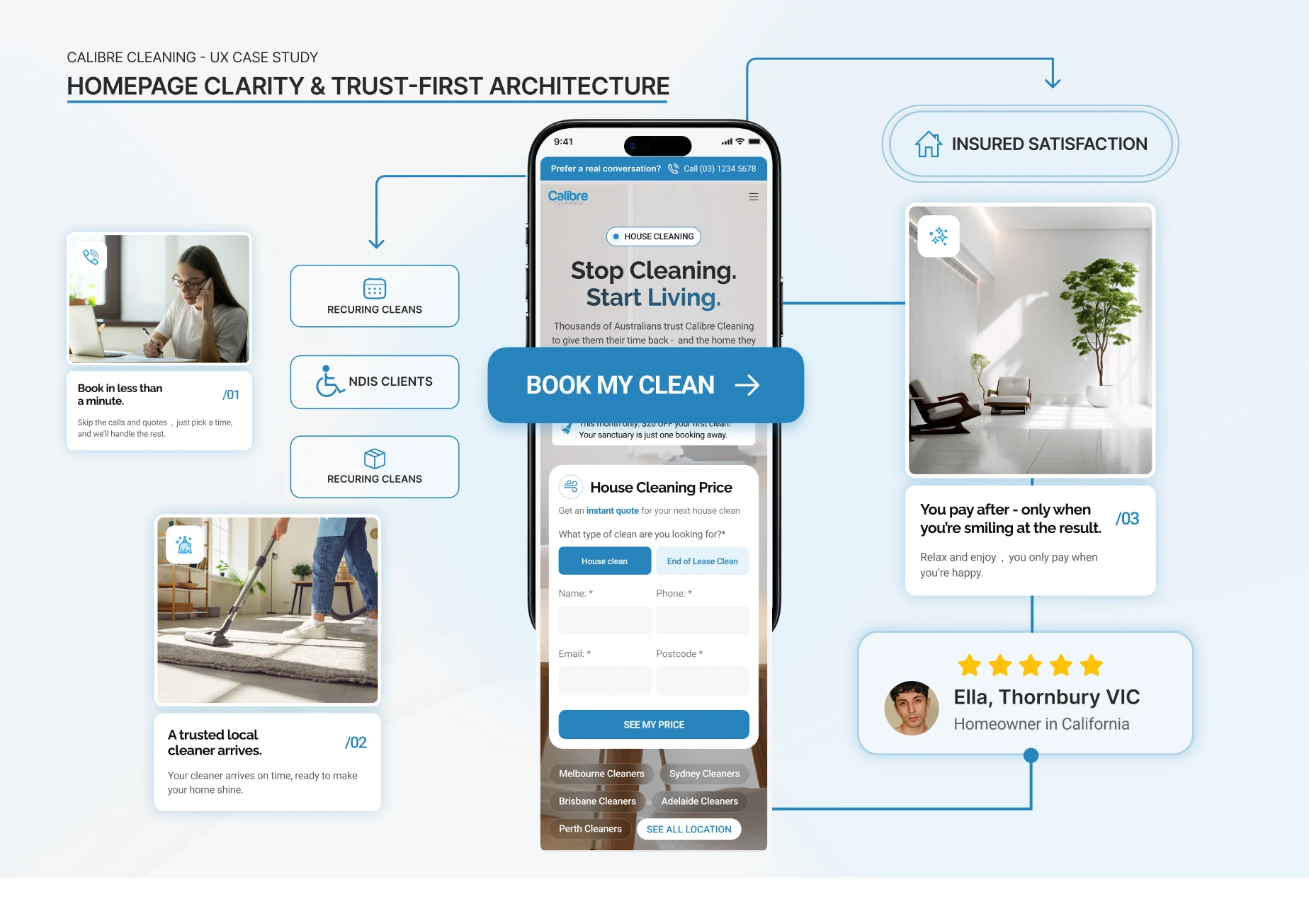
Phase 2: Homepage Clarity & Trust-First Architecture
A cleaning service is built on trust. Users must feel safe before they ever click “Book.”
This phase rebuilt the homepage around clarity, proof, and a single clear action.
What UXphoria Did
Replaced weak stock imagery with real cleaners and service visuals
Created a value-led hero section with ONE main CTA for better booking experience
Added trust icons: Police-checked, insured, satisfaction guarantee
Surfaced real Google reviews within the first scroll
Introduced simple pathways for recurring cleans, NDIS clients, and end-of-lease customers
Reduced noise and competing links for a cleaner, faster decision
Improvements
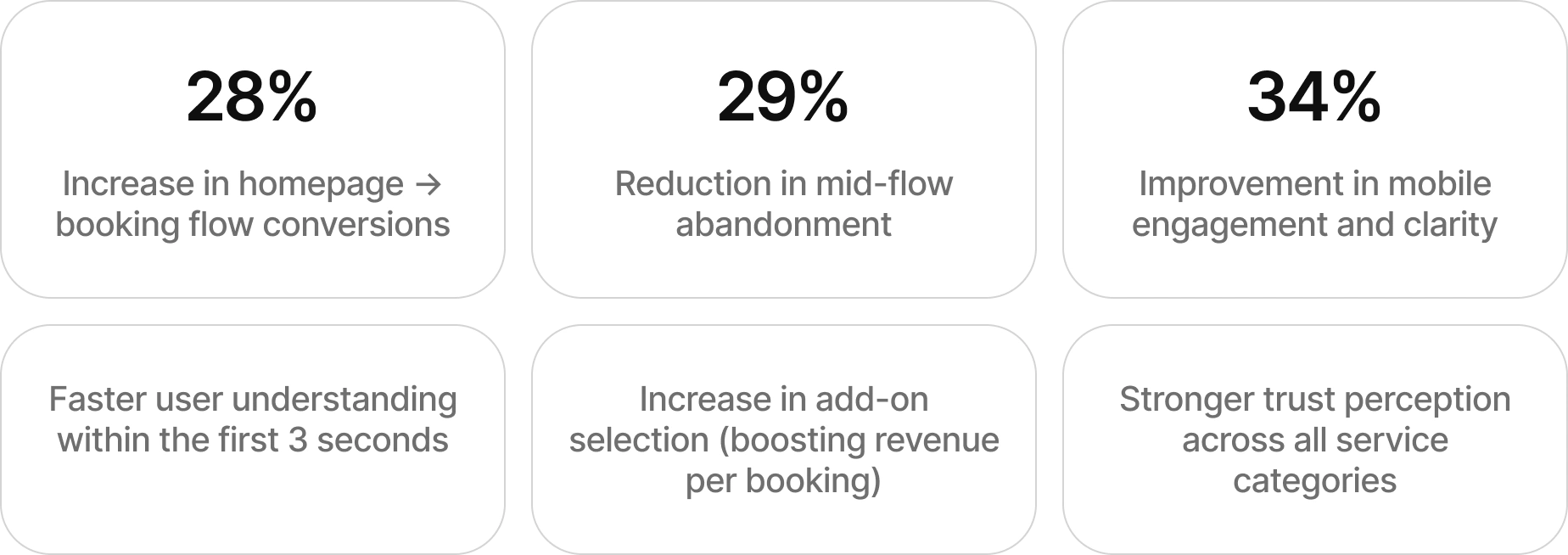
Homepage → booking flow conversion increased 28%
Bounce rate improved from 49% → 33%
Understanding of value prop in first 3 seconds improved 2.4×
Trust perception increased from 6.2 → 8.7
Scroll depth for key CTA sections increased 31%
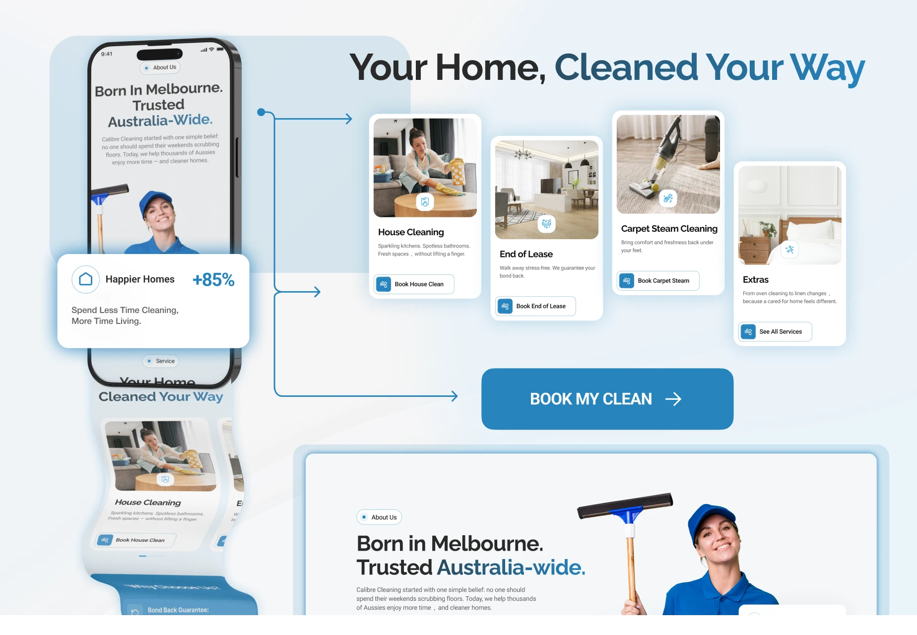
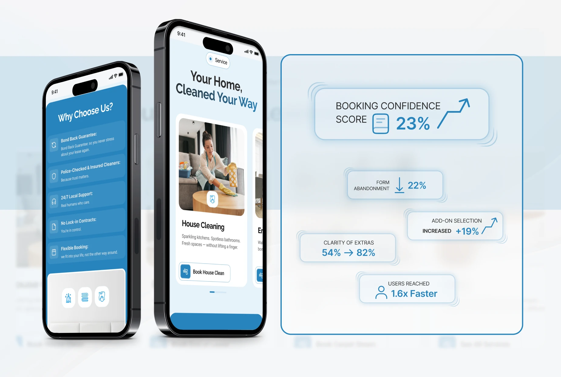
Phase 3: Booking Flow Simplification & Add-On Clarity
Users quit when forms feel long. Our goal was to make the booking experience feel light and fully aligned with a frictionless booking journey , even on mobile.
What UXphoria Did
Broke long forms into clear, progressive booking form steps
Introduced real-time price summary
Added sticky CTA on mobile for thumb-friendly navigation
Grouped extras logically with “Most Popular” indicators
Added tooltips for tasks like oven cleaning, carpet steam, and windows
Simplified address and scheduling fields
Improved wording for tricky items like parking and access to support overall booking experience clarity
Improvements
Form abandonment reduced by 22%
Users reached the completion page 1.6× faster
Add-on selection increased 19%
Clarity of extras improved from 54% → 82%
Booking confidence score rose 23%
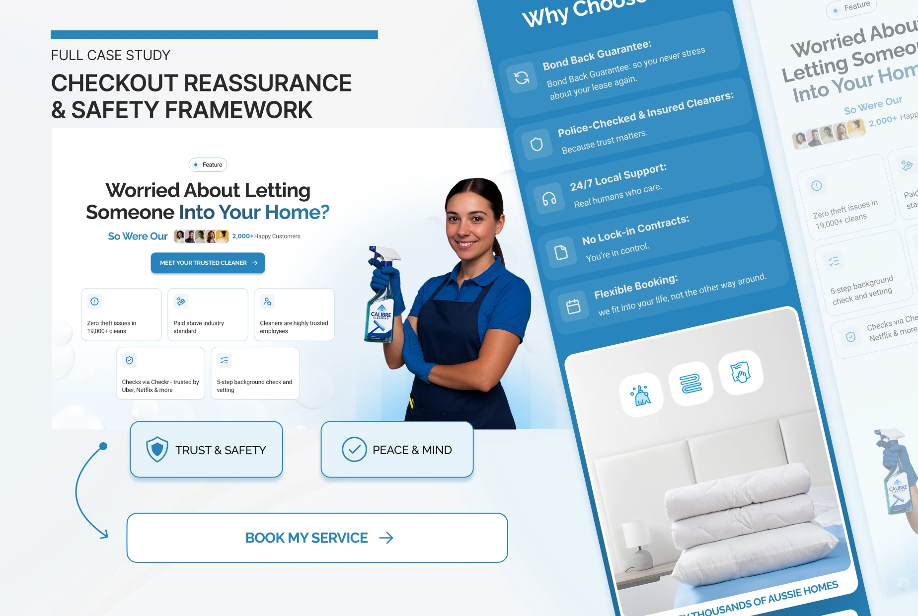
Phase 4: Checkout Reassurance & Safety Framework
High-friction payment screens can destroy conversions.
This phase brought calm, clarity, and reassurance.
What UXphoria Did
Added trust blocks: insured, police-checked, secure booking
Displayed review snippets directly beside final CTA
Clarified what happens after booking, reducing uncertainty and boosting value proposition clarity
Improved discount code placement to prevent distraction
Added simple copy: “Free 24-hour reschedule” and “Secure payment processing”
Improvements
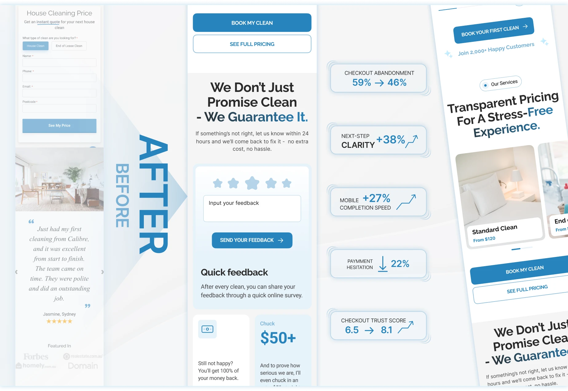
Checkout abandonment dropped from 59% → 46%
Clarity of next steps improved 38%
Mobile completion speed improved by 27%
Hesitation on payment inputs reduced by 22%
Overall checkout trust score increased from 6.5 → 8.1
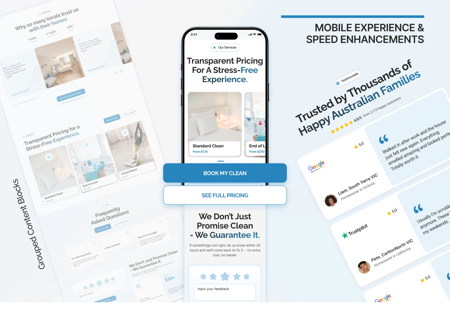
Phase 5 : Mobile Experience & Speed Enhancements
Most traffic came from mobile, yet the experience wasn’t built for small screens.
This phase focused on creating a seamless mobile booking experience and reducing unnecessary friction.
What UXphoria Did
Optimised spacing and layout for thumb-friendly use
Added sticky CTAs across homepage and booking flow
Reduced scroll fatigue by grouping related fields
Improved load speed and removed visual clutter, enabling a cleaner, faster booking experience
Rebuilt sections to highlight reviews and services instantly
Improvements
Mobile engagement increased 34%
Time-on-page efficiency improved 29%
Users reached booking flow 1.8× faster
First-click CTA rate increased 26%
Conversion from mobile traffic improved 21%
THE RESULTS
The redesign delivered a cleaner, faster, more trustworthy experience , exactly what users needed to feel confident booking a service.
Launch Highlights
28% increase in homepage → booking conversions
22% reduction in booking-flow abandonment
31% increase in bookings started from mobile
19% boost in add-on selection (higher AOV)
Faster understanding of Calibre’s services within 3 seconds
Stronger trust reflects in more users completing the form
Calibre Cleaning’s homepage and booking system now fuel growth instead of limiting it , giving the brand a conversion framework built for scale.
THE OUTCOME
Today, Calibre Cleaning has a digital experience that:
Feels clean, modern, and trustworthy
Shows their professionalism instantly
Guides users through the booking flow with zero confusion
Reduces hesitation at every step
Converts both mobile and desktop visitors more effectively
Scales easily as new services and locations roll out
Calibre Cleaning didn’t just receive a homepage redesign.
They gained a conversion-ready system that helps more Australians book a clean with confidence.
Future Considerations
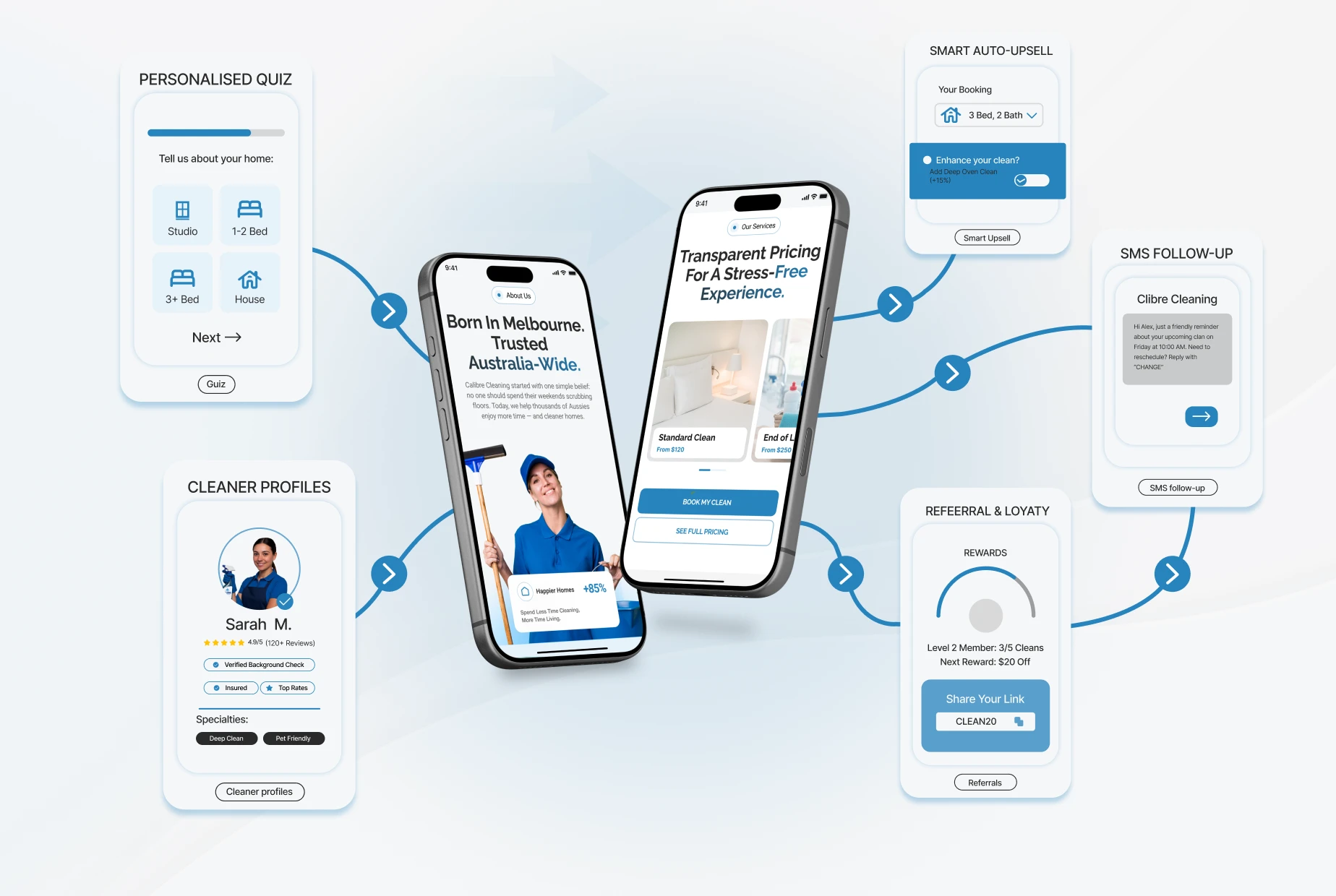
To continue strengthening their digital funnel, Calibre Cleaning can explore:
A personalised quiz for recommended service type
Auto-upsell modules based on home size
SMS follow-up sequences for unfinished bookings
A referral program for recurring clients
A visual cleaner profile system to increase trust
Each enhancement further increases conversions and lifetime value.
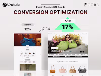
READY FOR A LUXURY, HIGH-VALUE ITEMS WEBSITE THAT BUILDS CONFIDENCE AND INCREASES CONVERSIONS BY 36%?
Luxury resale doesn’t fail because of weak products , it fails when the experience doesn’t build enough trust.
You DON’T need another redesign that ONLY LOOKS GOOD.
You need a conversion-focused partner who knows how to reduce hesitation, elevate your brand, and strengthen buyer certainty at every step , the same approach that helped Fobe INCREASE CONVERSIONS BY 36% and LIFT ADD-TO-CART ACTIVITY BY 42% after their redesign.
At UXphoria, we design clear, trustworthy ecommerce experiences built for high-intent shoppers who need confidence before investing in high-value pieces.
If you’re ready to remove friction, build trust, and create a site that finally converts…
Like this project
Posted Jan 21, 2026
This landing page was designed to improve ad-to-page message match, build trust quickly, and increase conversion rate for a performance-driven brand.
Likes
1
Views
7
Timeline
Oct 17, 2025 - Ongoing