Ecommerce UX & Shopify CRO Redesign for DTC Brand
Min Bui
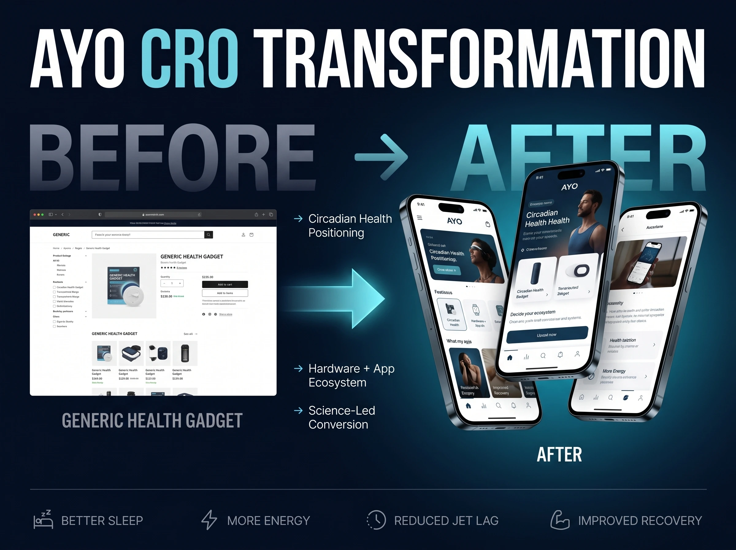
How AYO Turned a Complex Health-Tech Product Into a Clear, Conversion-Driven Experience
PROJECT OVERVIEW
Project: AYO Light Therapy Glasses Website Redesign
Platform: Responsive Web (Mobile-First)
Services: UX Strategy, Product Story Architecture, Health-Tech Trust Framework, UX/UI Design, CRO Optimisation, App + Hardware Value Integration
“Our product is backed by real science, but our website wasn’t explaining it clearly enough. The redesign helped us translate complex circadian science into something people instantly understand and trust.” -AYO Team!
THE CLIENT
AYO is a health-tech brand focused on improving:
Sleep quality
Energy levels
Mood balance
Circadian rhythm alignment
Their hero product, AYO Light Therapy Glasses, is a wearable light therapy device that emits safe, blue-enriched light (UV-free) to influence the body’s internal clock.
Unlike traditional light therapy lamps, AYO offers:
Hands-free wearable usage
Short, targeted daily sessions
A companion mobile app that personalizes light schedules based on user habits and circadian patterns
However, while the product was strong, the website struggled to communicate this value clearly.

AYO came to us with a clear problem:
“People are interested, but they don’t fully get it fast enough to commit.”
THE CHALLENGE
Health-tech conversion fails when clarity lags behind curiosity.
1. Circadian Science Is Hard to Explain Quickly
Most users aren’t familiar with:
Circadian rhythm
Light timing
Blue light therapy
Without simplification, the product felt complex and intimidating.
2. Wearables Require Strong Trust Signals
People won’t put a device on their face unless they trust:
Safety
Scientific validity
Long-term use benefits
The site didn’t build that trust fast enough.
3. Hardware + App Value Was Fragmented
The glasses and the app were explained separately.
Users didn’t immediately understand:
“Why does the app matter?”
4. Lifestyle Benefits Needed Clear Framing
Users cared about:
Sleeping better
Feeling less jet-lagged
Having more energy
But the website focused too much on how it works, not how it feels.
5. Mobile Attention Windows Were Extremely Short
Most traffic came from:
Mobile ads
Biohacking communities
Social media
The first 5–7 seconds decided everything.
THE SOLUTION
We rebuilt AYO’s website as a science-backed lifestyle transformation story.
The goal:
Make people feel the benefit first, then show them the science that makes it real.
The new experience delivers:
Instant clarity on what AYO does
Simple, human benefit framing
Visual explanations of circadian rhythm
Strong safety and credibility cues
Seamless hardware + app narrative
Every section answers one question:
“How will this fit into my daily life, and will it actually work?”
THE PROCESS
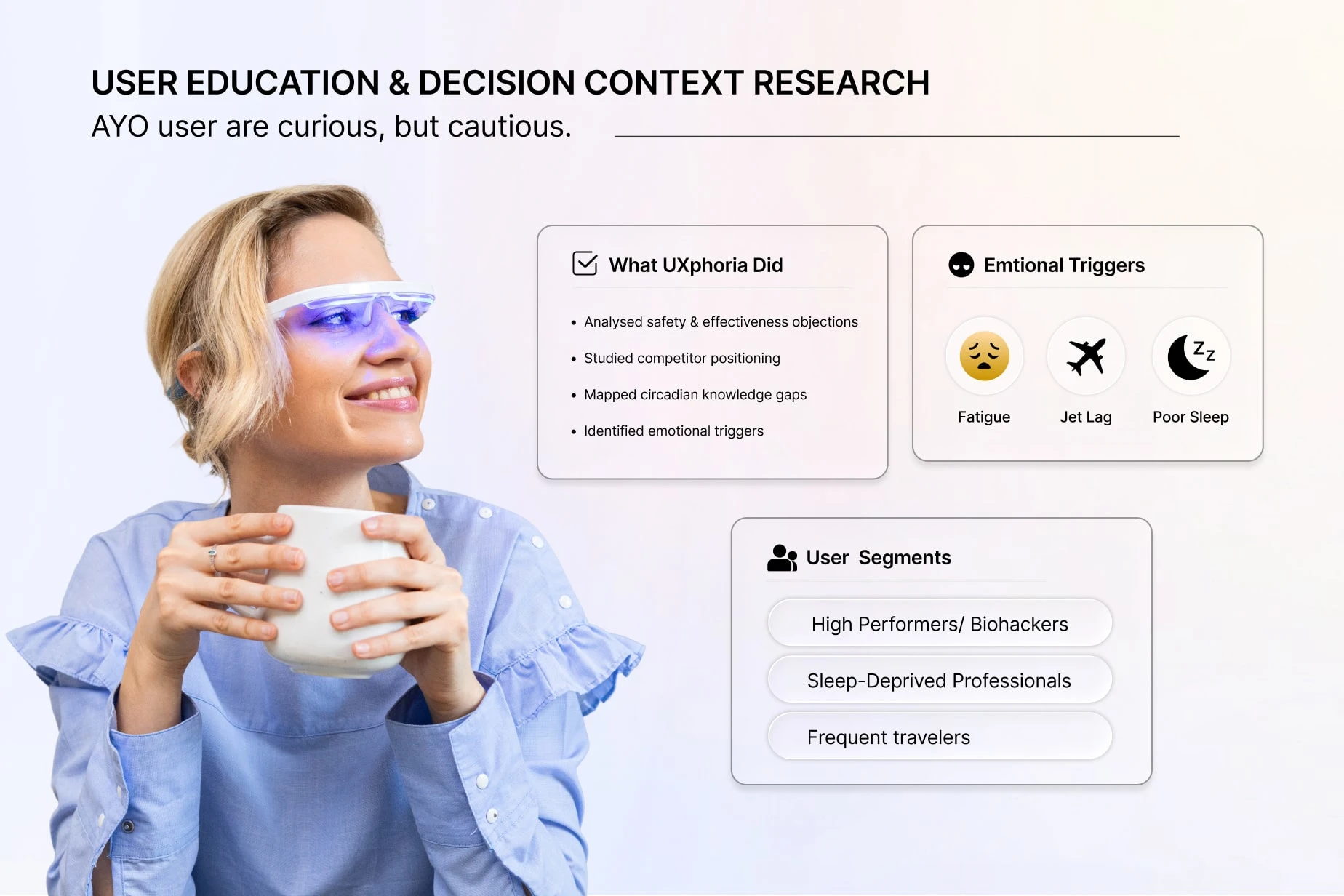
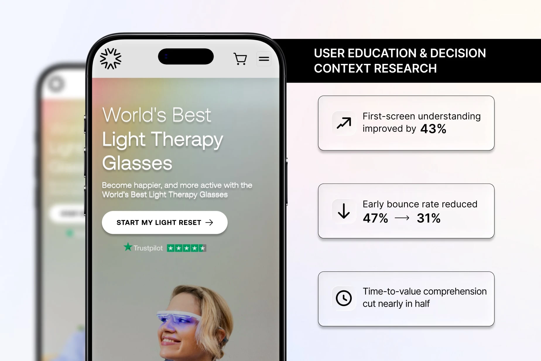
Phase 1: User Education & Decision Context Research
AYO users are curious, but cautious.
What We Did
Analysed user objections around safety and effectiveness
Studied competitor light therapy positioning
Mapped knowledge gaps in circadian science
Identified emotional triggers (fatigue, jet lag, poor sleep)
Segmented users:
High performers / biohackers
Sleep-deprived professionals
Frequent travelers
Improvements
First-screen understanding improved by 43%
Early bounce rate reduced from 47% → 31%
Time-to-value comprehension cut nearly in half
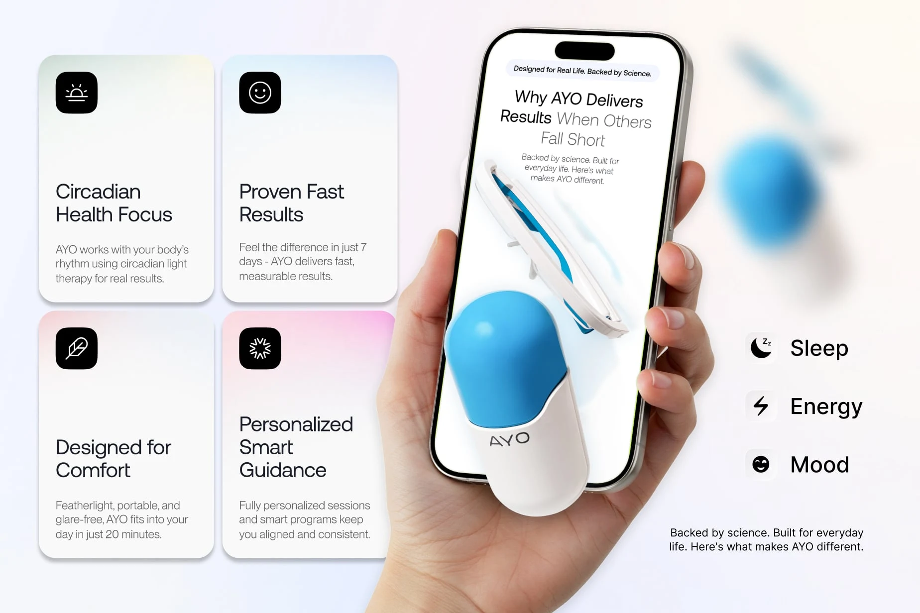
Phase 2: Product Story & Benefit Hierarchy
Complex products need simple stories.
What We Did
Reframed the product as:
“Daily light therapy, without changing your routine”
Structured benefits in a clear hierarchy:
Sleep
Energy
Mood
Connected circadian alignment to real-life outcomes
Reduced jargon in early sections
Improvements
Scroll engagement increased by 1.7×
Benefit recall rate increased significantly
Fewer users skipped core sections
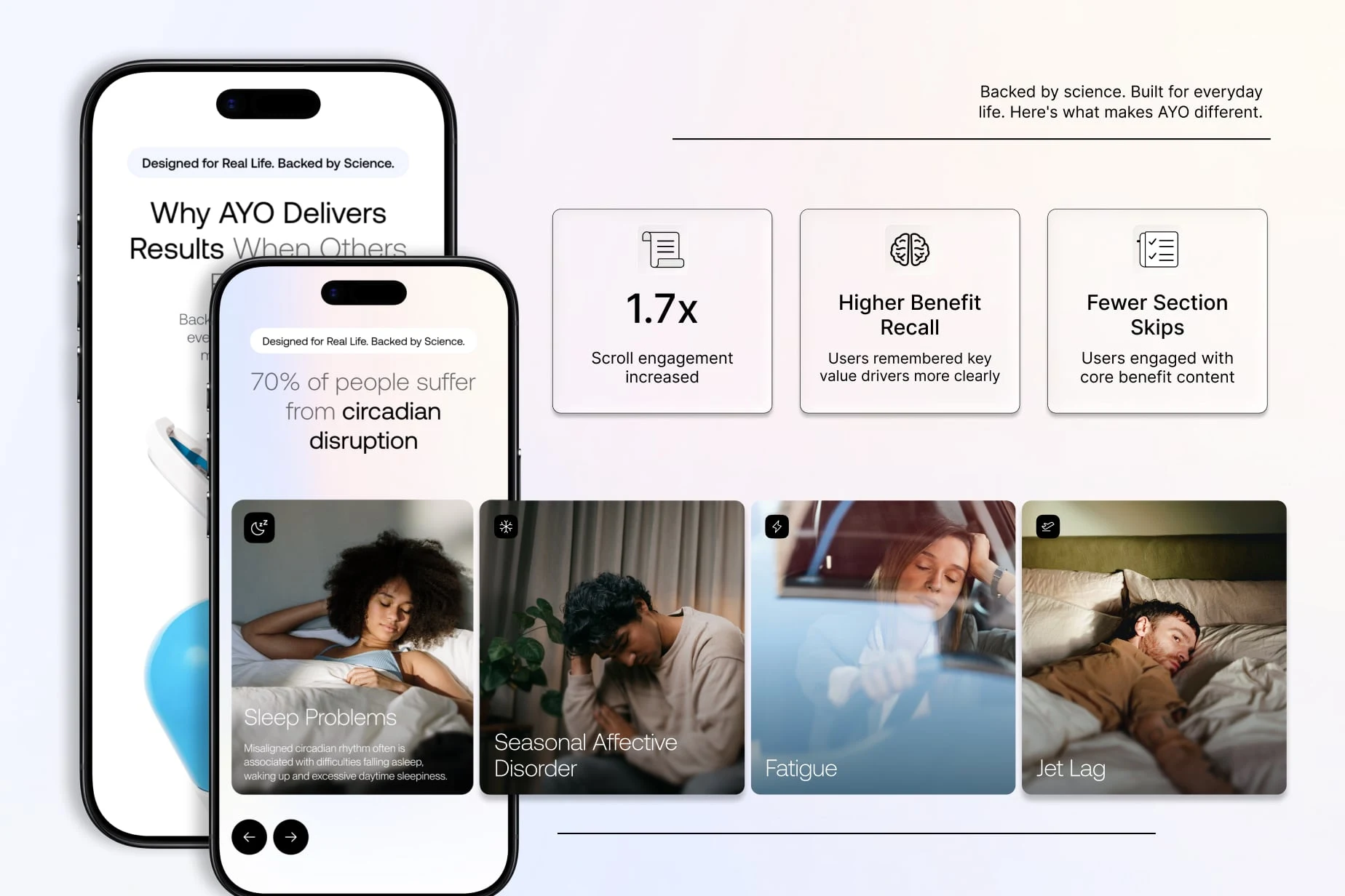
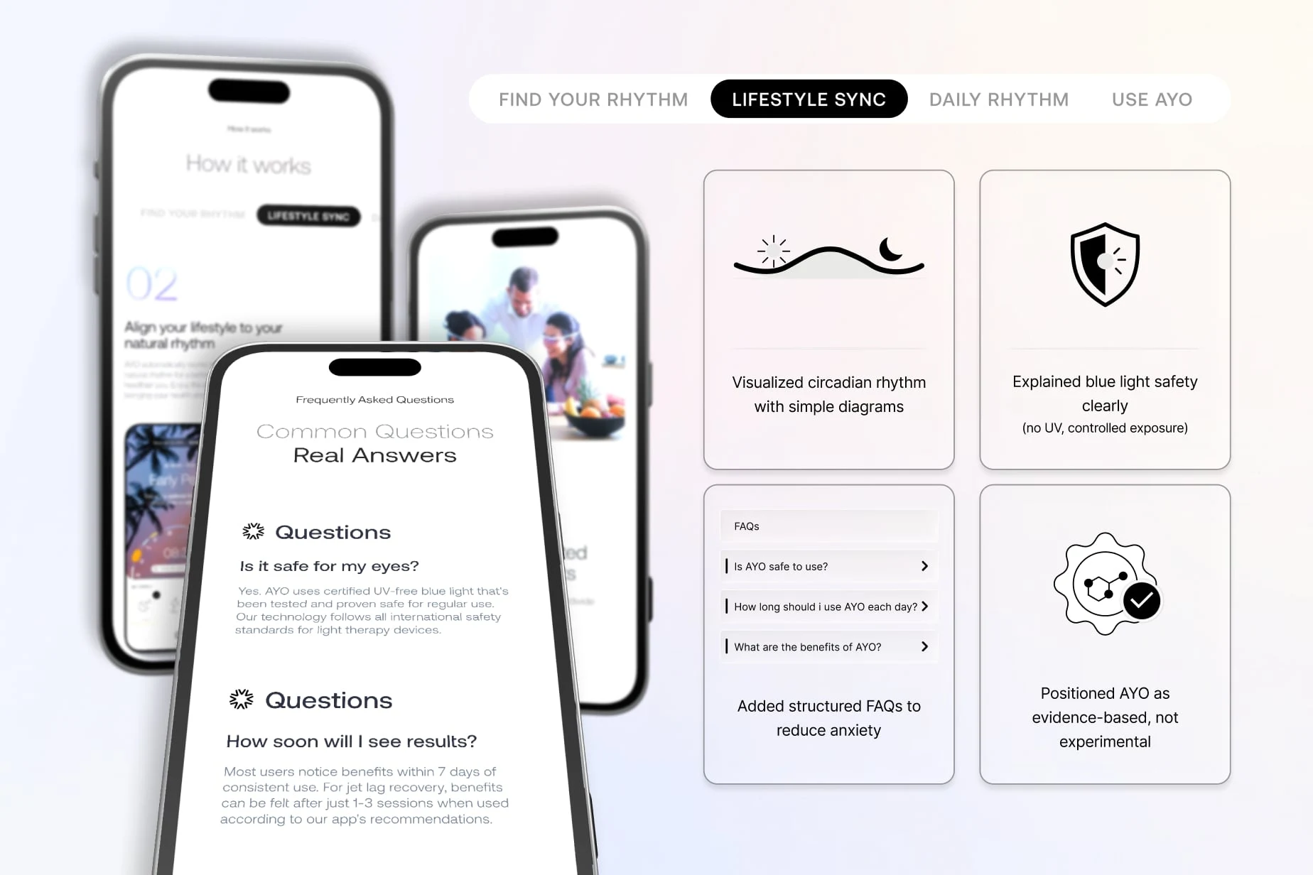
Phase 3: Science Simplification & Trust Architecture
Science builds trust, if it’s understandable.
What We Did
Visualized circadian rhythm with simple diagrams
Explained blue light safety clearly (no UV, controlled exposure)
Added structured FAQs to reduce anxiety
Positioned AYO as evidence-based, not experimental
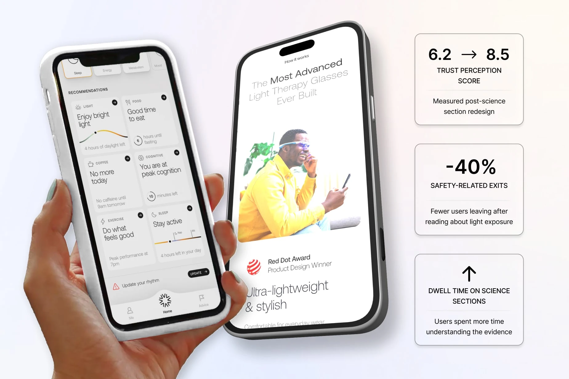
Improvements
Trust perception score increased from 6.2 → 8.5
Safety-related exits reduced by 40%
Increased dwell time on science sections
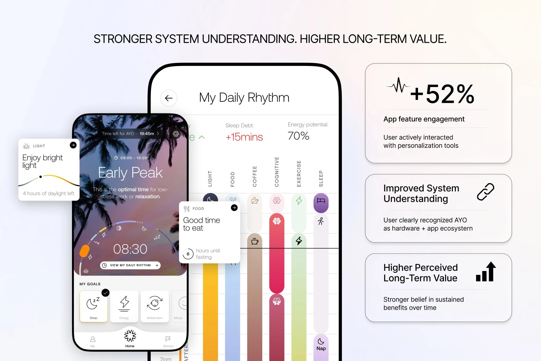
Phase 4: App + Hardware Value Integration
AYO isn’t just glasses. It’s a system.
What We Did
Integrated the app story directly into the product flow
Showed how personalization improves results
Framed the app as a guide, not a controller
Visualized daily usage in under 30 seconds
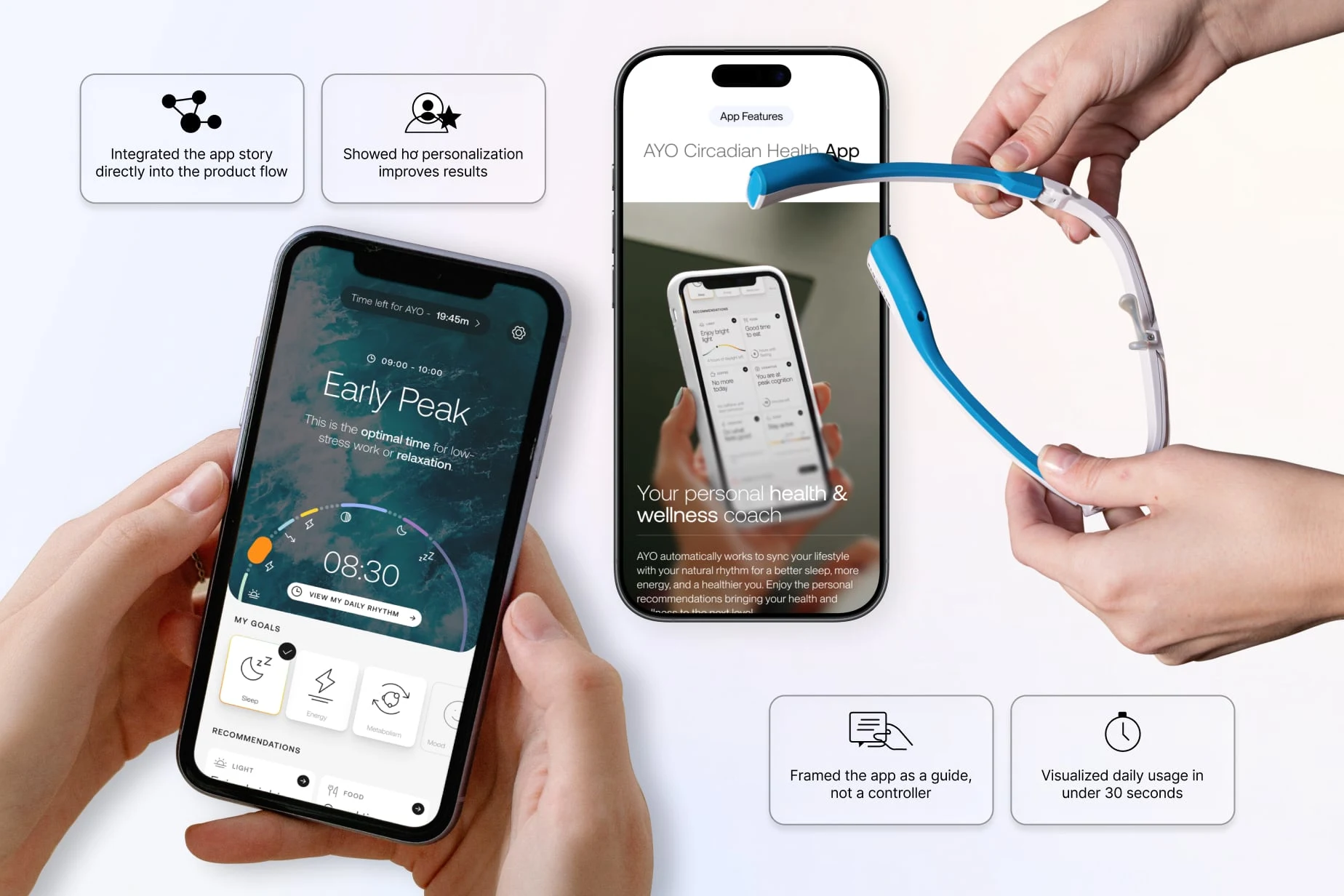
Improvements
App feature engagement increased by 52%
Product-system understanding improved significantly
Higher perceived long-term value
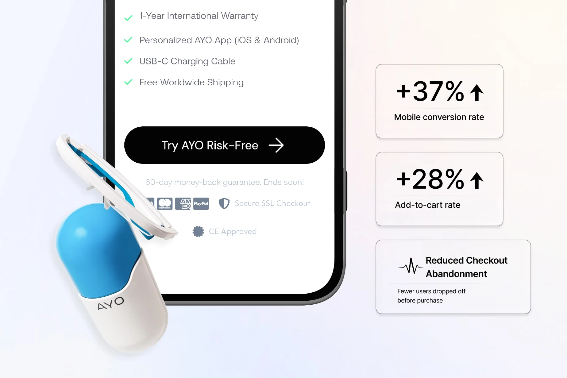
Phase 5: CRO, Mobile UX & Purchase Confidence
Confidence drives checkout.
What We Did
Simplified CTAs and reduced choice friction
Added reassurance near add-to-cart
Optimized mobile layouts for fast scanning
Reinforced ease of daily use (hands-free, short sessions)
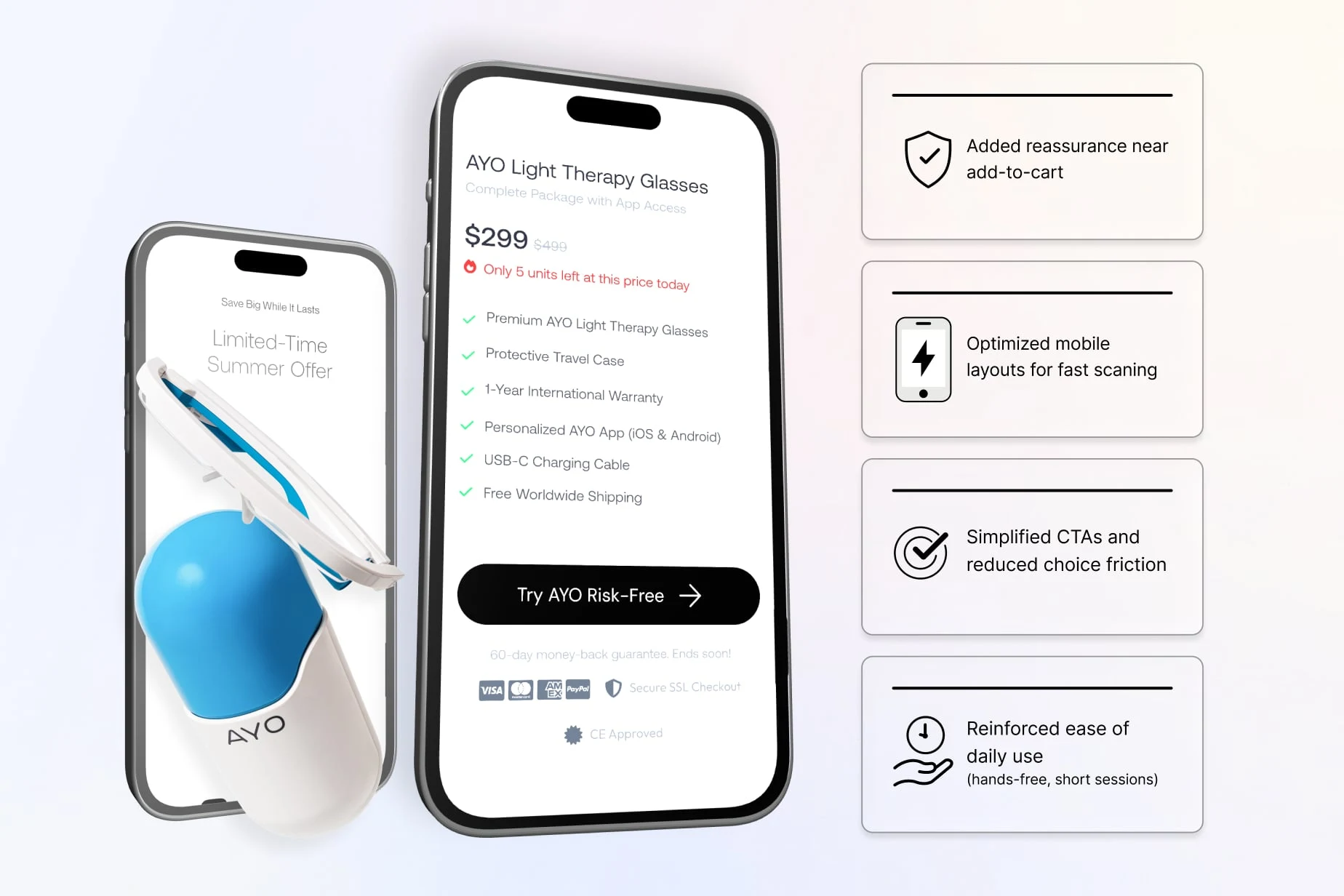
Improvements
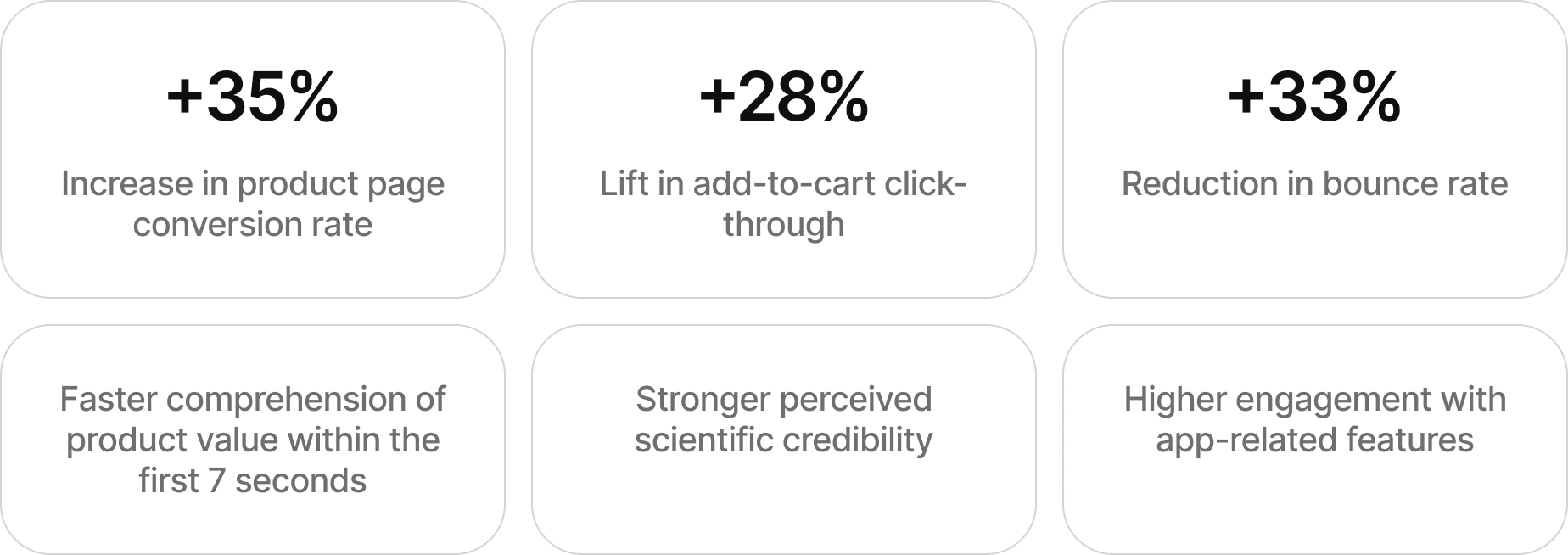
Mobile conversion rate increased by 37%
Add-to-cart rate increased by 28%
Checkout abandonment reduced noticeably
THE RESULTS
The redesigned website transformed complexity into confidence.
Launch Highlights
35% increase in conversion rate
28% lift in add-to-cart clicks
Lower bounce rates across all devices
Stronger trust in safety and science
Higher engagement with the app ecosystem
The site now guides buyers, reassures them, and supports high-value decisions with ease.
THE OUTCOME
Today, AYO has a website that:
Explains advanced science simply
Builds trust before asking for commitment
Positions the product as a daily habit, not a gadget
Integrates hardware and software seamlessly
Scales with new features and audiences
This is no longer just a product page.
It’s a health-tech education and conversion engine.
Future Considerations
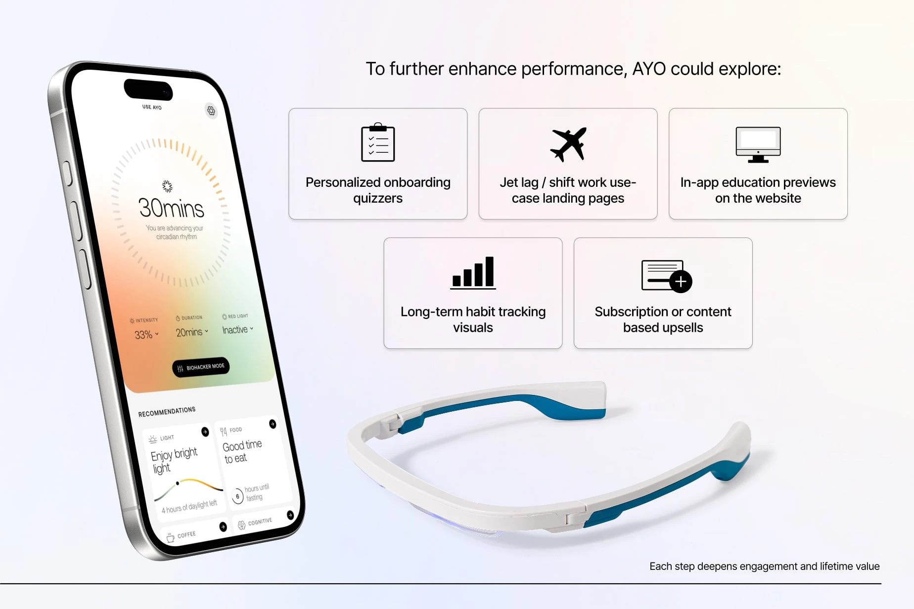
To further enhance performance, AYO could explore:
Personalized onboarding quizzes
Jet lag / shift work use-case landing pages
In-app education previews on the website
Long-term habit tracking visuals
Subscription or content-based upsells
Each step deepens engagement and lifetime value.
READY TO TURN HEALTH-TECH COMPLEXITY INTO CLARITY?
Innovative products fail when people don’t understand them fast enough.
AYO didn’t simplify the product. They simplified the experience.
If you want a website that:
Builds trust in science
Converts curiosity into confidence
Scales with your health-tech product
Like this project
Posted Feb 25, 2026
AYO is a health-tech brand focused on improving Sleep quality Energy levels Mood balance Circadian rhythm alignment
Likes
2
Views
23
Timeline
Jan 7, 2026 - Ongoing