
Lorelai Lopez
UX Writer & Content Strategist | Clear, Human Content
- 5.0
- Rating
- 52
- Followers


A reminder I ran into while working on one of my own projects: sometimes the copy isn’t the problem—the container is.
If good content still feels awkward, confusing, or difficult to move through, rewriting it again may not fix it. Sometimes the structure around the words is...
Working on some of my own projects lately has been a good reminder that information hierarchy isn’t just a design decision — it’s part of the user experience.
When everything feels equally important, even good content can become overwhelming. Clear structure gives people...
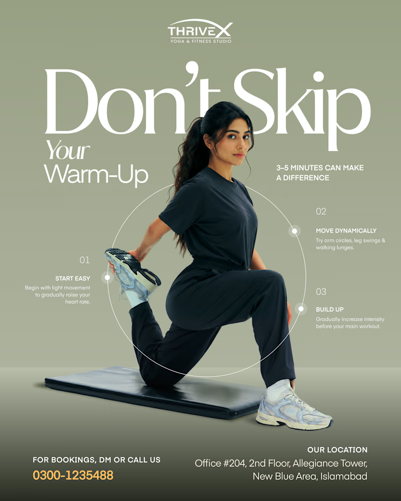
This sage mockup is a great example of how copy and design elements can come together to create depth. Playing with the dimensions and foreground in a given space can add a lot of value.

"Don't Skip Your Warm-Up."
Two different ways to deliver advice that actually gets saved.
Which one are you saving? 👇
34 voted
58%
25 voted
42%

59 votes
Closed
A product can have beautiful visuals and powerful features, but unclear communication can create unnecessary friction.
People can forget that words are an important part of the experience.
I've been exploring how small copy changes can improve digital experiences – from...
The headline of a page shouldn't make visitors work to understand the offer.
If someone has to read three paragraphs before they know what a product actually does, there's a clarity problem.