The network for creativity
Join 1.25M professional creatives like you
Connect with clients, get discovered, and run your business 100% commission-free
Creatives on Contra have earned over $150M and we are just getting started
Back to feedPost

A product can have beautiful visuals and powerful features, but unclear communication can create unnecessary friction.
People can forget that words are an important part of the experience.
I've been exploring how small copy changes can improve digital experiences – from onboarding flows to everyday interactions.
Clear communication is a design tool too.
The network for creativity
Join 1.25M professional creatives like you
Connect with clients, get discovered, and run your business 100% commission-free
Creatives on Contra have earned over $150M and we are just getting started











Related posts

Making AI feel tangible through design.
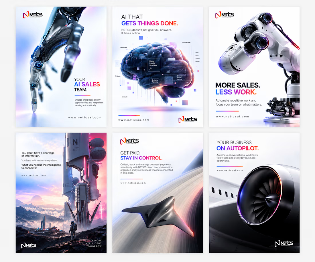
One thing I kept thinking about while working on NETICS was: how do you make a brand about something as complex as AI feel simple, clear, and actually interesting?
I didn’t want to just make things look futuristic. I wanted the designs to communicate.
So I focused on three things:
1. Brand identity. A consistent visual language, from the gradients and typography to the overall look, so every design feels like NETICS.
2. Functionality. Clear headlines, simple copy, and a visual hierarchy that helps people understand what the product actually does.
3. Aesthetics. Cinematic 3D visuals, futuristic elements, and enough whitespace to keep everything clean without losing that tech feel.
The goal was simple: make the brand look good, but more importantly, make the message stick.
Because what’s the point of beautiful design if people don’t understand what you’re trying to say?
Here’s a look at the work.


The line about making the message stick over the look is the hard part with AI brands. With cinematic 3D visuals carrying so much weight, how did you keep the headline from competing with the image on the busier posters?

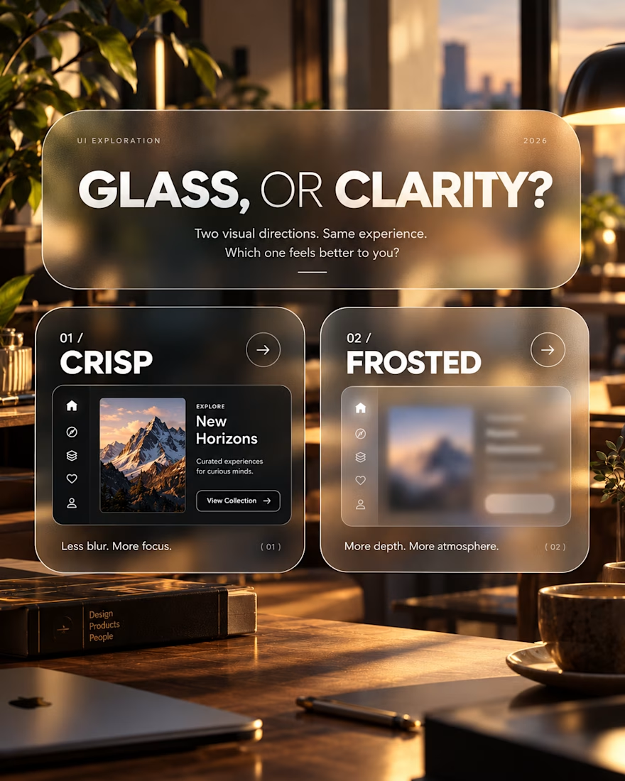
Glass, or Clarity?
An exploration of visual depth, contrast and interface clarity.
This concept explores two approaches to presenting the same interface: a crisp, sharply defined layout and a frosted-glass treatment.
The intention was to examine how surface treatments influence the overall character of a digital product, and where visual atmosphere begins to compete with usability.
Design considerations
Visual hierarchy and content legibility
Transparency, blur and depth
Contrast across layered surfaces
Choosing visual treatments that serve the product
The takeaway
Visual effects are most effective when they have a purpose. Aesthetic refinement matters, but it should never come at the expense of understanding or usability.
An ongoing exploration of the relationship between visual expression and functional design.
Which direction would you explore further, and why?




New LinkedIn banner designs, built around one goal: making the value clear at a glance.
From YouTube creators to healthcare businesses and SaaS brands, every banner needs a clear message, the right visual direction, and a reason for the audience to care.
My approach is simple: understand the audience, lead with the outcome, use visuals that support the message, and make the next step obvious.
Good design should look great, but it should also communicate with purpose.
Open to 2 more LinkedIn branding projects this week. 💜

Good call building each banner around one clear message.