The network for creativity
Join 1.25M professional creatives like you
Connect with clients, get discovered, and run your business 100% commission-free
Creatives on Contra have earned over $150M and we are just getting started
Back to feedPost

The headline of a page shouldn't make visitors work to understand the offer.
If someone has to read three paragraphs before they know what a product actually does, there's a clarity problem.
The network for creativity
Join 1.25M professional creatives like you
Connect with clients, get discovered, and run your business 100% commission-free
Creatives on Contra have earned over $150M and we are just getting started



Related posts

A focused landing page helps visitors understand the product and explore the offer without unnecessary distractions.
For this project, the landing page presents the product through a dedicated shopping experience.
When building landing pages, I focus on the offer, page structure, product information, visual hierarchy, and clear calls to action.
Check out the landing page here:
https://lovenood.com/pages/landing-page-psk
Need a dedicated landing page for your product or campaign? Let's discuss it.
#LandingPageDesign #Shopify #EcommerceDesign #ConversionFocusedDesign

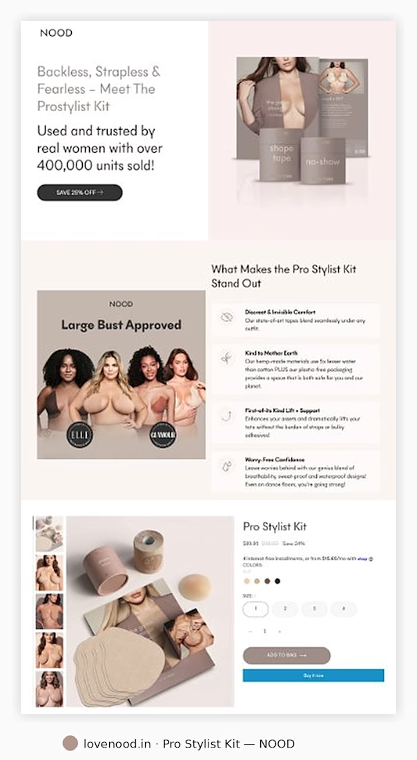

The four icon benefits next to the photo are easy to scan, and the ELLE and GLAMOUR badges add quick trust. Does the Add to Bag button stay sticky on mobile?

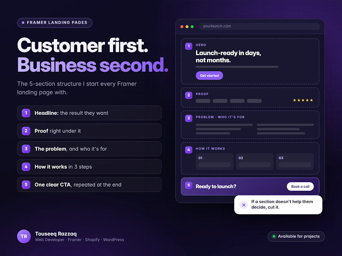
Most landing pages I'm asked to fix have the same problem: they talk about the business before the customer.
The structure I start with for a Framer landing page:
1. Headline: the result your customer wants, in their words
2. Proof right under it: logos, a review or a number
3. The problem you solve, and who it's for
4. How it works, in 3 steps
5. One clear call to action, repeated at the end
If a section doesn't help someone decide, it can probably go.
Launching something soon? Send me a message and I'll sketch the page structure with you.


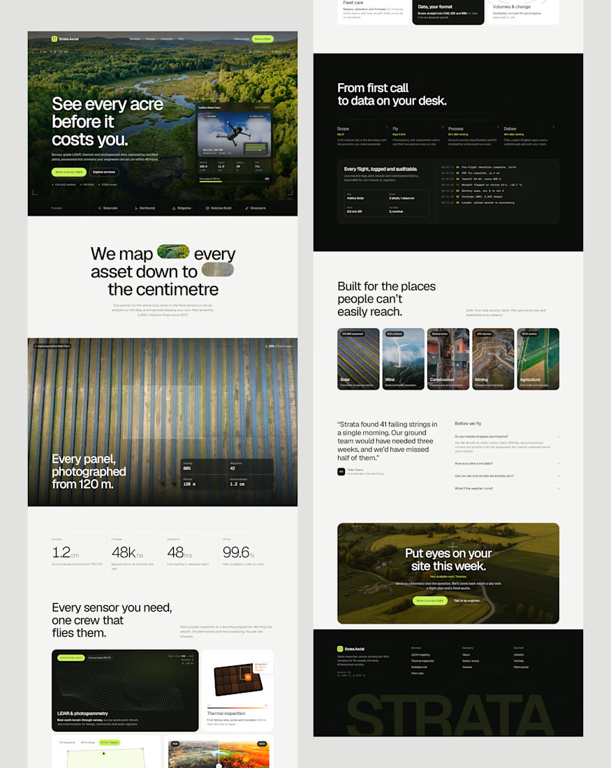
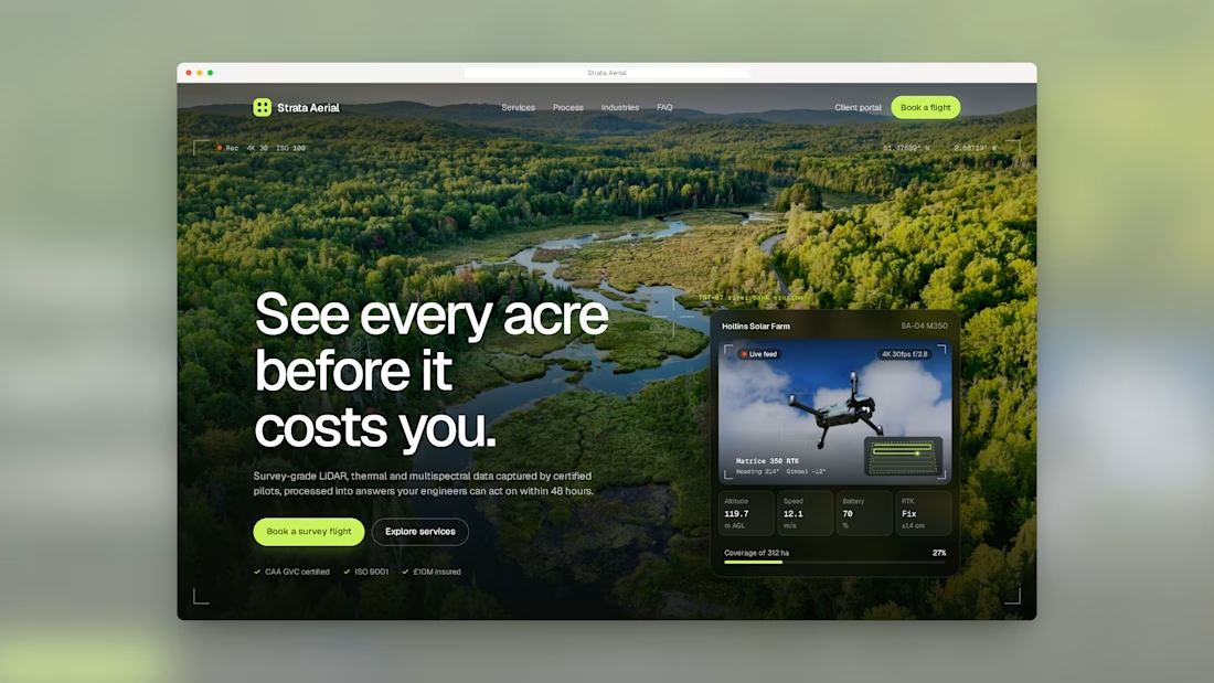
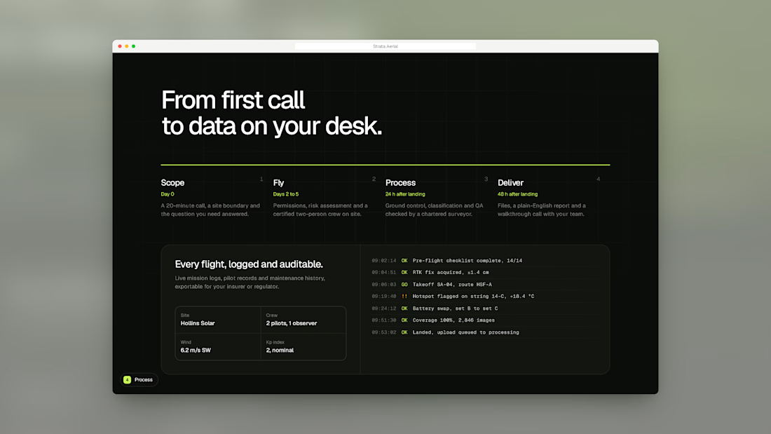
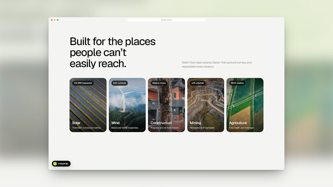
"See every acre before it costs you" over the aerial forest is a strong hook, and the dark data section gives it a serious tone. Who is the main buyer, land investors?