The network for creativity
Join 1.25M professional creatives like you
Connect with clients, get discovered, and run your business 100% commission-free
Creatives on Contra have earned over $150M and we are just getting started
Back to feedPost
Taste Test

"Don't Skip Your Warm-Up."
Two different ways to deliver advice that actually gets saved.
Which one are you saving? 👇

34 voted
58%
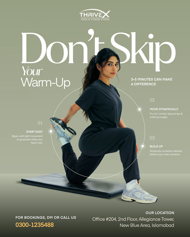
25 voted
42%
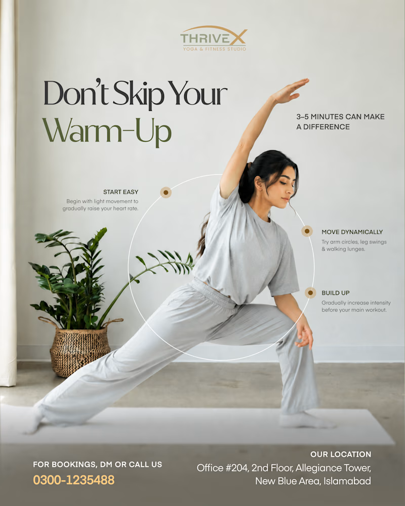
59 votes
Closed

Love it i chose sage & athletic


Sage

The little details really make this stand out


Awesome design !

Both look good! The muted green one feels calmer, while the lighter one looks more clear and fresh.
Thanks!

very cool posters

Nice one!

The sage & athletic design looks warm


Light and natural

Went with Sage, love it.

light & natural feels good

The two designs are great but sage & Athletic looks better
Thankyou Samuel!

The second one feels calming and real. I like it!

Thanks!

I will prefer Sage & Athletic Version. It's very warming!

AWESOME🙌


sage

wow👍

Two visual tones for the same message is a smart way to test what resonates. The athletic option has more energy but both versions deliver the point clearly.

Don't skip leg day!

Using the same "Don't Skip Your Warm-Up" message in two palettes is a smart way to A/B the visual tone, and the 58% for Sage & Athletic makes sense since the deeper green reads as more energetic. Did you notice any difference in saves versus votes between the two versions?
The network for creativity
Join 1.25M professional creatives like you
Connect with clients, get discovered, and run your business 100% commission-free
Creatives on Contra have earned over $150M and we are just getting started











Related posts

A little peek at the brand work we did for Elio Mortgage.
A warm, approachable identity full of warm vibrant colors paired with soft sun rising inspired gradients, inner glows and custom illustrations & more. Loved this direction!
Full case study coming soon, from process to final identity.
Plenty of logo explorations to share too!


That color palette takes the whole identity to a different level!! I loove it.

Brand Expressions -- Olivir



Thats so crazy!!!!!! Seeing this I feel we humans are still far better than AI

