The network for creativity
Join 1.25M professional creatives like you
Connect with clients, get discovered, and run your business 100% commission-free
Creatives on Contra have earned over $150M and we are just getting started
Back to feedPost
Taste Test

Portfolio update: I couldn't decide on a look, so I built both.
A or B? manucabezas.com

13 votes
Ends in 1d

dev mode on dark looks 👌🏻✨
Thanks! I agree! The only thing that looks a bit odd in the dark version of Dev Mode are the eyeballs in the logo and the hero section. I’ll have to find a way around it... or just leave it this creepy 😂

Art mode for me.

Art mode for me, the serif headings suit the character work better. Since both already exist, why not keep a Dev / Art toggle in the nav and let visitors pick? The switch itself could be a nice little Rive moment.
The network for creativity
Join 1.25M professional creatives like you
Connect with clients, get discovered, and run your business 100% commission-free
Creatives on Contra have earned over $150M and we are just getting started



Related posts

Which AI startupTwo different creative directions. One AI startup. 👀
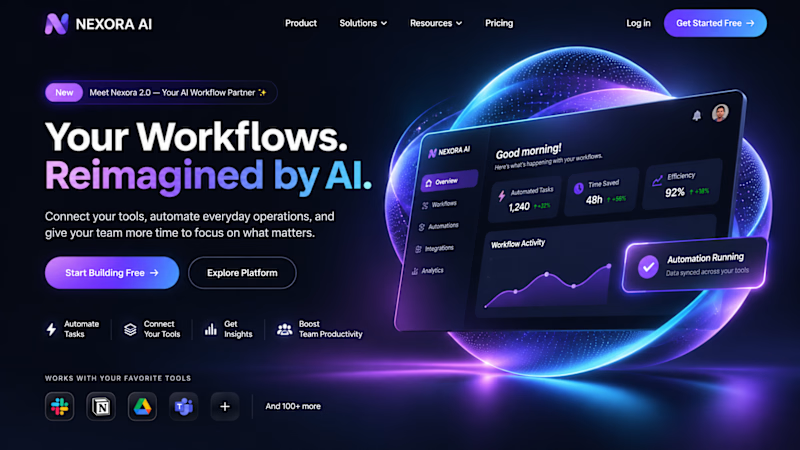
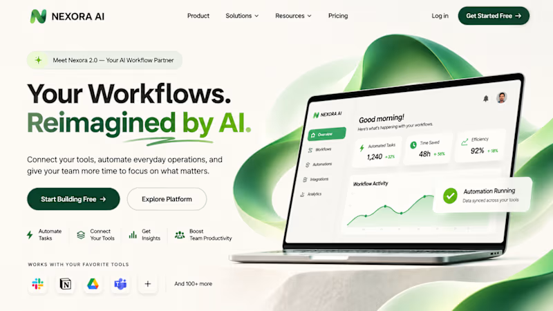
We designed two completely different hero sections for a fictional AI startup, NEXORA AI.
🔵 Design 01: Futuristic, bold and technology-driven.
🟢 Design 02: Minimal, refined and sophisticated.
Both communicate the same product, but with completely different visual identities.
Which direction would you choose?
A Futuristic
B Minimal
Drop your vote in the comments. We'd love to hear your thoughts! website design would you choose?

3 voted
100%
0 voted
0%
3 votes
Closed

futuristic

I created 2 concepts for the same tagline "Shaping Skylines", for a vertical construction company. Both of these are scroll triggered, which one you prefer? I'm biased towards the skewed option.
I'm giving a free component copy for both of them:
Zoom in: https://framer.link/CQNgUkU
Skewed: https://framer.link/XTmQcBK
Check them out and if you'd like, use them in your upcoming project!
29 voted
64%
16 voted
36%
45 votes
Closed

Flawless

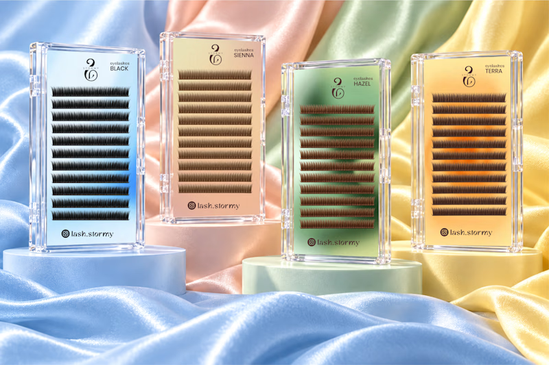
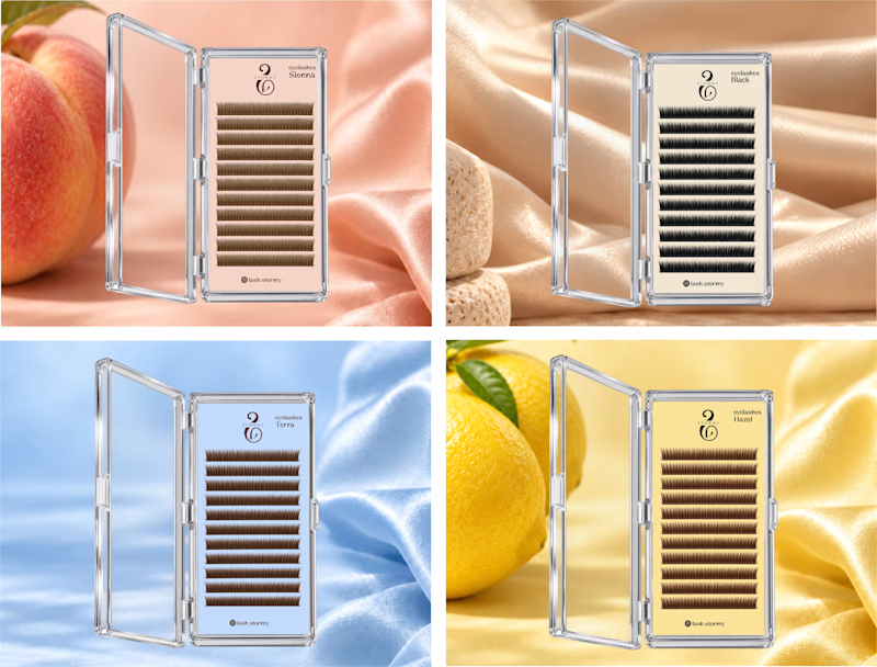
Two packaging directions for STORMY, currently in progress ✨
Exploring soft pastels and richer color finishes for the lash collection.
Which would you choose A or B?
I’d love to hear why.
3 voted
50%
3 voted
50%
6 votes
Closed

Option 1. Seeing the whole lash range together feels more like a proper collection.