The network for creativity
Join 1.25M professional creatives like you
Connect with clients, get discovered, and run your business 100% commission-free
Creatives on Contra have earned over $150M and we are just getting started
Back to feedPost

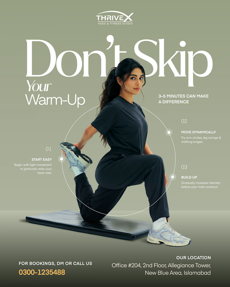
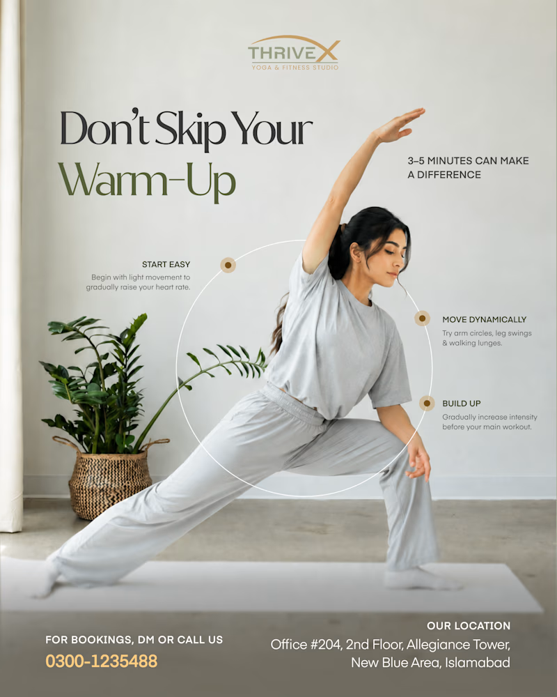
This sage mockup is a great example of how copy and design elements can come together to create depth. Playing with the dimensions and foreground in a given space can add a lot of value.

"Don't Skip Your Warm-Up."
Two different ways to deliver advice that actually gets saved.
Which one are you saving? 👇
34 voted
58%
25 voted
42%
59 votes
Closed

Amazing

Nice.👍

sage & athletic is cool

nice

Both designs are really good however it depends on the main goal “warm up at home or warm up in the gym” that’s why the main goal of the brand and the target audience is the key of taking the best decision

what a design, good job

This is really a great design


both are looking good, but i would prefer the first one, why? had worked on such audiences and they actually like simple things.
I love this

Nice design!


Fantastic work!

Amazing

Really well executed — the visual direction, details, and overall presentation come together beautifully.

Nice
I like Light & Natural One

This is clean

nice

Great one 💓

Both designs are great. I'd say.

Amazing Work

Very nice

Amazing 😍
Amazing 😍

wow amazing


Stunning!

Great examples!
The network for creativity
Join 1.25M professional creatives like you
Connect with clients, get discovered, and run your business 100% commission-free
Creatives on Contra have earned over $150M and we are just getting started











Related posts

A little peek at the brand work we did for Elio Mortgage.
A warm, approachable identity full of warm vibrant colors paired with soft sun rising inspired gradients, inner glows and custom illustrations & more. Loved this direction!
Full case study coming soon, from process to final identity.
Plenty of logo explorations to share too!


That color palette takes the whole identity to a different level!! I loove it.

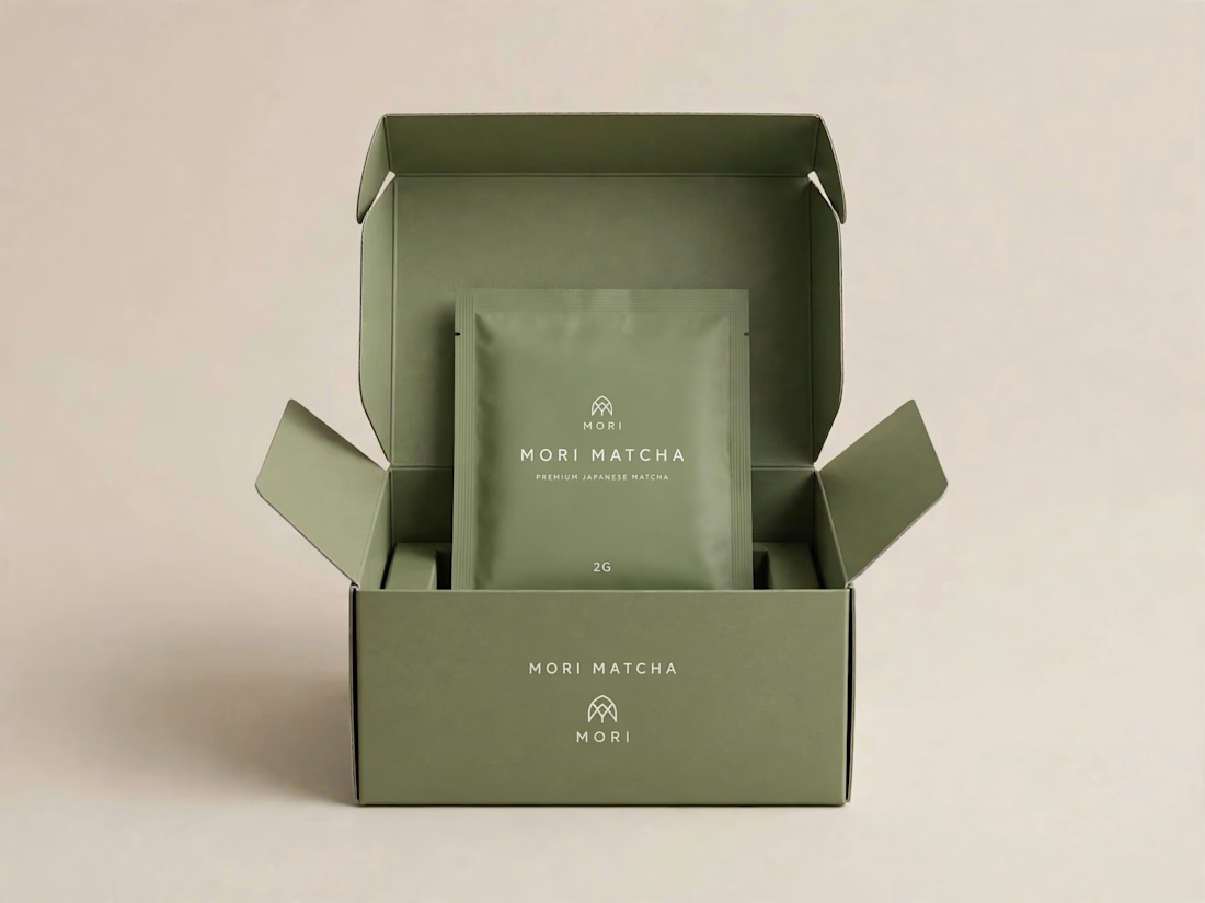
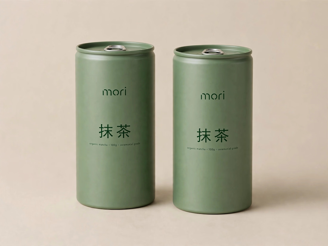
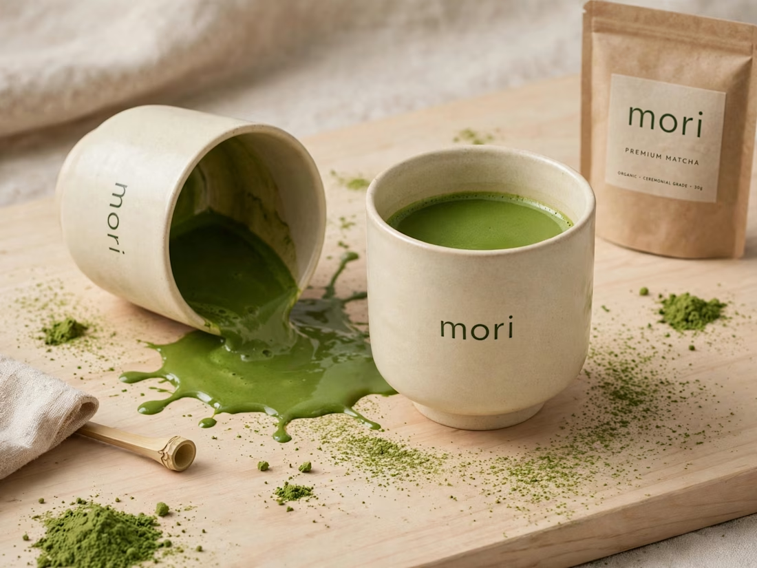
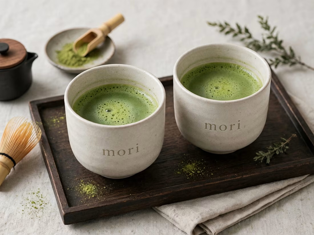
more visuals from my latest project — mori matcha 🍵
explored minimal Japanese packaging with earthy greens and calm typography.
focusing on premium ceramic cups and clean can design.
#branddesign #packagingdesign #visualidentity #brandstrategy #matcha #minimaldesign #japanesedesign #figma #mockup #branding



Which mockup platforms are you sourcing your mockups from ?
These are my favorite ones ✨
Share yours below.

This is very useful, and of course very beautiful