Gabriel Polido
Brand Designer
- 5.0
- Rating
- 38
- Followers


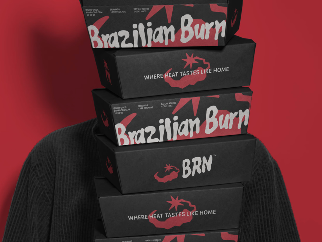
Brazilian Burn translates the warmth of Brazilian cooking into a brand identity built around fire, flavour and belonging.
The project connects brand strategy with a visual language rooted in the ember. Expressive lettering, a compact BRN signature and a palette of ember red, bone...
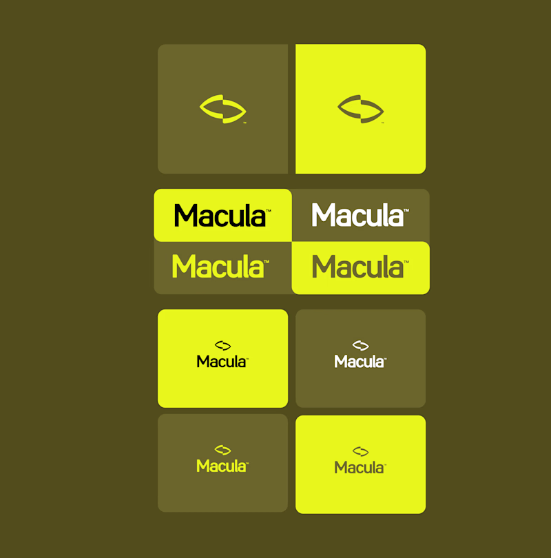
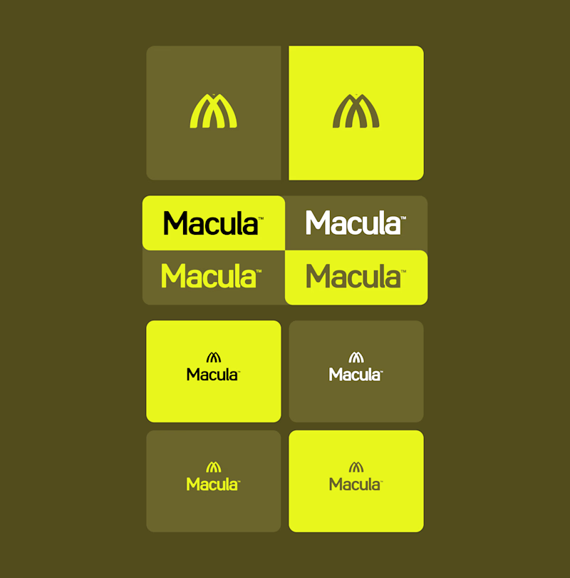
A closer look at the Macula symbol, from its underlying geometry to the finished mark.
Curves and openings bring together the initial M and architectural forms, exploring how light shapes our perception of space.
Explore the full brand identity case study:



Trying out two symbols for this identity.
The type and colors stay the same, but the feel changes.
Which one would you go with?
6 voted
50%
6 voted
50%
12 votes
Closed
User browsing experience on my website
polido.pages.dev
Macula - Motion studies.
A central point, radiating forms, and the spaces between them.
The identity’s geometry moves between symbol and pattern through changes in scale, cropping, and repetition. Each composition reveals a different reading of the same structure.