Marca de Fogo: Branding for Brazilian Burn

Gabriel Polido


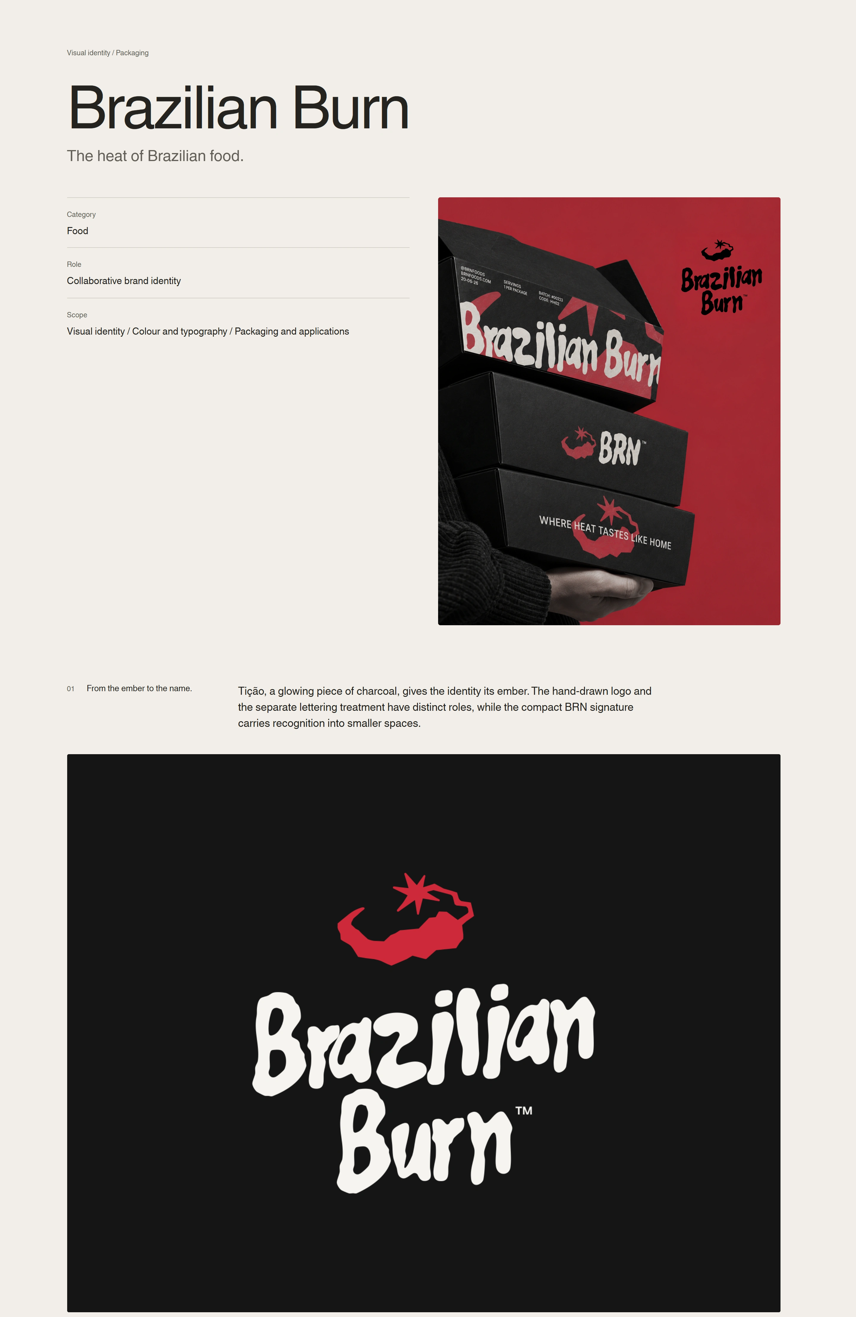
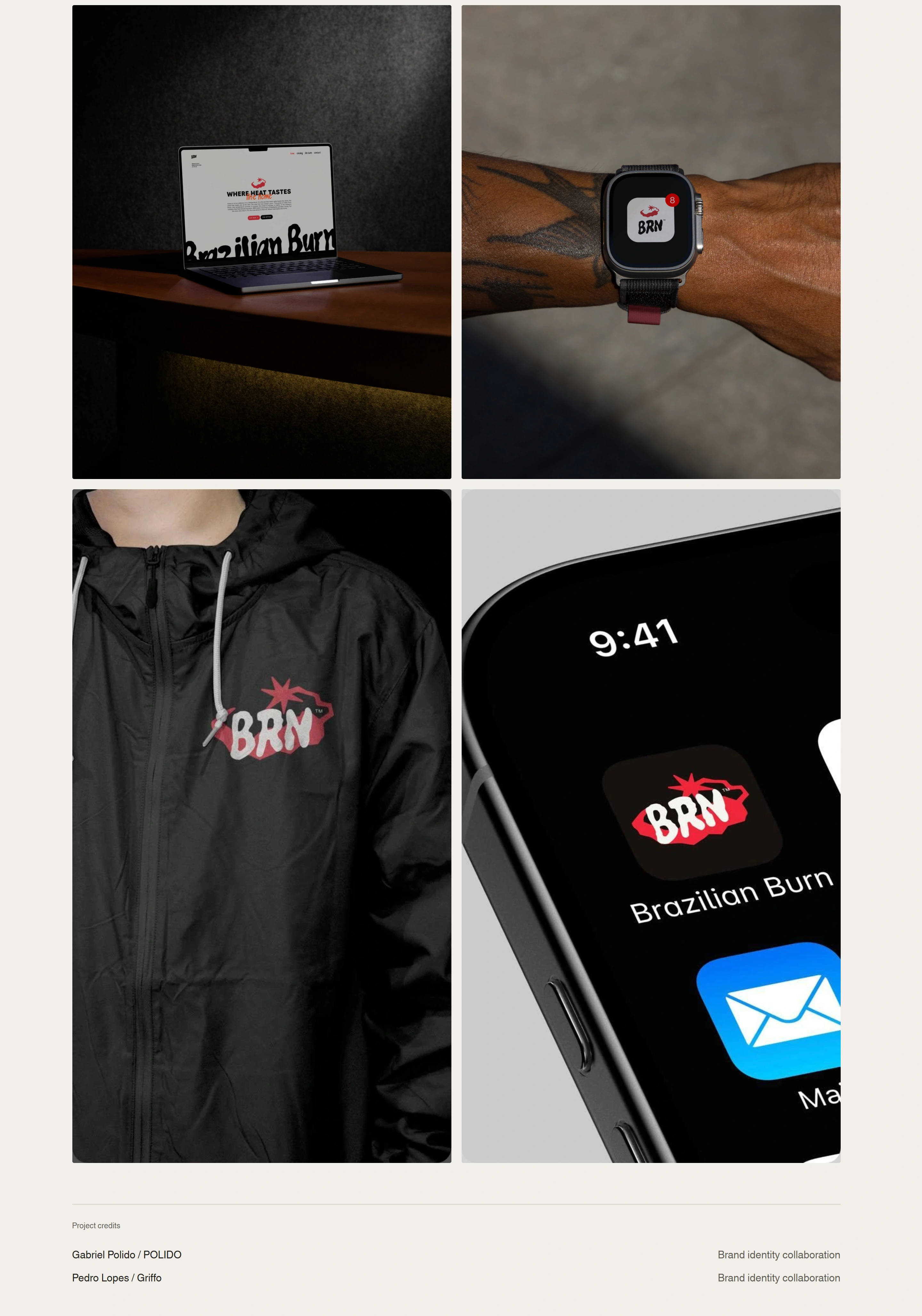
Brazilian Burn’s identity brings the fire behind the food into the way the brand presents itself. The challenge was to communicate the quality of its cooking while preserving the warmth of Brazilian hospitality. Moving away from flag-based imagery, the identity finds a more specific cultural reference in charcoal, cooking and the shared table.
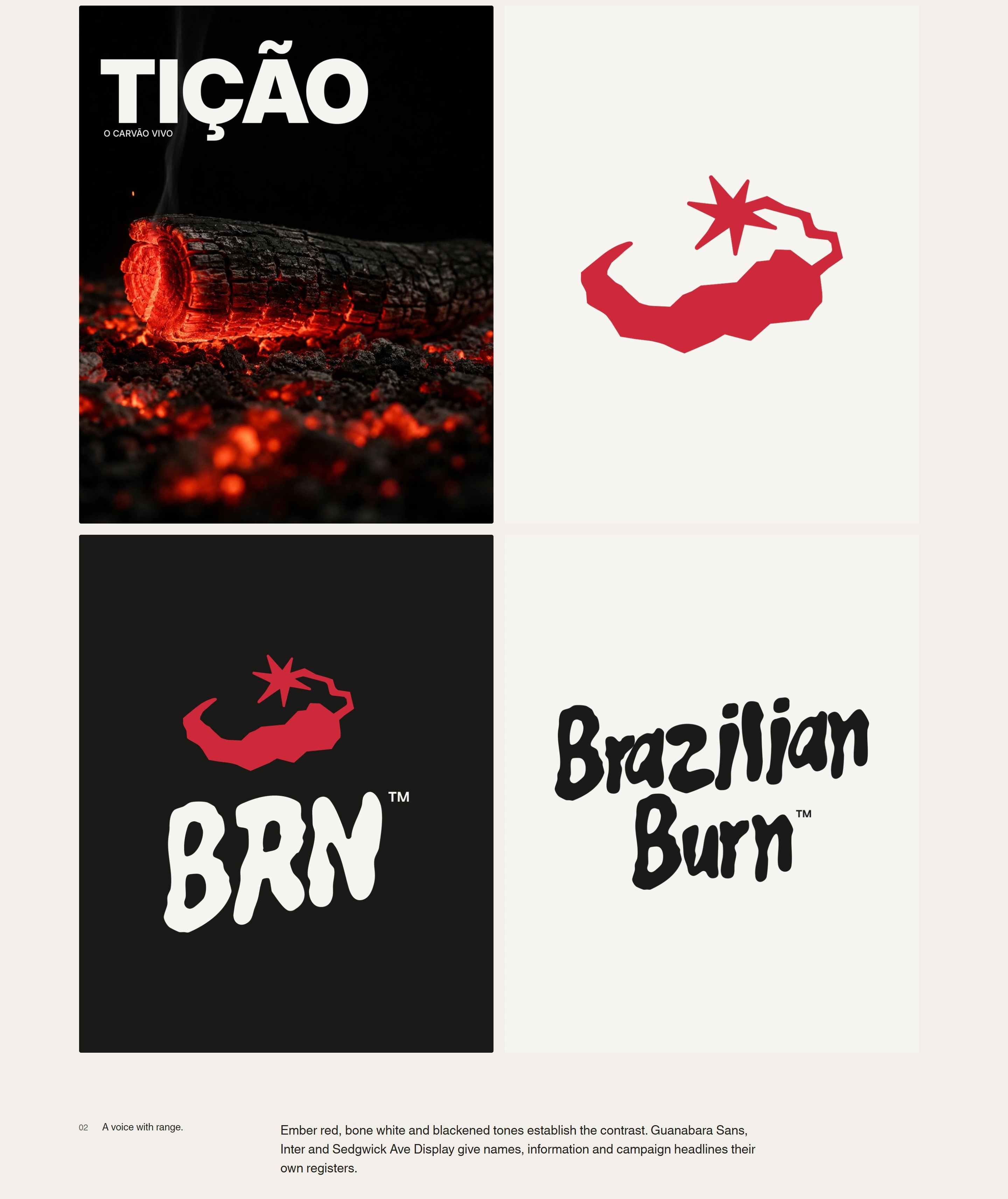
The concept, “Marca de Fogo,” connects these ideas across the visual system. Tição, a glowing piece of charcoal with a spark, gives the brand a symbol rooted in the origin of churrasco. Paired with the hand-drawn logotype, it introduces a human touch that reflects the care behind the food.
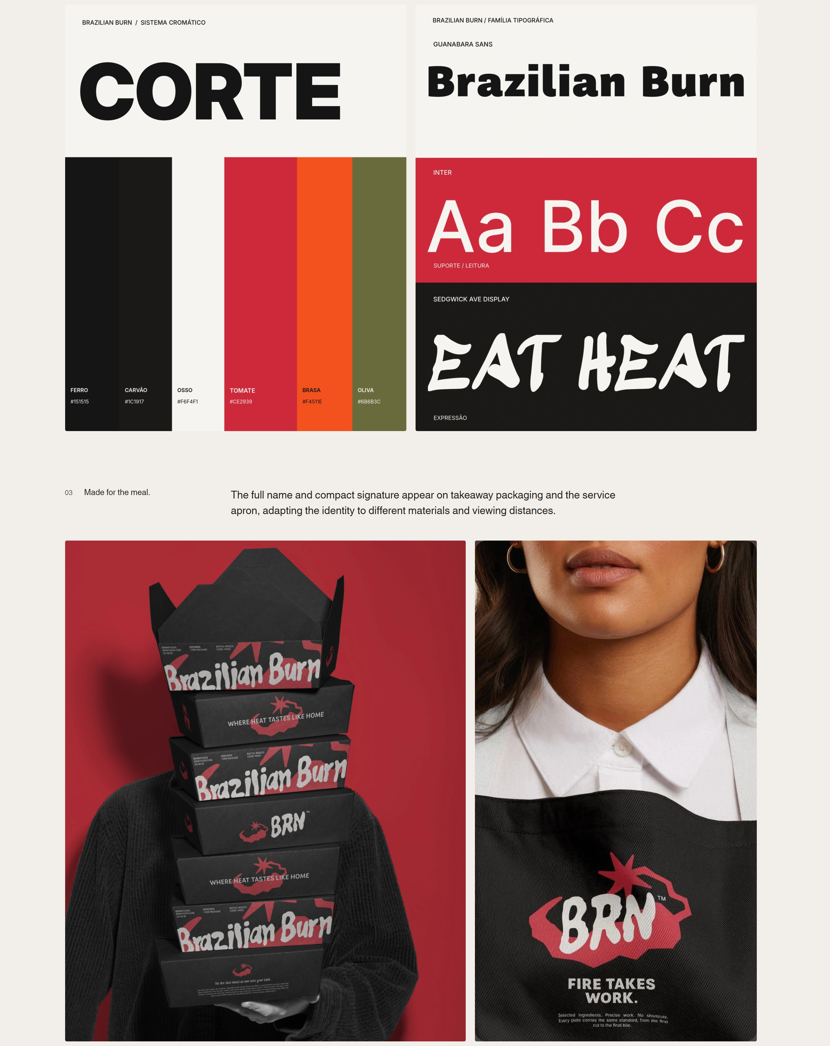
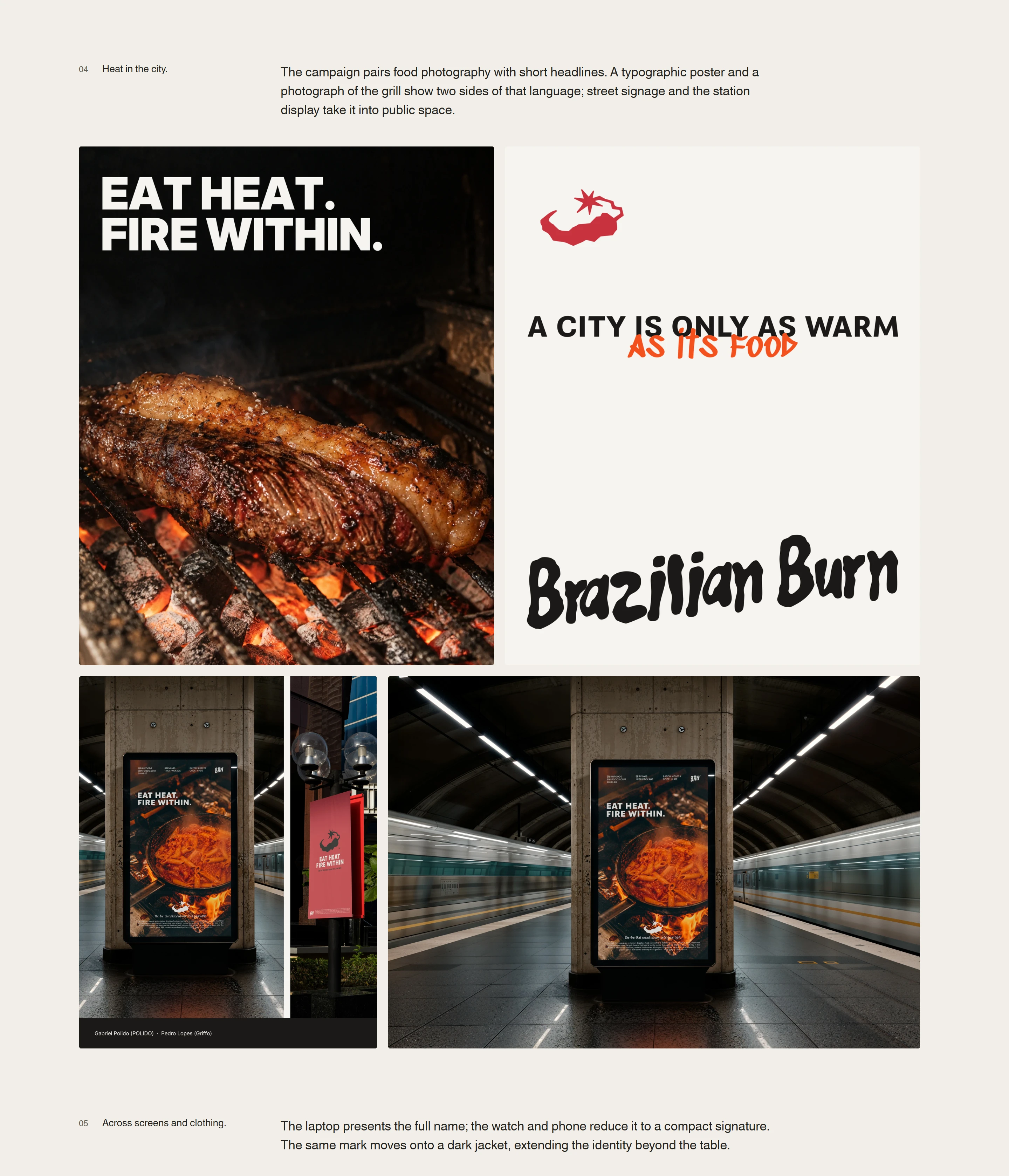
Dark tones, warm neutrals and red accents establish contrast, while clear typography organizes the practical information each application needs. Expressive marks bring energy to the communication without competing with product details. This balance gives BRN room to feel celebratory at an event and direct on an everyday meal label.
The system brings catering, frozen meals and subscriptions under one recognizable identity. It gives BRN a consistent way to communicate across different buying occasions, making its quality more visible and its Brazilian roots more tangible through the experience of food.
POLIDO.PAGES.DEV
Like this project
Posted Oct 23, 2026
A collaborative food brand identity rooted in the Brazilian ember, expressed through hand-drawn lettering, packaging and campaign art direction.