The network for creativity
Join 1.25M professional creatives like you
Connect with clients, get discovered, and run your business 100% commission-free
Creatives on Contra have earned over $150M and we are just getting started
Back to feedPost
Taste Test
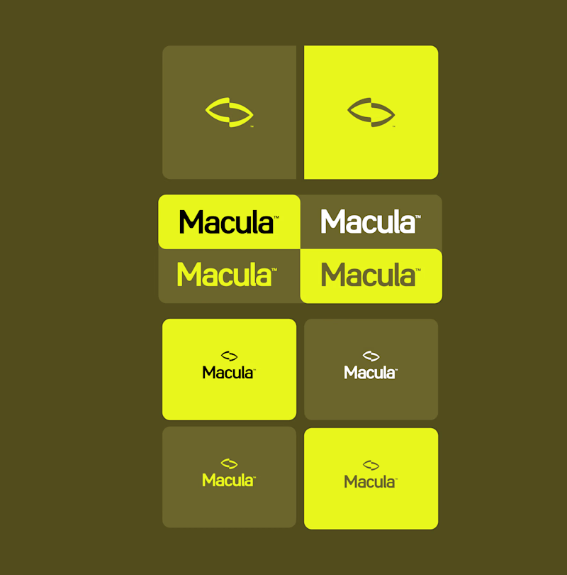
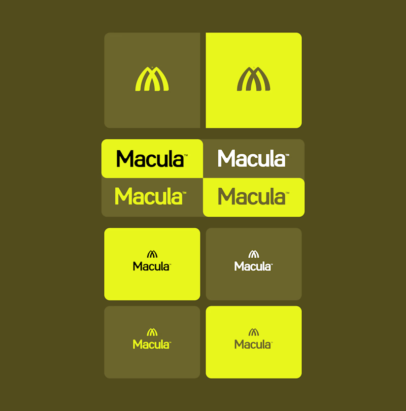
Trying out two symbols for this identity.
The type and colors stay the same, but the feel changes.
Which one would you go with?

6 voted
50%
6 voted
50%
12 votes
Closed

Voting Spotlight on this one, the arch shape reads like a light rising, which fits the name beautifully. Converge is sharp, but Spotlight has more warmth and personality.

Yes, your reading of the Spotlight was EXTREMELY ACCURATE, thank you so much for the help!

Converge is great but Spotlight feels an updated macdonalds logo ❤️
Great job Gabriel 🎉🎉🔥🔥
Thank you so much for your feedback! Others have pointed this out to me as well, and once I noticed it, it really started to bother me too, haha. I’m working on fixing it!
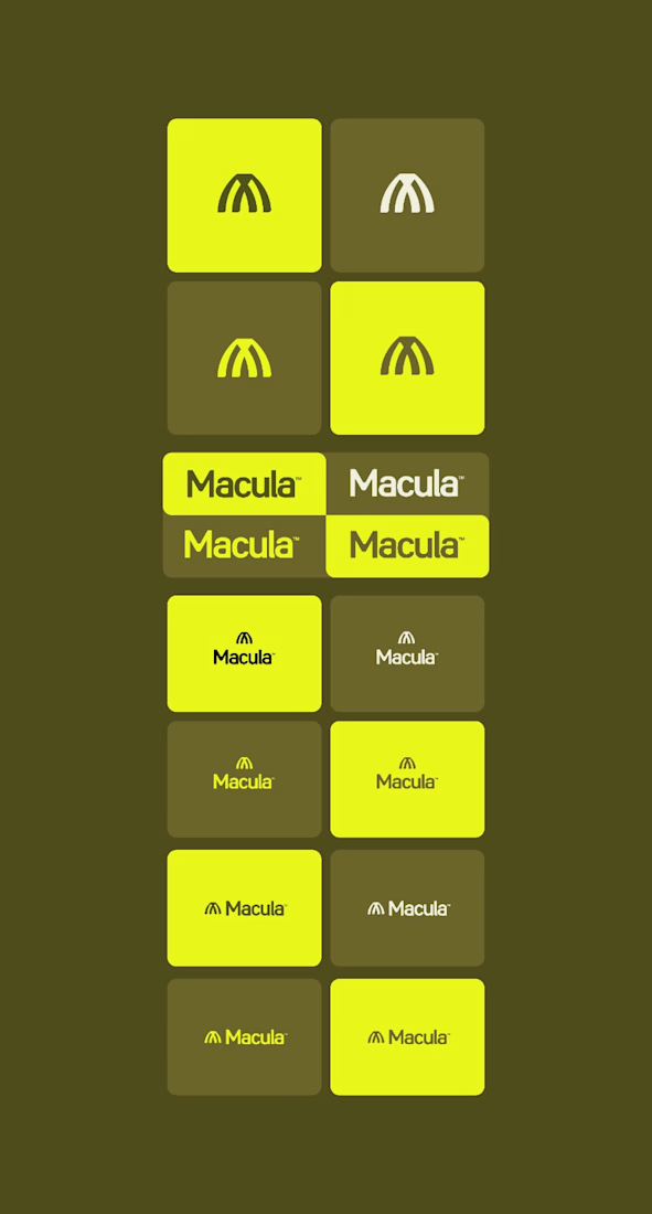
Pardon Gabriel❤️
If you make it different from M shape or different color that's good 🔥🔥

spotlight has my vote, hands-down! especially with the name, converge feels a bit distanced from the viewer & from the brand identity as framed here.
Thank you very much for your feedback!

Went with A. Converge holds up better at the small sizes and the lime still pops on the dark olive.

I love B but makes me think abuot McDonald's a lot!
thanks fo the comment! I’m working on fixing it!
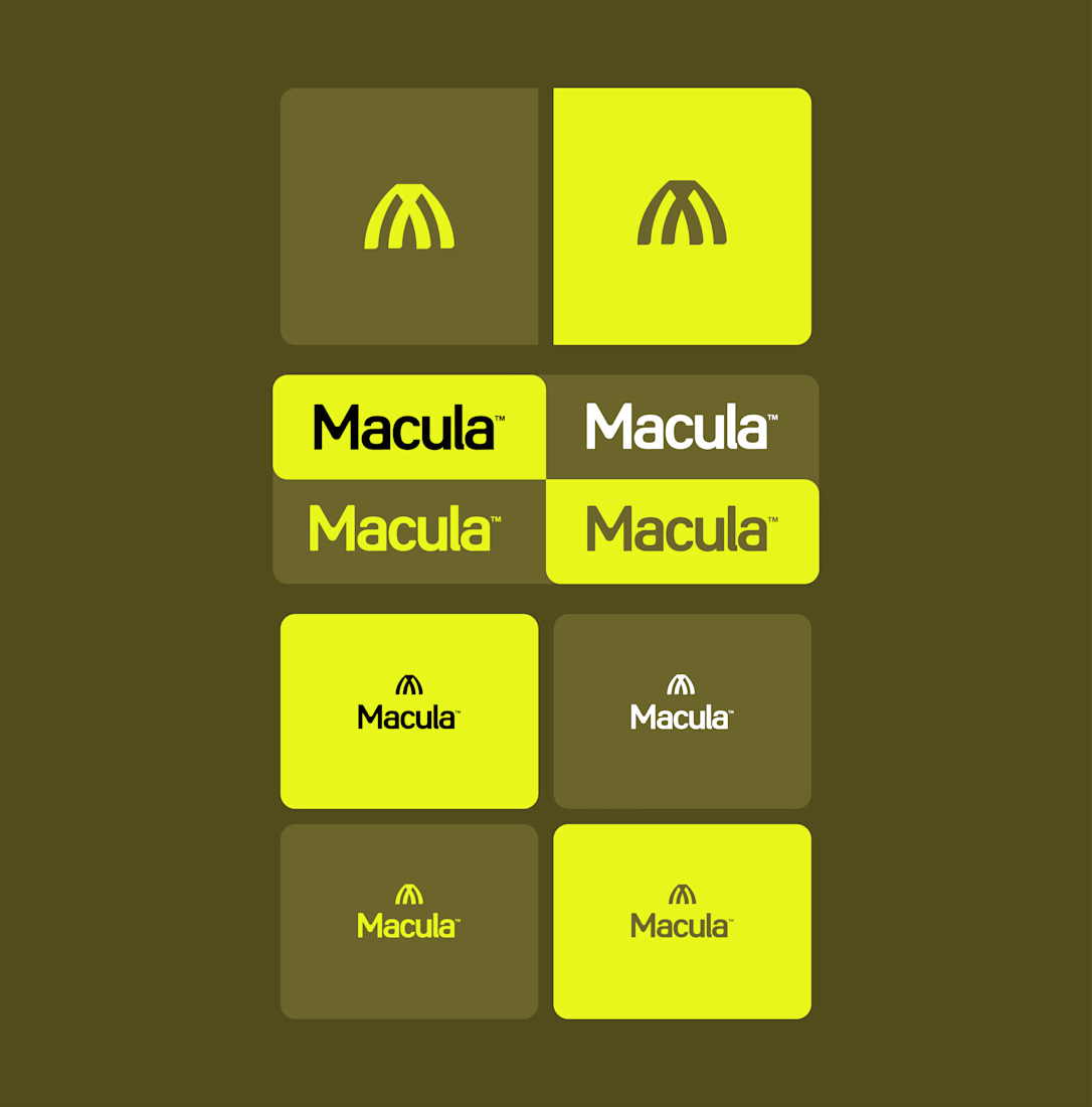


You redefined McDonals with the second one haha
For sure! hahaha

B is my recommendation.
The network for creativity
Join 1.25M professional creatives like you
Connect with clients, get discovered, and run your business 100% commission-free
Creatives on Contra have earned over $150M and we are just getting started


Related posts

Very close to finish a website project! Help me out!
Blue or orange scheme?
38 voted
47%
43 voted
53%
81 votes
Closed

The orange scheme was stunning 😍


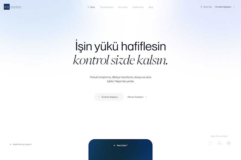
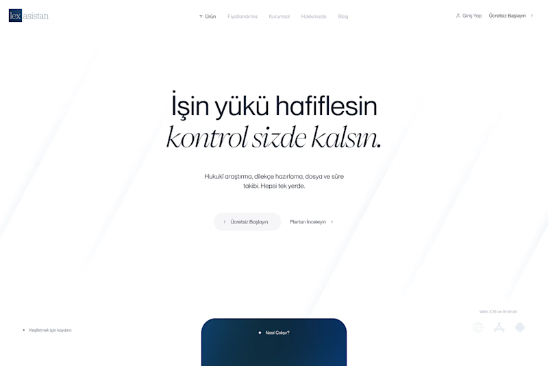
Exploring hero backgrounds for an AI assistant landing page. Which one feels more trustworthy?
9 voted
100%
0 voted
0%
9 votes
Closed

Aura feels more trustworthy and calm.

Can AI create a professional-looking logo?
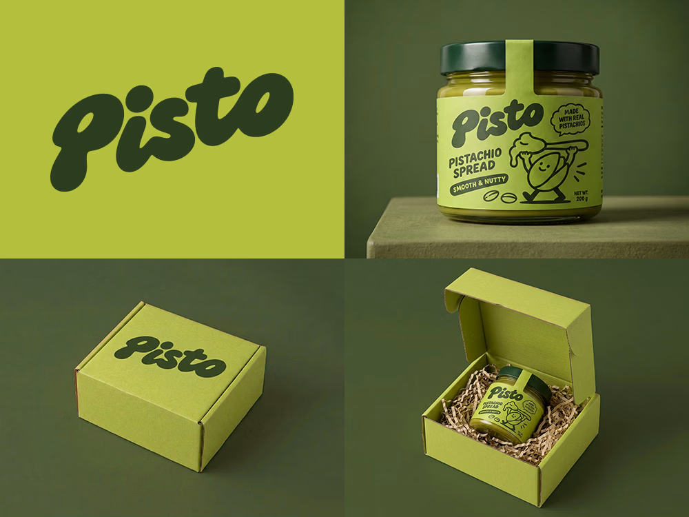
I tried to create a logo concept for a pistachio spread brand using Recraft Logo Maker.
After answering a few questions about the brand and going through several variations, I finally landed on a logo that felt right and captured the fun, fresh personality I had in mind.
But I didn't want to stop at just the logo.
I took it a step further by exploring how the identity could come to life through product packaging and a branded mailer box.
A quick process video is included in the comments.
What do you think?